How to align the button to the bottom of the column in Divi
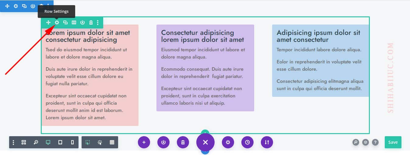
In Divi, to align the button to the bottom of the column, go to the “Row Settings” as you see below.
Now go to each column’s settings, and the click on “Advanced” tab & then “Custom CSS.”
And write the following two lines of CSS to the “Main Element” of each column.
display: flex;
flex-direction: column;
As mentioned, you have to do this for all your columns. In my example, I have 3 columns and did the same for all 3 columns. Only with the above two lines of CSS.
You are done with the column settings.
In the next step, go to each button setting and click on the “Design” tab, and click on “Spacing.”
Only for the “Top Margin” write “auto” and do this for the rest of the other buttons.
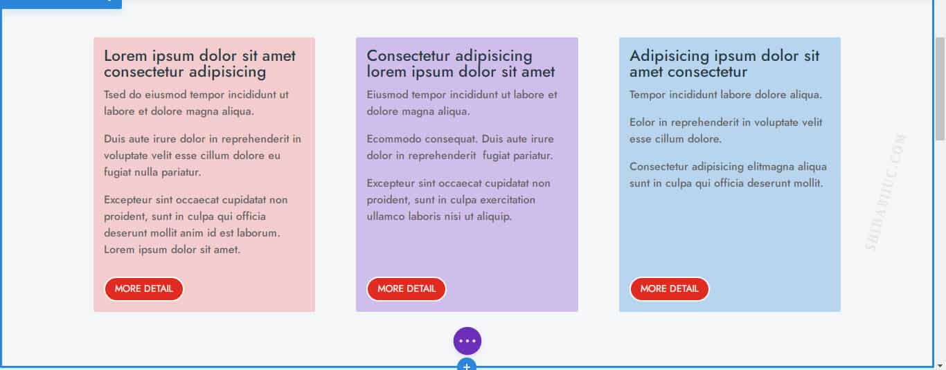
That’s it! This will place your buttons at the bottom of each column.
With this CSS, my columns & buttons look like the following screenshot.
If you still have any confusion, please check the video instruction.
Do you need web design help? Feel free to reach out.
I am a freelance web developer helping other developers, designers, and clients. If you need web design-related help, feel free to reach out to me. Always a reasonable price and easy to communicate with.
How to offset the space between text & buttons on mobile & tablet?
Generally, you don’t need to offset the space between the button & text. Because it breaks down into one column on small devices.
But if you’re displaying multiple columns in one row, you’ll find a huge gap (based on the largest column) between the text & button. To get around this situation, have to write the CSS based on media queries. See the following example.
@media (min-width: 768px) {
  display: flex;
  flex-direction: column;
}
The above CSS won’t apply until it hits the 768 pixels width.
However, since you’re using Divi, so you don’t have to write the CSS based on media query. You can leave the CSS as you wrote earlier. Then go to the “Tablet” screen and write “display: block” (see the screenshot below for more clarification).
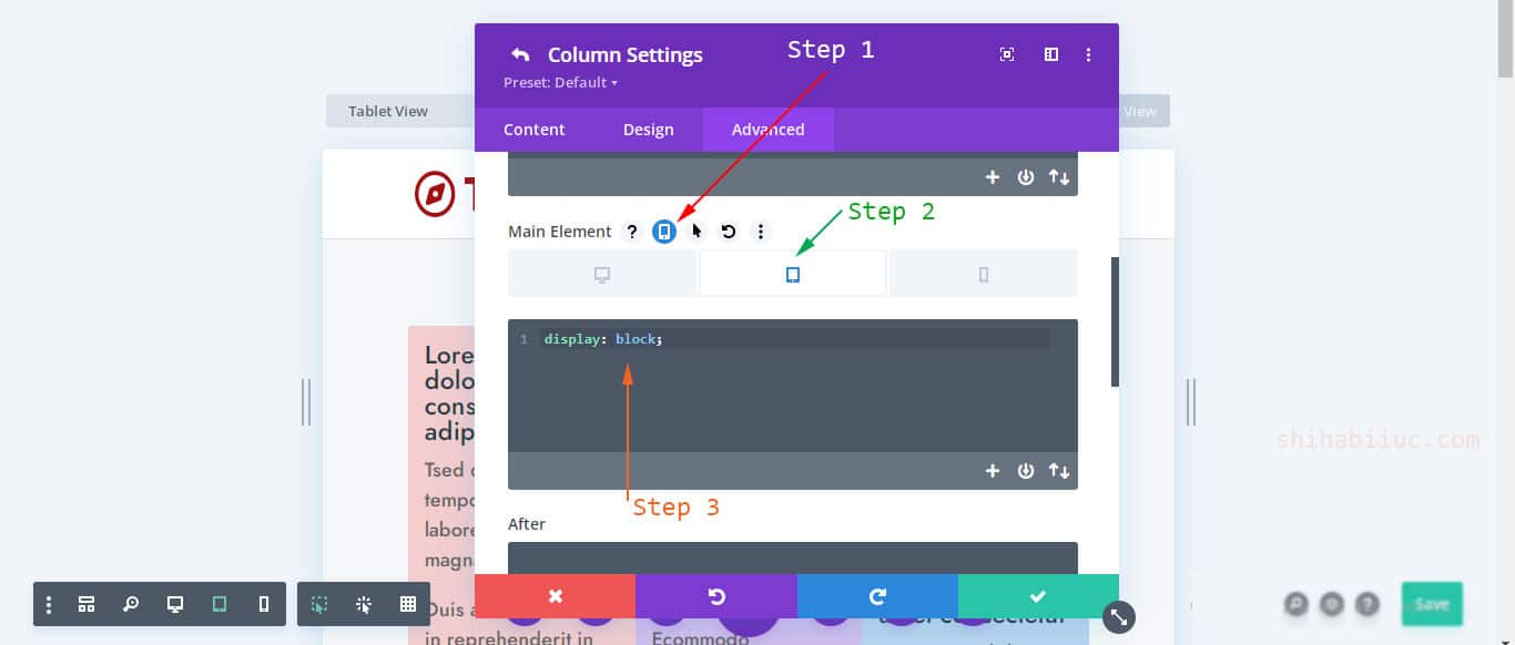
You don’t have to write this again for the “Mobile” because the CSS for “Tablet” will automatically apply for mobile unless you change it.
If you still have any issues, you can email me.