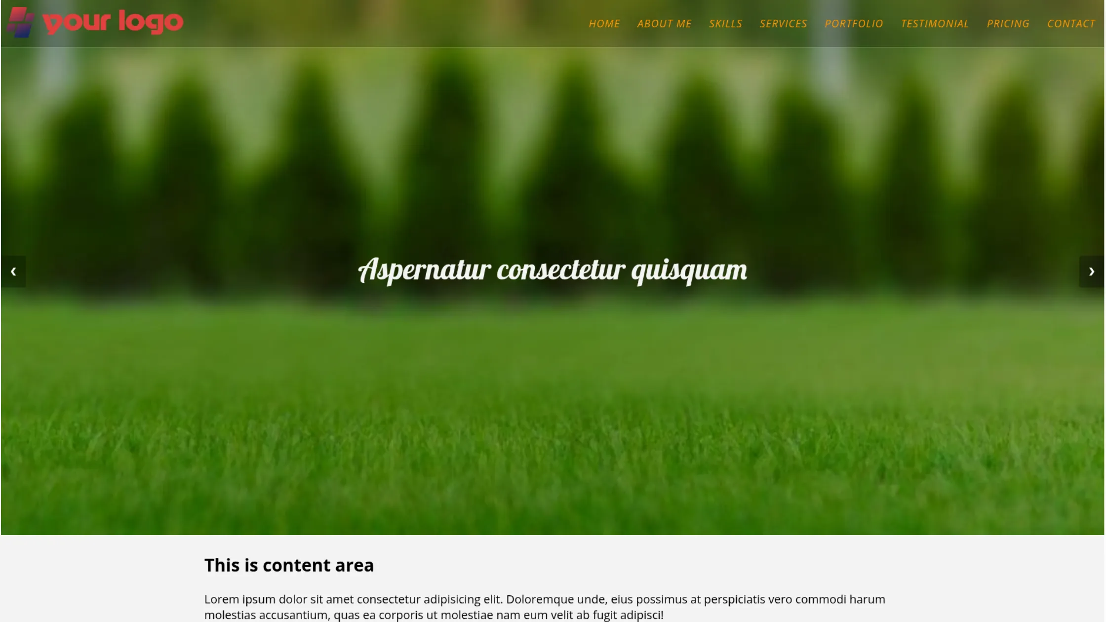
Full-screen slider using HTML, CSS & JS (template included)
This post will show you how to create a full-screen slider using HTML, CSS & JavaScript. Also, I will include header navigation that stays on top of the slider. It’s fully mobile responsive and works well on all web browsers. No dependencies, frameworks, or libraries are required.
Before you start, you can see the finished project in the link below.
Live Preview
If you liked the live demo, let’s get started.
My Project Structure (Your’s could be different)
full-screen-slider/
├── index.html
├── style.css
├── script.js
├── favicon.png
└── img/
This slider always fills the entire screen, regardless of device size. It’s commonly used on homepages, but you can place it anywhere.
The example includes a semi-transparent, mobile-responsive header navigation. For simplicity, the demo focuses only on the slider and header—generic content and footer are excluded.
If you want the complete template, I’ll link the full GitHub repository later in the post.
HTML
<section class="fullscreen-slider-with-header">
  <nav class="site-header">
    <div class="nav-logo">
      <a href="index.html">
        <img src="img/logo.png" alt="logo" width="314" height="60" />
      </a>
    </div>
    <button class="hamburger">
      <img src="img/menu.png" alt="menu toggle icon" />
    </button>
    <div class="nav-links">
      <ul>
        <li><a href="index.html">Home</a></li>
        <li><a href="#about">About Me</a></li>
        <li><a href="#skill">Skills</a></li>
        <li><a href="#service">Services</a></li>
        <li><a href="#portfolio">Portfolio</a></li>
        <li><a href="#testimonial">Testimonial</a></li>
        <li><a href="#pricing">Pricing</a></li>
        <li><a href="#contact">Contact</a></li>
      </ul>
    </div>
  </nav>
  <!-- .site-header -->

  <div class="slideshow-container">
    <div class="mySlides fade bg1">
      <h3 class="text">Aspernatur consectetur quisquam</h3>
    </div>
    <!-- .mySlides -->

    <div class="mySlides fade bg2">
      <h3 class="text">Debipisicing laboriosam deserunt</h3>
    </div>
    <!-- .mySlides -->

    <div class="mySlides fade bg3">
      <h3 class="text">Consectetur voluptates suscipit</h3>
    </div>
    <!-- .mySlides -->

    <a class="prev" onclick="plusSlides(-1)">❮</a>
    <a class="next" onclick="plusSlides(1)">❯</a>
  </div>
  <!-- .slideshow-container -->
</section>
<!-- .fullscreen-slider-with-header -->
As you see in this HTML, I have an “img” folder where all the images are stored. If you want to download the image or the folder, please refer to the following link. This “img” folder also contains the social icons for the footer (as you see in the demo).
Download images
Do you need web design help? Feel free to reach out.
I am a freelance web developer helping other developers, designers, and clients. If you need web design-related help, feel free to reach out to me. Always a reasonable price and easy to communicate with.
CSS
.fullscreen-slider-with-header {
  position: relative;
  /* Fading animation */
  /* On smaller screens, decrease text size */
}
.fullscreen-slider-with-header .site-header {
  height: 83px;
  position: relative;
  z-index: 10;
  display: -webkit-box;
  display: -ms-flexbox;
  display: flex;
  -webkit-box-align: center;
  -ms-flex-align: center;
  align-items: center;
  -webkit-box-orient: vertical;
  -webkit-box-direction: normal;
  -ms-flex-direction: column;
  flex-direction: column;
  background-color: rgba(0, 0, 0, 0.2);
  border-bottom: 1px solid rgba(255, 255, 255, 0.3);
}
@media screen and (min-width: 1250px) {
  .fullscreen-slider-with-header .site-header {
    -webkit-box-pack: justify;
    -ms-flex-pack: justify;
    justify-content: space-between;
    -webkit-box-orient: horizontal;
    -webkit-box-direction: normal;
    -ms-flex-direction: row;
    flex-direction: row;
  }
}
.fullscreen-slider-with-header .site-header .nav-logo {
  -ms-flex-item-align: start;
  align-self: flex-start;
  padding: 10px 5px 5px;
}
.fullscreen-slider-with-header .site-header .nav-logo a img {
  max-width: 200px;
  height: auto;
}
@media screen and (min-width: 768px) {
  .fullscreen-slider-with-header .site-header .nav-logo a img {
    max-width: 314px;
    height: auto;
  }
}
.fullscreen-slider-with-header .site-header .nav-links {
  display: none;
  width: 100%;
}
@media screen and (min-width: 1250px) {
  .fullscreen-slider-with-header .site-header .nav-links {
    display: block;
  }
}
.fullscreen-slider-with-header .site-header .nav-links ul {
  position: absolute;
  width: 100%;
  background-color: rgba(0, 0, 0, 0.6);
  margin: 0;
  padding: 20px 10px;
  display: -webkit-box;
  display: -ms-flexbox;
  display: flex;
  -webkit-box-orient: vertical;
  -webkit-box-direction: normal;
  -ms-flex-direction: column;
  flex-direction: column;
  -webkit-box-pack: end;
  -ms-flex-pack: end;
  justify-content: flex-end;
}
@media screen and (min-width: 1250px) {
  .fullscreen-slider-with-header .site-header .nav-links ul {
    -webkit-box-orient: horizontal;
    -webkit-box-direction: normal;
    -ms-flex-direction: row;
    flex-direction: row;
    background-color: transparent;
    padding: 0;
    position: static;
  }
}
.fullscreen-slider-with-header .site-header .nav-links ul li {
  list-style: none;
  position: relative;
}
.fullscreen-slider-with-header .site-header .nav-links ul li a {
  font-family: "Open Sans", sans-serif;
  font-size: 18px;
  font-weight: 400;
  font-style: italic;
  color: #ff9800;
  text-transform: uppercase;
  text-decoration: none;
  letter-spacing: 1.2px;
  padding: 10px 15px;
  display: block;
  -webkit-transition: all 0.4s ease-in-out;
  transition: all 0.4s ease-in-out;
}
.fullscreen-slider-with-header .site-header .nav-links ul li a:hover {
  background-color: rgba(255, 152, 0, 0.5);
  color: #ffffff;
  border-radius: 20px 5px 35px 7px;
}
.fullscreen-slider-with-header .site-header button {
  cursor: pointer;
  background: transparent;
  border: none;
  max-width: 50px;
  display: block;
  position: absolute;
  top: 10px;
  right: 10px;
}
@media screen and (min-width: 768px) {
  .fullscreen-slider-with-header .site-header button {
    top: 20px;
  }
}
@media screen and (min-width: 1250px) {
  .fullscreen-slider-with-header .site-header button {
    display: none;
  }
}
.fullscreen-slider-with-header .nav-links.active {
  display: block;
}
.fullscreen-slider-with-header .slideshow-container {
  margin-top: -83px;
  z-index: 0;
  font-family: "Lobster", cursive;
  padding: 0;
  width: 100vw;
  max-width: 100%;
  height: 100vh;
  /* Next & previous buttons */
}
.fullscreen-slider-with-header .slideshow-container .mySlides {
  -webkit-box-pack: center;
  -ms-flex-pack: center;
  justify-content: center;
  -webkit-box-align: center;
  -ms-flex-align: center;
  align-items: center;
  height: 100%;
  padding: 30px 10px;
}
@media (min-width: 768px) {
  .fullscreen-slider-with-header .slideshow-container .mySlides {
    padding: 45px 35px;
  }
}
.fullscreen-slider-with-header .slideshow-container .mySlides .text {
  font-weight: 400;
  text-align: center;
  color: rgba(255, 255, 255, 0.95);
  font-size: 30px;
  padding: 0 20px;
  line-height: 1.2;
}
@media (min-width: 768px) {
  .fullscreen-slider-with-header .slideshow-container .mySlides .text {
    font-size: 3.225rem;
  }
}
.fullscreen-slider-with-header .slideshow-container .bg1 {
  background-image:
    -webkit-gradient(linear, left top, left bottom, from(rgba(0, 0, 0, 0.25))),
    url("./img/slide-1.jpg");
  background-image:
    linear-gradient(rgba(0, 0, 0, 0.25)), url("./img/slide-1.jpg");
  background-repeat: no-repeat;
  background-size: cover;
}
.fullscreen-slider-with-header .slideshow-container .bg2 {
  background-image:
    -webkit-gradient(linear, left top, left bottom, from(rgba(0, 0, 0, 0.45))),
    url("./img/slide-2.jpg");
  background-image:
    linear-gradient(rgba(0, 0, 0, 0.45)), url("./img/slide-2.jpg");
  background-repeat: no-repeat;
  background-size: cover;
}
.fullscreen-slider-with-header .slideshow-container .bg3 {
  background-image:
    -webkit-gradient(linear, left top, left bottom, from(rgba(0, 0, 0, 0.25))),
    url("./img/slide-3.jpg");
  background-image:
    linear-gradient(rgba(0, 0, 0, 0.25)), url("./img/slide-3.jpg");
  background-repeat: no-repeat;
  background-size: cover;
}
.fullscreen-slider-with-header .slideshow-container .prev,
.fullscreen-slider-with-header .slideshow-container .next {
  cursor: pointer;
  position: absolute;
  top: 50%;
  width: auto;
  padding: 16px;
  margin-top: -22px;
  color: white;
  font-weight: 700;
  font-size: 18px;
  -webkit-transition: 0.6s ease;
  transition: 0.6s ease;
  border-radius: 0 3px 3px 0;
  -webkit-user-select: none;
  -moz-user-select: none;
  -ms-user-select: none;
  user-select: none;
  background-color: rgba(0, 0, 0, 0.25);
}
.fullscreen-slider-with-header .slideshow-container .next {
  right: 0;
  border-radius: 3px 0 0 3px;
}
.fullscreen-slider-with-header .slideshow-container .prev:hover,
.fullscreen-slider-with-header .slideshow-container .next:hover {
  background-color: rgba(0, 0, 0, 0.8);
}
.fullscreen-slider-with-header .fade {
  -webkit-animation-name: fade;
  animation-name: fade;
  -webkit-animation-duration: 1.5s;
  animation-duration: 1.5s;
}
@-webkit-keyframes fade {
  from {
    opacity: 0.4;
  }
  to {
    opacity: 1;
  }
}
@keyframes fade {
  from {
    opacity: 0.4;
  }
  to {
    opacity: 1;
  }
}
@media only screen and (max-width: 300px) {
  .fullscreen-slider-with-header .prev,
  .fullscreen-slider-with-header .next {
    font-size: 11px;
  }
}
As I mentioned, the placeholder content and the footer part are missing from the above CSS. If you want them all, please find my GitHub repo at the bottom of this post.
JavaScript
// HEADER NAVIGATION
const hamburger = document.getElementsByClassName("hamburger")[0];
const mobileNavs = document.getElementsByClassName("nav-links")[0];

hamburger.addEventListener("click", () => {
  mobileNavs.classList.toggle("active");
});

// SLIDER
let slideIndex = 1;
showSlides(slideIndex);

function plusSlides(n) {
  showSlides((slideIndex += n));
}

function currentSlide(n) {
  showSlides((slideIndex = n));
}

function showSlides(n) {
  let i;
  let slides = document.getElementsByClassName("mySlides");

  if (n > slides.length) {
    slideIndex = 1;
  }
  if (n < 1) {
    slideIndex = slides.length;
  }
  for (i = 0; i < slides.length; i++) {
    slides[i].style.display = "none";
  }
  slides[slideIndex - 1].style.display = "flex";
}
This is plain/vanilla JavaScript that does not require any dependencies. The first two const and the Event Listener I created for mobile navigation. And rest of the code is applicable to the slider.
That’s all after you save your file and if you have the “img” folder in the root (along with images), you will see that you have a full-screen slider as mine (including the header navigation).
If you find any issue, please look for any error in the console (inspect element) and see if any file paths are missing. Or if you properly added the styles & scripts to the HTML. Otherwise, let me know.
Download / Clone the entire project from your terminal:
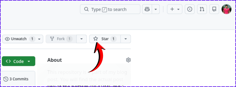
git clone https://github.com/shihabiiuc/full-screen-slider.gitIf you found this project helpful, please support me by hitting the 'Star' icon on my GitHub Repository. Please use the following link.
Give it a STAR
Do you need web design help? Feel free to reach out.
I am a freelance web developer helping other developers, designers, and clients. If you need web design-related help, feel free to reach out to me. Always a reasonable price and easy to communicate with.