How to create a Thank You page in HTML CSS? (source code)
When people buy something on our website or subscribe to the newsletter, we generally redirect them to a “Thank You” page. It’s a great opportunity to engage with our audience more closely & build business relationships. In this post, I will give you a thank you page template. And I will show you how I created this only using HTML & CSS.
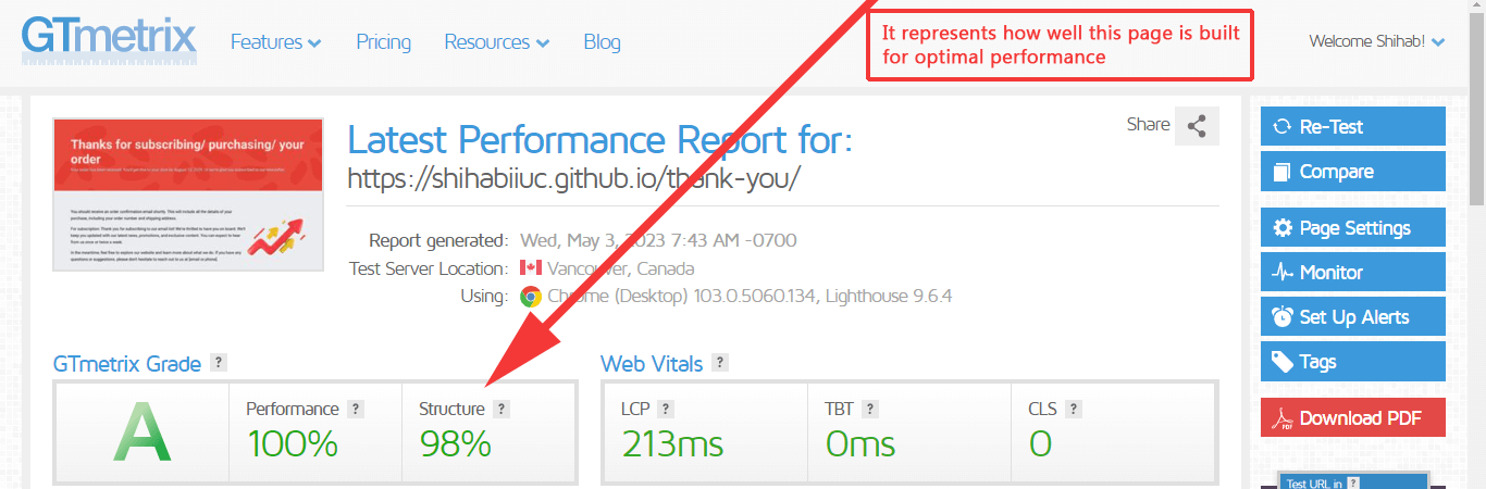
This template is fully mobile responsive, fast loading & well-structured. When I say well-structured, it means that I used semantic HTML where/when necessary and I did not even include a wrapper <div> just for the sake of limiting the max-width value. See the GTmetrix report in the screenshot below:
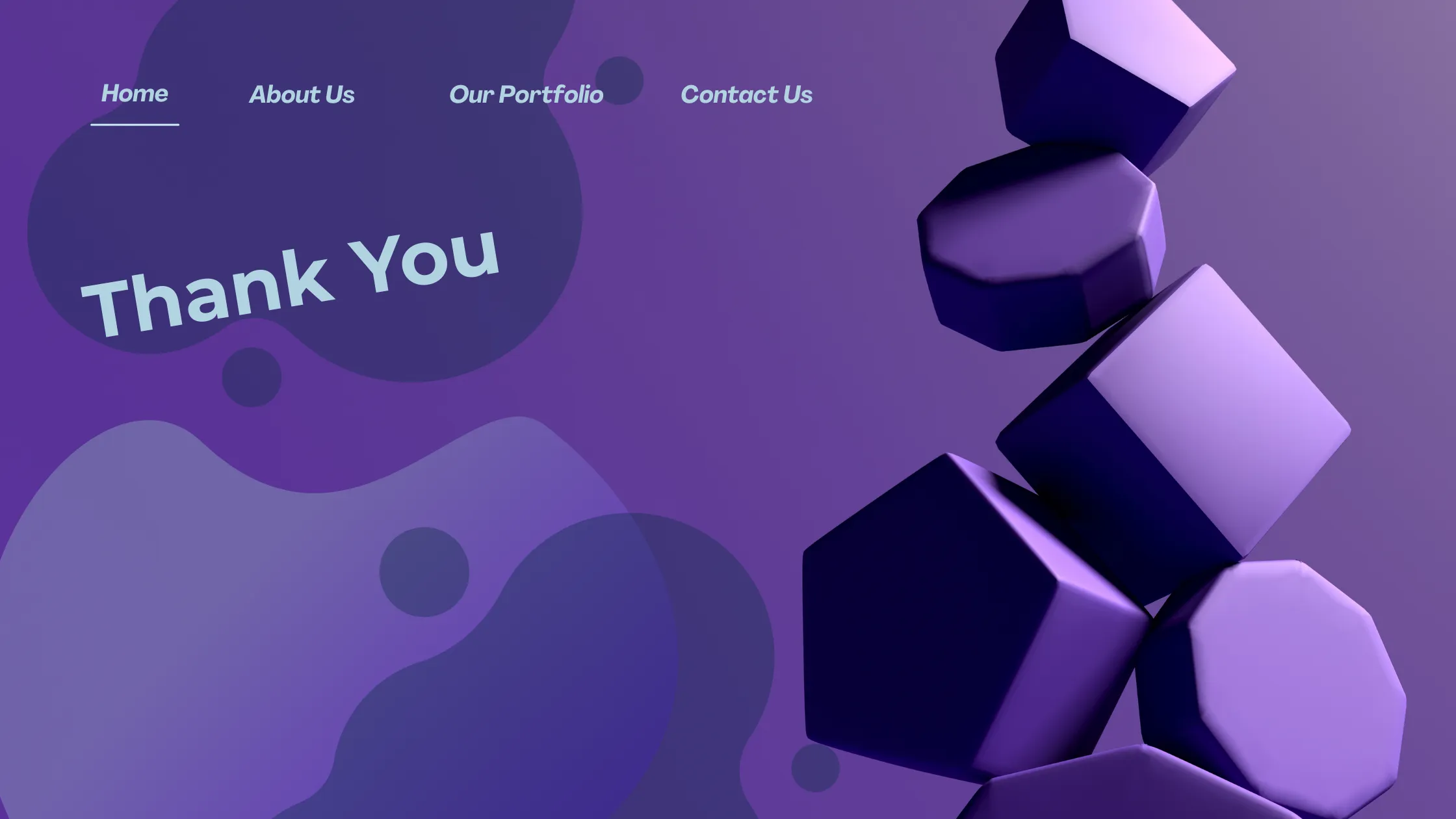
Anyways, before you start, let’s see the live demo of this page.
Live PreviewProject Structure
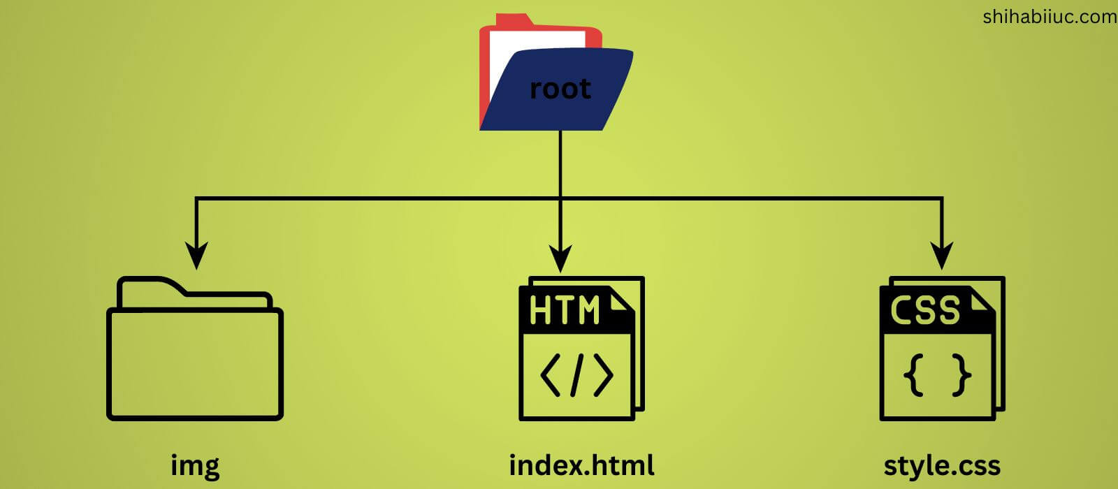
You can name the root or main project folder whatever you like (I named it ‘thank-you’). In the root, you have to create one folder called “img” that will contain all the images/assets. Also, you need to create two other files named “index.html & style.css.”
However, index.html generally refers to the home page (front page). So you can rename this to “thank-you.html” if you already have a file named “index.html.” Either way, let’s get started.
Do you need web design help? Feel free to reach out.
I am a freelance web developer helping other developers, designers, and clients. If you need web design-related help, feel free to reach out to me. Always a reasonable price and easy to communicate with.
HTML
<section class="banner">
  <!-- confirmation message -->
  <h1>Thanks for subscribing/ purchasing/ your order</h1>
  <!-- Gratitude message -->
  <p>Your order has been received. You'll get this to your ...</p>
</section>
<!-- .banner -->
<!-- Next steps -->
<section class="next-step">
  <div class="container">
    <div class="three-fourth">
      <p>You should receive an order confirmation email shortly. ...</p>
      <p>For subscription: Thank you for subscribing to our email...</p>
      <p>In the meantime, feel free to explore our website and learn....</p>
    </div>
    <div class="one-fourth">
      <img src="./img/growth.png" alt="growth infographic" />
    </div>
  </div>
</section>
<!-- .next-step -->
<!-- Offer an incentive -->
<section class="offer">
  <div class="container">
    <div class="one-fifth">
      <img src="./img/wait.jpg" alt="" />
    </div>
    <div class="three-fifth">
      <h2>Wait! We have a bonus for you!</h2>
      <p>
        As a token of our appreciation, we'd like to offer you a 10% discount...
      </p>
      <p>For subscription: We've created an exclusive ebook ...</p>
      <p>To download your free ebook, simply click on the button below.</p>
      <a href="./img/search-technic.pdf" target="_blank" download
        >Download ebook</a
      >
    </div>
    <div class="one-fifth">
      <img src="./img/gift.jpg" alt="" />
    </div>
  </div>
</section>
<!-- .offer -->
<!-- Related content -->
<section class="related-content">
  <h2>Visit our blog</h2>
  <p>Throughout the years, we have been doing our own research...</p>
  <div class="post-container">
    <div class="post">
      <h3>Consectetur adipisicing elit</h3>
      <img src="./img/coconuts.jpg" loading="lazy" alt="coconuts" />
      <p>Lorem ipsum dolor sit amet consectetur adipisicing elit...</p>
      <a href="#">Read more ⤍</a>
    </div>
    <!-- .post -->
    <div class="post">
      <h3>Autem aut eos accusantium</h3>
      <img src="./img/vegetables.jpg" loading="lazy" alt="vegetables" />
      <p>Auas beatae blanditiis adipisci exercitationem reprehenderit...</p>
      <a href="#">Read more ⤍</a>
    </div>
    <!-- .post -->
    <div class="post">
      <h3>Repudiandae ducimus inventore</h3>
      <img src="./img/garden.jpg" loading="lazy" alt="garden, flowers" />
      <p>
        Nonmaiores animi cum placeat. Lorem ipsum dolor sit amet quas
        recusandae...
      </p>
      <a href="#">Read more ⤍</a>
    </div>
    <!-- .post -->
  </div>
  <!-- .post-container -->
</section>
<!-- .related-content -->
CSS
*,
*::before,
*::after {
-webkit-box-sizing: border-box;
box-sizing: border-box;
}
body {
font-family: "Roboto", sans-serif;
background-color: #ebecf0;
padding: 0;
margin: 0;
}
img {
max-width: 100%;
}
h1,
h2,
h3 {
margin: 0;
}
h2 {
font-size: 1.7em;
font-weight: 700;
}
@media (min-width: 768px) {
h2 {
font-size: 3em;
}
}
h3 {
font-size: 1.5em;
font-weight: 700;
}
@media (min-width: 768px) {
h3 {
font-size: 1.7em;
}
}
p {
font-size: 1.25em;
margin: 0 0 20px;
line-height: 1.7;
font-weight: 400;
}
section:not(.banner) {
padding: 90px 15px;
background-color: #ffffff;
}
section:nth-child(even) {
background-color: transparent;
}
.container {
max-width: 1200px;
margin: 0 auto;
}
.banner {
display: -ms-grid;
display: grid;
-ms-grid-columns: minmax(auto, 1200px);
grid-template-columns: minmax(auto, 1200px);
-webkit-box-pack: center;
-ms-flex-pack: center;
justify-content: center;
padding: 90px 15px;
background-color: #e74133;
background:
-webkit-gradient(
linear,
left bottom,
left top,
from(rgba(231, 65, 51, 0.95))
),
url(./img/bg-banner.png) repeat;
background:
linear-gradient(0deg, rgba(231, 65, 51, 0.95)),
url(./img/bg-banner.png) repeat;
}
.banner h1 {
color: rgba(255, 255, 255, 0.85);
font-size: 2em;
font-weight: 700;
}
@media (min-width: 768px) {
.banner h1 {
font-size: 4em;
}
}
.banner p {
color: #ffffff;
margin-bottom: 0;
text-shadow: 1px 1px #222222;
}
.next-step .container {
display: -webkit-box;
display: -ms-flexbox;
display: flex;
-webkit-box-pack: justify;
-ms-flex-pack: justify;
justify-content: space-between;
-webkit-box-align: center;
-ms-flex-align: center;
align-items: center;
-ms-flex-wrap: wrap;
flex-wrap: wrap;
}
.next-step .container .three-fourth {
-webkit-box-ordinal-group: 3;
-ms-flex-order: 2;
order: 2;
-ms-flex-preferred-size: 100%;
flex-basis: 100%;
}
@media (min-width: 768px) {
.next-step .container .three-fourth {
-webkit-box-ordinal-group: 2;
-ms-flex-order: 1;
order: 1;
-ms-flex-preferred-size: 75%;
flex-basis: 75%;
}
}
.next-step .container .one-fourth {
-webkit-box-ordinal-group: 2;
-ms-flex-order: 1;
order: 1;
-ms-flex-preferred-size: 100%;
flex-basis: 100%;
margin-bottom: 30px;
}
@media (min-width: 768px) {
.next-step .container .one-fourth {
-webkit-box-ordinal-group: 3;
-ms-flex-order: 2;
order: 2;
-ms-flex-preferred-size: 25%;
flex-basis: 25%;
margin-bottom: 0;
}
}
.offer .container {
display: -webkit-box;
display: -ms-flexbox;
display: flex;
-webkit-box-pack: center;
-ms-flex-pack: center;
justify-content: center;
-ms-flex-wrap: wrap;
flex-wrap: wrap;
}
@media (min-width: 768px) {
.offer .container {
-webkit-box-pack: justify;
-ms-flex-pack: justify;
justify-content: space-between;
}
}
.offer .container .one-fifth {
-ms-flex-preferred-size: 100%;
flex-basis: 100%;
}
@media (min-width: 768px) {
.offer .container .one-fifth {
-ms-flex-preferred-size: 20%;
flex-basis: 20%;
}
}
.offer .container .one-fifth img {
width: 100%;
height: auto;
}
@media (min-width: 768px) {
.offer .container .one-fifth img {
height: 100%;
width: auto;
-o-object-fit: cover;
object-fit: cover;
}
}
.offer .container .three-fifth {
-ms-flex-preferred-size: 100%;
flex-basis: 100%;
background-color: #ebecf0;
padding: 20px 15px;
}
@media (min-width: 768px) {
.offer .container .three-fifth {
-ms-flex-preferred-size: 60%;
flex-basis: 60%;
}
}
.offer .container .three-fifth a {
text-transform: uppercase;
color: #e74133;
}
.related-content {
display: -ms-grid;
display: grid;
-ms-grid-columns: minmax(auto, 1200px);
grid-template-columns: minmax(auto, 1200px);
-webkit-box-pack: center;
-ms-flex-pack: center;
justify-content: center;
}
.related-content .post-container {
display: -webkit-box;
display: -ms-flexbox;
display: flex;
-webkit-box-pack: justify;
-ms-flex-pack: justify;
justify-content: space-between;
-ms-flex-wrap: wrap;
flex-wrap: wrap;
}
.related-content .post-container .post {
-ms-flex-preferred-size: 100%;
flex-basis: 100%;
margin-bottom: 60px;
background-color: #d9e7ff;
border: 1px solid #5895fc;
border-radius: 4px;
}
@media (min-width: 768px) {
.related-content .post-container .post {
-ms-flex-preferred-size: 30%;
flex-basis: 30%;
margin-bottom: 0;
}
}
.related-content .post-container .post h3 {
min-height: 90px;
display: -webkit-box;
display: -ms-flexbox;
display: flex;
-webkit-box-align: center;
-ms-flex-align: center;
align-items: center;
margin-left: 10px;
}
.related-content .post-container .post img {
width: 100%;
}
.related-content .post-container .post p {
margin: 20px 10px;
}
.related-content .post-container .post a {
margin: 0 10px 30px;
display: inline-block;
text-decoration: none;
color: #e74133;
-webkit-transition: color 0.4s ease-in-out;
transition: color 0.4s ease-in-out;
}
.related-content .post-container .post a:hover {
color: #357ffc;
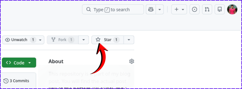
}If you found this project helpful, please support me by hitting the 'Star' icon on my GitHub Repository. Please use the following link.
Thank you for your support.
You can also clone the entire repo using your terminal:
git clone https://github.com/shihabiiuc/thank-you.git