The most commonly used CSS for rounded corners
Example of rounded corner
Use the border-radius: 30px; property to make rounded corners.
Not to mention, you can use any value instead of the 30px.
div.rounded {
	border: 3px solid #4285F4;
	border-radius: 30px; /* This property makes the rounded corners */
}
<div class="rounded">
<h3>Example of rounded corner</h3>
<p>Use the border-radius: 30px; property to make rounded corners.</p>
<p>Not to mention, you can use any value instead of the 30px.</p>
</div>CSS round corners with fill color
Round corners and fill with color
Use the background: #FFE797; property to fill with color (you can use any color code). And useborder-radius property to make rounded corners.
div.rounded {
	border: 3px solid #4285F4;
	border-radius: 60px;
	background: #FFE797; /* it fills with color */
}
CSS for button or link round corners
a, button {
	background-color: rgba(66, 133, 244, 0.3);
	border: 2px solid #4285F4;
	border-radius: 10px;
	padding: 15px 30px;
	width: 250px;
	text-align: center;
	font-size: 18px;
	text-decoration: none;
	text-transform: uppercase;
	color: #EA4335;
	transition: all 0.8s ease-in;
}

a:hover, button:hover {
	background-color: #4285F4;
	border-radius: 20px;
	color: #FFFFFF;
}
Different border-radius for different corners
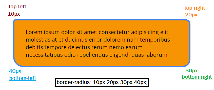
Four unit border-radius
Lorem ipsum dolor sit amet consectetur adipisicing elit molestias at et ducimus error dolorem nam temporibus debitis tempore delectus rerum nemo earum necessitatibus odio repellendus eligendi quas laborum.
border-radius: 10px 20px 30px 40px;
In this example, 10px applied to top-left corner, 20px to the top-right, 30px to the bottom right, and 40px to the bottom-left.
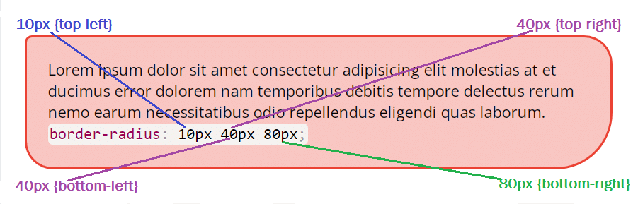
Three unit border-radius
Lorem ipsum dolor sit amet consectetur adipisicing elit molestias at et ducimus error dolorem nam temporibus debitis tempore delectus rerum nemo earum necessitatibus odio repellendus eligendi quas laborum.
border-radius: 10px 40px 80px;
In this example, you see a three-unit border-radius property. The first unit applied to the top-left, the second unit applied to the top-right & bottom-left, and the last/third unit applied to the bottom-right corner.
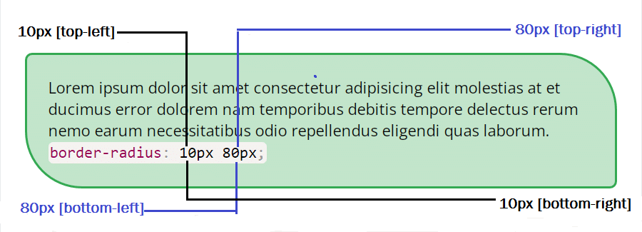
Two unit border-radius
Lorem ipsum dolor sit amet consectetur adipisicing elit molestias at et ducimus error dolorem nam temporibus debitis tempore delectus rerum nemo earum necessitatibus odio repellendus eligendi quas laborum.
border-radius: 10px 80px;
In this exampl, In this example, you see a two-unit border-radius. The first unit applied to the top-left & bottom-right. And the second unit applied to the top-right & bottom-left.
As you already have seen in the first example, 1 unit border-radius applies to all 4 corners. For example border-radius: 30px;. Also, it’s not mandatory to have a border property to apply a border-radius. No matter if it's a text or image, you can write CSS to make round corners without border.