It’s easy to add borders to a table but making the table rounded is a bit trickier. Wood-made rounded tables are very common but it’s rare when it comes to making them with HTML & CSS. I used the “border-radius” property to make the rounded corners but it did not work.
So I took a deep dive and come up with a couple of solutions to make a table rounded with CSS (not wood).
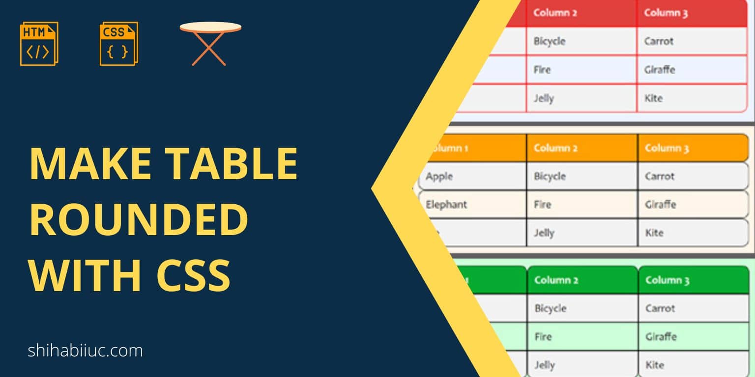
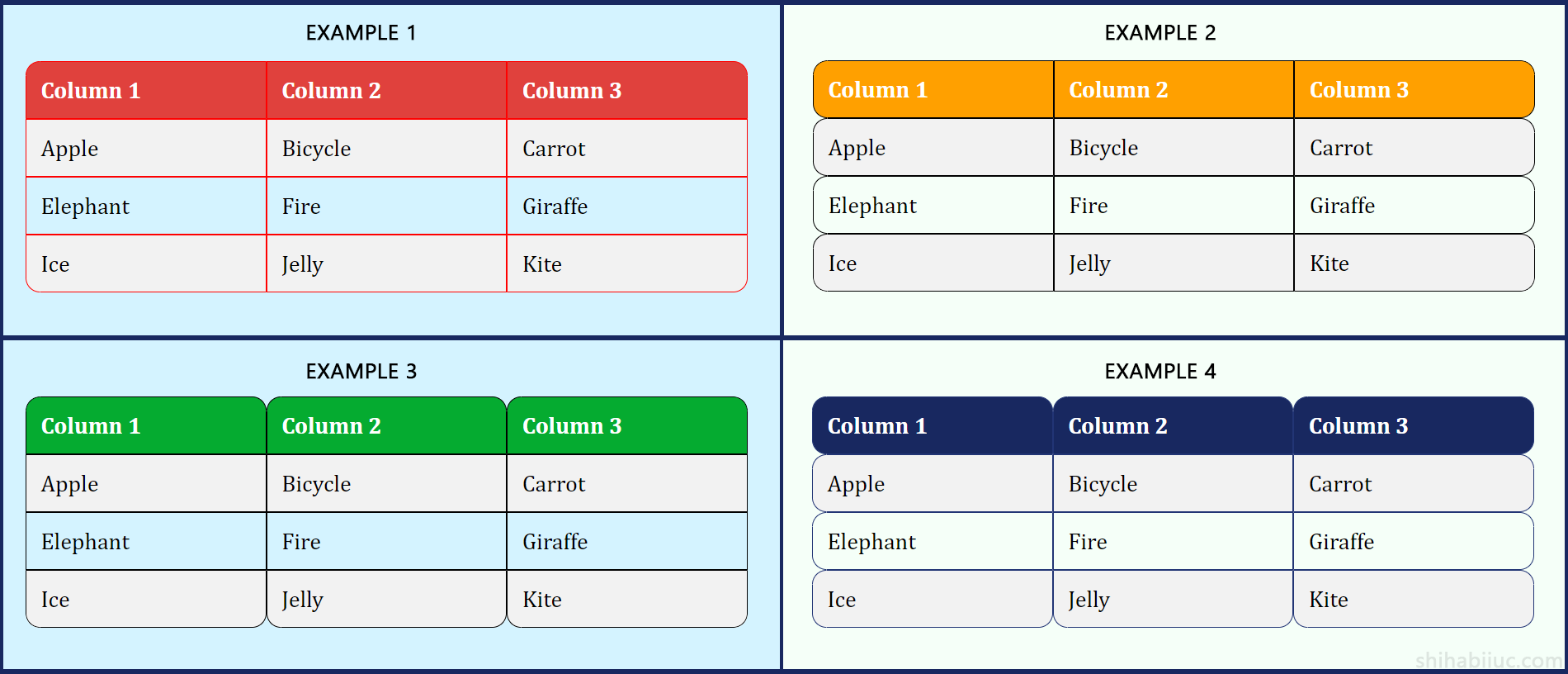
In this post, I will show you a couple of ways to make rounded tables with CSS. Also, I will show you different types of rounded tables such as rounding 4 corners, rounding rows, columns, etc. See the examples in the screenshot below that we’re going to build.
Let’s see them one by one.
A few methods to make a table rounded
I will show you a couple of ways to make rounded corners. Also, you will get a few different appearances of the round corners. If that does not make sense yet, don’t worry! Let’s see them gradually.
Example 1: Rounded 4 corners of the table
In this example, I will show you how to make the four corners rounded. See the preview below.
Preview
| Column 1 | Column 2 | Column 3 |
|---|---|---|
| Apple | Bicycle | Carrot |
| Elephant | Fire | Giraffe |
| Ice | Jelly | Kite |
For the above table, I have the following HTML.
HTML
<table>
  <tr>
    <th>Column 1</th>
    <th>Column 2</th>
    <th>Column 3</th>
  </tr>
  <tr>
    <td>Apple</td>
    <td>Bicycle</td>
    <td>Carrot</td>
  </tr>
  <tr>
    <td>Elephant</td>
    <td>Fire</td>
    <td>Giraffe</td>
  </tr>
  <tr>
    <td>Ice</td>
    <td>Jelly</td>
    <td>Kite</td>
  </tr>
</table>
And see my CSS below.
CSS
table {
  border-collapse: separate;
  border-spacing: 0;
  overflow: hidden;
}
th {
  background-color: #e0413d;
  color: #FFFFFF;
}
th, td {
  padding: 10px;
  border: 1px solid #FF0000;
}
tr:nth-child(even) {
  background-color: #f2f2f2;
}
/* required css to make rounded table (below) */
tr:first-child th:first-child {
  border-top-left-radius: 10px;
}
tr:first-child th:last-child {
  border-top-right-radius: 10px;
}
tr:last-child td:first-child {
  border-bottom-left-radius: 10px;
}
tr:last-child td:last-child {
  border-bottom-right-radius: 10px;
}
Explanation:
The first two lines of CSS for the table tag made the cell borders visible. And the “overflow: hidden” makes the extended borders invisible that come outside of the rounded corners. To give you an example of how it works, see the green & red columns below.

overflow: visible
overflow: hidden
As you see in the red example above, some portions of the image are invisible that exceed the container. And the same thing is true about the extra borders that exceed the rounded corners.
See the infographic below for more clarification.
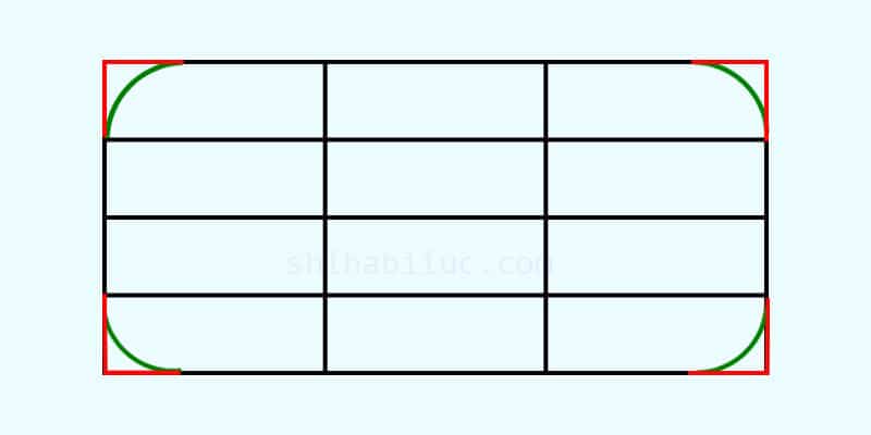
In the above graphic, the green line/shape is the border-radius. The red lines are the table border parts that exceed the rounded corners. And the red parts will be invisible using the overflow (hidden) property.
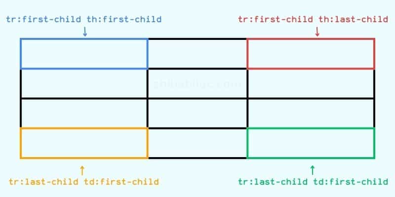
Finally, I have 10px of “border-radius” for the top-left, top-right, bottom-left & bottom-right cells. In my CSS, these cells are accordingly “tr:first-child th:first-child”, “tr:first-child th:last-child”, “tr:last-child td:first-child” & “tr:last-child td:last-child” (selectors). For more explanation about it, see the infographic below.
This is how I made the table rounded and you can do the same.
Example 2: Rounded rows of the table
In this example, you’ll see how make the table rows rounded. See the preview below.
Preview
| Column 1 | Column 2 | Column 3 |
|---|---|---|
| Apple | Bicycle | Carrot |
| Elephant | Fire | Giraffe |
| Ice | Jelly | Kite |
In the above, you see that each of the rows is rounded instead of only 4 corners of the table. I applied the same technics as you saw in “Example 1.”
Also, I used the exact same HTML markup for the table. Once again see the HTML below.
HTML
<table>
  <tr>
    <th>Column 1</th>
    <th>Column 2</th>
    <th>Column 3</th>
  </tr>
  <tr>
    <td>Apple</td>
    <td>Bicycle</td>
    <td>Carrot</td>
  </tr>
  <tr>
    <td>Elephant</td>
    <td>Fire</td>
    <td>Giraffe</td>
  </tr>
  <tr>
    <td>Ice</td>
    <td>Jelly</td>
    <td>Kite</td>
  </tr>
</table>
Here is how I tweaked the CSS to make all the rows round.
CSS
table {
  border-collapse: separate;
  border-spacing: 0;
  border-radius: 10px;
  overflow: hidden;
}
th {
  background-color: #FFA000;
  color: #FFFFFF;
}
th, td {
  padding: 10px;
  border: 1px solid black;
}
tr:nth-child(even) {
  background-color: #f2f2f2;
}
tr:hover {
  background-color: #ddd;
}
/* required css to make the rows rounded */
th:first-child, td:first-child {
  border-top-left-radius: 10px;
  border-bottom-left-radius: 10px;
}
th:last-child, td:last-child {
  border-top-right-radius: 10px;
  border-bottom-right-radius: 10px;
}
tr:first-child th:first-child {
  border-top-left-radius: 10px;
}
tr:first-child th:last-child {
  border-top-right-radius: 10px;
}
tr:last-child td:first-child {
  border-bottom-left-radius: 10px;
}
tr:last-child td:last-child {
  border-bottom-right-radius: 10px;
}
That means we are individually selecting starting & ending cells of each row and making them round by 10 pixels. However, you can change this amount based on your choice.
Example 3: Rounded columns of the table
In this example, you’ll see how to make the table columns rounded instead of the rows. See the preview below.
Preview
| Column 1 | Column 2 | Column 3 |
|---|---|---|
| Apple | Bicycle | Carrot |
| Elephant | Fire | Giraffe |
| Ice | Jelly | Kite |
The concept is the same as in the past example. Also, I used the same HTML markup for the table. Once again, see it below.
HTML
<table>
  <tr>
    <th>Column 1</th>
    <th>Column 2</th>
    <th>Column 3</th>
  </tr>
  <tr>
    <td>Apple</td>
    <td>Bicycle</td>
    <td>Carrot</td>
  </tr>
  <tr>
    <td>Elephant</td>
    <td>Fire</td>
    <td>Giraffe</td>
  </tr>
  <tr>
    <td>Ice</td>
    <td>Jelly</td>
    <td>Kite</td>
  </tr>
</table>
In this 3rd example, I made the table rounded in the column direction instead of the row. To do that, I selected all the table header <th> tags and set their border-radius in the top-left & top-right.
For the bottom part of each column, I targetted the last row of the table (tr:last-child) and then all the table data <td> tags. And set their border-radius in bottom-left & bottom-right.
See the entire CSS for this table.
CSS
table {
  border-collapse: separate;
  border-spacing: 0;
  border-radius: 10px;
  overflow: hidden;
}
th {
  background-color: #05ab30;
  color: #FFFFFF;
}
th, td {
  padding: 10px;
  border: 1px solid black;
}
tr:nth-child(even) {
  background-color: #f2f2f2;
}
tr:hover {
  background-color: #ddd;
}
/* required css to make columns rounded */
th {
  border-top-left-radius: 10px;
  border-top-right-radius: 10px;
}
tr:last-child td {
  border-bottom-left-radius: 10px;
  border-bottom-right-radius: 10px;
}
This is how I made each column rounded.
Example 4: Rounded rows & columns
Now if you want to make the table rows & columns rounded, you can combine examples 2 & 3.
Preview
| Column 1 | Column 2 | Column 3 |
|---|---|---|
| Apple | Bicycle | Carrot |
| Elephant | Fire | Giraffe |
| Ice | Jelly | Kite |
Here I will combine the last two examples (2 & 3). See my HTML below.
HTML
<table>
  <tr>
    <th>Column 1</th>
    <th>Column 2</th>
    <th>Column 3</th>
  </tr>
  <tr>
    <td>Apple</td>
    <td>Bicycle</td>
    <td>Carrot</td>
  </tr>
  <tr>
    <td>Elephant</td>
    <td>Fire</td>
    <td>Giraffe</td>
  </tr>
  <tr>
    <td>Ice</td>
    <td>Jelly</td>
    <td>Kite</td>
  </tr>
</table>
To make both rows & columns rounded, I have the following CSS.
CSS
table {
  border-collapse: separate;
  border-spacing: 0;
  overflow: hidden;
}
th {
  background-color: #182860;
  color: #FFFFFF;
}
th, td {
  padding: 10px;
  border: 1px solid #223575;
}
tr:nth-child(even) {
  background-color: #f2f2f2;
}
/* required CSS - making the rows rounded*/
th:first-child, td:first-child {
  border-top-left-radius: 10px;
  border-bottom-left-radius: 10px;
}
th:last-child, td:last-child {
  border-top-right-radius: 10px;
  border-bottom-right-radius: 10px;
}
tr:first-child th:first-child {
  border-top-left-radius: 10px;
}
tr:first-child th:last-child {
  border-top-right-radius: 10px;
}
tr:last-child td:first-child {
  border-bottom-left-radius: 10px;
}
tr:last-child td:last-child {
  border-bottom-right-radius: 10px;
}
/* required CSS - making the columns rounded*/
th {
  border-top-left-radius: 10px;
  border-top-right-radius: 10px;
}
tr:last-child td {
  border-bottom-left-radius: 10px;
  border-bottom-right-radius: 10px;
}
I added necessary comments to the CSS so you can understand which part does what specific things.
Live previews in GitHub pages →
Download the live preview template →
And it brings me to the end of this post.
Learn more about tables
- How to add borders in an HTML table?
- How to remove HTML table border?
- How to make a table rounded with CSS?
- How to fill a table cell with color in WordPress Gutenberg?
- How to center a table in HTML CSS?
- How to align table elements?
- How to add & align images inside an HTML table?
- TR, TH & TD workflow in an HTML table.
- HTML table background-color & background-image
- How to make a scrollable table in HTML CSS?
Conclusion
Now you know how to make a table rounded using CSS. Also, I showed how you can make rounded corners in various directions. Such as rounding all four corners, columns, rows & both. Also, I showed you the live previews of each examples and gave you all the HTML & CSS.
I tried to make this post simple & easy to digest for beginners. Aside from the code samples, I also explained how the CSS works & how I made the rounding corners of the tables.
But if you have any questions or if have a hard time following my guideline, please let me know. I will try to keep improving this post based on your feedback. And if this post helped you in any ways, please share it to any of your social networks or websites.

