You can rotate text, images, and other HTML elements using the CSS transition property. The transition has a “rotate” function that can make rotation an element clockwise or anticlockwise.
In this post, I will try to make you understand the CSS rotate function in depth. And will give you some real examples. So you can take these ideas to implement on your project without much spending time on it.
Let’s start.
Rotate a text using CSS
In order to rotate a text, your first instinct should be to give it a class or ID so you can target it easily in your stylesheet. To demonstrate the purpose, I have the following HTML.
<p class="rotate-me">Rotate me!</p>To rotate the paragraph 45 degrees clockwise, I have the following CSS (with additional/optional other values).
.rotate-me {
  background-color: #ffba8c;
  padding: 10px;
  width: 120px;
  height: 120px;
  transform: rotate(45deg);
}
See the output below:
Rotate 45 degrees clockwise
Whenever you see an example of a rotating function, you will see a fixed width & height. But you don’t have to give it a fixed width & height.
However, the paragraph or the <p> tag is a block-level element and it takes the full available width. If you rotate it, the paragraph will start from the very top because of its longer width.
So if you’re experimenting with a block-level element, make sure to give it a fixed width & height (just to avoid confusion).
Anyways, let’s move on!
If you want to rotate the above text anticlockwise, you have to give it a negative value as you see below.
.rotate-me {
  transform: rotate(-45deg);
}
See its output below.
Rotate 45 degrees anticlockwise
In the same vein, you can use any number of positive or negative degrees. And you’re just not limited to using the degree unit but also can use turn (max value is 1), rad, etc. But the most used unit is degree or short for deg.
How to use the degree value to rotate an element?
The maximum rotation is 360 degrees and it could be also a negative value if you want to rotate anticlockwise (-360). See the diagram to better understand the clockwise and anticlockwise rotation.
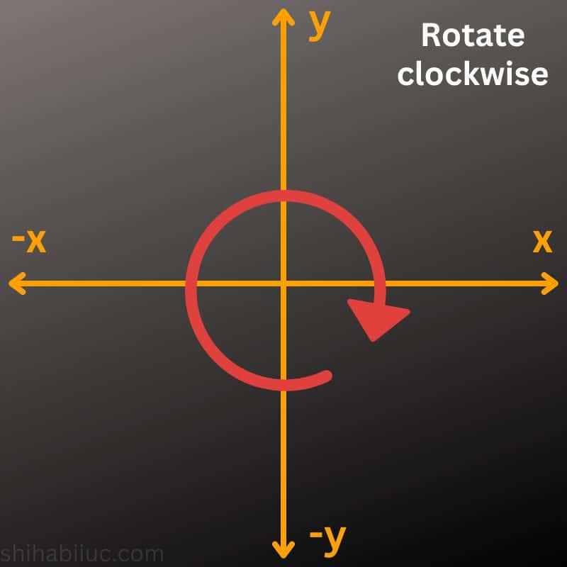
And the anticlockwise rotation will be its the opposite direction as you see below.
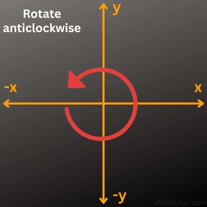
The intersection of the X & Y axis is the transform origin. That means, your element will rotate based on this center (intersection). While the entire circle is 360deg, each of the 4 blocks is 90 degrees.
How to rotate an image using CSS?
There is no different CSS to rotate an image and you can follow the exact process as you make a rotation to the text in the last section.
Just keep in mind that an image is an inline-level element. That means it will take space as much as it needs. So you don’t have to set fixed width & height properties as we did while experimenting in the last section.
Anyways, let’s rotate an image 🙂
For this example, I have the following HTML.
<div class="example-2">
  <img src="./img/person.jpg" alt="Shihab" class="rotate-image">
</div>
To rotate the image (if you don’t know, it’s my photo), I have the following CSS.
.rotate-image {
  transform: rotate(25deg);
}
See the output yourself below.
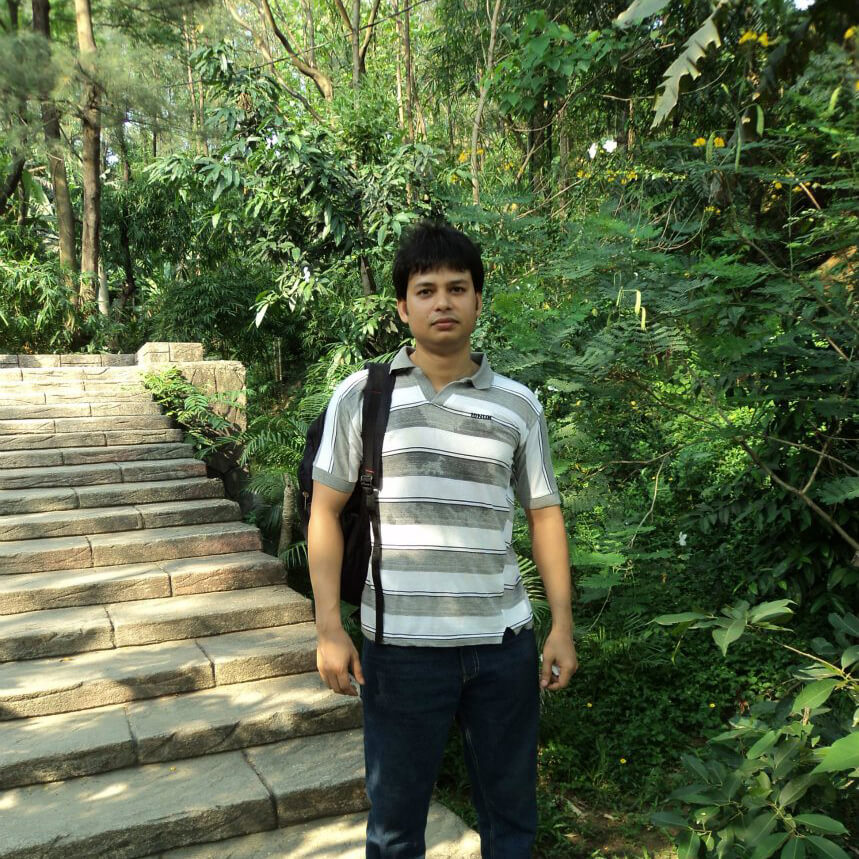
Not to mention, you may need to add some padding to the container div sometimes. Otherwise, a few portions of the element may go outside of the container.
How to rotate 180 in CSS?
Use the following CSS to rotate an element 180 degrees clockwise:
.element-selector {
  transform: rotate(180deg)
}
Use the following line if you want the element to rotate anticlockwise 180 degrees.
.element-selector {
  transform: rotate(-180deg)
}
How do you rotate 90 degrees in CSS?
Use the following CSS to rotate 90 degrees:
.element-selector {
  transform: rotate(90deg)
}
To rotate the element anticlockwise, use a negative value as you see below:
.element-selector {
  transform: rotate(-90deg)
}
Learn more about images
- How to add images to an HTML table?
- How to create an image hover animation effect only with CSS?
- How to position text over an image with CSS?
- How to change an image on hover (CSS)
- Center an image in various directions & methods
- How to right-align an image in HTML CSS?
- How to create a hero banner image using HTML CSS?
- How to wrap text around an image in HTML?
- How to rotate text & images using CSS?
Build HTML CSS projects
Conclusion
That’s a lot! Hopefully, this will make sense and gave you a clear understanding of rotating a text or image using CSS.

