I will give you an “About Us” page template to download in this post. It was built with only HTML & CSS. But it looks very professional & mobile-responsive.
I will also show you how I built this About Us template from scratch. So you can learn basic HTML & CSS. If you’re already familiar with or an expert, you can go to the bottom of this post to find the download option.
Before we move forward, let’s the finished product (about page) in the link below.
Let’s get started.
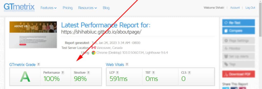
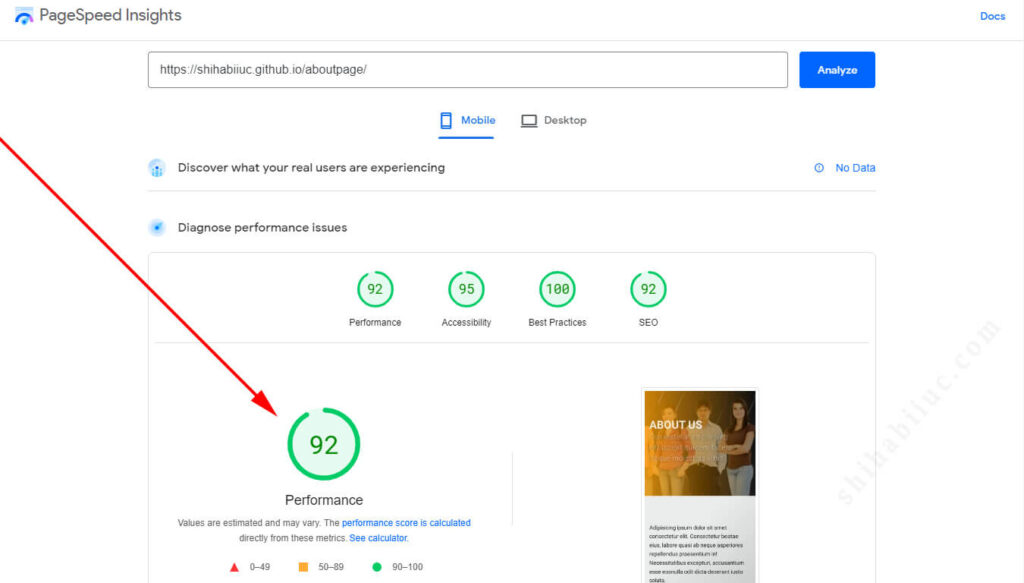
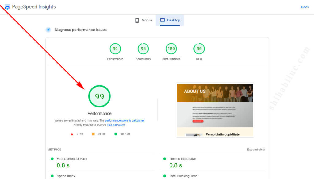
A few facts about this template
When I created the template, I made sure that it was well structured both for humans & search engines. Also, I tried to optimize the template so it loads faster and even on a low-speed internet connection.
Please check a couple of performance reports below:
GTmetrix performance report
PageSpeed Insights performance report
How to use this about us template?
I created a couple of sections in this template, including an overlay hero banner section. After you download the template, you can edit the HTML, CSS, text & images as you see fit.
In my project, I have the following structure:
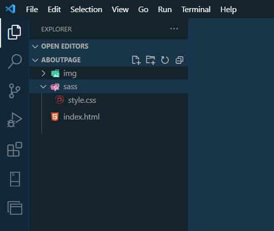
That means I have an index.html file in the project folder and two folders such as sass & img. The sass & img folders contain the style.css & images, respectively.
I used Roboto font for the entire template that you will find in the index.html file (within the <head> tag).
You may need to rename the index.html file to about.html or about-us.html or whatever you like. For more information, please see how to create a multipage HTML website.
Download the About Us template
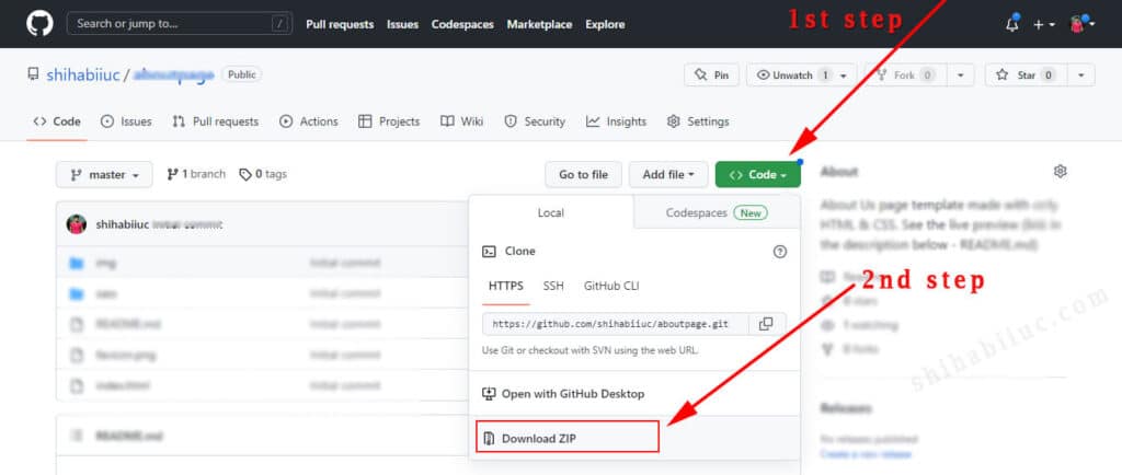
If you want your About page to be the same as mine, download the template from my GitHub repository.
If you’re not familiar with GitHub, see the screenshot below to learn how to download a project:
But if you want the HTML & CSS only, see below:
HTML
<!DOCTYPE html>
<html lang="en">
<head>
  <meta charset="UTF-8">
  <meta http-equiv="X-UA-Compatible" content="IE=edge">
  <meta name="viewport" content="width=device-width, initial-scale=1.0">
  <link rel="shortcut icon" href="favicon.png" type="image/x-icon">
  <!-- font -->
  <link rel="preconnect" href="https://fonts.googleapis.com">
  <link rel="preconnect" href="https://fonts.gstatic.com" crossorigin>
  <link href="https://fonts.googleapis.com/css2?family=Roboto:ital,wght@0,100;0,400;0,700;1,400&display=swap" rel="stylesheet">
  <!-- font ends here -->
  <link rel="stylesheet" href="./sass/style.css">
  <title>About - An example of about us page</title>
</head>
<body>
  <section class="banner">
    <div class="container">
      <h1>About us</h1>
      <p>Consectetur adipisicing elituscipit quidem facere itaque molestias vitae.</p>
    </div>     <!-- .container -->
  </section>  <!-- .banner -->
  <section class="first">
    <div class="container">
      <p>Adipisicing ipsum dolor sit amet consectetur elit. Consectetur beatae eius, labore quasi ab neque asperiores repellendus praesentium in! Necessitatibus excepturi, accusantium esse eosnulla odit dicta deserunt iusto soluta.</p>
      <p>Labore quasi <strong>abneque asperiores repellendus</strong> praesentium in! Necessitatibus excepturi, accusantium esse eos nulla odit dicta deserunt iusto. Tuasi ablabore neque <u>asperiores repellendus praesentium</u> in! Necessitatibus excepturi, accusantium esse eos nulla odit dicta deserunt iusto soluta. Labore quasi ab neque asperiores repellendus praesentium.</p>
      <a class="cta" href="index.html">Discover more ⟩</a>
    </div>
  </section>
  <section class="second">
    <div class="container">
      <div class="left-img">
        <img src="./img/photo-1.jpg" alt="Person">
      </div>
      <div class="right-content">
        <h2>Perspiciatis cupiditate deserunt</h2>
        <p>Lorem ipsum dolor sit amet, consectetur adipisicing elit. Voluptatum in cumque, id quisquam praesentium unde dolor fugiat mollitia perspiciatis cupiditate deserunt, odit quo non officiis optio illum eum ad expedita? Lorem ipsum dolor sit, amet consectetur adipisicing elit. Sit enim dolorum, adipisci explicabo, officia reprehenderit velit quasi voluptatibus consectetur et accusantium quam quaerat voluptates vel sapiente consequuntur doloribus illum dolores!</p>
        <a class="cta" href="index.html">Learn more »</a>
      </div>
    </div>
  </section>
  <section class="third">
    <div class="container">
      <div class="left-content">
        <h2>Mollitia consequatur</h2>
        <p>Lorem ipsum dolor sit amet consectetur, adipisicing elit. In consequuntur velit repudiandae nobis sunt quisquam odio nesciunt! Saepe aspernatur in ad itaque quasi vel voluptatem recusandae nemo rem uidem facilis.</p>
        <p>Aliquidorem ipsum dolor sit amet consectetur adipisicing elit. Blanditiis quo porro laborum non praesentium delectus ipsum, ullam necessitatibus assumenda voluptatem repellendus quis cumque nobis unde aliquam mollitia asperiores consequatur.</p>
        <a class="cta" href="index.html">Contact us »</a>
      </div>
      <div class="right-img">
        <img src="./img/photo-2.jpg" alt="photo">
      </div>
    </div>    <!-- .container -->
  </section>  <!-- .third -->
  <section class="four">
    <div class="container">
      <div class="member">
        <img src="./img/photo-3.jpg" alt="photo">
        <h3>Margaret Hilda</h3>
        <p>Sitamet ipsum dolor consectetur adipisicing elit. Similique numquam aperiam commodi! Id, ipsam pariatur! Ex cupiditate officiis iste laboriosam quibusdam esse illo praesentium, nemo necessitatibus tempore.</p>
        <div class="social">
          <a title="LinkedIn" href="index.html"><img src="./img/linkedin.png" alt="linkedin"></a>
          <a title="Facebook" href="index.html"><img src="./img/facebook.png" alt="facebook"></a>
          <a title="Instagram" href="index.html"><img src="./img/instagram.png" alt="instagram"></a>
        </div>
      </div>  <!-- .member -->
      <div class="member">
        <img src="./img/photo-4.jpg" alt="photo">
        <h3>Justin Trudeau</h3>
        <p>Lpsum dolor sit amet consectetur adipisicing elit. Similique numquam aperiam commodi! Id, ipsam pariatur! Ex cupiditate officiis iste laboriosam quibusdam esse illo praesentium.</p>
        <div class="social">
          <a title="LinkedIn" href="index.html"><img src="./img/linkedin.png" alt="linkedin"></a>
          <a title="Instagram" href="index.html"><img src="./img/instagram.png" alt="instagram"></a>
          <a title="Medium" href="index.html"><img src="./img/medium.png" alt="medium"></a>
        </div> <!-- .social -->
      </div>  <!-- .member -->
      <div class="member">
        <img src="./img/photo-5.jpg" alt="photo">
        <h3>Yoweri Museveni</h3>
        <p>Consectetur upsum dolor sit amet adipisicing elit. Similique numquam aperiam commodi! Id ipsam pariatur! Ex cupiditate officiis iste laboriosam quibusdam esse illo praesentium, nemo necessitatibus tempore. Cupiditate officiis iste laboriosam.</p>
        <div class="social">
          <a title="LinkedIn" href="index.html"><img src="./img/linkedin.png" alt="linkedin"></a>
          <a title="Facebook" href="index.html"><img src="./img/facebook.png" alt="facebook"></a>
          <a title="Medium" href="index.html"><img src="./img/medium.png" alt="medium"></a>
        </div> <!-- .social -->
      </div>  <!-- .member -->
    </div>    <!-- .container -->
  </section>  <!-- .four -->
  <section class="five">
    <div class="container">
      <div class="video-wrapper">
        <video width="560" height="315" controls>
          <source src="./img/video.mp4" type="video/mp4">
          Your browser does not support the video tag.
        </video>
      </div>      <!-- .video-wrapper -->
    </div>    <!-- .container -->
  </section>  <!-- .five -->
  <section class="six">
    <div class="container">
      <h4>Taborum modi fugiat rem aliquid quod</h4>
      <p>Lorem ipsum dolor sit amet consectetur adipisicing elit. Eum laboriosam laborum modi fugiat rem aliquid quod? Non, laudantium, aperiam deserunt sequi harum mollitia sapiente magnam rem expedita voluptas necessitatibus quam!</p>
      <img src="./img/photo-6.jpg" alt="let's get started">
      <p><i>Magnam reprehenderit sequi provident minima! Molestiae eum repudiandae dolorem sapiente, expedita debitis corrupti quia! Suscipit, officia. Tenetur perspiciatis totam debitis maxime nam. Lorem, ipsum dolor sit amet consectetur adipisicing elit.</i></p>
      <a class="cta" href="index.html">Contact us »</a>
    </div>
  </section>
  <footer>
    <div class="container">
      <p>This is a free template available for download. You are free to customize, edit & upload it on your own projects. But you're not allowed to distribute or sell it.<br>All rights reserved by shihabiiuc.com</p>
    </div>
  </footer>
</body>
</html>
CSS
* {
  -webkit-box-sizing: border-box;
          box-sizing: border-box;
}

body {
  margin: 0;
  padding: 0;
  font-family: 'Roboto', sans-serif;
  background-color: #F8F9FA;
  color: #222222;
  font-weight: 400;
}

strong {
  font-weight: 700;
}

img {
  max-width: 100%;
}

p {
  font-size: 1.125rem;
  color: #222222;
  margin: 0 0 15px;
  line-height: 1.6;
}

h1, h2, h3, h4, h5, h6 {
  margin: 0;
}

h1 {
  color: #000000;
  font-size: 36px;
}

@media (min-width: 768px) {
  h1 {
    font-size: 80px;
  }
}

h2 {
  color: #222222;
  font-size: 30px;
}

@media (min-width: 768px) {
  h2 {
    font-size: 60px;
  }
}

h3 {
  color: #444444;
  font-size: 24px;
}

@media (min-width: 768px) {
  h3 {
    font-size: 50px;
  }
}

h4 {
  color: #555555;
  font-size: 22px;
}

@media (min-width: 768px) {
  h4 {
    font-size: 40px;
  }
}

h5 {
  color: #666666;
  font-size: 20px;
}

@media (min-width: 768px) {
  h5 {
    font-size: 35px;
  }
}

h6 {
  color: #777777;
  font-size: 18px;
}

@media (min-width: 768px) {
  h6 {
    font-size: 32px;
  }
}

section {
  padding: 90px 15px;
}

a.cta {
  padding: 10px 30px;
  text-align: center;
  text-decoration: none;
  background-color: #f72d3d;
  border: 1px solid #d41c2a;
  border-radius: 25px;
  color: #FFFFFF;
  text-transform: uppercase;
  display: inline-block;
  -webkit-box-shadow: rgba(100, 100, 111, 0.8) 0px 7px 19px 0px;
          box-shadow: rgba(100, 100, 111, 0.8) 0px 7px 19px 0px;
  -webkit-transition: all 0.8s ease;
  transition: all 0.8s ease;
}

a.cta:hover {
  background-color: #f75763;
  border: 1px solid #3b1215;
  color: #000000;
}

.container {
  max-width: 1100px;
  margin: 0 auto;
}

.container img {
  padding: 0.25rem;
  border: 1px solid #bdbdbd;
  border-radius: 0.25rem;
}

.banner {
  background: -webkit-gradient(linear, left top, right top, from(rgba(241, 157, 0, 0.8)), to(rgba(0, 0, 0, 0.5))), url(../img/banner.jpg) no-repeat;
  background: linear-gradient(90deg, rgba(241, 157, 0, 0.8), rgba(0, 0, 0, 0.5)), url(../img/banner.jpg) no-repeat;
  background-position: top right;
  background-size: cover;
}

.banner h1 {
  color: rgba(255, 255, 255, 0.85);
  text-transform: uppercase;
  font-weight: 700;
}

.banner p {
  color: #FFFFFF;
  font-size: 1.375rem;
  letter-spacing: 1.5px;
  font-weight: 100;
  text-shadow: 2px 2px 7px #222222;
}

.first {
  background-color: #FFFFFF;
  background-image: linear-gradient(315deg, #a7a8a8 0%, #E9EBEC 74%);
}

.first .container {
  max-width: 800px;
}

.second {
  background-color: #fff8e6;
}

.second .container {
  display: block;
}

@media (min-width: 768px) {
  .second .container {
    display: -webkit-box;
    display: -ms-flexbox;
    display: flex;
    -webkit-box-pack: justify;
        -ms-flex-pack: justify;
            justify-content: space-between;
    -webkit-box-align: center;
        -ms-flex-align: center;
            align-items: center;
  }
}

@media (min-width: 768px) {
  .second .container .left-img {
    -ms-flex-preferred-size: 30%;
        flex-basis: 30%;
  }
}

@media (min-width: 768px) {
  .second .container .right-content {
    -ms-flex-preferred-size: 65%;
        flex-basis: 65%;
  }
}

.second .container .right-content h2 {
  margin: 30px 0 0;
}

@media (min-width: 768px) {
  .second .container .right-content h2 {
    margin: 0;
  }
}

.third {
  background-color: #e6f5fc;
}

@media (min-width: 768px) {
  .third .container {
    display: -webkit-box;
    display: -ms-flexbox;
    display: flex;
    -webkit-box-pack: justify;
        -ms-flex-pack: justify;
            justify-content: space-between;
    -webkit-box-align: center;
        -ms-flex-align: center;
            align-items: center;
  }
}

.third .container .left-content {
  -ms-flex-preferred-size: 68%;
      flex-basis: 68%;
}

.third .container .right-img {
  -ms-flex-preferred-size: 30%;
      flex-basis: 30%;
}

.four {
  background-color: #c6fcb8;
}

.four .container {
  display: block;
}

@media (min-width: 768px) {
  .four .container {
    display: -webkit-box;
    display: -ms-flexbox;
    display: flex;
    -webkit-box-pack: justify;
        -ms-flex-pack: justify;
            justify-content: space-between;
  }
}

.four .container .member {
  background-color: #c0c6fa;
  padding: 20px;
  margin: 0 0 60px;
  border-radius: 5px;
  -webkit-box-shadow: rgba(0, 0, 0, 0.24) 0px 3px 8px;
          box-shadow: rgba(0, 0, 0, 0.24) 0px 3px 8px;
}

@media (min-width: 768px) {
  .four .container .member {
    -ms-flex-preferred-size: 31%;
        flex-basis: 31%;
    display: -webkit-box;
    display: -ms-flexbox;
    display: flex;
    -webkit-box-orient: vertical;
    -webkit-box-direction: normal;
        -ms-flex-direction: column;
            flex-direction: column;
    -webkit-box-pack: justify;
        -ms-flex-pack: justify;
            justify-content: space-between;
  }
}

@media (min-width: 768px) {
  .four .container .member h3 {
    font-size: 32px;
  }
}

.four .container .member .social {
  display: -webkit-box;
  display: -ms-flexbox;
  display: flex;
  -webkit-box-pack: start;
      -ms-flex-pack: start;
          justify-content: flex-start;
}

.four .container .member .social a img {
  border: none;
  max-width: 40px;
}

.five {
  background-color: #fcde88;
}

.five .container {
  max-width: 700px;
  -webkit-box-shadow: rgba(0, 0, 0, 0.8) 0px 7px 29px 0px;
          box-shadow: rgba(0, 0, 0, 0.8) 0px 7px 29px 0px;
}

.five .container .video-wrapper {
  position: relative;
  padding-bottom: 56.25%;
  height: 0;
}

.five .container .video-wrapper video {
  position: absolute;
  top: 0;
  left: 0;
  width: 100%;
  height: 100%;
}

.six .container {
  text-align: center;
  max-width: 800px;
}

footer {
  background-color: #222222;
  padding: 40px 15px;
}

footer .container {
  max-width: 600px;
}

footer p {
  color: #FFFFFF;
  margin: 0;
  text-align: center;
  font-weight: 100;
  font-size: 14px;
}
I also have all the necessary browser vendor prefixes in the stylesheet. So the template/web page will work just fine in all sorts of browsers.
However, make sure you have an “img” folder on your project. Otherwise, the images will be missing. But if you already have a different project structure in place, be sure to replace the path both on HTML & CSS.
Build HTML CSS projects
This About Us page template is available for download. You’re free to customize & use it on your projects.
If you’re a beginner in web design, I would encourage you to learn how I structured the HTML & wrote the CSS to align different elements.
After you download the template, if you find any difficulties, please let me know. I will try to help all of you as much as I can (without any cost).

