Using the “title” attribute, you can show a mouse hover text in your HTML document. Sometimes it’s known as a tooltip, mouseover & help text.
Once you hover your mouse over a certain text or link or button, a piece of additional information pops up. And it disappears after you leave your mouse. This is something that I will show you in this post.
However, the title attribute has a default style. But you can add a custom style to the tooltip using HTML data-attribute and some additional CSS. See an example of a custom tooltip below:
Hover on me
Aside from the above example, I will also show you different types of tooltips. Some of them are easy to implement and some of them take a little effort.
Let’s see how you can create these hover HTML text and style it.
How to create an HTML hover text using the title attribute?
<a title="This is additional info" href="/">Learn more</a>
<button title="This is a button that submits a form">Learn more</button>
<img title="This is an image of a bulb" src="bulb.jpg" alt="bulb">
Output
To see the output, hover your mouse over each element below:

The tooltip or the title text is generally used on links, buttons, and images. But it’s not limited to these three elements. You can use it in more places on your HTML documents.
Where to use this title attribute
In some situations, you may need to show this hover text in paragraphs. But you don’t want to show it for the entire text block. Instead, you may want to display the mouseover text on certain words.
So you can wrap those specific words in a <span> tag and use the title attribute. Please see the following example:
<p>Lorem ipsum <span title="Additional information goes here">dolor sit amet</span> consectetur.</p>But the problem with this approach is the bad user experience. If you wrap the text with a <span> tag, you have to write additional CSS to highlight the mouseover text. Otherwise, people won’t understand that it has additional information.
How to use title attributes in paragraphs?
To get around this, you can wrap it using an <abbr> (abbreviation) tag as you see below.
<p>Lorem ipsum <abbr title="Additional information goes here">dolor sit amet</abbr> consectetur.</p>See the output below.
Lorem ipsum dolor sit amet consectetur.
This is how you can use the HTML title attribute to create hover text.
But how to add a custom style to those title attributes? Keep reading.
How to add a custom style to the tooltip or title attribute?
Now you know how to make additional text appear on hover using the default HTML title attribute and <abbr> tag. In this section, you’ll learn how to add custom style to these tooltip texts.
Let’s explore them one by one.
Example 1
The mouseover text or tooltip gets default styles based on the browsers. You can’t change its appearance only by targeting the “title” attribute.
Every browser has its own style for this mouse hover text. And this style is different on each browser and operating system.
However, still you can add a custom style to these tooltips using a custom data attribute. For example, “data-title” or “data-tooltip.”
The second part of the custom attribute can be anything you like. And it does not require to be exact title or tooltip. The first part “data” is mandatory and you can make any name for the second part.
Let’s go with “data-title” so we are on the same page and your CSS matches mine.
HTML
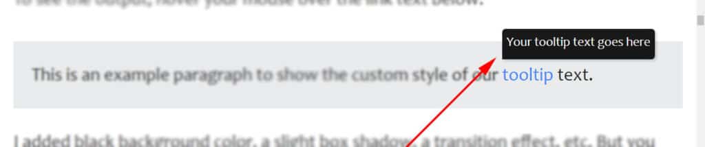
<p>This is an example paragraph to show the custom style of our <a href="/" data-title="Your tooltip text goes here">tooltip</a> text.</p>In the above code, you see that I have a custom data attribute named “data-title” and it contains the additional help text.
To style this tooltip, I wrote the following CSS:
CSS
[data-title] {
  position: relative;
}
[data-title]:after {
  content: attr(data-title);
  color: #FFFFFF;
  background-color: rgba(0, 0, 0, 0.9);
  padding: 3px 5px 7px;
  white-space: nowrap;
  z-index: 99999;
  visibility: hidden;
  position: absolute;
  left: 0%;
  bottom: 120%;
  border-radius: 4px 4px 4px 0;
  font-size: 0.875rem;
  -webkit-box-shadow: rgba(0, 0, 0, 0.15) 1.95px 1.95px 2.6px;
          box-shadow: rgba(0, 0, 0, 0.15) 1.95px 1.95px 2.6px;
}
[data-title]:hover:after {
  opacity: 1;
  -webkit-transition: all 0.1s ease 0.3s;
  transition: all 0.1s ease 0.3s;
  visibility: visible;
}
Output
To see the output, hover your mouse over the link text below.
This is an example paragraph to show the custom style of our tooltip text.
I added black background color, a slight box shadow, a transition effect, etc. But you can change the style as you see fit.
Example 2
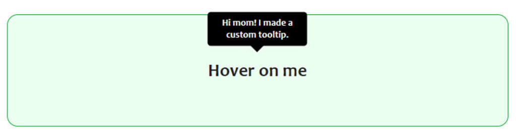
To create this custom tooltip, you’ll only need HTML & CSS. See my code for the above example.
HTML
<p id="custooltip" data-tooltip="Hi mom! I made a custom tooltip.">Hover on me</p>CSS
:root {
  --scale: 0;
  --arrow-size: 10px;
  --tooltip-color: #000000;
}
*, *::before, *::after {
  -webkit-box-sizing: border-box;
          box-sizing: border-box;
}
#custooltip {
  font-size: 1.7rem;
  position: relative;
  margin: 0;
  font-weight: 700;
  cursor: pointer;
}
#custooltip::before, #custooltip::after {
  position: absolute;
  top: -.25rem;
  left: 50%;
  -webkit-transform: translateX(-50%) translateY(var(--translate-y, 0)) scale(var(--scale));
          transform: translateX(-50%) translateY(var(--translate-y, 0)) scale(var(--scale));
  -webkit-transform-origin: bottom center;
          transform-origin: bottom center;
  -webkit-transition: 100ms -webkit-transform ease-in-out;
  transition: 100ms -webkit-transform ease-in-out;
  transition: 100ms transform ease-in-out;
  transition: 100ms transform ease-in-out, 100ms -webkit-transform ease-in-out;
}
#custooltip::before {
  --translate-y: calc(-100% - var(--arrow-size));
  content: attr(data-tooltip);
  color: white;
  padding: .5rem;
  border-radius: .3rem;
  text-align: center;
  font-size: .90rem;
  width: -webkit-max-content;
  width: -moz-max-content;
  width: max-content;
  max-width: 100%;
  background: var(--tooltip-color);
  line-height: 1.2;
}
#custooltip:hover::before, #custooltip:hover::after {
  --scale: 1;
}
#custooltip::after {
  --translate-y: calc(-1 * var(--arrow-size));
  content: '';
  border: var(--arrow-size) solid transparent;
  border-top-color: var(--tooltip-color);
  -webkit-transform-origin: top center;
          transform-origin: top center;
}
That’s all you need to create a custom tooltip just like the example (2).
How to display alt text on hover?
An alt text or alternative text is not implemented or designed to display on hover. Its purpose is different than displaying on hover. For example, showing the text when the image failed to load or helping search engines to better understand the image.

To display certain text on hover, you have to add an additional title attribute to the image that I showed you in the above example (in the bulb image). You can follow the following HTML markup:
<img src="flower.jpg" title="This is a flower" alt="This is a flower">This is how you can display the text on hover. Don’t feel shy to add the same text to the title & alt attributes.
And it brings me to the end of this post.
| Learn & practice CSS with real-world examples |
|---|
| Learn basic CSS from the ground up. |
| Build real projects in HTML CSS. |
Build HTML CSS projects
Conclusion
Now you know how to add a hover HTML text on an element, and how to style the tooltip/mouseover text using the custom data attribute. If you still have any questions about the tooltip text, let me know.

