In this post, you’ll see how to create a mobile responsive & equal-width 3-column layout in HTML & CSS. Also, you’ll learn how to do it in three different ways such as CSS flexbox, grid & float. End of this post, I will give my opinion about the best method that you should use.
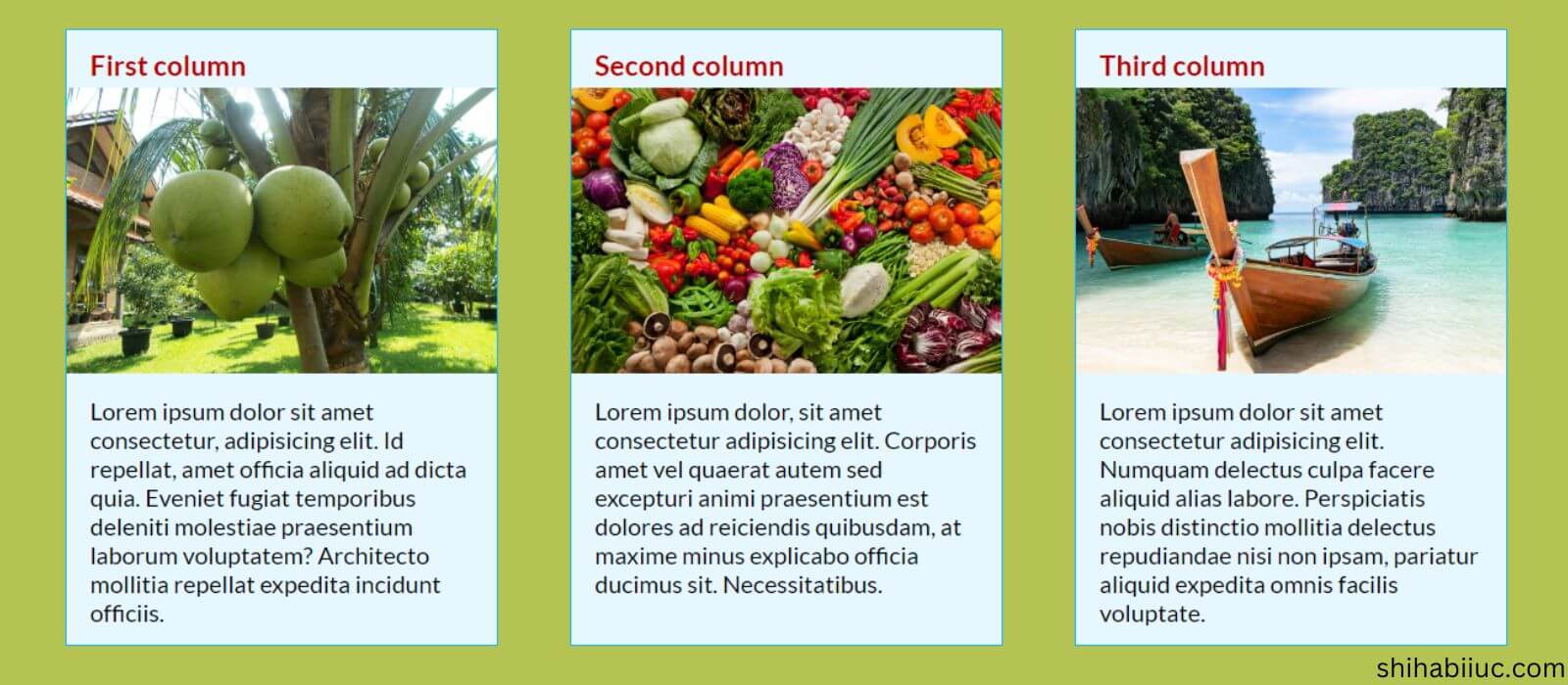
I will also give you the source code of the column layouts. End of the post, you’ll also find my GitHub repository URL to clone the entire template. See the live preview of what we are going to build in this post.
Some of you may think that why should learn three ways to create the layout. This is just because it’s better to learn multiple ways to achieve something so you can accomplish your task in different situations. It’s good to have multiple tools in your tool belt.
Create 3 columns using Flexbox
To create multiple columns layout using CSS Flexbox, we need to wrap each column in a <div>. To save everyone’s time, I will use the same HTML markup in all the methods (flexbox, grid & float). And I will change only the class name of the parent container.
Here is my HTML for the three columns.
HTML
<div class="three-col-using-flexbox">
  <div class="col">
    <h3>First column</h3>
    <img src="./img/coconut-tree.jpg" alt="coconut tree">
    <p>Lorem ipsum dolor sit amet consectetur...</p>
  </div>
  <div class="col">
    <h3>Second column</h3>
    <img src="./img/vegetables.jpg" alt="vegetables">
    <p>Lorem ipsum dolor, sit amet consectetur...</p>
  </div>
  <div class="col">
    <h3>Third column</h3>
    <img src="./img/beach.jpg" alt="sea beach">
    <p>Lorem ipsum dolor sit amet consectetur adipis...</p>
  </div>
</div> <!-- .three-col-using-flexbox -->
As you see in the above HTML, I have some placeholder content such as <h3>, <img> & <p>. But you can use the type of content you need. Now see the CSS below.
CSS
.three-col-using-flexbox {
  max-width: 1200px;
  margin: 0 auto;
}
@media (min-width: 768px) {
  .three-col-using-flexbox {
    display: -webkit-box;
    display: -ms-flexbox;
    display: flex;
    -webkit-box-pack: justify;
        -ms-flex-pack: justify;
            justify-content: space-between;
  }
}
.three-col-using-flexbox .col {
  margin: 30px 15px;
  background-color: #e6f7ff;
  border: 1px solid #17b5ff;
}
@media (min-width: 768px) {
  .three-col-using-flexbox .col {
    margin: 0;
    -ms-flex-preferred-size: 30%;
        flex-basis: 30%;
  }
}
.three-col-using-flexbox .col h3 {
  margin: 15px 0 5px 20px;
  color: #BA0000;
}
.three-col-using-flexbox .col img {
  width: 100%;
}
.three-col-using-flexbox .col p {
  margin: 15px 20px;
}
To make the layout responsive, I used media query. And to make a 3-column layout, I set the parent/container <div> to display: flex. The child elements or columns have a 30% width using the flex-basis. To evenly distribute the remaining 10% of space among the three columns, I used justify-content: space-between.
This is how you can make a 3-column layout using CSS Flexbox.
Using CSS grid
As mentioned in the last section, I used the same HTML for all the methods. I only changed the class name of the main container <div>.
HTML
<div class="three-col-using-grid">
  <div class="col">
    <h3>First column</h3>
    <img src="./img/coconut-tree.jpg" alt="coconut tree">
    <p>Lorem ipsum dolor sit amet consectetur, adipisicing...</p>
  </div>
  <div class="col">
    <h3>Second column</h3>
    <img src="./img/vegetables.jpg" alt="vegetables">
    <p>Lorem ipsum dolor, sit amet consectetur adipisicing elit...</p>
  </div>
  <div class="col">
    <h3>Third column</h3>
    <img src="./img/beach.jpg" alt="sea beach">
    <p>Lorem ipsum dolor sit amet consectetur adipisicing elit...</p>
  </div>
</div>
Here is my CSS for making a 3-column layout using Grid.
CSS
.three-col-using-grid {
  max-width: 1200px;
  margin: 0 auto;
}
@media (min-width: 768px) {
  .three-col-using-grid {
    display: -ms-grid;
    display: grid;
    -ms-grid-columns: 1fr 1fr 1fr;
        grid-template-columns: 1fr 1fr 1fr;
    -webkit-column-gap: 60px;
            column-gap: 60px;
  }
}
.three-col-using-grid .col {
  margin: 30px 15px;
  background-color: #e6f7ff;
  border: 1px solid #17b5ff;
}
@media (min-width: 768px) {
  .three-col-using-grid .col {
    margin: 0;
  }
}
.three-col-using-grid .col h3 {
  margin: 15px 0 5px 20px;
  color: #BA0000;
}
.three-col-using-grid .col img {
  width: 100%;
}
.three-col-using-grid .col p {
  margin: 15px 20px;
}
After specifying display: grid to the parent container, I also used grid-template-columns: 1fr 1fr 1fr to make a three-column layout.
However, you can also achieve a similar layout without specifying the grid-template-columns: 1fr 1fr 1fr.
For example, if you don’t want to use CSS media query, you can still create a mobile responsive multiple columns layout using Grid. To show you an example, instead of the above CSS, you can use the following:
.three-col-using-grid {
  max-width: 1200px;
  margin: 0 auto;
  display: grid;
  grid-template-columns: repeat(auto-fit, minmax(250px, 1fr));
  gap: 20px 60px;
}
This will create a three-column layout on a large screen and on mobile it will have one column per row. The most interesting thing is that you don’t have to use media queries to make the layout responsive. However, in some screen sizes (e.g: tablet), the layout may contain 2 columns in a row. The minmax(250px, 1fr) means that the columns will break to the new line once it hits 250px.
Using CSS float

It’s one of the oldest ways to align elements. But it’s still in use in many places on the web. That’s why you need to know about CSS floats. So you can apply this technic when necessary.
HTML
<div class="three-col-using-float">
  <div class="col">
    <h3>First column</h3>
    <img src="./img/coconut-tree.jpg" alt="coconut tree">
    <p>Lorem ipsum dolor sit amet consectetur......voluptate</p>
  </div>
  <div class="col">
    <h3>Second column</h3>
    <img src="./img/vegetables.jpg" alt="vegetables">
    <p>Lorem ipsum dolor, sit amet consectetur adipisicing eli...necessitatibus.</p>
  </div>
  <div class="col last-col">
    <h3>Third column</h3>
    <img src="./img/beach.jpg" alt="sea beach">
    <p>Lorem ipsum dolor sit amet consectetur adipisicing ...voluptate.</p>
  </div>
</div>
I used the following CSS to make a 3-column layout using float.
CSS
.three-col-using-float {
  max-width: 1200px;
  margin: 0 auto;
  overflow: hidden;
  /* clearfix for floated elements */
}
.three-col-using-float .col {
  margin: 30px 15px;
  background-color: #e6f7ff;
  border: 1px solid #17b5ff;
}
@media (min-width: 768px) {
  .three-col-using-float .col {
    margin: 0;
    float: left;
    width: 30%;
    margin-right: 5%;
    -webkit-box-sizing: border-box;
            box-sizing: border-box;
  }
  .three-col-using-float .col:last-child {
    margin-right: 0;
  }
}
.three-col-using-float .col h3 {
  margin: 15px 0 5px 20px;
  color: #BA0000;
}
.three-col-using-float .col img {
  width: 100%;
}
.three-col-using-float .col p {
  margin: 15px 20px;
}
I have a 30% width for each column. And I distributed the remaining 10% among the columns. So I used margin-right: 5% for the first two columns. And for the last column, I have margin-right: 0. Because I don’t want any gap after the last column.
For the parent container, I specified overflow: hidden to clearfix the floated elements. Otherwise, the elements will mess up with the other HTML documents. Not to mention, there are a few other ways to clearfix float.
When you use float to left or right, the floated elements are taken out of the normal flow and can cause their parent container to collapse or not expand to contain them (elements) properly.
To clear the float and ensure that the parent container wraps around the floated elements correctly, you can use any of the following CSS clearfix technics.
Popular clearfix technics in CSS
.parent-container::after {
  content: "";
  display: table;
  clear: both;
}
.parent-container {
display: flow-root;
}.parent-container {
overflow: auto;
}.parent-container {
overflow: hidden;
}You can use any one of the above examples. The .parent-container refers to the main container <div> that holds all the child elements.
Review all the code once again and download the template that you saw in the live preview
I already gave you all the code (HTML & CSS) to make a 3 column layout using three different methods. Also, I showed you the live preview of the template that we built in this post.
I also have some extra CSS that was not mentioned here and those are optional in this context. For example, which font I used, the heading color, image size, etc (the silly stuff).
But if you want to check all the HTML & CSS from start to finish, files & folder structure, etc, you can check them on my GitHub repository at this link.
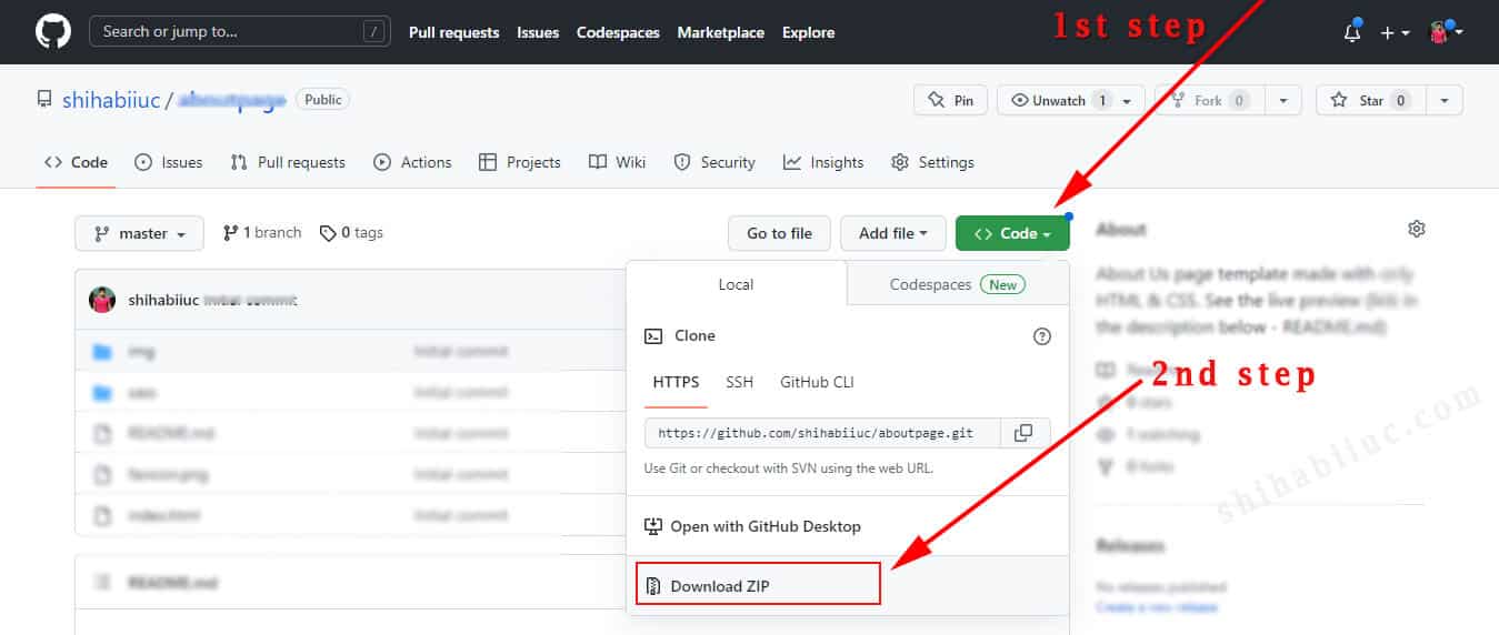
The above screenshot shows how you can download the entire template from my GitHub repository.
If this template helped you, please give it a “Star” 🌟 on GitHub.
Build HTML CSS projects
Conclusion
In my opinion, the CSS grid is the best way to create this type of layout. Because it’s two-dimensional (row & column), you don’t need media queries for mobile responsiveness (mostly), write less code & achieve more, and the list goes on.
Flexbox is also another great option for aligning elements even though it’s one-dimensional (either row or column).
Float is the oldest way to do it. However, many people still use it today. Even it has been used in many popular digital assets. For example, the WooCommerce plugin still uses this CSS float property. It’s really difficult to remove all the backdated CSS entirely and from the history.
So if you’re a developer or web designer, you should learn all these three ways to align elements and to make yourself compatible/comfortable with others.
Now you know how to easily create a 3-column layout in HTML & CSS. You also learned how to do it in three different ways.
I gave you all the source code, template, live preview & the GitHub repository. Also, you learned a few additional things such as how to clear floats.
Therefore if you still have any questions about the layout or if you still struggle with aligning elements, please let me know.

