
To create a coming soon template or page, the most important part is the countdown timer. You can come up with any styles but your audience may want to see the remaining time to go live.
In this post, I will show you how to create a static coming soon page only using HTML & CSS. I used a few lines of JavaScript only for the countdown timer.
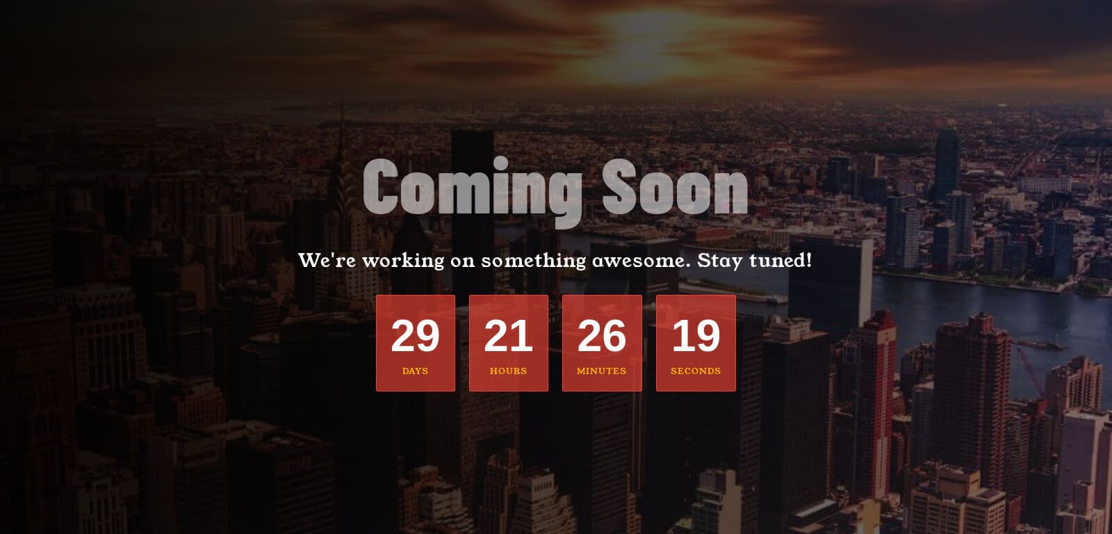
You can download the template & use it on your projects for free. Before you start, see the live preview of the coming soon page that you are going to build.
If you’re using WordPress, you can create a coming soon page within a few minutes (using Elementor). For more information and to download Elementor templates, please see this post. Also, there are many plugins for it such as SeedProd. Anyway, let’s get started on the topic for this post.
Coming soon template
You saw the live preview of the template. Now I will give you all the HTML, CSS & JavaScript for it. Therefore if you need to download the entire project including the background image & favicon, I have linked to my GitHub Repository at the bottom of this post.
To learn more about the background image and its sizes, see this post.
This template on desktop, looks like the following screenshot.
HTML
In this HTML, I used two Google fonts. You can edit those if you have a different choice.
I have a link to the favicon in the <head> section. So you need a favicon.png file at the root of your project. Also, I have a link to the JavaScript before the closing </body> tag. So you need a script.js file in the root.
Let’s see how it is done.
<!DOCTYPE html>
<html lang="en">
<head>
  <meta charset="UTF-8">
  <meta name="viewport" content="width=device-width, initial-scale=1.0">
  <link rel="shortcut icon" href="favicon.png" type="image/x-icon">
  <!-- google fonts -->
  <link rel="preconnect" href="https://fonts.googleapis.com">
  <link rel="preconnect" href="https://fonts.gstatic.com" crossorigin>
  <link href="https://fonts.googleapis.com/css2?family=Barlow+Condensed:wght@900&family=Young+Serif&display=swap" rel="stylesheet">
  <!-- google fonts end -->
  <link rel="stylesheet" href="style.css">
  <title>Coming Soon Template</title>
</head>
<body>
  <section class="container">
    <h1>Coming soon</h1>
    <p>We're working on something awesome. Stay tuned!</p>
    <div id="countdown">
        <div class="countdown-item">
            <span id="days">00</span>
            <p>Days</p>
        </div>
        <div class="countdown-item">
            <span id="hours">00</span>
            <p>Hours</p>
        </div>
        <div class="countdown-item">
            <span id="minutes">00</span>
            <p>Minutes</p>
        </div>
        <div class="countdown-item">
            <span id="seconds">00</span>
            <p>Seconds</p>
        </div>
      </div><!-- .countdown -->
    </section><!-- .container -->
  <script src="script.js"></script>
</body>
</html>
CSS
This CSS may seem like a lot but it’s actually not. I have vendor prefixes & media queries. So you don’t have to worry about different browser compatibilities and mobile responsiveness.
On mobile, the template will look like the screenshot below.
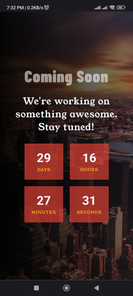
You have to make sure that it works well on mobile phones, tablets, and desktops. I wrote everything that you need for it. If you need to change the font, color, background gradient, etc., you can do it here.
*, *::before, *::after {
  -webkit-box-sizing: border-box;
          box-sizing: border-box;
}

body {
  font-family: "Young Serif", serif;
  font-size: 16px;
  margin: 0;
  padding: 0;
  display: -webkit-box;
  display: -ms-flexbox;
  display: flex;
  -webkit-box-pack: center;
      -ms-flex-pack: center;
          justify-content: center;
  -webkit-box-align: center;
      -ms-flex-align: center;
          align-items: center;
  width: 100vw;
  height: 100vh;
  background-color: #222222;
  background: -webkit-gradient(linear, left top, right top, from(rgba(0, 0, 0, 0.95)), to(rgba(0, 0, 0, 0.47))), url("./img/cityscape.jpg") no-repeat center;
  background: linear-gradient(to right, rgba(0, 0, 0, 0.95), rgba(0, 0, 0, 0.47)), url("./img/cityscape.jpg") no-repeat center;
  background-size: cover;
}

section.container {
  text-align: center;
  padding: 15px;
}
section.container h1 {
  font-family: "Barlow Condensed", sans-serif;
  font-weight: 900;
  letter-spacing: 1.5px;
  color: rgba(255, 255, 255, 0.55);
  text-transform: capitalize;
  margin: 0;
  font-size: 3em;
}
@media (min-width: 768px) {
  section.container h1 {
    font-size: 7em;
  }
}
section.container p {
  font-size: 1.7em;
  letter-spacing: 1.1px;
  color: #FFFFFF;
  margin-bottom: 20px;
}
section.container #countdown {
  display: -webkit-box;
  display: -ms-flexbox;
  display: flex;
  -webkit-box-pack: center;
      -ms-flex-pack: center;
          justify-content: center;
  -webkit-box-align: center;
      -ms-flex-align: center;
          align-items: center;
  -ms-flex-wrap: wrap;
      flex-wrap: wrap;
}
section.container #countdown .countdown-item {
  margin: 10px;
  padding: 20px;
  font-size: 1.5rem;
  background-color: rgba(234, 67, 53, 0.65);
  border: 1px solid #EA4335;
  border-radius: 2px;
  min-width: 114px;
}
section.container #countdown .countdown-item span {
  font-family: Arial, sans-serif;
  font-weight: bold;
  color: #FFFFFF;
  font-size: 1.5em;
}
@media (min-width: 768px) {
  section.container #countdown .countdown-item span {
    font-size: 2.7em;
  }
}
section.container #countdown .countdown-item p {
  margin: 5px 0 0;
  font-size: 0.5em;
  color: #FBBC05;
  text-transform: uppercase;
}
In the CSS, I used a background image that lives inside the “img” folder. If your image path & name is different, make sure you updated it correctly on your project.
JavaScript
This JavaScript is only used for the countdown timer. However, it does not require any dependencies or libraries. It’s plain/vanilla JavaScript and can work alone.
I have different IDs for the days, hours, minutes & seconds. Let’s see it first and then I will explain how you can change the time.
// Set the launch date for your website (YYYY, MM-1, DD, HH, MM, SS)
const launchDate = new Date(2024, 5, 19, 12, 0, 0);

function updateCountdown() {
    const currentDate = new Date();
    const timeDifference = launchDate - currentDate;

    const days = Math.floor(timeDifference / (1000 * 60 * 60 * 24));
    const hours = Math.floor((timeDifference % (1000 * 60 * 60 * 24)) / (1000 * 60 * 60));
    const minutes = Math.floor((timeDifference % (1000 * 60 * 60)) / (1000 * 60));
    const seconds = Math.floor((timeDifference % (1000 * 60)) / 1000);

    document.getElementById("days").textContent = days.toString().padStart(2, '0');
    document.getElementById("hours").textContent = hours.toString().padStart(2, '0');
    document.getElementById("minutes").textContent = minutes.toString().padStart(2, '0');
    document.getElementById("seconds").textContent = seconds.toString().padStart(2, '0');
}
setInterval(updateCountdown, 1000);
updateCountdown();
How to change the time?
To change the time, you just need to change the first line:
const launchDate = new Date(2023, 9, 30, 12, 0, 0)
As you see above the line of code, I am using the Date() constructor to create the launch date. The first part is the year (2023), and the second part is the month (9). And then date/day, hour, minute & seconds respectively.
However, the month-index is 0 (zero) based. For January, it would be 0, for February, it would be 1, for December, it would be 11. And so on and so forth.
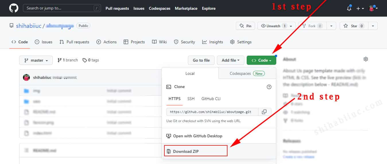
Download template
I gave you all the code above. But if your project does not work as mine, probably you missed something or made mistakes. Whatever the reason, if you need to download the entire project folder, you can do it below.
It will take you to my GitHub Repository from where you can download the template.
I used SCSS (SASS) to write all the CSS. If you’re familiar with it, you can use the style.scss file. If you’re not, you can use the plain style.css. The choice is yours!
If you want to know how to use SASS/SCSS in VSCode, see this post.
Build HTML CSS projects
Conclusion
In this post, I showed you how to create this coming soon template using HTML, CSS & JavaScript. I also explained how to change the time to go live (countdown timer).
If you have any questions, please let me know.
