In this post, I will give you some examples of gradient background colors and explain how you can make them yourself. You’ll learn how to use the background image and background color (semi-transparent) together where the color stays on top of the image.
Last but not least, you’ll also learn how to implement a semi-transparent gradient background on top of a background image.
You can check the live preview of the examples in the link below.
Let’s get started.
Gradient background color examples
In this section, I will give you some examples and their CSS. After that, I will explain how you can create your own gradient background color.
You can click the icon on the top-right corner of each code block to copy the CSS.
Example 1

.example-1 {
  background-image: linear-gradient(230deg, #7f53ac 35%, #647dee 90%);
}
Example 2

.example-2 {
  background-image: linear-gradient(300deg, #045de9 25%, #09c6f9 90%);
}
Example 3

.example-3 {
  background-image: linear-gradient(315deg, #90d5ec 0%, #fc575e 74%);
}
Example 4

.example-4 {
  background-image: linear-gradient(315deg, #42378f 0%, #f53844 74%);
}
Please note that it’s a good practice to specify a background-color along with the background-image. It works as a fallback. If the gradient does not work for some reason on an old browser, the background-color will take place. See the following CSS as an example:
.example-4 {
  background-color: #42378f;
  background-image: linear-gradient(315deg, #42378f 0%, #f53844 74%);
}
How you can make your own gradient background color
There are three types of gradients: linear, radial & conic. In this post, I only used the first one (linear gradient).
For implementing gradient, you need the background-image property. Out of the box, there are numerous technics you can apply to create gradients. However, I want to make this super simple for you.
Inside the first bracket, the first value is the angle (degree), and then the comma separated by colors. You can ignore the percentage for simplicity. And it will also work. See the modified CSS below.
.example-4 {
  background-image: linear-gradient(345deg, #42378f, #f53844);
}
This angle or degree also accepts a negative value.
However, if you want to make it simpler one step more, you can skip the angle or degree (as you see below).
.example-4 {
  background-image: linear-gradient(#42378f, #f53844);
}
This will also work.
But if you do not specify any degree/angle for the gradient, the default is 180 degrees.
You can also specify more than two colors like this:
.example-4 {
  background-image: linear-gradient(#42378f, #f53844, #FF9800, #229241);
}
You can also specify a degree or angle in the above gradient. In my option, in most cases, 315 degrees works very well.
.example-4 {
  background-image: linear-gradient(315deg, #42378f, #f53844, #FF9800, #229241);
}
Use whatever option is easy for you. All these are valid CSS.
Background image & color together (semi-transparent color on top of the image)
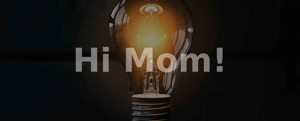
In this example, I have the background image first and then the background color on top of that image. Also, I used semi-transparent colors so you can see them both.
CSS
.container{
  background: linear-gradient(rgba(0, 0, 0, 0.45)), url("./img/bulb.jpg") no-repeat center;
  background-size: cover;
}
You need to specify at least two colors in order to make gradients. But in this example, I only used one color. Because as the title suggests, I only need a semi-transparent background color on top of the image.
The background is a shorthand that can hold five other CSS properties. Since I only need a semi-transparent color on top of the image, so I used 45% black color. But you can use any color and any opacity (less than 1).
Semi-transparent gradient colors on top of the image

If you like to implement semi-transparent background color over the image, you can do that by adding more colors by comma separating.
CSS
.container{
  background: linear-gradient(to right, rgba(0, 0, 0, 0.45), rgba(255, 0, 0, 0.6)), url("./img/bulb.jpg") no-repeat center;
  background-size: cover;
}
This is how you can make a semi-transparent gradient on top of the background image.
And it brings me to the end of this post.
Learn more about CSS backgrounds
- Gradient background color
- Animated background examples
- Background image size (full-width, responsive, full-screen, etc)
- Video background
- How to add background color & background image to an HTML table?
- How to create a background slider
Conclusion
In this post, I tried to explain the gradient background color in-depth and gave you many examples. I showed you how you can create your own gradient background. Also, you learned the easiest way to remember & implement gradients ignoring the weird parts.
If you want to download all the code for the live preview template, head over to my GitHub repository.

