I will show you some exceptional animated backgrounds. I only used CSS to create those animations. There is no JavaScript involved. You’ll see all the demos and get the code (HTML & CSS). I used CSS keyframes & animation property to create the background animations. Some of the examples contain images that I created or I own them. If you like, you can use them on your projects.
Example 1
Example 1: The cow eats grass 🌲
This is a very simple but eye-catching background example. Aside from the fallback white background, I used three different colors to make the gradient.
You’ll also see some shining effects and other animation effects in this example. See its HTML & CSS below.
<div class="example-1">
  <p>Example 1: The cow eats grass 🌲</p>
</div>
.example-1 {
width: 100%;
min-height: 400px;
background-color: #fff;
background-image: linear-gradient(-45deg, #f0f, #00f, #0f0);
background-size: 400% 400%;
-webkit-animation: gradient-example-1 5s ease infinite;
animation: gradient-example-1 5s ease infinite;
}
@-webkit-keyframes gradient-example-1 {
0% {
background-position: 0% 50%;
}
50% {
background-position: 100% 50%;
}
100% {
background-position: 0% 50%;
}
}
@keyframes gradient-example-1 {
0% {
background-position: 0% 50%;
}
50% {
background-position: 100% 50%;
}
100% {
background-position: 0% 50%;
}
}Example 2
Example 2: It has four legs 🐂
This background example has a radial gradient along with a pulse and glow effect. The animation property has a 2-second duration (animation-duration) but you can change it according to your choice.
<div class="example-2">
  <p>Example 2: It has four legs 🐂</p>
</div>
.example-2 {
width: 100%;
min-height: 400px;
background: radial-gradient(ellipse at center, #ff2f2f, #6c0000);
-webkit-animation: pulse-example-2 2s linear infinite;
animation: pulse-example-2 2s linear infinite;
}
@-webkit-keyframes pulse-example-2 {
0% {
-webkit-transform: scale(0.9);
transform: scale(0.9);
opacity: 0.7;
}
50% {
-webkit-transform: scale(1);
transform: scale(1);
opacity: 1;
}
100% {
-webkit-transform: scale(0.9);
transform: scale(0.9);
opacity: 0.7;
}
}
@keyframes pulse-example-2 {
0% {
-webkit-transform: scale(0.9);
transform: scale(0.9);
opacity: 0.7;
}
50% {
-webkit-transform: scale(1);
transform: scale(1);
opacity: 1;
}
100% {
-webkit-transform: scale(0.9);
transform: scale(0.9);
opacity: 0.7;
}
}Example 3
Example 3: I had never seen an alien 👽
In this example, the background gradient colors change from one direction to another.
<div class="example-3">
  <p>Example 3: I had never seen an alien 👽</p>
</div>
.example-3 {
width: 100%;
min-height: 400px;
background: linear-gradient(-45deg, #D4145A, #FBB03B, #FF5E3A);
background-size: 400% 400%;
-webkit-animation: gradient-example-3 8s ease infinite;
animation: gradient-example-3 8s ease infinite;
}
@-webkit-keyframes gradient-example-3 {
0% {
background-position: 0% 50%;
}
50% {
background-position: 100% 50%;
}
100% {
background-position: 0% 50%;
}
}
@keyframes gradient-example-3 {
0% {
background-position: 0% 50%;
}
50% {
background-position: 100% 50%;
}
100% {
background-position: 0% 50%;
}
}Example 4
Example 4: Hi mom! I took money from your vanity bag 😿
It’s an extended version of the last example. Aside from the background animation, the text also has effects that really look good on human eyes. It can quickly grab visitors’ attention.
<div class="example-4">
  <p>Example 4: Hi mom! I took money from your vanity bag 😿</p>
</div>
.example-4 {
width: 100%;
min-height: 400px;
background: linear-gradient(-45deg, #FF5F6D, #FFC371, #FF5F6D, #FFC371);
background-size: 400% 400%;
-webkit-animation: gradient-example-4 10s ease infinite;
animation: gradient-example-4 10s ease infinite;
}
.example-4 p {
color: #fff;
text-shadow: 2px 2px 4px #000000;
-webkit-animation: glow-example-4 2s ease-in-out infinite alternate;
animation: glow-example-4 2s ease-in-out infinite alternate;
}
@-webkit-keyframes gradient-example-4 {
0% {
background-position: 0% 50%;
}
50% {
background-position: 100% 50%;
}
100% {
background-position: 0% 50%;
}
}
@keyframes gradient-example-4 {
0% {
background-position: 0% 50%;
}
50% {
background-position: 100% 50%;
}
100% {
background-position: 0% 50%;
}
}
@-webkit-keyframes glow-example-4 {
0% {
text-shadow: 2px 2px 4px #000000;
}
100% {
text-shadow: 0 0 20px #ff0000, 0 0 30px #ff0000, 0 0 40px #ff0000, 0 0 50px #ff0000;
}
}
@keyframes glow-example-4 {
0% {
text-shadow: 2px 2px 4px #000000;
}
100% {
text-shadow: 0 0 20px #ff0000, 0 0 30px #ff0000, 0 0 40px #ff0000, 0 0 50px #ff0000;
}
}Example 5
Example 5: That’s not quite right 😈
It’s nearly similar to the last example. However, it’s a bit different based on color combination, glowing effect, animation direction, etc.
<div class="example-5">
  <p>Example 5: That's not quite right 😈</p>
</div>
.example-5 {
width: 100%;
min-height: 400px;
background: -webkit-gradient(linear, left top, right top, from(#64B5F6), color-stop(#E57373), color-stop(#FBC02D), to(#4DB6AC));
background: linear-gradient(to right, #64B5F6, #E57373, #FBC02D, #4DB6AC);
background-size: 400% 400%;
-webkit-animation: gradient-example-5 10s ease infinite;
animation: gradient-example-5 10s ease infinite;
}
.example-5 p {
color: #fff;
text-shadow: 2px 2px 4px #000000;
-webkit-animation: dropshadow-example-5 5s ease infinite alternate;
animation: dropshadow-example-5 5s ease infinite alternate;
}
@-webkit-keyframes gradient-example-5 {
0% {
background-position: 0% 50%;
}
50% {
background-position: 100% 50%;
}
100% {
background-position: 0% 50%;
}
}
@keyframes gradient-example-5 {
0% {
background-position: 0% 50%;
}
50% {
background-position: 100% 50%;
}
100% {
background-position: 0% 50%;
}
}
@-webkit-keyframes dropshadow-example-5 {
0% {
text-shadow: 2px 2px 4px #000000;
}
50% {
text-shadow: 6px 6px 10px #000000;
}
100% {
text-shadow: 2px 2px 4px #000000;
}
}
@keyframes dropshadow-example-5 {
0% {
text-shadow: 2px 2px 4px #000000;
}
50% {
text-shadow: 6px 6px 10px #000000;
}
100% {
text-shadow: 2px 2px 4px #000000;
}
}Example 6
Example 6: Five little monkeys are jumping on the bed 🙉
This is very similar to the 2nd example. However, it’s still different based on colors, animation duration & direction & scale.
<div class="example-6">
  <p>Example 6: Five little monkeys are jumping on the bed 🙉</p>
</div>
.example-6 {
max-width: 80%;
min-height: 400px;
background: radial-gradient(circle, #A9A9A9, #000000);
-webkit-animation: pulsate-example-6 4s ease-in-out infinite;
animation: pulsate-example-6 4s ease-in-out infinite;
margin: 90px auto;
}
.example-6 p {
color: #fff;
text-shadow: 2px 2px 4px #000000;
}
@-webkit-keyframes pulsate-example-6 {
0% {
-webkit-transform: scale(1);
transform: scale(1);
opacity: 0.5;
}
50% {
-webkit-transform: scale(1.2);
transform: scale(1.2);
opacity: 0.7;
}
100% {
-webkit-transform: scale(1);
transform: scale(1);
opacity: 0.5;
}
}
@keyframes pulsate-example-6 {
0% {
-webkit-transform: scale(1);
transform: scale(1);
opacity: 0.5;
}
50% {
-webkit-transform: scale(1.2);
transform: scale(1.2);
opacity: 0.7;
}
100% {
-webkit-transform: scale(1);
transform: scale(1);
opacity: 0.5;
}
}Example 7
Example 7: Hi dad! I won’t go to school today 🐢
This is the first example that has a background image. Most of the next examples will also have images.
Anyways, if you take a closer look, you’ll see that this background image has color filtering effects. It looks very nice.
Not to mention, I used a different image for mobile (only for this example) but you can use only one image for all screens.
<div class="example-7">
  <p>Example 7: Hi dad! I won't go to school today 🐢</p>
</div>
.example-7 {
min-height: 400px;
background-color: #000;
background-image: url("./img/bg-hero-mobile.jpg");
background-repeat: no-repeat;
background-position: center;
background-size: cover;
-webkit-animation: background-anim-example-7 10s linear infinite;
animation: background-anim-example-7 10s linear infinite;
}
@media (min-width: 768px) {
.example-7 {
background-image: url("./img/bg-hero.png");
}
}
.example-7 p {
color: #fff;
text-shadow: 2px 2px 4px #000;
}
@-webkit-keyframes background-anim-example-7 {
0% {
background-size: 120% auto;
-webkit-filter: hue-rotate(0deg);
filter: hue-rotate(0deg);
}
50% {
background-size: 100% auto;
-webkit-filter: hue-rotate(90deg);
filter: hue-rotate(90deg);
}
100% {
background-size: 120% auto;
-webkit-filter: hue-rotate(0deg);
filter: hue-rotate(0deg);
}
}
@keyframes background-anim-example-7 {
0% {
background-size: 120% auto;
-webkit-filter: hue-rotate(0deg);
filter: hue-rotate(0deg);
}
50% {
background-size: 100% auto;
-webkit-filter: hue-rotate(90deg);
filter: hue-rotate(90deg);
}
100% {
background-size: 120% auto;
-webkit-filter: hue-rotate(0deg);
filter: hue-rotate(0deg);
}
}Example 8
Example 8: Hi sis! I need your old books 📗
It has a blur effect and at the same time, the background image is moving up & down (infinite loop).
<div class="example-8">
  <p>Example 8: Hi sis! I need your old books 📗</p>
</div>
.example-8 {
min-height: 400px;
background-image: url(./img/isometric-mockup-four.jpg);
background-position: center;
background-repeat: no-repeat;
background-size: cover;
-webkit-animation: background-anim-example-8 10s linear infinite;
animation: background-anim-example-8 10s linear infinite;
}
.example-8 p {
color: #fff;
text-shadow: 2px 2px 4px #000;
}
@-webkit-keyframes background-anim-example-8 {
0% {
background-position: center;
-webkit-filter: blur(0px);
filter: blur(0px);
}
50% {
background-position: left top;
-webkit-filter: blur(5px);
filter: blur(5px);
}
100% {
background-position: right bottom;
-webkit-filter: blur(0px);
filter: blur(0px);
}
}
@keyframes background-anim-example-8 {
0% {
background-position: center;
-webkit-filter: blur(0px);
filter: blur(0px);
}
50% {
background-position: left top;
-webkit-filter: blur(5px);
filter: blur(5px);
}
100% {
background-position: right bottom;
-webkit-filter: blur(0px);
filter: blur(0px);
}
}Example 9
Example 9: Every deep night I take a bath 🛀
It has a nice combination of colors. Also, the animation looks very similar to blinking or switching on/off different colors.
<div class="example-9">
  <p>Example 9: Every deep night I take a bath 🛀</p>
</div>
.example-9 {
width: 100%;
min-height: 400px;
background: linear-gradient(45deg, #ff8a00, #e52e71), linear-gradient(-45deg, #ffc900, #ff3838), linear-gradient(135deg, #8e2de2, #4a00e0), linear-gradient(-135deg, #08cde9, #006ba1);
background-size: 400% 400%;
-webkit-animation: background-anim-example-9 1s ease-in-out infinite;
animation: background-anim-example-9 1s ease-in-out infinite;
}
.example-9 p {
color: #fff;
text-shadow: 2px 2px 4px #000;
}
@-webkit-keyframes background-anim-example-9 {
0% {
background-position: 0% 50%;
}
50% {
background-position: 100% 50%;
}
100% {
background-position: 0% 50%;
}
}
@keyframes background-anim-example-9 {
0% {
background-position: 0% 50%;
}
50% {
background-position: 100% 50%;
}
100% {
background-position: 0% 50%;
}
}Example 10
Example 10: My heart broke when my little cat died 🐱
This is a moving image in the background. This type of example best suits isometric images or graphics.
<div class="example-10">
  <p>Example 10: My heart broke when my little cat died 🐱</p>
</div>
.example-10 {
width: 100%;
min-height: 400px;
background-image: url("./img/isometric-mockup.jpg");
background-size: cover;
-webkit-animation: background-anim-example-10 20s linear infinite;
animation: background-anim-example-10 20s linear infinite;
}
.example-10 p {
color: #fff;
text-shadow: 2px 2px 4px #000;
}
@-webkit-keyframes background-anim-example-10 {
0% {
background-position: 0% 0%;
}
50% {
background-position: 100% 100%;
}
100% {
background-position: 0% 0%;
}
}
@keyframes background-anim-example-10 {
0% {
background-position: 0% 0%;
}
50% {
background-position: 100% 100%;
}
100% {
background-position: 0% 0%;
}
}Example 11
Example 11: I never eat turtles 🐢
This example is similar to the last one. But it’s still different compared to the animation effect, direction, background-position, etc.
<div class="example-11">
  <p>Example 11: I never eat turtles 🐢</p>
</div>
.example-11 {
width: 100%;
min-height: 400px;
background-image: url("./img/isometric-mockup-two.jpg");
background-position: center;
background-repeat: no-repeat;
-webkit-animation: background-anim-example-11 20s ease-in-out infinite;
animation: background-anim-example-11 20s ease-in-out infinite;
}
.example-11 p {
color: #fff;
text-shadow: 2px 2px 4px #000;
}
@-webkit-keyframes background-anim-example-11 {
0% {
background-position: 0 0;
}
50% {
background-position: 100% 0;
}
100% {
background-position: 0 0;
}
}
@keyframes background-anim-example-11 {
0% {
background-position: 0 0;
}
50% {
background-position: 100% 0;
}
100% {
background-position: 0 0;
}
}Example 12
Example 12: I have eggplant in my rooftop garden 🍆
This is very uncommon. Aside from the background animation, there is another (extra) layer that moves from one direction to another (semi-transparent color, ongoing loop).
<div class="example-12">
  <div class="animated-rectangle"></div>
  <p>Example 12: I have eggplant in my rooftop garden 🍆</p>
</div>
.example-12 {
min-height: 400px;
position: relative;
overflow: hidden;
}
.example-12::before {
content: "";
background: url("./img/isometric-mockup-three.jpg") no-repeat center center fixed;
background-size: cover;
background-position: center;
height: 100%;
width: 100%;
position: absolute;
top: 0;
left: 0;
z-index: -1;
-webkit-animation: slide-example-12 5s linear infinite;
animation: slide-example-12 5s linear infinite;
}
.example-12 .animated-rectangle {
height: 100%;
width: 100%;
position: absolute;
top: 0;
left: 0;
background: -webkit-gradient(linear, left top, right top, from(rgba(0, 0, 0, 0.5)), color-stop(50%, rgba(0, 0, 0, 0.8)), to(rgba(0, 0, 0, 0.5)));
background: linear-gradient(to right, rgba(0, 0, 0, 0.5) 0%, rgba(0, 0, 0, 0.8) 50%, rgba(0, 0, 0, 0.5) 100%);
-webkit-animation: rectangle-anim-example-12 5s linear infinite;
animation: rectangle-anim-example-12 5s linear infinite;
}
.example-12 p {
color: #fff;
text-shadow: 2px 2px 4px #000;
z-index: 1;
}
@-webkit-keyframes rectangle-anim-example-12 {
0% {
-webkit-transform: translateX(-100%);
transform: translateX(-100%);
}
100% {
-webkit-transform: translateX(100%);
transform: translateX(100%);
}
}
@keyframes rectangle-anim-example-12 {
0% {
-webkit-transform: translateX(-100%);
transform: translateX(-100%);
}
100% {
-webkit-transform: translateX(100%);
transform: translateX(100%);
}
}
@-webkit-keyframes slide-example-12 {
0% {
-webkit-transform: scale(1.2);
transform: scale(1.2);
}
100% {
-webkit-transform: scale(1);
transform: scale(1);
}
}
@keyframes slide-example-12 {
0% {
-webkit-transform: scale(1.2);
transform: scale(1.2);
}
100% {
-webkit-transform: scale(1);
transform: scale(1);
}
}Example 13
Example 13: I lost many umbrellas in my life 🌂
It changes the background colors in an ease-in-out motion effect. This example has three different colors that change consistently.
<div class="example-13">
  <p>Example 13: I lost many umbrellas in my life 🌂</p>
</div>
.example-13 {
min-height: 400px;
background-color: #4285F4;
-webkit-animation: background-animation-example-13 5s ease-in-out infinite;
animation: background-animation-example-13 5s ease-in-out infinite;
}
.example-13 p {
color: white;
}
@-webkit-keyframes background-animation-example-13 {
0% {
background-color: #4285F4;
}
50% {
background-color: #EA4335;
}
100% {
background-color: #FBBC05;
}
}
@keyframes background-animation-example-13 {
0% {
background-color: #4285F4;
}
50% {
background-color: #EA4335;
}
100% {
background-color: #FBBC05;
}
}Example 14
Example 14: That’s all 🚀
It has multiple background images that change frequently. There is a semi-transparent overlay color on top of each background image.
<div class="example-14">
  <p>Example 14: That's all 🚀</p>
</div>
.example-14 {
min-height: 400px;
background-color: #4285F4;
-webkit-animation: background-animation-example-14 10s ease-in-out infinite;
animation: background-animation-example-14 10s ease-in-out infinite;
}
.example-14 p {
color: white;
text-shadow: 1px 1px 2px #000000;
}
@-webkit-keyframes background-animation-example-14 {
0% {
background: -webkit-gradient(linear, left bottom, left top, from(rgba(14, 5, 81, 0.7))), url(img/isometric-mockup.jpg) no-repeat;
background: linear-gradient(0deg, rgba(14, 5, 81, 0.7)), url(img/isometric-mockup.jpg) no-repeat;
}
30% {
background: -webkit-gradient(linear, left bottom, left top, from(rgba(87, 1, 1, 0.7))), url(img/isometric-mockup-two.jpg) no-repeat;
background: linear-gradient(0deg, rgba(87, 1, 1, 0.7)), url(img/isometric-mockup-two.jpg) no-repeat;
}
60% {
background: -webkit-gradient(linear, left bottom, left top, from(rgba(1, 54, 17, 0.5))), url(img/isometric-mockup-three.jpg) no-repeat;
background: linear-gradient(0deg, rgba(1, 54, 17, 0.5)), url(img/isometric-mockup-three.jpg) no-repeat;
}
100% {
background: -webkit-gradient(linear, left bottom, left top, from(rgba(87, 2, 82, 0.6))), url(img/isometric-mockup.jpg) no-repeat;
background: linear-gradient(0deg, rgba(87, 2, 82, 0.6)), url(img/isometric-mockup.jpg) no-repeat;
}
}
@keyframes background-animation-example-14 {
0% {
background: -webkit-gradient(linear, left bottom, left top, from(rgba(14, 5, 81, 0.7))), url(img/isometric-mockup.jpg) no-repeat;
background: linear-gradient(0deg, rgba(14, 5, 81, 0.7)), url(img/isometric-mockup.jpg) no-repeat;
}
30% {
background: -webkit-gradient(linear, left bottom, left top, from(rgba(87, 1, 1, 0.7))), url(img/isometric-mockup-two.jpg) no-repeat;
background: linear-gradient(0deg, rgba(87, 1, 1, 0.7)), url(img/isometric-mockup-two.jpg) no-repeat;
}
60% {
background: -webkit-gradient(linear, left bottom, left top, from(rgba(1, 54, 17, 0.5))), url(img/isometric-mockup-three.jpg) no-repeat;
background: linear-gradient(0deg, rgba(1, 54, 17, 0.5)), url(img/isometric-mockup-three.jpg) no-repeat;
}
100% {
background: -webkit-gradient(linear, left bottom, left top, from(rgba(87, 2, 82, 0.6))), url(img/isometric-mockup.jpg) no-repeat;
background: linear-gradient(0deg, rgba(87, 2, 82, 0.6)), url(img/isometric-mockup.jpg) no-repeat;
}
}And it brings me to the end of this post.
Learn more about CSS backgrounds
- Gradient background color
- Animated background examples
- Background image size (full-width, responsive, full-screen, etc)
- Video background
- How to add background color & background image to an HTML table?
- How to create a background slider
I created each of these animated background examples from scratch. Even the graphics are either created by me or owned by me.
I tried my best to give you extraordinary backgrounds. Each of these examples contains a text but it’s not mandatory to have it. You can also check all the demos on my GitHub page.
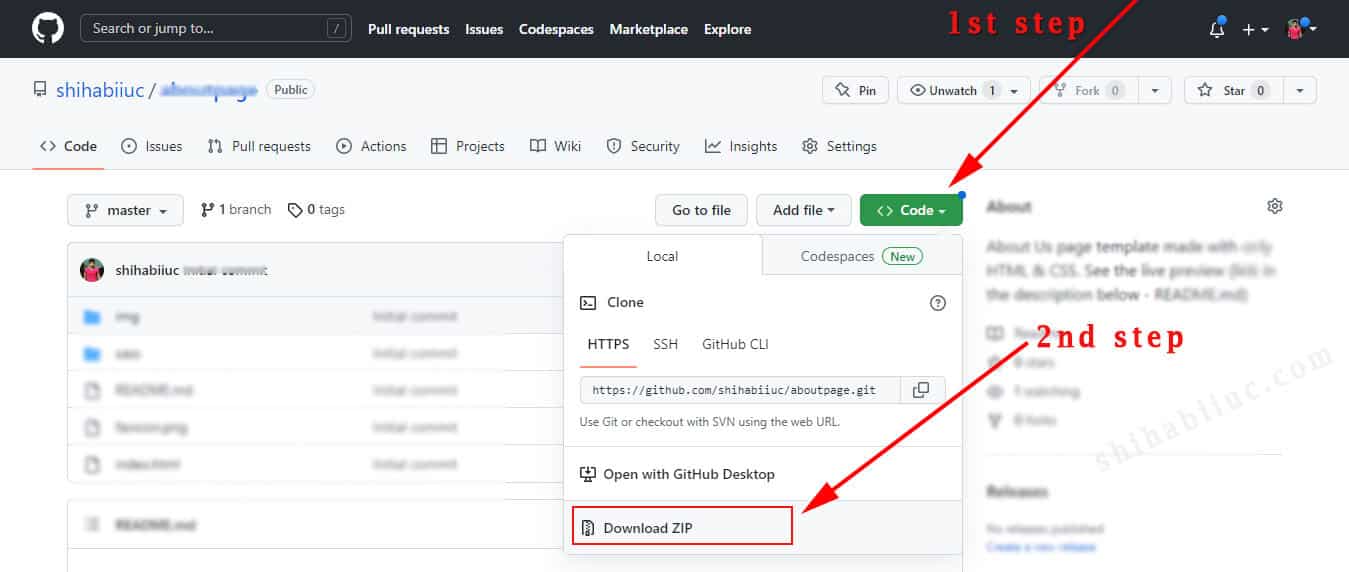
You already have all the codes. But if you still need further explanation, you can download the entire project from my GitHub repository.
Alternatively, you can clone it directly from your command line: git clone https://github.com/shihabiiuc/css-animated-background.git
You can download all the background images from here. Is there anything are you missing? Or do you have any questions? Let me know.

