In this post, I will show you a couple of examples based on the background-size property. After reading it, you’ll learn how to make a full-width background image, how to make it responsive for all devices, full-screen background on any screen, custom size, etc.
Before you start, you can also check the live demo of the finished examples that you’re going to build.
You’ll get all the code samples and all the source code that powers the live preview template.
Let’s get started.
Examples of background image size
Throughout the examples, I am only using plain text/paragraphs but you can use other types of content.
I have some additional markup for the live preview template. But those additional markups are optional in this context.
Also, I have some additional CSS such as padding, color, margin, etc. I skipped these as well. Because these optional HTML & CSS are not necessary.
But if you want to achieve the exact same design as the live preview template, I will include my GitHub repository at the very bottom of this post. So you can grab all the code (including optional) if necessary.
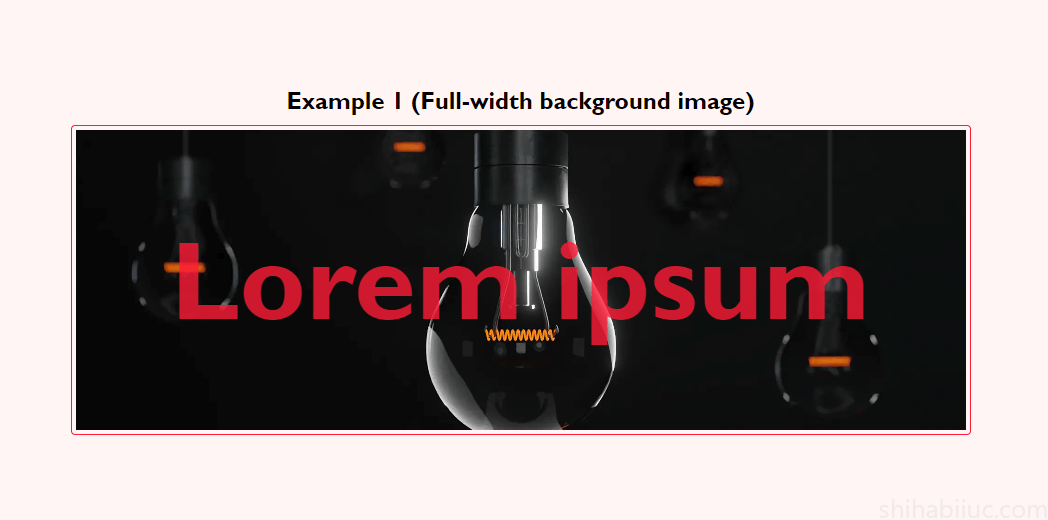
Example 1: Full-width background image (The most commonly used)
HTML
<div class="container--content">
  <p>Lorem ipsum</p>
</div>
For this <div>, I have a min-height of 300px so you can see the background image clearly. But if you have sufficient content inside, then you don’t have to specify any height or min-height. I specified this height for other examples as well.
CSS
.container--content {
    background-image: url('./img/bulb.jpg');
    background-size: cover; /* mandatory if you want full-width background */
    background-repeat: no-repeat;
    background-position: center;
}
From the above CSS (background-image), you see that I have an “img” folder in the root directory. So I specified a relative path. But this image path could be different in your case. Also, this could be an absolute path in your case. Whatever is it, make sure you specified the image link/path properly.
Here most important is the background-size property which is cover. This will make your image full-width & height.
The background-repeat: no-repeat will prevent the image from repeating and display only once.
And the background-position: center will align the background image both in horizontal & vertical directions. It’s equivalent to background-position: center center. But you can change or adjust the values based on your need. Such as top right, bottom left, etc.
Output
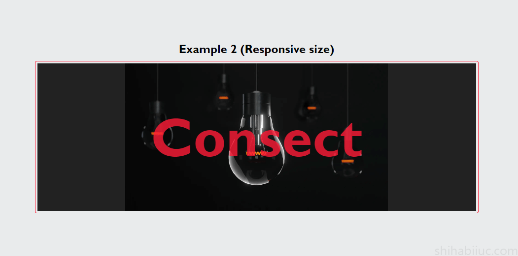
Example 2: Responsive background image
HTML
<div class="container--content">
  <p>Consect</p>
</div>
CSS
.container--content {
    background-image: url('./img/bulb.jpg');
    background-size: contain; /* makes the bg image responsive */
    background-repeat: no-repeat;
    background-position: center;
    background-color: #222222;
}
Here background-size: contain makes the image responsive. But use it whenever it makes sense.
Sometimes your content may exceed the background image as you see in the live preview & the above screenshot.
You can also use a background color with the background image as you see in the above CSS. Think of this background-color as the fallback.
Output
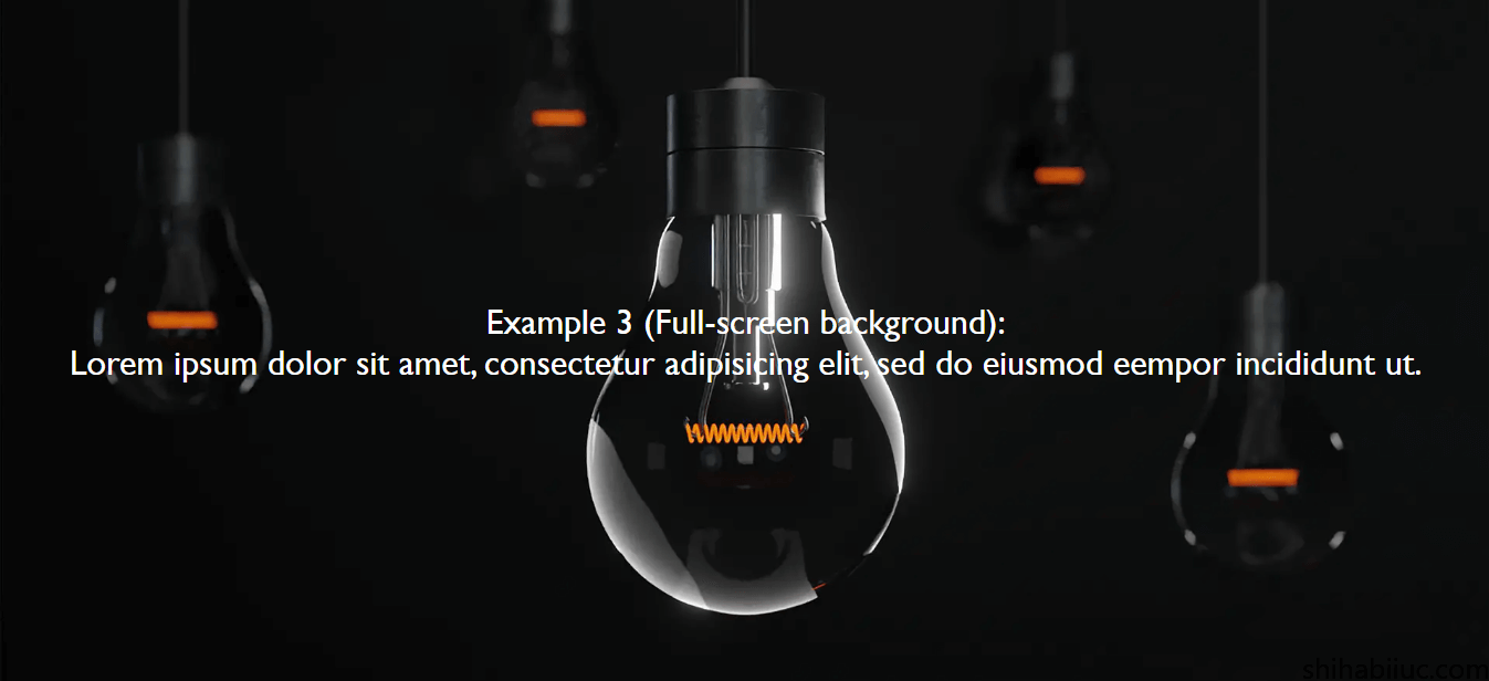
Example 3: Full-screen background image
HTML
<section class="example-3">
  <p>Lorem ipsum dolor sit amet, consectetur adipisicing elit, sed do eiusmod eempor incididunt ut.</p>
</section>
CSS
.example-3 {
  width: 100vw; /* required */
  height: 100vh; /* required */
  max-width: 100%; /* required to make it responsive */
  background-image: url('./img/bulb.jpg');
  background-size: cover;
  background-repeat: no-repeat;
  background-position: center;
}
In order to create a full-screen background, you need a full-screen width & height of the container. And this is exactly what I did with the first two lines of CSS: width: 100vw & height: 100vh. Here “vw” refers to the “Viewport Width” and “vh” stands for “Viewport Height.”
These two lines of CSS will always make the <div> or container full-width & full height no matter the screen size.
But there is a caveat. Only using 100vw will make the content slightly wider than the actual size because of other elements such as the scrollbar. And you’ll see a horizontal scrollbar at the very bottom.
To get around this problem, you also have to specify the max-width: 100%.
And then you can add a background image to the container div. In this context, the background-size: cover is the best approach.
Output
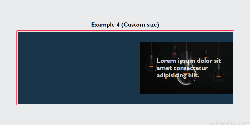
Example 4: Custom size
HTML
<div class="container--content">
  <p>Lorem ipsum dolor sit amet consectetur adipisicing elit.</p>
</div>
CSS
.container--content {
  background-image: url('./img/bulb.jpg');
  background-size: 384px 216px; /* make it proportional based on the actual size */
  background-position: center right;
  background-color: #193549; /* optional - works as a fallback */
}
When you use a custom size, make sure it’s proportionally correct. Otherwise, the background image may be stretched and look bad.
Output
Bonus example: Fixed background (parallax)
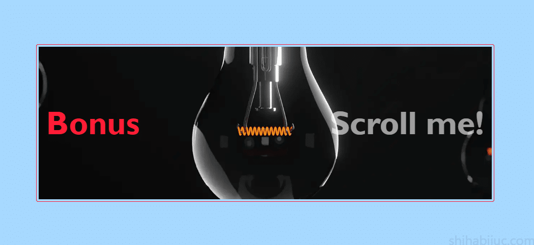
You won’t be able to see the scrolling effect in the above screenshot. So you can check the live demo of it.
HTML
<div class="container--content">
  <p>Scroll me!</p>
</div>
CSS
.container--content {
  background-image: url('./img/bulb.jpg');
  background-size: cover;
  background-repeat: no-repeat;
  background-position: center;
  background-attachment: fixed; /* makes the bg image fixed/parallax */
}
You saw a new property background-attachment which is the main focus of this example. The default value is scroll. But when you change it to fixed, this will fix the background image in the same position. As a result, when you scroll the page, it looks like a parallax effect.
Output
Wrap up the background image sizes
background-size: auto; /* default */
background-size: 1920px 1080px; /* custom size */
background-size: 100% 60%; /* custom size */
background-size: cover; /* full-width & height */
background-size: contain; /* responsive */
When you use a custom size, make it proportionally correct based on the actual image. And it’s just not limited to the pixel values. You can also use the percentage as you see above.
The first value is horizontal & the second is vertical. So the background-size: 100% 60% means the image will cover 100% horizontally and 60% vertically. Again, you need to be proportional here. You can also use fractions with percentages such as 95.7% 59.3%.
If you use more than 100% such as background-image: 235% 187% it will stretch the background image based on these percentages. But it will not exceed the available width & height.
Learn more about CSS backgrounds
- Gradient background color
- Animated background examples
- Background image size (full-width, responsive, full-screen, etc)
- Video background
- How to add background color & background image to an HTML table?
- How to create a background slider
Conclusion
In this post, I gave you multiple examples & use cases. Hopefully, this will give you a clear concept of background-size CSS property.
You can also download the live preview template from my GitHub repository.

