In this post, I will show how you can center-align an image in various directions & using different methods (CSS). Any HTML element can be centered horizontally, vertically & both.
Also, a horizontally centered image can be aligned at the top & bottom. In the same vein, a vertically centered image can be aligned at the left & right.
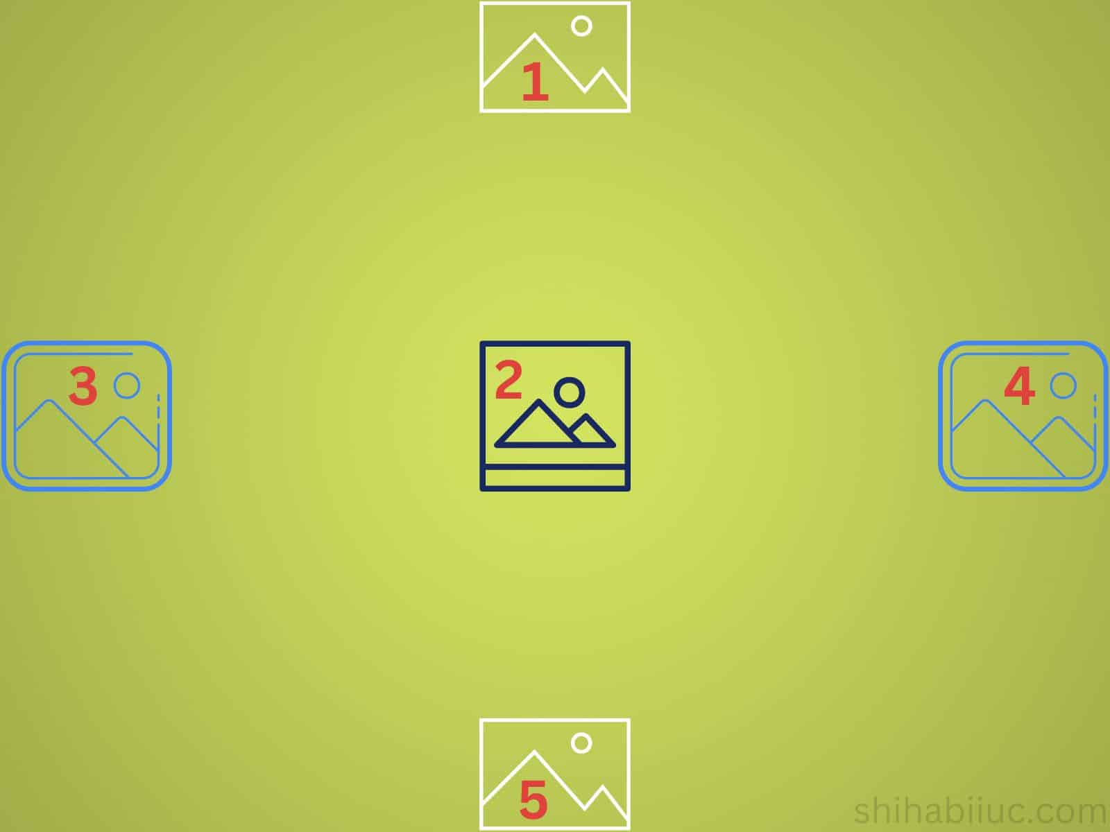
If this doesn’t make sense, see the infographic below.
Please take a look at all the live examples in the link below.
Center align an image in all the possible directions
If you take a closer look at the above infographic, you’ll see that all the images are center-aligned in various directions.
- Horizontally center at the top
- Horizontally & vertically center aligned
- Vertically center at the left
- Vertically center at the right
- Horizontally center at the bottom
I will show you all these 5 possible center alignments.
Let’s get started.
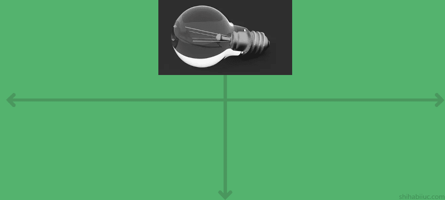
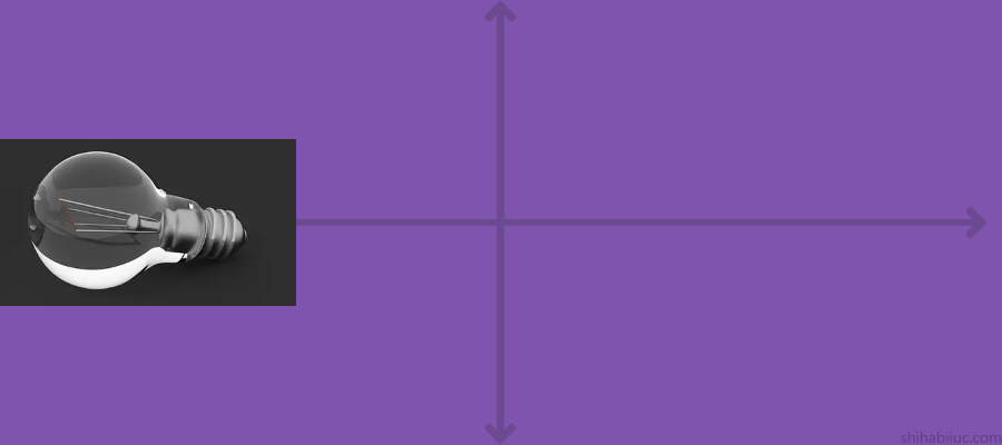
Case 1: Horizontally center & top align
I specified a 400px minimum height for the container <div>. Also, the image has a maximum height of 150px. So I get enough room for experiments. Here is the simple CSS for it: .container {min-height: 400px} and .container img {max-height: 150px}
It’s not mandatory (max & min height) to specify and I did it only for demonstration.
Therefore, if you have any confusion, you can check all the code (including optional) on my GitHub repository that I linked at the very bottom of this post.
HTML
<div class="container">
  <img src="bulb.png">
</div>
I have an image (<img>) inside a <div> that has a .container class. Throughout all these examples, I will use this same HTML markup.
Image path/link: I have an image named “bulb.png” in the root directory. But if you have the image in another location, you have to update the image path accordingly. For example, if you have the image inside an “img” folder, then the path will be ‘./img/bulb.png’ or ‘img/bulb.png’ (assuming your HTML file & the ‘img’ folder lives on the same level).
Alternatively, you can also use an absolute path. For example https://yoursite.com/bulb.png
CSS
.container {
  display: flex;
  justify-content: center;
  align-items: flex-start;
}
In these examples, I used CSS Flexbox but I will show you other methods later in this post.
Your HTML markup is important when it comes to applying Flexbox CSS. I already explained the markup. However, it’s a very simple strategy.
To use Flexbox, you have to wrap the element(s) inside a <div>, <section> or other types of containers or wrappers. Not to mention, you have to write most of the CSS (Flexbox) properties for the container <div> in order to affect/align elements inside the container/div. If you want to learn more about Flexbox, please check another article with examples.
Anyways, to align the image horizontally (at the top), I used two of the Flexbox properties. The justify-content: center makes the image (elements) horizontally centered. And the align-items: flex-start makes the image (elements) start from the top.
This is how you can make an image or other HTML elements center aligned horizontally that starts from the top.
Output
Case 2: Horizontally & vertically center
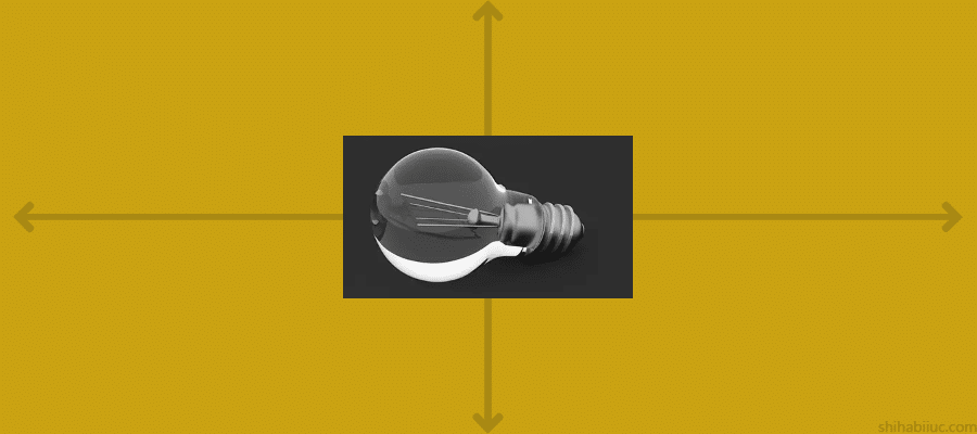
This is probably the most used alignment. And many of you may have come to this post for this example.
HTML
<div class="container">
  <img src="bulb.png">
</div>
As I mentioned earlier, I will use the same HTML markup for all these 5 examples.
CSS
.container {
  display: flex;
  justify-content: center;
  align-items: center;
}
The justify-content: center makes the image (other elements) horizontally center-aligned (as I mentioned earlier). And the align-items: center makes the image (element) vertically center aligned.
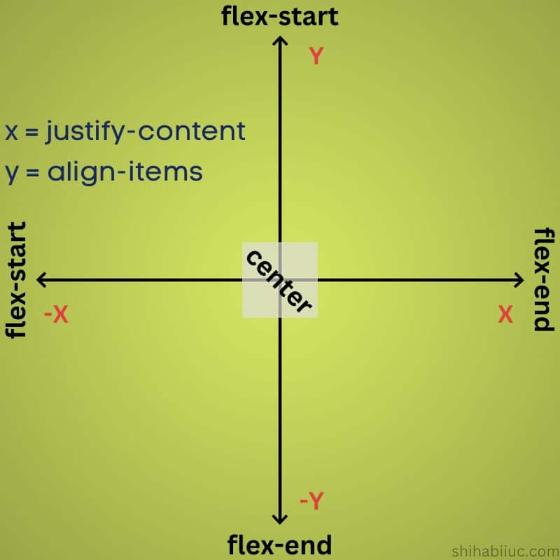
The justify-content property works in the horizontal direction & align-items works in the vertical direction. See the infographic to better understand these two properties:
Output
Case 3: Vertically center & left align
In this example, the image is vertically centered and at the same time, it’s horizontally left-aligned.
HTML
<div class="container">
  <img src="bulb.png">
</div>
CSS
.container {
  display: flex;
  justify-content: flex-start;
  align-items: center;
}
To make the image vertically centered, I used align-items: center and to make it horizontally left-aligned, I used justify-content: flex-start.
If you still have any confusion, please see the Flexbox infographic again.
Output
Case 4: Vertically center & right align
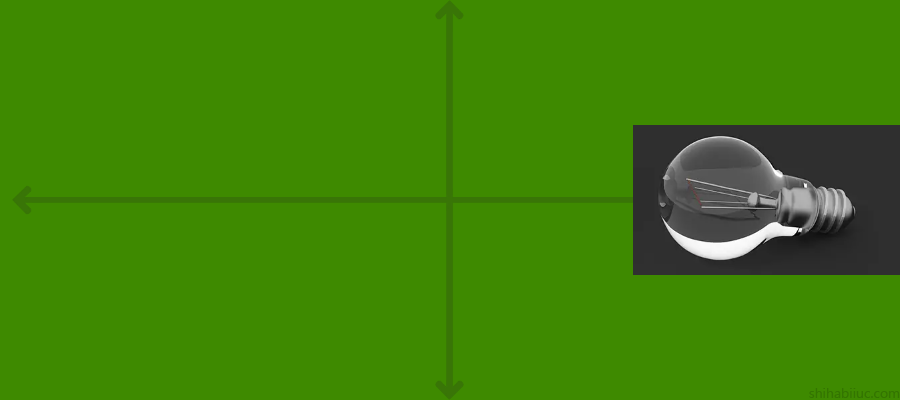
In this example, the image is vertically centered and also aligned on the right side (as you see in the above screenshot).
HTML
<div class="container">
  <img src="bulb.png">
</div>
CSS
.container {
  display: flex;
  justify-content: flex-end;
  align-items: center;
}
Just like I did in the past, to make it vertically centered, I used align-items to center. To push the image to the right side (horizontally), I used justify-content: flex-end.
Output
Case 5: Horizontally center & bottom align
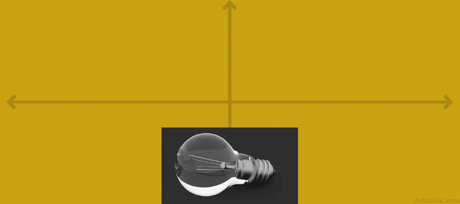
In this example, the image is horizontally centered and vertically bottom aligned.
HTML
<div class="container">
  <img src="bulb.png">
</div>
CSS
.container {
  display: flex;
  justify-content: center;
  align-items: flex-end;
}
To make it horizontally centered, I used justify-content: center and to push the image to the bottom (vertically), I used align-items to flex-end.
Output
Now you know how to center-align an image using CSS Flexbox. Also, you learned all the possible 5 center points.
Until this point, I only used Flexbox. In the next sections, I will show you other ways to center an image.
Centering an image using CSS position & transform properties
In this section, I will achieve the same layouts (five centering points) using CSS position & transform properties. But I will try to make it short, clear & concise.
In the next 5 examples, I will use the same HTML markup again as you see below.
<div class="container">
  <img src="bulb.png">
</div>
Let’s get started.
1 Horizontally center at the top
CSS
.container {
  position: relative;
}
.container img {
  position: absolute;
  top: 0; /* optional */
  left: 50%;
  transform: translateX(-50%);
}
Before you use CSS absolute position, you need a relative position first. Otherwise, the absolutely positioned element will consider its nearest ancestor (container) as the relative.
In this example, the left: 50% will push the content (image) by 50% from the left. To make it perfectly centered, you need to push it back to the left side of its own width. And this is exactly done by the next line transform: translateX(-50%).
Output
2 Horizontally & vertically center aligned
CSS
.container {
  position: relative;
}
.container img {
  position: absolute;
  top: 50%;
  left: 50%;
  transform: translate(-50%, -50%);
}
top: 50% & left: 50% will position the image 50% from the top & left accordingly. To make it horizontally & vertically centered, you need to push it back by 50% of its own width & height. And this is what I did with the transform: translate(-50%, -50%).
Output
3 Vertically center at the left
CSS
.container {
  position: relative;
}
.container img {
  position: absolute;
  left: 0;
  top: 50%;
  transform: translateY(-50%);
}
In this example, left: 0 brings the image to the left side. top: 50% brings the image to the bottom by 50%. And transform: translateY(-50%) pushes back the image to the top by 50% of its own height. This is how it’s vertically centered and horizontally left-aligned.
Output
4 Vertically center at the right
CSS
.container {
  position: relative;
}
.container img {
  position: absolute;
  top: 50%;
  right: 0;
  transform: translateY(-50%);
}
I already explained the top: 50% in the last couple of examples. The right: 0 places the image on the right side. And transformY(-50%) brings it back to the top by 50% of its own height.
Output
5 Horizontally center at the bottom
CSS
.container {
  position: relative;
}
.container img {
  position: absolute;
  left: 50%;
  bottom: 0;
  transform: translateX(-50%);
}
In this example, the unique property is bottom: 0 and it brings the image to the bottom (vertically). left: 50% & transform: translateX(-50%) made the image horizontally center aligned. This is how it’s horizontally centered and vertically bottom aligned.
Output
Learn more about centering HTML elements
- Center a table
- Center a video
- Center an image
- Center alignment using absolute position
- Center alignment using Flexbox
Learn more about images
- How to add images to an HTML table?
- How to create an image hover animation effect only with CSS?
- How to position text over an image with CSS?
- How to change an image on hover (CSS)
- Center an image in various directions & methods
- How to right-align an image in HTML CSS?
- How to create a hero banner image using HTML CSS?
- How to wrap text around an image in HTML?
- How to rotate text & images using CSS?
Conclusion
Most time centering an image (or other HTML elements) refers to aligning it to the zero point in the cross-axis. That means vertically & horizontally centered. But there 4 other center points (positions). You learned all of them.
In this post, I showed you how to make an image center aligned in all 5 possible directions. Also, you learned different ways to center the image. I gave you all the HTML markup & CSS. Therefore, if you still have any questions, please let me know.
Additionally, you can download the live preview template from my GitHub repository.

