CSS position is one of the most used properties that confuses many web designers & developers.
In this post, I will explain this property in depth. Hopefully, this will make things clear.
Let’s get started.
CSS position property
There are 5 different values for the CSS position property: static, fixed, relative, absolute & sticky. The static is the default value. And the absolute is the most puzzle piece among them.
Let’s discuss & make things clear.
Static position
As I mentioned, the static is the default value. Think of it as a normal situation on your web page.
.any-element {
	position: static;
}
Fixed position
It’s related to the viewport. That means a fixed position depends on the device or screen. And it does not depend on the parent container or anything else. As the name suggests, it’s always fixed.
For example, you have an image (bulb) that has a position: fixed; top: 50px; left: 100px;
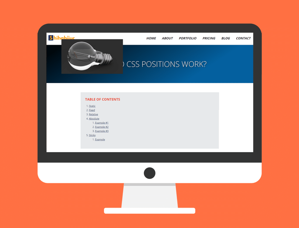
In this case, the bulb photo will stay 50px from the top and 100px from the left of the device. No matter how wide or tall is the device, its position will be the same.
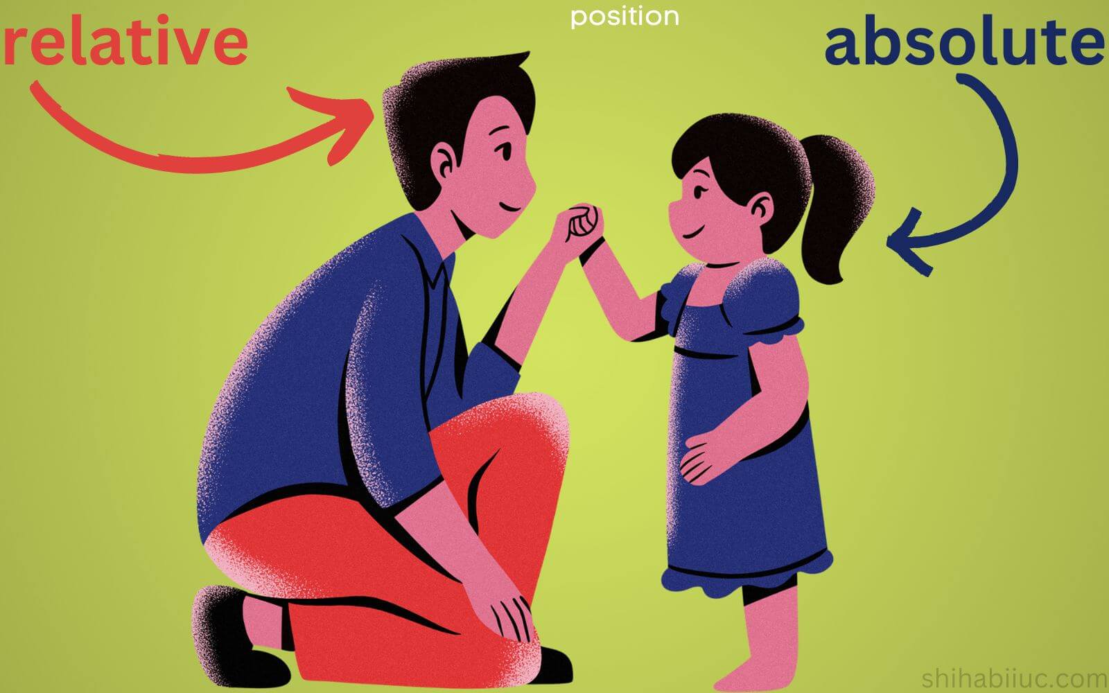
Relative position
Think of it as the normal position of an HTML element. Only with position: relative; does not do anything. But if you also include top, left, bottom, or right values then the element creates space compared to its parent <div> or container.
Look at the below HTML markup and CSS as an example:
<div class="parent">
	<p>I live 70px from top & 50px from left comparing to my parent.</p>
</div>
p {
position: relative;
top: 100px;
right: 50px;
}
.parent {
background: #EA4335;
height: 150px;
}OUTPUT
I live 70px from top & 50px from left comparing to my parent.
In the above example, the red background area is the parent <div> that has a 150px height.
In reality, the position: relative; is generally used with position: absolute;. And I will discuss more in the next property.
Absolute position
As I said, it’s the most complex among the 5 positioning CSS. No worries, I am going to make it super simple right now.
In real-world projects, you have to specify position: relative; to a container <div> before you apply position: absolute; to a certain element.
But if you don’t specify position: relative; then it (the element that has position: absolute;) will consider its nearest ancestor as its parent or container. And that container will be treated as positioned relatively. But if it (the element that has position: absolute;) does not find any container then the <body> will be treated as positioned relatively.
Alright, if you specified position: relative to an ancestor (parent) <div> then you’re ready to specify position absolute;
Wait, I know it looks confusing to you. But don’t be frustrated yet because I will show you some examples below that will clarify everything & any confusion.
Once you specified position: absolute; the element will be positioned based on the <div> that has a position: relative;. See the following examples that will clear all your confusion.
EXAMPLE #1
position: relative;position: absolute;<div class="father">
<span>I am father and I have blue background color.</span>
<div class="son">
<span>I am son and I have red background color.</span>
</div>
</div>.father {
background: #4285F4;
height: 300px;
position: relative;
}
.father .son {
background: #EA4335;
height: 100px;
position: absolute;
top: 60px;
left: 30px;
}EXAMPLE #2
position: relative;position: absolute;<div class="grandfather">
<span>I am the grand father and I have yellow background.</span>
<div class="father">
<span>I am father and I have blue background.</span>
<div class="son">
<span>I am son and I have red background.</span>
</div>
</div>
</div>.grandfather {
background: #FBBC05;
height: 400px;
position: relative;
}
.grandfather .father {
background: #4285F4;
height: 300px;
}
.grandfather .father .son {
background: #EA4335;
height: 100px;
position: absolute;
top: 60px;
left: 30px;
}EXAMPLE #3
position: relative;position: absolute;<div class="grandfather">
<span>I am the grand father and I have yellow background.</span>
<div class="father">
<span>I am father and I have blue background.</span>
<div class="son">
<span>I am son and I have red background.</span>
</div>
</div>
</div>.grandfather {
background: #FBBC05;
height: 400px;
}
.grandfather .father {
background: #4285F4;
height: 300px;
position: relative;
}
.grandfather .father .son {
background: #EA4335;
height: 100px;
position: absolute;
top: 60px;
left: 30px;
}In this Example #3, the father is positioned relatively. But in Example #2, the grandfather was positioned relatively. And in all examples, the son has position: absolute. Do you see the difference?
Sticky position
Position sticky makes an element/content sticky relative to its closest container/ancestor. See this in action below:
This is an example of sticky element behavior.
The blue area has a position sticky;
Scroll in this gray box to see it in action.
Logo
- Home
- About
- Contact
Lorem ipsum dolor sit amet consectetur adipisicing elit. Natus ad, debitis dolores eum mollitia, tenetur sunt id at blanditiis provident quos temporibus! Assumenda maiores veritatis earum, iusto aliquam accusantium accusamus vel minus similique quos, ad ipsa? Corporis soluta quam vero facere doloribus natus voluptas quod iure voluptatem dolorem id facilis, ut doloremque placeat dolore corrupti ad. Mollitia, laudantium quis! Suscipit quasi consequatur accusamus saepe, corrupti animi dolor facilis voluptas officia explicabo eius molestiae debitis sed veniam modi ipsam tempore doloremque odio excepturi recusandae! Nobis provident doloribus fugiat quod iusto autem et quaerat? Sit ut necessitatibus molestias? Quas alias mollitia ipsam vitae architecto suscipit quasi officiis placeat magni exercitationem expedita repellendus, deserunt tempora corrupti! Minima odio facilis adipisci consequuntur? Provident impedit maxime, accusamus assumenda aperiam a laborum doloribus molestiae consequuntur labore rem? Earum fuga cupiditate saepe qui libero quasi explicabo quos beatae? Tempora dicta quasi sequi atque numquam sapiente mollitia quas quam. Tempore ea ducimus ullam, est soluta eaque in eligendi numquam magni officiis dolores consectetur blanditiis consequatur? Neque necessitatibus libero dolor exercitationem? Ipsum quia voluptatum quos, cupiditate at modi praesentium accusantium laudantium consequatur aperiam exercitationem. Ab nam voluptatibus itaque. Impedit, ducimus. Maiores obcaecati amet id quia? Odit, error obcaecati aliquid nesciunt suscipit minima exercitationem esse et voluptates fugit reprehenderit ea quos dolor animi praesentium nostrum accusamus! Incidunt et earum neque aliquid quaerat fugit in! A obcaecati ullam blanditiis nam, consequuntur repudiandae, odio voluptatem doloremque totam vero molestias perferendis! Cupiditate recusandae rem dolorem dolorum numquam voluptas odio maiores mollitia. Iste incidunt nostrum vel ducimus ea architecto, facere magnam voluptate neque, labore perspiciatis! Est natus repellendus ducimus voluptatum. Voluptates nulla corrupti, temporibus eaque doloribus ipsam magnam deleniti nemo laudantium. Accusamus ipsam natus accusantium dolore commodi ea omnis, suscipit quasi quae itaque impedit tempore quisquam corporis illum modi voluptatibus qui?
ul {
	position: -webkit-sticky;
	position: sticky;
	top: 0;

	padding: 20px 15px;
	background: #4285F4;
}
And it brings me to the end of this discussion.
| Learn & practice CSS with real-world examples |
|---|
| Learn basic CSS from the ground up. |
| Build real projects in HTML CSS. |
Build HTML CSS projects
Conclusion
I discussed a lot about CSS positioning in this post. Also, gave you many live examples to demonstrate the purposes. Therefore if you still have any questions, please let me know.