In this post, you’ll see how to create a two-column layout in HTML CSS. Also, you’ll learn how to make this layout mobile responsive. That means the layout will automatically break into one column on small screens.
I will give you all the source code for this column layout & the link to my GitHub repository. Before you start, let’s see the live template that we’re going to build in this post.
In this post, I will show you three different ways to create a two-column layout. Use any of the approaches that you like the most.
Using CSS Flexbox
Flexbox is a powerful one-dimensional layout model and it’s very easy to create a multi-column layout using it. If you want to learn more about it, see this post after.
I have the following HTML markup for the 2 column layout.
HTML
<div class="two-col-using-flexbox">
<div class="col">
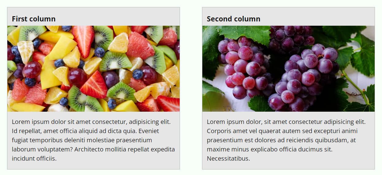
<h3>First column</h3>
<img src="./img/fruits.jpg" alt="fruits">
<p>Lorem ipsum dolor sit amet consectetur...officiis.</p>
</div>
<div class="col">
<h3>Second column</h3>
<img src="./img/grapes.jpg" alt="grapes">
<p>Lorem ipsum dolor, sit amet ...Necessitatibus.</p>
</div>
</div>Based on the above HTML markup & the class names, I have the following CSS.
CSS
@media (min-width: 768px) {
  .two-col-using-flexbox {
    display: -webkit-box;
    display: -ms-flexbox;
    display: flex;
    -webkit-box-pack: justify;
        -ms-flex-pack: justify;
            justify-content: space-between;
  }
}
.two-col-using-flexbox .col {
  -ms-flex-preferred-size: 47%;
      flex-basis: 47%;
}
.two-col-using-flexbox .col:first-child {
  margin-bottom: 60px;
}
@media (min-width: 768px) {
  .two-col-using-flexbox .col:first-child {
    margin-bottom: 0;
  }
}
You see that I have a CSS media query (min-width: 768px). It means if the screen size hits 768px or above, the corresponding CSS will be applied.
Using CSS Grid
CSS Grid is the latest layout model which is two-dimensional. That means the grid can affect both rows & columns at the same time.
I have the same HTML as the Flexbox method. Only I changed the CSS class name of the parent container. Let’s see it once again.
HTML
<div class="two-col-using-grid">
  <div class="col">
    <h3>First column</h3>
    <img src="./img/fruits.jpg" alt="fruits">
    <p>Lorem ipsum dolor sit amet consectetur,...officiis.</p>
  </div>
  <div class="col">
    <h3>Second column</h3>
    <img src="./img/grapes.jpg" alt="grapes">
    <p>Lorem ipsum dolor, sit amet consectetur adipisicing... Necessitatibus.</p>
  </div>
</div>
CSS
@media (min-width: 768px) {
  .two-col-using-grid {
    display: -ms-grid;
    display: grid;
    -ms-grid-columns: 47% 47%;
        grid-template-columns: 47% 47%;
    -webkit-column-gap: 6%;
            column-gap: 6%;
  }
}
.two-col-using-grid .col:first-child {
  margin-bottom: 60px;
}
@media (min-width: 768px) {
  .two-col-using-grid .col:first-child {
    margin-bottom: 0;
  }
}
As you see in all CSS, I also included necessary vendor prefixes so the web page can work well on all browsers.
Using CSS Float
CSS float is one of the oldest ways to create layouts and align items. However, it’s still in use in many places on the web and you also have to be familiar with it.
HTML
<div class="two-col-using-float">
  <div class="col">
    <h3>First column</h3>
    <img src="./img/fruits.jpg" alt="fruits">
    <p>Lorem ipsum dolor sit amet consectetur... officiis.</p>
  </div>
  <div class="col">
    <h3>Second column</h3>
    <img src="./img/grapes.jpg" alt="grapes">
    <p>Lorem ipsum dolor, sit amet consectetur adipisicing...Necessitatibus.</p>
  </div>
</div>
As you see in my HTML, I only changed the class name of the parent container. Other than that, the rest of the things are the same as in the past.
CSS
.two-col-using-float {
  -webkit-box-sizing: border-box;
          box-sizing: border-box;
  overflow: hidden;
}
@media (min-width: 768px) {
  .two-col-using-float .col {
    float: left;
    width: 47%;
  }
}
.two-col-using-float .col:first-child {
  margin-bottom: 60px;
}
@media (min-width: 768px) {
  .two-col-using-float .col:first-child {
    margin-right: 6%;
    margin-bottom: 0;
  }
}
This is how you can make a two-column layout in HTML CSS.
Build HTML CSS projects
Conclusion
I gave you three different examples of creating a two-column layout in HTML CSS. If you want to download the template that you saw in the “Live Preview”, you can do it from my GitHub repo.
If you’re familiar with Git, use the following command to clone the entire repo: git clone https://github.com/shihabiiuc/two-column-layout.git
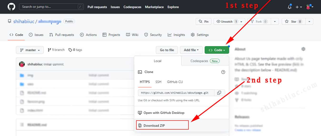
For more detail, see how to clone a Git repository. Otherwise, see the screenshot below to understand how you can download the ZIP file.
If you have any questions about this post or sample code, please let me know.

