A portfolio is a great way to showcase your expertise and increase your chances of getting hired. I will show you a step-by-step guide on how to design a portfolio website using only HTML, CSS, and a few lines of simple JavaScript.
End of this post, you will get the portfolio website source code, and you’re free to edit the template as you see fit.
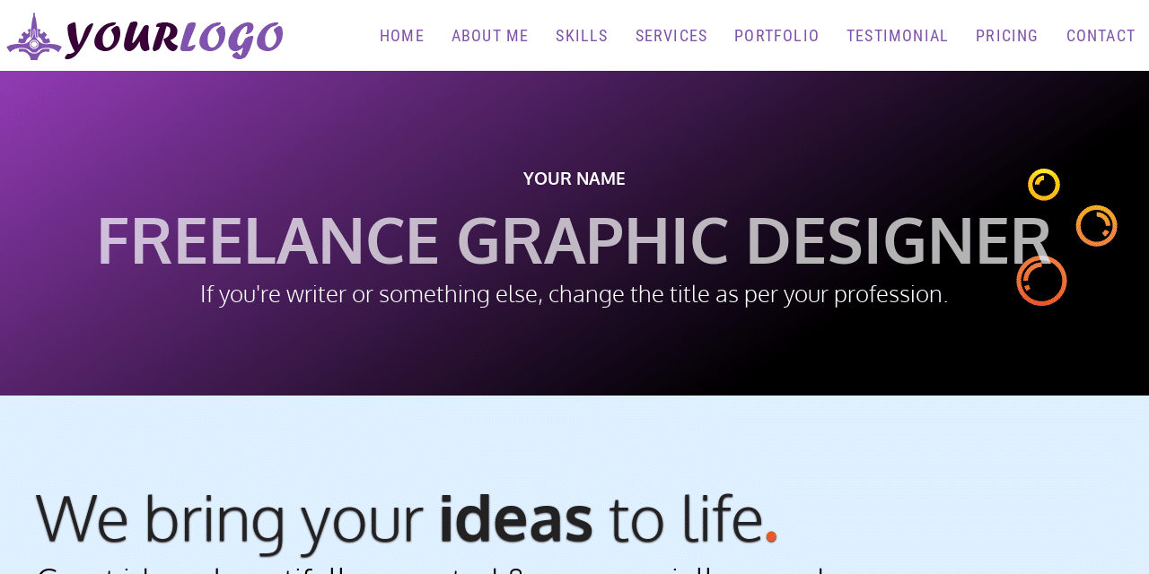
Before we start together, see the finished product (live demo) you will build.
It’s completely mobile responsive, fast loading, and easy to customize the template. It shows a portfolio for a freelance graphic designer. But you can make changes according to your niche. Such as website designers, freelance writers, SEO experts, and anyone who needs a portfolio website in the tech industry.
What you will get
End of this guide, you’ll get a fully mobile responsive portfolio website with all the necessary features that a professional has. But these are not just limited to:
- Favicon (a short icon for the browser tab).
- Social sharing option.
- Social sharing thumbnail/card (people will see an image, title & excerpt after you share the portfolio)
- A modern navigation menu that was built without any framework.
Most importantly, I have not used any CSS framework on this template such as Bootstrap, Zurb Foundation, etc. And not even JavaScript libraries like jQuery.
So your website will load quickly & you’ll understand the source code very easily.
Prerequisite
You need a basic understanding of HTML and CSS. For mobile navigation, I used the minimum amount of JavaScript.
But it’s not a problem if you don’t know JavaScript. There are only 5 lines of JavaScript that are very easy for beginners to understand, but even if you don’t, you can still follow me without any trouble.
Let’s build your portfolio website step-by-step
Downloading someone else’s code without understanding is not very educational. Of course, you’ll get the portfolio website source code at the end.
But it’s very important to understand the code. So it will be easier for you to make necessary edits and add new things.
You can even create a better version than I can.
File structure
Don’t worry! I will make the process super simple so everyone can digest it. We need three primary files: index.html, style.css & script.js. Also, we need a folder that will keep all of our images. See the file structure below:
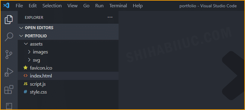
We also have an “assets” folder that contains all the images. And the “favicon.ico” is the ‘Short Icon’ that lives in the root directory. It works as your website identity & it will display on the browser’s tab.
So if you want to follow me along the way, I encourage you to create the same folder structure. First, create a project folder named “portfolio” and then, create other folders & files as you see above.
We will create “favicon.ico” later.
Boilerplate (general code)
As you have seen on the demo, it’s a one-page website/template that contains all the sections. So we will write all our HTML in the “index.html” file.
After you write the boilerplate code, add the following assets to your HTML file.
- Google fonts
- Stylesheet (style.css)
- JavaScript (script.js)
- Social media cards (if you want people to share your portfolio on social media platforms)
Here is the code I have written in the startup:
<!DOCTYPE html>
<html lang="en">
	<head>
	  <meta charset="UTF-8">
	  <meta http-equiv="X-UA-Compatible" content="IE=edge">
	  <meta name="viewport" content="width=device-width, initial-scale=1.0">
	  <link rel="shortcut icon" href="favicon.ico">
	  <!-- google fonts -->
	  <link href="https://fonts.googleapis.com/css2?family=Roboto+Condensed&display=swap" rel="stylesheet">
	  <!-- font-family: 'Roboto Condensed', sans-serif; -->
	  <link href="https://fonts.googleapis.com/css2?family=Oxygen:wght@300;700&display=swap" rel="stylesheet">
	  <!-- font-family: 'Oxygen', sans-serif; -->
	  <link rel="stylesheet" type="text/css" href="style.css" >
	  <!-- Twitter Card -->
	  <meta name="twitter:card" content="summary_large_image">
	  <meta name="twitter:site" content="@shihabiiuc">
	  <meta name="twitter:creator" content="@shihabiiuc">
	  <meta name="twitter:title"
	    content="Your Name -Portfolio">
	  <meta name="twitter:description"
	    content="This is a portfolio website template that is free to download and use. You can edit this template and create your portfolio website in half an hour.">
	  <meta name="twitter:image" content="assets/images/social-media-thumbnail.jpg">
	  <!-- Twitter Card End -->
	  <!-- Linkedin & Facebook Card -->
	  <meta property='og:title'
	    content="Your Name -Portfolio" />
	  <meta property='og:image' content="assets/images/social-media-thumbnail.jpg" />
	  <meta property="og:type" content="website" /><!--  og:type is only for Facebook-->
	  <meta property='og:description'
	    content="This is a portfolio website template that is free to download and use. You can edit this template and create your portfolio website in half an hour." />
	  <meta property='og:url' content="assets/images/social-media-thumbnail.jpg" />
	  <!-- Linkedin Card End -->
	  <title>Your Name -Portfolio</title>
	</head>
	<body>

	</body>

  		<script src="script.js"></script>
	</body>
</html>
You don’t need any CSS for this startup code. However, I have written some basic CSS for the entire site and created a few utility classes. So I can use them throughout the project. See them below:
html {
  line-height: 1.15;
}
* {
  -webkit-box-sizing: border-box;
          box-sizing: border-box;
}
body {
  margin: 0;
  font-family: 'Oxygen', sans-serif;
  position: relative;
}
section {
  padding: 90px 15px;
}
.content {
  max-width: 1200px;
  display: block;
  margin: 0 auto;
}
p {
  font-size: 18px;
  margin: 5px 0 10px;
}
.bold {
  font-weight: 700;
}
.orange {
  color: #FF5100;
}
h2 {
  font-size: 36px;
  margin: 5px 0 10px;
}
@media screen and (min-width: 768px) {
  h2 {
    font-size: 70px;
    color: #848484;
    font-weight: 700;
  }
}
img {
  max-width: 100%;
  height: auto;
}
.center {
  text-align: center;
}
Build the Header & navigation menu
We will have a brand logo and navigation links for the 8 sections (Home, About Me, Skills, Services, Portfolio, Testimonial, Pricing & Contact).
This header code will go under the <body> as the first item.
Here is the HTML for the entire header:
<nav class="site-header">
	<div class="nav-logo">
	  <a href="index.html">
	    <img src="assets/images/logo.png" alt="logo" width="314" height="60">
	  </a>
	</div>
	<button class="hamburger"><img src="assets/images/menu.png" alt="menu toggle icon"></button>
	<div class="nav-links">
	  <ul>
	    <li><a href="index.html">Home</a></li>
	    <li><a href="#about">About Me</a></li>
	    <li><a href="#skill">Skills</a></li>
	    <li><a href="#service">Services</a></li>
	    <li><a href="#portfolio">Portfolio</a></li>
	    <li><a href="#testimonial">Testimonial</a></li>
	    <li><a href="#pricing">Pricing</a></li>
	    <li><a href="#contact">Contact</a></li>
	  </ul>
	</div>
</nav><!-- .site-header -->
The link for the logo and home is the “index.html” file itself. For the rest of the links, these are the CSS IDs for each section.
To make the header nice and mobile responsive, I have written the following CSS:
.site-header {
  z-index: 10;
  font-family: "Roboto Condensed", sans-serif;
  display: -webkit-box;
  display: -ms-flexbox;
  display: flex;
  -webkit-box-align: center;
      -ms-flex-align: center;
          align-items: center;
  -webkit-box-orient: vertical;
  -webkit-box-direction: normal;
      -ms-flex-direction: column;
          flex-direction: column;
  position: sticky;
  top: 0;
  background-color: #fff;
}
@media screen and (min-width: 1250px) {
  .site-header {
    -webkit-box-pack: justify;
        -ms-flex-pack: justify;
            justify-content: space-between;
    -webkit-box-orient: horizontal;
    -webkit-box-direction: normal;
        -ms-flex-direction: row;
            flex-direction: row;
  }
}
.site-header .nav-logo {
  -ms-flex-item-align: start;
      align-self: flex-start;
  padding: 10px 5px 5px;
}
.site-header .nav-logo a img {
  max-width: 200px;
  height: auto;
}
@media screen and (min-width: 768px) {
  .site-header .nav-logo a img {
    max-width: 314px;
    height: auto;
  }
}
.site-header .nav-links {
  display: none;
  width: 100%;
}
@media screen and (min-width: 1250px) {
  .site-header .nav-links {
    display: block;
    background-color: #fff;
  }
}
.site-header .nav-links ul {
  background-color: rgba(222, 240, 255, 0.95);
  padding: 0;
  margin: 0;
  display: -webkit-box;
  display: -ms-flexbox;
  display: flex;
  -webkit-box-orient: vertical;
  -webkit-box-direction: normal;
      -ms-flex-direction: column;
          flex-direction: column;
  -webkit-box-pack: end;
      -ms-flex-pack: end;
          justify-content: flex-end;
  position: absolute;
  width: 100%;
}
@media screen and (min-width: 1250px) {
  .site-header .nav-links ul {
    -webkit-box-orient: horizontal;
    -webkit-box-direction: normal;
        -ms-flex-direction: row;
            flex-direction: row;
    position: static;
    background-color: transparent;
  }
}
.site-header .nav-links ul li {
  list-style: none;
  position: relative;
}
.site-header .nav-links ul li a {
  font-size: 18px;
  text-transform: uppercase;
  font-family: 400;
  color: #7f53ac;
  letter-spacing: 1.2px;
  padding: 10px 15px;
  text-decoration: none;
  display: block;
}
.site-header .nav-links ul li:hover {
  background-color: #efe0ff;
}
.site-header button {
  cursor: pointer;
  background: transparent;
  border: none;
  max-width: 50px;
  display: block;
  position: absolute;
  top: 10px;
  right: 10px;
}
@media screen and (min-width: 768px) {
  .site-header button {
    top: 20px;
  }
}
@media screen and (min-width: 1250px) {
  .site-header button {
    display: none;
  }
}
.nav-links.active {
  display: block;
}
Update May 19, 2023: Prevent the dropdown menu from pushing content down on mobile.
You see that I also included some media queries and vendor prefixes. This is just to ensure that your website looks good on every screen size and works well on all browsers.
You need only a few lines of JavaScript for navigation, especially for mobile.
For the rest of the site, we will not use any other JS. You need the following line of code to make the navigation work properly on mobile, desktop, and other devices.
const hamburger = document.getElementsByClassName("hamburger")[0]
const mobileNavs = document.getElementsByClassName("nav-links")[0]
hamburger.addEventListener("click", () => {
  mobileNavs.classList.toggle("active")
})
Banner and promo section
These two are the first sections that visitors see as soon as they land on your website. It’s pretty straightforward but you should replace the demo text with your own. Below is the code for the first two sections (banner & promo):
<section class="banner">
    <div class="banner--content">
      <h3 class="name">Your name</h3>
      <h1 class="designation">Freelance graphic designer</h1>
      <p class="tagline">If you're writer or something else, change the title as per your profession.</p>
    </div>
</section><!-- .banner -->
<section class="promo">
	<div class="content">
	  <h2>We bring your <span class="bold">ideas</span> to life<span class="orange">.</span></h2>
	  <p>Great ideas, beautifully executed & commercially sound.</p>
	</div>
</section>
I have some background (gradient) color and font styling. Below is the CSS for it.
.banner {
  padding: 90px 15px;
  background-color: #923cb5;
  background-image: linear-gradient(147deg, #923cb5 0%, #000000 74%);
  text-align: center;
  color: #FFFFFF;
}
.banner .banner--content {
  max-width: 1400px;
  height: auto;
  display: block;
  margin: 0 auto;
  background: url("./assets/svg/soap.svg");
  background-repeat: no-repeat;
  background-position: top right;
  background-size: contain;
}
.banner .banner--content .name {
  text-transform: uppercase;
}
.banner .banner--content .designation {
  color: rgba(255, 255, 255, 0.7);
  text-transform: uppercase;
  font-family: 'Oxygen', sans-serif;
  font-weight: 700;
  font-size: 36px;
  margin: 0;
}
@media screen and (min-width: 768px) {
  .banner .banner--content .designation {
    font-size: 70px;
  }
}
.banner .banner--content .tagline {
  font-size: 18px;
}
@media screen and (min-width: 768px) {
  .banner .banner--content .tagline {
    font-size: 26px;
  }
}
.promo {
  background-color: #DEF0FF;
}
.promo .content h2 {
  font-size: 36px;
  font-weight: 300;
  color: #222;
  text-shadow: 0 1px 2px #222;
}
@media screen and (min-width: 768px) {
  .promo .content h2 {
    font-size: 70px;
  }
}
.promo .content h2 span.orange {
  font-weight: 700;
}
.promo .content p {
  font-size: 22px;
}
@media screen and (min-width: 768px) {
  .promo .content p {
    font-size: 36px;
  }
}
Well done! You just made the header, banner & promo section. Let’s move forward quickly.
About section
You can write the best about yourself but I have created the structure for you. The “About” section should not only include the text about you. It must include a headshot or picture of you.
So your prospects will see the person with whom they are going to work with. See the HTML for it.
<section id="about">
  <div class="content">
    <h2>About Me</h2>
    <div class="about-container">
      <div class="about-container-left">
        <p>Consectetur adipisicing elit fugiat ratione laboriosam nostrum atque. Accusantium atque molestias amet culpa, quam illo porro, cupiditate repellendus explicabo sunt natus voluptate fugit ducimus esse.</p>
        <h3>Accusantium atque molestias</h3>
        <ul>
          <li>Amet consectetur adipisicing elit</li>
          <li>Fugiat ratione laboriosam nostrum atque</li>
          <li>Cupiditate repellendus explicabo</li>
        </ul>
        <p>Fugiat ratione laboriosam nostrum atque. Lorem ipsum dolor sit amet consectetur adipisicing elit.</p>
        <h4>Atque lccusantium molestias amet</h4>
        <p>Auam illo porro cupiditate repellendus explicabo ducimus esse. Dupiditate repellendus explicabo sunt natus voluptate fugit ducimus esse</p>
      </div>
      <div class="about-container-right">
        <img src="assets/images/headshot.jpg" alt="your name, headshot">
      </div>
    </div>
  </div>
</section><!-- #about -->
Have you noticed that I have created a CSS ID for each section? These IDs work as a link with a “#” sign. Anyways, here is the CSS for the ‘About’ section.
#about .content h2 {
text-align: center;
}
#about .about-container {
display: block;
}
@media screen and (min-width: 768px) {
#about .about-container {
display: -webkit-box;
display: -ms-flexbox;
display: flex;
-webkit-box-pack: justify;
-ms-flex-pack: justify;
justify-content: space-between;
}
}
#about .about-container-left {
-ms-flex-preferred-size: 40%;
flex-basis: 40%;
background: #DEF0FF;
padding: 30px 15px;
}
#about .about-container-left li {
font-style: italic;
line-height: 1.9;
}
#about .about-container-right {
-ms-flex-preferred-size: 60%;
flex-basis: 60%;
background: #F2F3F8;
display: -webkit-box;
display: -ms-flexbox;
display: flex;
-ms-flex-wrap: wrap;
flex-wrap: wrap;
}
#about .about-container-right img {
max-width: 100%;
-ms-flex-item-align: start;
align-self: flex-start;
}
@media screen and (min-width: 1200px) {
#about .about-container-right img {
-ms-flex-item-align: stretch;
-ms-grid-row-align: stretch;
align-self: stretch;
}
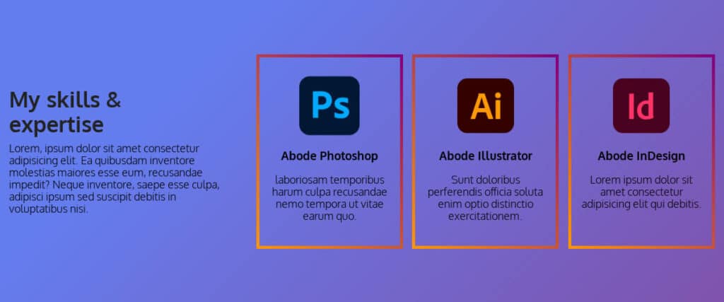
}After having both HTML & CSS in place, the “About” section will look like the below screenshot.
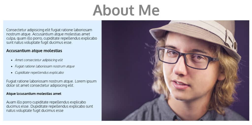
Don’t forget to make changes and replace the dummy text. Write something awesome about yourself. Replace the picture of the guy with your real photo. If you want to create a completely separate “About Page”, I have created another template for it (see the post & template here). And if you have multiple team members, you can create it by following this post.
Skill section
We have a heading & paragraph on the left and three cards on the right side. Follow the HTML & CSS below to achieve this same layout.
<section id="skill">
  <div class="content skill--content">
    <div class="left">
      <h2>My skills & expertise</h2>
      <p>Lorem, ipsum dolor sit amet consectetur adipisicing elit. Ea quibusdam inventore molestias maiores esse eum, recusandae impedit? Neque inventore, saepe esse culpa, adipisci ipsum sed suscipit debitis in voluptatibus nisi.</p>
    </div>
    <div class="right">
      <div class="item">
        <img src="assets/images/photoshop.png" alt="Photoshop">
        <h3>Abode Photoshop</h3>
        <p>laboriosam temporibus harum culpa recusandae nemo tempora ut vitae earum quo.</p>
      </div>
      <div class="item">
        <img src="assets/images/illustrator.png" alt="Illustrator">
        <h3>Abode Illustrator</h3>
        <p>Sunt doloribus perferendis officia soluta enim optio distinctio exercitationem.</p>
      </div>
      <div class="item">
        <img src="assets/images/indesign.png" alt="InDesign">
        <h3>Abode InDesign</h3>
        <p>Lorem ipsum dolor sit amet consectetur adipisicing elit qui debitis.</p>
      </div>
    </div>
  </div>
</section><!-- #skill -->
#skill {
background-color: #7f53ac;
background-image: linear-gradient(315deg, #7f53ac 0%, #647dee 74%);
}
#skill .skill--content {
display: block;
}
@media screen and (min-width: 768px) {
#skill .skill--content {
display: -webkit-box;
display: -ms-flexbox;
display: flex;
-webkit-box-pack: justify;
-ms-flex-pack: justify;
justify-content: space-between;
-webkit-box-align: center;
-ms-flex-align: center;
align-items: center;
}
}
#skill .skill--content .left {
-ms-flex-preferred-size: 30%;
flex-basis: 30%;
}
#skill .skill--content .left h2 {
font-size: 36px;
color: #222;
}
#skill .skill--content .right {
-ms-flex-preferred-size: 65%;
flex-basis: 65%;
display: block;
}
@media screen and (min-width: 768px) {
#skill .skill--content .right {
display: -webkit-box;
display: -ms-flexbox;
display: flex;
-webkit-box-pack: justify;
-ms-flex-pack: justify;
justify-content: space-between;
}
}
#skill .skill--content .right .item {
-ms-flex-preferred-size: 32%;
flex-basis: 32%;
text-align: center;
border: 1px solid #222;
padding: 30px 15px;
margin-bottom: 30px;
border-width: 5px 5px 5px 5px;
-o-border-image: linear-gradient(45deg, #ff9800 0%, purple 100%);
border-image: linear-gradient(45deg, #ff9800 0%, purple 100%);
border-image-slice: 9;
border-style: solid;
}
@media screen and (min-width: 768px) {
#skill .skill--content .right .item {
margin-bottom: 0;
}
}
#skill .skill--content .right .item img {
max-width: 100px;
height: auto;
}I used Flexbox in most sections to achieve these layouts. If you used the floats in the past, I would encourage you to follow along with me. If you’re already familiar with it, that’s awesome, but if you’re not, then try this today.
Service section
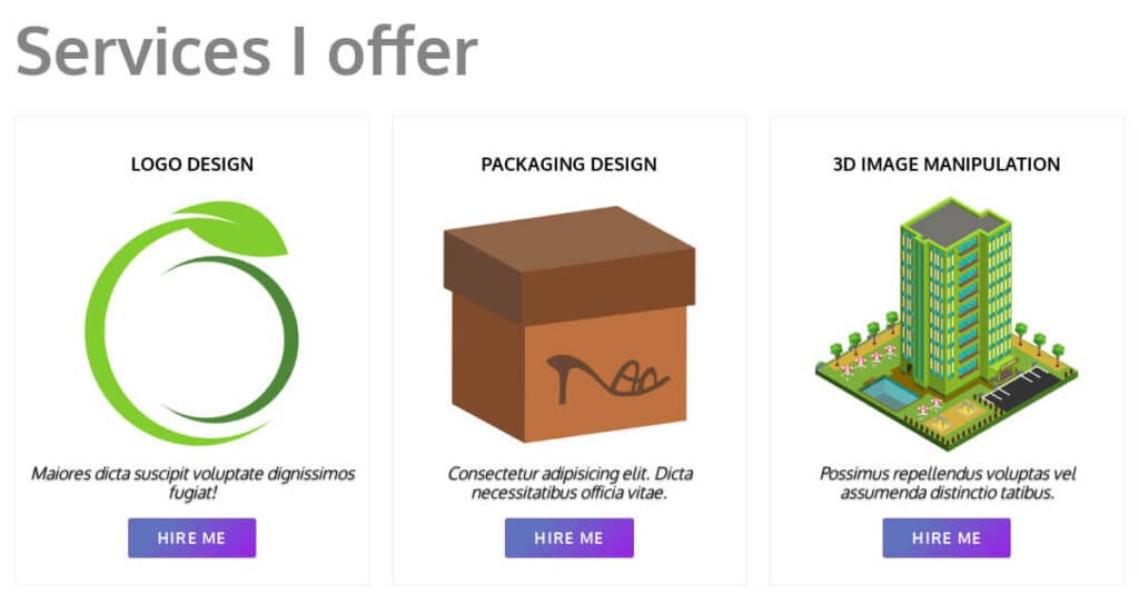
I don’t know about you but I will not create a list of every service that I offer (on the landing page). So I created only three cards. So you can replace the cards with your top 3 services that you’re best at.
<section id="service">
  <h2>Services I offer</h2>
  <div class="content service--content">
    <div class="item">
      <h3>Logo design</h3>
      <img src="assets/images/logo-design.png" alt="Logo design">
      <p>Maiores dicta suscipit voluptate dignissimos fugiat!</p>
      <a href="#contact">Hire Me</a>
    </div><!-- .item -->
    <div class="item">
      <h3>Packaging design</h3>
      <img src="assets/images/packaging-design.png" alt="Packaging design">
      <p>Consectetur adipisicing elit. Dicta necessitatibus officia vitae.</p>
      <a href="#contact">Hire Me</a>
    </div><!-- .item -->
    <div class="item">
      <h3>3D image manipulation</h3>
      <img src="assets/images/3d-image-design.png" alt="3D image manipulation">
      <p>Possimus repellendus voluptas vel assumenda distinctio tatibus.</p>
      <a href="#contact">Hire Me</a>
    </div><!-- .item -->
  </div>
</section><!-- #service -->
#service h2 {
max-width: 1200px;
display: block;
margin: 0 auto 30px auto;
}
#service .service--content {
display: block;
}
@media screen and (min-width: 768px) {
#service .service--content {
display: -webkit-box;
display: -ms-flexbox;
display: flex;
-webkit-box-pack: justify;
-ms-flex-pack: justify;
justify-content: space-between;
}
}
#service .service--content .item {
-ms-flex-preferred-size: 32%;
flex-basis: 32%;
text-align: center;
border: 1px solid #E9EBEC;
padding: 20px 10px 40px;
margin-bottom: 30px;
-webkit-transition: background-color 0.8s ease-in;
transition: background-color 0.8s ease-in;
}
@media screen and (min-width: 768px) {
#service .service--content .item {
margin-bottom: 0;
}
}
#service .service--content .item h3 {
text-transform: uppercase;
font-weight: 700;
}
#service .service--content .item img {
max-width: 80%;
display: block;
margin: 0 auto;
}
#service .service--content .item p {
font-style: italic;
display: block;
margin-bottom: 30px;
text-shadow: 0 1px 2px #222;
}
#service .service--content .item a {
border: 1px solid #7f53ac;
border-radius: 4px;
padding: 10px 30px;
color: #FFF;
text-decoration: none;
text-transform: uppercase;
font-weight: 700;
letter-spacing: 1.3px;
-webkit-transition: all 0.8s ease-in-out;
transition: all 0.8s ease-in-out;
background-color: #9921e8;
background-image: linear-gradient(315deg, #9921e8 0%, #5f72be 74%);
}
#service .service--content .item a:hover {
background-color: #7f5a83;
background-image: linear-gradient(315deg, #7f5a83 0%, #0d324d 74%);
border: #0d324d;
}
#service .item:hover {
background-color: #DEF0FF;
}You see that these services are graphic design-related. But don’t feel shy or hesitant to use the same structure and code for other sectors. I just picked a random niche but I had all the tech sectors in mind while creating this template. So it has been written for you as well.
Portfolio section
I have 6 items in the portfolio but you can add more just by copy-pasting the “item” block in the HTML. These items are mainly project images. Each item will show the project title once you hover your mouse. It also has a nice & smooth overlay color.
<section id="portfolio">
  <h2 class="center">Portfolio -My past work samples</h2>
  <div class="content portfolio--content">
    <div class="item">
      <h3>Project Name</h3>
      <img src="assets/images/project-one.jpg" alt="logo design">
    </div><!-- item -->
    <div class="item">
      <h3>Project Name</h3>
      <img src="assets/images/project-two.jpg" alt="logo design">
    </div><!-- item -->
    <div class="item">
      <h3>Project Name</h3>
      <img src="assets/images/project-three.png" alt="logo design">
    </div><!-- item -->
    <div class="item">
      <h3>Project Name</h3>
      <img src="assets/images/project-four.jpg" alt="logo design">
    </div><!-- item -->
    <div class="item">
      <h3>Project Name</h3>
      <img src="assets/images/project-five.jpg" alt="logo design">
    </div><!-- item -->
    <div class="item">
      <h3>Project Name</h3>
      <img src="assets/images/project-six.jpg" alt="logo design">
    </div><!-- item -->
  </div>
</section><!-- portfolio -->
The “item” block refers to the CSS class of “item.”
#portfolio {
  z-index: 1;
  background-color: #923cb5;
  background-image: linear-gradient(147deg, #923cb5 0%, #000000 74%);
}
#portfolio h2 {
  color: rgba(255, 255, 255, 0.8);
  display: block;
  margin-bottom: 30px;
}
#portfolio .portfolio--content {
  display: -webkit-box;
  display: -ms-flexbox;
  display: flex;
  -webkit-box-pack: center;
      -ms-flex-pack: center;
          justify-content: center;
  -ms-flex-wrap: wrap;
      flex-wrap: wrap;
}
#portfolio .portfolio--content .item {
  -ms-flex-preferred-size: 50%;
      flex-basis: 50%;
  position: relative;
  background-color: #cb2027;
  -webkit-transition: all 0.8s ease-in-out;
  transition: all 0.8s ease-in-out;
}
#portfolio .portfolio--content .item h3 {
  color: #FFF;
  font-weight: 700;
  text-transform: uppercase;
  position: absolute;
  top: 50%;
  left: 50%;
  text-align: center;
  -webkit-transform: translate(-50%, -50%);
          transform: translate(-50%, -50%);
  opacity: 0;
  -webkit-transition: all 0.8s ease-in-out;
  transition: all 0.8s ease-in-out;
}
#portfolio .portfolio--content .item img {
  -ms-flex-negative: 0;
      flex-shrink: 0;
  min-width: 100%;
  min-height: 100%;
}
#portfolio .portfolio--content .item:hover > h3 {
  opacity: 1;
}
#portfolio .portfolio--content .item:hover > img {
  opacity: 0.3;
}
Ignore the social media share icons for now. And we will look into this later. Otherwise, your template will look like this screenshot.
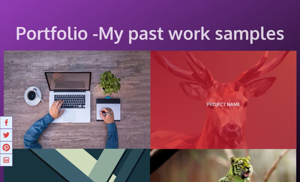
This is the section that is really important for you. So, spend some time figuring out the most important projects that you are proud of.
Testimonial section
It does not need to be super fancy. Rather, we should make it easy to read for your prospects & clients.
However, aside from designing your portfolio website, I have an extra word for you.
Do not misuse the “Testimonials.” I saw many people just use stock photos of the clients, random testimonial texts, random names, etc.
If you have a real testimonial, then go for it. Otherwise, try & wait for it.
Anyway, here is the simple code for the testimonial section.
<section id="testimonial">
  <h2>Testimonial -What clients are saying about me</h2>
  <div class="content testimonial--content">
    <div class="item">
      <figure>
        <blockquote cite="https://www.huxley.net/bnw/four.html">
            <p>Lorem ipsum dolor sit amet consectetur adipisicing elit. Neque cumque quibusdam libero! Aperiam qui unde dolores iste eos, odit laboriosam optio sunt commodi aliquid pariatur nobis dolore! Excepturi, harum possimus.</p>
        </blockquote>
        <figcaption>—John Doe, <cite>CEO, Lorem Digital</cite></figcaption>
      </figure>
    </div><!-- item -->
    <div class="item">
      <figure>
        <blockquote cite="https://www.huxley.net/bnw/four.html">
            <p>Sit amet consectetur adipisicing elit. Neque cumque quibusdam libero! Aperiam qui unde dolores iste eos, odit laboriosam optio sunt commodi aliquid pariatur nobis dolore! Excepturi, harum possimus.</p>
        </blockquote>
        <figcaption>—John Doe, <cite>CEO, Lorem Digital</cite></figcaption>
      </figure>
    </div><!-- item -->
    <div class="item">
      <figure>
        <blockquote cite="https://www.huxley.net/bnw/four.html">
            <p>Consectetur adipisicing elit. Neque cumque quibusdam libero! Aperiam qui unde dolores iste eos, odit laboriosam optio sunt commodi aliquid pariatur nobis dolore! Excepturi, harum possimus.</p>
        </blockquote>
        <figcaption>—John Doe, <cite>CEO, Lorem Digital</cite></figcaption>
      </figure>
    </div><!-- item -->
    <div class="item">
      <figure>
        <blockquote cite="https://www.huxley.net/bnw/four.html">
            <p>Adipisicing elit. Neque cumque quibusdam libero! Aperiam qui unde dolores iste eos, odit laboriosam optio sunt commodi aliquid pariatur nobis dolore! Excepturi, harum possimus.</p>
        </blockquote>
        <figcaption>—John Doe, <cite>CEO, Lorem Digital</cite></figcaption>
      </figure>
    </div><!-- item -->
  </div><!-- .testimonial--content -->
</section><!-- testimonial -->
#testimonial h2 {
max-width: 1200px;
display: block;
margin: 0 auto 30px auto;
}
#testimonial .testimonial--content {
display: block;
}
@media screen and (min-width: 768px) {
#testimonial .testimonial--content {
display: -webkit-box;
display: -ms-flexbox;
display: flex;
-webkit-box-pack: justify;
-ms-flex-pack: justify;
justify-content: space-between;
-ms-flex-wrap: wrap;
flex-wrap: wrap;
-webkit-box-align: start;
-ms-flex-align: start;
align-items: flex-start;
}
}
#testimonial .testimonial--content .item {
-ms-flex-preferred-size: 45%;
flex-basis: 45%;
margin: 15px 0;
}
blockquote {
margin: 0;
}
blockquote p {
padding: 15px;
background: #DEF0FF;
border-radius: 5px;
}
blockquote p::before {
content: '\201C';
}
blockquote p::after {
content: '\201D';
}If you want a separate page for the testimonial, see another post where I created a testimonial template. You’ll also find the live preview and code (just like this one).
If you want to include a testimonial slider, see this post to learn more and get the template.
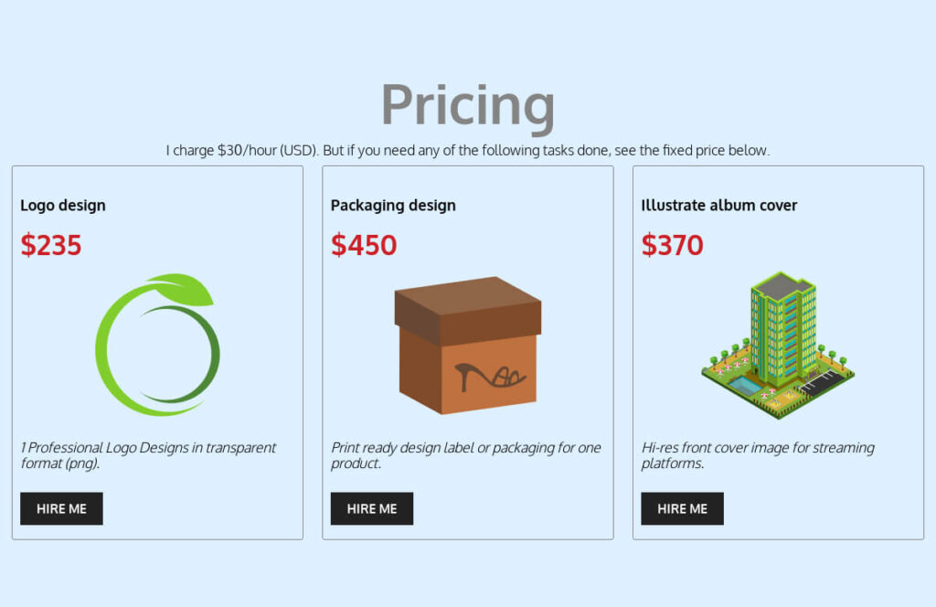
Pricing section
Here is the cool part. Let your prospects & buyers know your worth. A portfolio website is not just a collection of your past work samples. The pricing section is your topmost opportunity to pitch.
However, you really don’t need to create all sorts of pricing packages for all the services you offer. Create a few of them, and the clients will get a hint of your worth.
And then, you’ll have a contact section that your prospects can use to get quotes.
Below is the HTML & CSS for the pricing section.
<section id="pricing">
  <h2 class="center">Pricing</h2>
  <p class="center">I charge $30/hour (USD). But if you need any of the following tasks done, see the fixed price below.</p>
  <div class="pricing--content">
    <div class="item">
      <h3>Logo design</h3>
      <p class="price">$235</p>
      <img src="assets/images/logo-design.png" alt="logo design price">
      <p class="description">1 Professional Logo Designs in transparent format (png).</p>
      <a href="#contact">Hire me</a>
    </div><!-- item -->
    <div class="item">
      <h3>Packaging design</h3>
      <p class="price">$450</p>
      <img src="assets/images/packaging-design.png" alt="packaging design price">
      <p class="description">Print ready design label or packaging for one product.</p>
      <a href="#contact">Hire me</a>
    </div><!-- item -->
    <div class="item">
      <h3>Illustrate album cover</h3>
      <p class="price">$370</p>
      <img src="assets/images/3d-image-design.png" alt="3d image design price">
      <p class="description">Hi-res front cover image for streaming platforms.</p>
      <a href="#contact">Hire me</a>
    </div><!-- item -->
  </div><!-- pricing--content -->
</section><!-- #pricing-->
#pricing {
background-color: #DEF0FF;
}
#pricing .pricing--content {
display: block;
max-width: 1600px;
margin: 0 auto;
}
@media screen and (min-width: 768px) {
#pricing .pricing--content {
display: -webkit-box;
display: -ms-flexbox;
display: flex;
-webkit-box-pack: justify;
-ms-flex-pack: justify;
justify-content: space-between;
}
}
#pricing .pricing--content .item {
-ms-flex-preferred-size: 32%;
flex-basis: 32%;
border: 1px solid #848484;
border-radius: 3px;
padding: 20px 10px 30px;
margin-bottom: 30px;
}
@media screen and (min-width: 768px) {
#pricing .pricing--content .item {
margin-bottom: 0;
}
}
#pricing .pricing--content .item .price {
font-size: 36px;
color: #cb2027;
font-weight: 700;
}
#pricing .pricing--content .item img {
max-width: 200px;
height: auto;
display: block;
margin: 0 auto;
}
#pricing .pricing--content .item .description {
font-style: italic;
min-height: 60px;
display: block;
margin: 20px 0;
}
#pricing .pricing--content .item a {
padding: 10px 20px;
font-weight: 700;
text-transform: uppercase;
border: 1px solid #222;
text-decoration: none;
color: #FFF;
background: #222;
}After you have the code in place, don’t forget to update the price, service & description.
You can also add a ribbon to the best-selling item by following this post.
Contact section
Finally, you have the contact section. It’s an important section that is mandatory to have & to be getting hired.
However, you really don’t need a fancy contact form. Moreover, the contact form data also goes to the email. So why not use your email, phone, and other preferred contact methods?
In this contact section, I don’t have too many styles & it’s pretty straightforward.
<section id="contact">
  <div class="content">
    <h2 class="center">Contact Me</h2>
    <p class="center contact-detail">Lorem ipsum dolor sit amet consectetur, adipisicing elit. Nesciunt nam doloremque, pariatur, repellat est natus soluta autem atque velit nisi ipsum sint fuga tenetur, harum molestias doloribus fugiat obcaecati culpa!</p>
    <address>
      <p>Email Me: <a href="mailto:[email protected]">[email protected]</a></p>
      <p></p>Call me: <a href="tel:+88012345876">+88012345876</a></p>
      <p>Office address: Box 564, Manchester<br>
        England.</p>
    </address>
  </div>
</section>
#contact .contact-detail, #contact address {
max-width: 800px;
display: block;
margin: 0 auto;
}
#contact address {
margin-top: 60px;
}
#contact address a {
text-decoration: none;
}If you wish to create a separate contact page, you can do so by following this post.
Cool! If you made it this far then you’re nearly there. We only need some finishing touches which are the footer and the social sharing buttons.
Footer
It’s a standard section on every website. I have created a two-column layout and a copyright section. But if you wish to use a different footer, you can find more footer styles here.
<footer class="site-footer">
  <div class="content site-footer--content">
    <div class="footer-left">
      <img src="assets/images/logo-footer.png" alt="logo">
      <p>Lorem, ipsum dolor sit amet consectetur adipisicing elit. Repellat necessitatibus a pariatur, quibusdam dolorem impedit assumenda laborum modi nam, rem odit, doloremque commodi in consectetur vitae nisi. Nostrum, voluptatum quibusdam. Rpsum dolor sit amet consectetur adipisicing elit. Repellat necessitatibus a pariatur, quibusdam dolorem impedit assumenda laborum modi nam, rem odit, doloremque commodi in consectetur vitae nisi. Nostrum, voluptatum quibusdam</p>
    </div>
    <div class="footer-right">
      <address>
        <p>Email Me: <a href="mailto:[email protected]">[email protected]</a></p>
        <p></p>Call me: <a href="tel:+88012345876">+88012345876</a></p>
        <p>Office address: Box 564, Manchester<br>
          England.</p>
      </address>
    </div>
  </div>
  <div class="copyright-notice">
    <p>© <time datetime="2022">2022,</time> All rights reserved by your_name</p>
  </div>
</footer>
.site-footer {
background-color: #222;
padding: 90px 15px 30px;
}
.site-footer .site-footer--content {
max-width: 1600px;
display: block;
margin: 0 auto;
color: #FFF;
border-bottom: 1px solid #0000004D;
}
@media screen and (min-width: 768px) {
.site-footer .site-footer--content {
display: -webkit-box;
display: -ms-flexbox;
display: flex;
-webkit-box-pack: justify;
-ms-flex-pack: justify;
justify-content: space-between;
-webkit-box-align: start;
-ms-flex-align: start;
align-items: flex-start;
}
}
.site-footer .site-footer--content .footer-left {
-ms-flex-preferred-size: 55%;
flex-basis: 55%;
}
.site-footer .site-footer--content .footer-left p {
font-size: 16px;
line-height: 1.6;
color: #E0E0E0;
}
.site-footer .site-footer--content .footer-right {
-ms-flex-preferred-size: 40%;
flex-basis: 40%;
text-align: right;
}
.site-footer .site-footer--content a {
color: #FFF;
text-decoration: none;
}
.site-footer .copyright-notice {
padding-top: 20px;
text-align: center;
color: #7A7A7A;
border-top: 1px solid #FFFFFF0D;
}You’re almost done, just need social sharing buttons that may help you to promote the portfolio on various social media platforms.
Download the source code
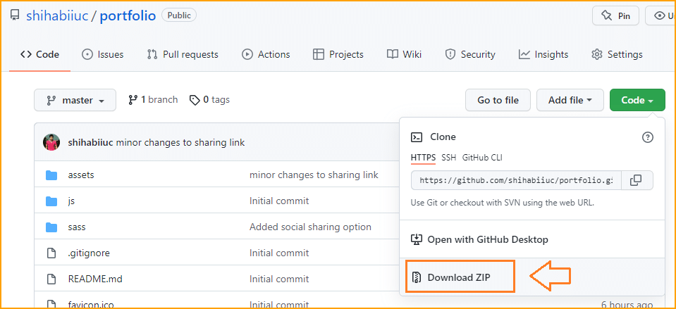
Together we went through the process and created a portfolio website step by step. Thus, it’s obvious to make mistakes or skip any part. So I have the entire template available for download. I could give you a downloadable zip file but I consistently make improvements on this template. So I want to make sure that you’re going to get the latest code at the current time. And that is why I have created a Git repository for this portfolio template. I also have included instructions on the repo. Feel free to make changes and use the template the way you want. But don’t use it for selling or commercial intent or do not make it available for download on other websites. Content creation takes huge time, effort, and thinking. And I expect my reader will also honor the copyright & use case.
Download TemplateIf you’re new to GitHub, see the download option in the screenshot below.
Social sharing buttons
You can write this code anywhere in the index.html file. Because I used CSS positioning (fixed) for them. It always stays on the left-middle side.
I decided not to show the social sharing options on mobile devices because it may look messy on smaller screens.
For social sharing icons, I preferred to write the HTML just before the footer tag.
<div class="social-share">
  <a href="https://www.facebook.com/sharer/sharer.php?u=https://shihabiiuc.github.io/portfolio/index.html" target="_blank"><img src="assets/svg/facebook.svg" alt="share on facebook"></a>
  <a href="https://twitter.com/intent/tweet?url=https://shihabiiuc.github.io/portfolio/index.html&text=" target="_blank"><img src="assets/svg/twitter.svg" alt="share on twitter"></a>
  <a href="https://pinterest.com/pin/create/button/?url=https://shihabiiuc.github.io/portfolio/index.html&media=&description=" target="_blank"><img src="assets/svg/pinterest.svg" alt="share on pinterest"></a>
  <a href="https://www.linkedin.com/shareArticle?mini=true&url=https://shihabiiuc.github.io/portfolio/index.html" target="_blank"><img src="assets/svg/linkedin.svg" alt="share on linkedin"></a>
</div>
.social-share {
display: none;
-webkit-box-pack: center;
-ms-flex-pack: center;
justify-content: center;
-webkit-box-align: center;
-ms-flex-align: center;
align-items: center;
-webkit-box-orient: vertical;
-webkit-box-direction: normal;
-ms-flex-direction: column;
flex-direction: column;
position: fixed;
top: 50vh;
left: 0;
-webkit-transform: translateY(-50%);
transform: translateY(-50%);
}
@media screen and (min-width: 768px) {
.social-share {
display: -webkit-box;
display: -ms-flexbox;
display: flex;
}
}
.social-share a {
width: 50px;
height: 50px;
background-color: #DEF0FF;
border: 1px solid #7f53ac;
-webkit-transition: background-color 0.8s ease-in;
transition: background-color 0.8s ease-in;
display: -webkit-box;
display: -ms-flexbox;
display: flex;
-webkit-box-pack: center;
-ms-flex-pack: center;
justify-content: center;
}
.social-share a img {
width: 30px;
height: auto;
-ms-flex-item-align: center;
-ms-grid-row-align: center;
align-self: center;
}
.social-share a:hover {
background-color: #7f53ac;
}After you create your own portfolio site, you need to replace the social sharing links. Depending on everyone’s website URL, the social sharing links will be different.
There are lots of online free tools that you can use to generate social sharing links. In this portfolio template, I used the Website Planet.
Favicon
For the favicon, use any online tools or Photoshop. After you create it, make sure to place it in the root directory. And name it exactly “favicon.ico.”
You can also use “favicon.png” or a JPG image. Make sure you updated the favicon link (if you used an extension other than ico).
Favicon is your website identity and it helps visitors quickly identify a website among multiple tabs (browser tab). But if you do not have a Favicon, the web browsers will display a default ‘Globe’ icon instead. By not having a favicon, your website may look newbies or unprofessional.
So, it’s always better to have a Favicon that is overlooked in most tutorials and guidelines.
Take this portfolio template to the next level. Adding a slight animation to this template will enhance the design, look & feel. So if you’re interested, see another guideline that will walk you through the process.
Animated portfolio »Now you know how to create a portfolio website using HTML, CSS & a little JavaScript. However, this is a one-page website. If you want to learn how to split them into multiple pages & how to interlink those pages, please see another post on how to create a multipage website using only HTML CSS.
Build HTML CSS projects
Conclusion
That’s all you need to design the exact same portfolio website with HTML, CSS & a few lines of JavaScript.
If your work doesn’t match the template (live preview), then download the portfolio website source code from my GitHub link mentioned earlier.
Also, feel free to ask me any questions and let me know if you want to get it as a WordPress theme, Divi, or Elementor template.

