In this post, I will show you a couple of cards that I made with HTML & CSS. You can use any of the card CSS or designs that you like. Let’s explore them one by one.
Example 1: simple card design with HTML CSS
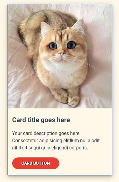
In this example, I have an image on top, a card title, a description & a link/button. This card also has some other hover styles that you’ll find on the live demo.
See its HTML & CSS below.
HTML
<div class="card-holder">
  <div class="card">
    <img src="./img/img-1.jpg" alt="cat">
    <h5>Card title goes here</h5>
    <p>Your card description goes here. Consectetur adipisicing elitllum nulla odit nihil sit sequi quia eligendi corporis.</p>
    <a href="#">Card button</a>
  </div>
</div>
Don’t forget to replace the image path.
CSS
.card-holder {
  max-width: 1100px;
  margin: 0 auto;
}

.card-holder .card {
  max-width: 350px;
  border: 1px solid #4285F4;
  border-radius: 3px;
  -webkit-transition: -webkit-box-shadow 0.7s ease-in;
  transition: -webkit-box-shadow 0.7s ease-in;
  transition: box-shadow 0.7s ease-in;
  transition: box-shadow 0.7s ease-in, -webkit-box-shadow 0.7s ease-in;
  margin: 30px 15px;
}

.card-holder .card h5 {
  padding: 20px 15px;
}

.card-holder .card p {
  padding: 0 15px;
  margin: 0 0 20px;
}

.card-holder .card a {
  padding: 10px 30px;
  display: inline-block;
  background-color: #E43E31;
  margin: 0 15px 20px;
  border: 1px solid #d92a1c;
  border-radius: 25px;
  color: #FFFFFF;
  text-transform: uppercase;
  text-shadow: 2px 1px #222222;
  -webkit-transition: background-color 0.7s ease;
  transition: background-color 0.7s ease;
  font-weight: 700;
  font-size: 14px;
}

.card-holder .card a:hover {
  background-color: #c2190c;
}

.card-holder .card:hover {
  -webkit-box-shadow: 0 4px 8px 0 rgba(0, 0, 0, 0.2), 0 6px 20px 0 rgba(0, 0, 0, 0.19);
          box-shadow: 0 4px 8px 0 rgba(0, 0, 0, 0.2), 0 6px 20px 0 rgba(0, 0, 0, 0.19);
}
Example 2: card with list items & two buttons
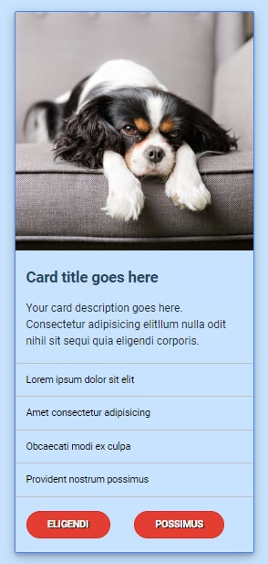
This card is an extended version of the first one. In addition to the first card, it has a couple of list items and two buttons.
See its HTML & CSS below.
HTML
<div class="card-holder">
  <div class="card">
    <img src="./img/img-2.jpg" alt="dog">
    <h5>Card title goes here</h5>
    <p>Your card description goes here. Consectetur adipisicing elitllum nulla odit nihil sit sequi quia eligendi corporis.</p>
    <ul>
      <li>Lorem ipsum dolor sit elit</li>
      <li>Amet consectetur adipisicing</li>
      <li>Obcaecati modi ex culpa</li>
      <li>Provident nostrum possimus</li>
    </ul>
    <div class="links">
      <a href="#">Eligendi</a>
      <a href="#">Possimus</a>
    </div>
  </div>
</div>  <!-- .card-holder -->
CSS
ul {
  padding: 0;
}

ul li {
  list-style: none;
  font-size: 14px;
  border-bottom: 1px solid #c0c1c2;
  padding: 15px 15px;
}

ul li:first-child {
  border-top: 1px solid #c0c1c2;
}

.card-holder {
  max-width: 1100px;
  margin: 0 auto;
}

.card-holder .card {
  max-width: 350px;
  border: 1px solid #4285F4;
  border-radius: 3px;
  -webkit-transition: -webkit-box-shadow 0.7s ease-in;
  transition: -webkit-box-shadow 0.7s ease-in;
  transition: box-shadow 0.7s ease-in;
  transition: box-shadow 0.7s ease-in, -webkit-box-shadow 0.7s ease-in;
  margin: 30px 15px;
}

.card-holder .card h5 {
  padding: 20px 15px;
}

.card-holder .card p {
  padding: 0 15px;
  margin: 0 0 20px;
}

.card-holder .card a {
  padding: 10px 30px;
  display: inline-block;
  background-color: #E43E31;
  margin: 0 15px 20px;
  border: 1px solid #d92a1c;
  border-radius: 25px;
  color: #FFFFFF;
  text-transform: uppercase;
  text-shadow: 2px 1px #222222;
  -webkit-transition: background-color 0.7s ease;
  transition: background-color 0.7s ease;
  font-weight: 700;
  font-size: 14px;
}

.card-holder .card a:hover {
  background-color: #c2190c;
}

.card-holder .card:hover {
  -webkit-box-shadow: 0 4px 8px 0 rgba(0, 0, 0, 0.2), 0 6px 20px 0 rgba(0, 0, 0, 0.19);
          box-shadow: 0 4px 8px 0 rgba(0, 0, 0, 0.2), 0 6px 20px 0 rgba(0, 0, 0, 0.19);
}
In the same vein, this card CSS is very similar to the first one. The only exception is the styles for the <ul> & <li> tags.
Example 3: pricing card HTML CSS template
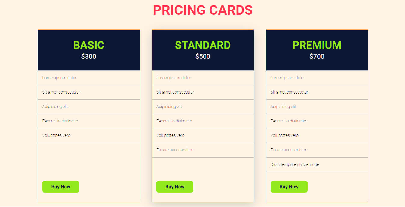
In this example, I have 3 cards side by side. This example best suits pricing cards.
If you see closely, the cards are equal in height even though their content is not equal. Also, the buttons are aligned at the very bottom as you will see in the real world and on popular websites.
See its HTML & CSS below.
HTML
<div class="card-holder">
  <div class="item">
    <div class="item--header">
      <h3 class="package">Basic</h3>
      <p><data class="price" value="300">$300</data></p>
    </div> <!-- .item--header -->
    <ul>
      <li>Lorem ipsum dolor</li>
      <li>Sit amet consectetur</li>
      <li>Adipisicing elit</li>
      <li>Facere illo distinctio</li>
      <li>Voluptates vero</li>
      <!-- <li>Facere accusantium</li> -->
      <!-- <li>Dicta tempore doloremque</li> -->
    </ul>
    <div class="link">
      <a href="#">Buy now</a>
    </div>
  </div>   <!-- .item -->
  <div class="item">
    <div class="item--header">
      <h3 class="package">Standard</h3>
      <p><data class="price" value="500">$500</data></p>
    </div> <!-- .item--header -->
    <ul>
      <li>Lorem ipsum dolor</li>
      <li>Sit amet consectetur</li>
      <li>Adipisicing elit</li>
      <li>Facere illo distinctio</li>
      <li>Voluptates vero</li>
      <li>Facere accusantium</li>
      <!-- <li>Dicta tempore doloremque</li> -->
    </ul>
    <div class="link">
      <a href="#">Buy now</a>
    </div>
  </div>   <!-- .item -->
  <div class="item">
    <div class="item--header">
      <h3 class="package">Premium</h3>
      <p><data class="price" value="700">$700</data></p>
    </div> <!-- .item--header -->
    <ul>
      <li>Lorem ipsum dolor</li>
      <li>Sit amet consectetur</li>
      <li>Adipisicing elit</li>
      <li>Facere illo distinctio</li>
      <li>Voluptates vero</li>
      <li>Facere accusantium</li>
      <li>Dicta tempore doloremque</li>
    </ul>
    <div class="link">
      <a href="#">Buy now</a>
    </div>
  </div>   <!-- .item -->
</div>  <!-- .card-holder -->
CSS
.example-3 {
  background-color: #fff4e6;
}

.example-3 h2 {
  text-align: center;
  text-transform: uppercase;
  color: #FD334D;
  font-size: 32px;
}

@media (min-width: 768px) {
  .example-3 h2 {
    font-size: 45px;
  }
}

@media (min-width: 768px) {
  .example-3 .card-holder {
    display: -webkit-box;
    display: -ms-flexbox;
    display: flex;
    -webkit-box-pack: justify;
        -ms-flex-pack: justify;
            justify-content: space-between;
  }
}

.example-3 .card-holder .item {
  margin: 0 0 30px;
  border: 1px solid #fcb65d;
  border-radius: 3px;
  -webkit-transition: -webkit-box-shadow 0.5s ease-in;
  transition: -webkit-box-shadow 0.5s ease-in;
  transition: box-shadow 0.5s ease-in;
  transition: box-shadow 0.5s ease-in, -webkit-box-shadow 0.5s ease-in;
}

@media (min-width: 768px) {
  .example-3 .card-holder .item {
    -ms-flex-preferred-size: 31%;
        flex-basis: 31%;
    display: -webkit-box;
    display: -ms-flexbox;
    display: flex;
    -webkit-box-orient: vertical;
    -webkit-box-direction: normal;
        -ms-flex-direction: column;
            flex-direction: column;
    -webkit-box-pack: justify;
        -ms-flex-pack: justify;
            justify-content: space-between;
  }
}

.example-3 .card-holder .item .item--header {
  text-align: center;
  background-color: #0C1733;
  padding: 30px 15px;
}

.example-3 .card-holder .item .item--header h3 {
  margin: 0;
  text-transform: uppercase;
  color: #92E81C;
  font-size: 36px;
}

.example-3 .card-holder .item .item--header p {
  margin: 0;
}

.example-3 .card-holder .item .item--header p .price {
  color: white;
  font-size: 22px;
}

.example-3 .card-holder .item ul {
  margin: 0;
}

@media (min-width: 768px) {
  .example-3 .card-holder .item ul {
    -webkit-box-flex: 1;
        -ms-flex: 1;
            flex: 1;
  }
}

.example-3 .card-holder .item ul li {
  font-weight: 100;
}

.example-3 .card-holder .item .link {
  padding: 30px 15px;
}

.example-3 .card-holder .item .link a {
  display: inline-block;
  background-color: #92E91F;
  padding: 10px 30px;
  color: #0C1733;
  font-size: 16px;
  font-weight: 700;
  border-radius: 7px;
  text-transform: capitalize;
}

.example-3 .card-holder .item:hover {
  -webkit-box-shadow: rgba(0, 0, 0, 0.16) 0px 10px 36px 0px, rgba(0, 0, 0, 0.06) 0px 0px 0px 1px;
          box-shadow: rgba(0, 0, 0, 0.16) 0px 10px 36px 0px, rgba(0, 0, 0, 0.06) 0px 0px 0px 1px;
}
If you want to see the full HTML template for all these cards, please visit my GitHub page.
See animated cards that have been made with only HTML & CSS.
Build HTML CSS projects
Conclusion
All these cards are mobile responsive. To align elements, I mostly used CSS flexbox in this post.
There is no CSS framework that I used in these card examples. So you don’t need Bootstrap, Zurb Foundation, Tailwind, or any other CSS framework to make these card designs.
You will also find the card CSS separately on my GitHub page that I mentioned earlier. If you have any suggestions or find difficulties, don’t hesitate to reach out.
Now let me know, which card you like the most.