
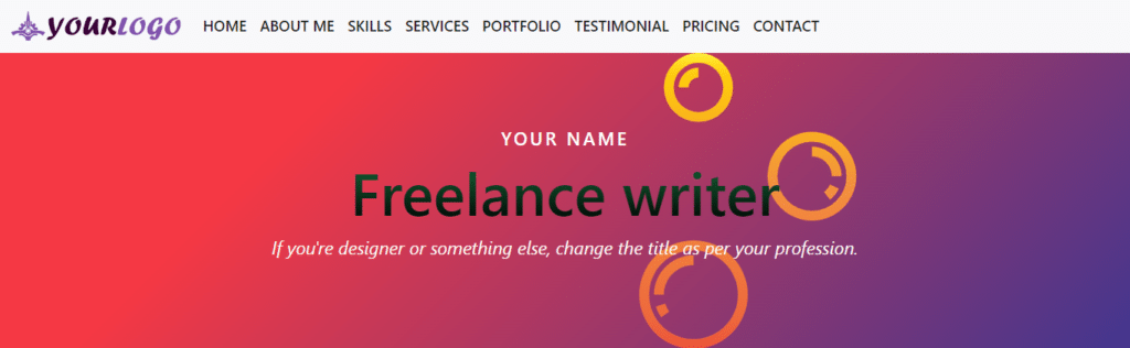
In this post, I will show how you can make a header navigation menu. This header will also contain a logo and the menu will be mobile-responsive. Also, I will show you how to do it without using Bootstrap and using it.
You can copy the code and use it on your project. Also, you will get a downloadable zip file for each header template.

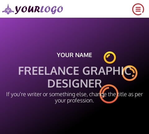
The header template will be the same as seen in the above screenshot. As I mentioned earlier, this header will also be mobile-responsive. See the screenshot of the mobile version below:
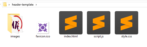
Files & folder structure
Before I jump into the code for this header template, let me show you the file & folder structure that I have. See the screenshot below:
HTML
<!DOCTYPE html>
<html lang="en">
<head>
  <meta charset="UTF-8">
  <meta http-equiv="X-UA-Compatible" content="IE=edge">
  <meta name="viewport" content="width=device-width, initial-scale=1.0">
  <link rel="shortcut icon" href="favicon.ico">
  <!-- google fonts -->
  <link href="https://fonts.googleapis.com/css2?family=Roboto+Condensed&display=swap" rel="stylesheet">
  <!-- font-family: 'Roboto Condensed', sans-serif; -->
  <link href="https://fonts.googleapis.com/css2?family=Oxygen:wght@300;700&display=swap" rel="stylesheet">
  <!-- font-family: 'Oxygen', sans-serif; -->
  <link rel="stylesheet" type="text/css" href="style.css" >
  <title>Your Name -Portfolio</title>
</head>
<body>
  <nav class="site-header">
    <div class="nav-logo">
      <a href="index.html">
        <img src="images/logo.png" alt="logo" width="314" height="60">
      </a>
    </div>
    <button class="hamburger"><img src="images/menu.png" alt="menu toggle icon"></button>
    <div class="nav-links">
      <ul>
        <li><a href="index.html">Home</a></li>
        <li><a href="#about">About Me</a></li>
        <li><a href="#skill">Skills</a></li>
        <li><a href="#service">Services</a></li>
        <li><a href="#portfolio">Portfolio</a></li>
        <li><a href="#testimonial">Testimonial</a></li>
        <li><a href="#pricing">Pricing</a></li>
        <li><a href="#contact">Contact</a></li>
      </ul>
    </div>
  </nav><!-- .site-header -->
  <section class="banner">
    <div class="banner--content">
      <h3 class="name">Your name</h3>
      <h1 class="designation">Freelance graphic designer</h1>
      <p class="tagline">If you're writer or something else, change the title as per your profession.</p>
    </div>
  </section><!-- .banner -->
  <script src="script.js"></script>
</body>
</html>
Above is the entire HTML code. Don’t worry! You’ll get the full template in a zip format later (downloadable). I have the following CSS below.
CSS
html {
  line-height: 1.15;
}

* {
  -webkit-box-sizing: border-box;
          box-sizing: border-box;
}

body {
  margin: 0;
  font-family: 'Oxygen', sans-serif;
  position: relative;
}

section {
  padding: 90px 15px;
}

.content {
  max-width: 1200px;
  display: block;
  margin: 0 auto;
}

p {
  font-size: 18px;
  margin: 5px 0 10px;
}

.bold {
  font-weight: 700;
}

.orange {
  color: #FF5100;
}

h2 {
  font-size: 36px;
  margin: 5px 0 10px;
}

@media screen and (min-width: 768px) {
  h2 {
    font-size: 70px;
    color: #848484;
    font-weight: 700;
  }
}

img {
  max-width: 100%;
  height: auto;
}

.center {
  text-align: center;
}

.site-header {
  z-index: 10;
  font-family: 'Roboto Condensed', sans-serif;
  display: -webkit-box;
  display: -ms-flexbox;
  display: flex;
  -webkit-box-align: center;
      -ms-flex-align: center;
          align-items: center;
  -webkit-box-orient: vertical;
  -webkit-box-direction: normal;
      -ms-flex-direction: column;
          flex-direction: column;
  position: -webkit-sticky;
  position: sticky;
  top: 0;
  background-color: #FFF;
}

@media screen and (min-width: 1250px) {
  .site-header {
    -webkit-box-pack: justify;
        -ms-flex-pack: justify;
            justify-content: space-between;
    -webkit-box-orient: horizontal;
    -webkit-box-direction: normal;
        -ms-flex-direction: row;
            flex-direction: row;
  }
}

.site-header .nav-logo {
  -ms-flex-item-align: start;
      align-self: flex-start;
  padding: 10px 5px 5px;
}

.site-header .nav-logo a img {
  max-width: 200px;
  height: auto;
}

@media screen and (min-width: 768px) {
  .site-header .nav-logo a img {
    max-width: 314px;
    height: auto;
  }
}

.site-header .nav-links {
  display: none;
  width: 100%;
  background-color: #DEF0FF;
}

@media screen and (min-width: 1250px) {
  .site-header .nav-links {
    display: block;
    background-color: #FFF;
  }
}

.site-header .nav-links ul {
  padding: 0;
  display: -webkit-box;
  display: -ms-flexbox;
  display: flex;
  -webkit-box-orient: vertical;
  -webkit-box-direction: normal;
      -ms-flex-direction: column;
          flex-direction: column;
  -webkit-box-pack: end;
      -ms-flex-pack: end;
          justify-content: flex-end;
}

@media screen and (min-width: 1250px) {
  .site-header .nav-links ul {
    -webkit-box-orient: horizontal;
    -webkit-box-direction: normal;
        -ms-flex-direction: row;
            flex-direction: row;
  }
}

.site-header .nav-links ul li {
  list-style: none;
}

.site-header .nav-links ul li a {
  font-size: 18px;
  text-transform: uppercase;
  font-family: 400;
  color: #7f53ac;
  letter-spacing: 1.2px;
  padding: 10px 15px;
  text-decoration: none;
  display: block;
}

.site-header .nav-links ul li:hover {
  background-color: #efe0ff;
}

.site-header button {
  cursor: pointer;
  background: transparent;
  border: none;
  max-width: 50px;
  display: block;
  position: absolute;
  top: 10px;
  right: 10px;
}

@media screen and (min-width: 768px) {
  .site-header button {
    top: 20px;
  }
}

@media screen and (min-width: 1250px) {
  .site-header button {
    display: none;
  }
}

.nav-links.active {
  display: block;
}

.banner {
  padding: 90px 15px;
  background-color: #923cb5;
  background-image: linear-gradient(147deg, #923cb5 0%, #000000 74%);
  text-align: center;
  color: #FFFFFF;
}

.banner .banner--content {
  max-width: 1400px;
  height: auto;
  display: block;
  margin: 0 auto;
  background: url("./images/soap.svg");
  background-repeat: no-repeat;
  background-position: top right;
  background-size: contain;
}

.banner .banner--content .name {
  text-transform: uppercase;
}

.banner .banner--content .designation {
  color: rgba(255, 255, 255, 0.7);
  text-transform: uppercase;
  font-family: 'Oxygen', sans-serif;
  font-weight: 700;
  font-size: 36px;
  margin: 0;
}

@media screen and (min-width: 768px) {
  .banner .banner--content .designation {
    font-size: 70px;
  }
}

.banner .banner--content .tagline {
  font-size: 18px;
}

@media screen and (min-width: 768px) {
  .banner .banner--content .tagline {
    font-size: 26px;
  }
}
JavaScript
To make the navigation menu work on mobile devices, I have a few lines of simple JavaScript that works without any dependencies and jQuery. It’s simply pure JavaScript.
const hamburger = document.getElementsByClassName("hamburger")[0]
const mobileNavs = document.getElementsByClassName("nav-links")[0]

hamburger.addEventListener("click", () => {
  mobileNavs.classList.toggle("active")
})
As you have seen on the folder structure, I have a favicon.ico that is not mandatory but good to have. Also, I have 3 the logo, a hamburger menu icon, and an SVG file in the images folder. And you should have the image folder too.
Once you have all these files and folders, drag & drop the “index.html” file into your web browser. And you will see the header template. Feel free to customize it as you see fit.
Have trouble understanding the code in separate places? Download the template
I have the same file & folder structure as the first example. If you’re not sure, please see the above.
For this Bootstrap header template, I will also give you a downloadable zip file. Here I tried to create a similar design to the first one using Bootstrap. See the following HTML code in my “index.html” file.
HTML
<!doctype html>
<html lang="en">
  <head>
    <meta charset="utf-8">
    <meta name="viewport" content="width=device-width, initial-scale=1">
    <link rel="shortcut icon" href="favicon.ico">
    <title>Bootstrap header template</title>
    <link href="https://cdn.jsdelivr.net/npm/[email protected]/dist/css/bootstrap.min.css" rel="stylesheet" integrity="sha384-0evHe/X+R7YkIZDRvuzKMRqM+OrBnVFBL6DOitfPri4tjfHxaWutUpFmBp4vmVor" crossorigin="anonymous">
    <link rel="stylesheet" href="style.css">
  </head>
  <body>
    <nav class="navbar navbar-expand-lg bg-light">
      <div class="container-fluid">
        <a class="navbar-brand" href="/index.html">
          <img src="images/logo.png" alt="logo">
        </a>
        <button class="navbar-toggler" type="button" data-bs-toggle="collapse" data-bs-target="#navbarSupportedContent" aria-controls="navbarSupportedContent" aria-expanded="false" aria-label="Toggle navigation">
          <span class="navbar-toggler-icon"></span>
        </button>
        <div class="collapse navbar-collapse" id="navbarSupportedContent">
          <ul class="navbar-nav me-auto mb-2 mb-lg-0">
            <li class="nav-item">
              <a class="nav-link active" aria-current="page" href="#">Home</a>
            </li>
            <li class="nav-item">
              <a class="nav-link active" aria-current="page" href="#">About me</a>
            </li>
            <li class="nav-item">
              <a class="nav-link active" aria-current="page" href="#">Skills</a>
            </li>
            <li class="nav-item">
              <a class="nav-link active" aria-current="page" href="#">Services</a>
            </li>
            <li class="nav-item">
              <a class="nav-link active" aria-current="page" href="#">Portfolio</a>
            </li>
            <li class="nav-item">
              <a class="nav-link active" aria-current="page" href="#">Testimonial</a>
            </li>
            <li class="nav-item">
              <a class="nav-link active" aria-current="page" href="#">Pricing</a>
            </li>
            <li class="nav-item">
              <a class="nav-link active" aria-current="page" href="#">Contact</a>
            </li>

          </ul>
        </div>
      </div>
    </nav>
    <!-- navigation menu ends here -->
    <!-- hero section/banner start from below -->
    <div class="container-fluid" id="banner">
      <div class="row">
        <h3>Your name</h3>
        <h1>Freelance writer</h1>
        <p>If you're designer or something else, change the title as per your profession.</p>
      </div>
    </div>


    <script src="https://cdn.jsdelivr.net/npm/[email protected]/dist/js/bootstrap.bundle.min.js" integrity="sha384-pprn3073KE6tl6bjs2QrFaJGz5/SUsLqktiwsUTF55Jfv3qYSDhgCecCxMW52nD2" crossorigin="anonymous"></script>
  </body>
</html>
CSS
I could design the header without any additional CSS but wrote a couple of lines to create a similar look. Anyways, I have the following CSS in my “style.css” file.
.navbar .navbar-brand img {
  max-height: 40px;
  width: auto;
}
.navbar ul li a {
  font-size: 18px;
  text-transform: uppercase;
  font-weight: 600;
}
#banner {
  background-color: #42378f;
  background-image: linear-gradient(315deg, #42378f 0%, #f53844 74%);
}
#banner .row {
  max-width: 800px;
  display: block;
  margin: 0 auto;
  text-align: center;
  padding: 90px 15px;
  background: url("./images/soap.svg");
  background-repeat: no-repeat;
  background-position: top right;
  background-size: contain;
}
#banner .row h3 {
  text-transform: uppercase;
  color: #FFFFFF;
  font-size: 1.375rem;
  letter-spacing: 3px;
}
#banner .row h1 {
  font-size: 36px;
  background: -webkit-linear-gradient(#166d3b, #000000);
  -webkit-background-clip: text;
  -webkit-text-fill-color: transparent;
}
@media (min-width: 768px) {
  #banner .row h1 {
    font-size: 72px;
  }
}
#banner .row p {
  font-size: 22px;
  font-style: italic;
  color: #fffdf7;
}
For this Bootstrap navigation menu, I don’t need any additional JavaScript.
Because the mobile navigation is already working through the Bootstrap JS that we added before the closing ‘body’ tag (bootstrap.bundle.min.js).
You can take a copy of the code by clicking on it. However, you can download the header template (Bootstrap) in zip format and use it for your own project.
Build HTML CSS projects
Conclusion
Now you know how to make a navigation menu using Bootstrap and without using Bootstrap (HTML, CSS & JS). In this post, you also got two downloadable header templates. Use whatever is easier for you. I tried to keep the code as simple as possible. If you have any confusion, please let me know.