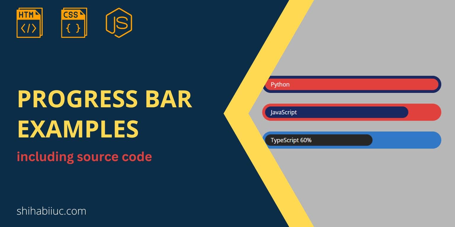
In this post, I will give you some progress bar examples that have been created in HTML, CSS & JavaScript. Let’s see the live examples below.
Live preview of the progress bars
For the above progress bars, I have the following HTML, CSS & JavaScript.
HTML
<div class="progress-bar" style="--width: 30" data-label="Python"></div>
<div class="progress-bar js" style="--width: 30" data-label="JavaScript"></div>
<div class="progress-bar ts" style="--width: 30" data-label="TypeScript 60%"></div>
CSS
:root {
  --color1: #182860;
  --color2: #e0413d;
  --color3: #3178C6;
  --color4: #262626;
}
*, *::before, *::after {
  -webkit-box-sizing: border-box;
          box-sizing: border-box;
}
.progress-bar {
  width: 500px;
  max-width: 100%;
  height: 3em;
  background-color: var(--color1);
  border-radius: 1.5em;
  color: white;
  position: relative;
  margin-bottom: 30px;
}
.progress-bar::before {
  content: attr(data-label);
  display: -webkit-box;
  display: -ms-flexbox;
  display: flex;
  -webkit-box-align: center;
      -ms-flex-align: center;
          align-items: center;
  position: absolute;
  top: .5em;
  left: .5em;
  bottom: .5em;
  width: calc(var(--width, 0) * 1%);
  min-width: 2rem;
  max-width: calc(100% - 1em);
  background-color: var(--color2);
  border-radius: 1em;
  padding: 1em;
  white-space: nowrap;
}
.progress-bar.js {
  background-color: var(--color2);
}
.progress-bar.js::before {
  background-color: var(--color1);
  max-width: calc(100% - 20%);
}
.progress-bar.ts {
  margin-bottom: 0;
  background-color: var(--color3);
}
.progress-bar.ts::before {
  background-color: var(--color4);
  max-width: calc(100% - 40%);
}
JavaScript
const progressbar = document.getElementsByClassName("progress-bar")[0]
setInterval(() => {
  const computedStyle = getComputedStyle(progressbar)
  const width = parseFloat(computedStyle.getPropertyValue('--width')) || 0
  progressbar.style.setProperty('--width', width + .1)
}, 3)
// second example
const progressbarjs = document.getElementsByClassName("js")[0]
setInterval(() => {
  const computedStyleJS = getComputedStyle(progressbarjs)
  const width = parseFloat(computedStyleJS.getPropertyValue('--width')) || 0
  progressbarjs.style.setProperty('--width', width + .1)
}, 10)
// third example
const progressbarts = document.getElementsByClassName("ts")[0]
setInterval(() => {
  const computedStyleTS = getComputedStyle(progressbarts)
  const width = parseFloat(computedStyleTS.getPropertyValue('--width')) || 0
  progressbarts.style.setProperty('--width', width + .1)
}, 20)
How to edit these progress bars?
Aside from the color, background, etc, you may also need to change the text/label and percentage of the progress bars. And this is what I am going to show you here.
Change the text or label
To change the labels such as Python, JavaScript, and TypeScript, go to the HTML file and you will find them in the data-label attribute. Here you can change the texts.
Change the percentage of the progress bars
In the first example, it has 100% progress. The second & third have 80% & 60% respectively.
To change these percentages, navigate to the CSS and look for the progress bar ::before pseudo-elements. Here you can change the percentage in the max-width property.
For example, if you need 70% progress, then it will be max-width: calc(100% - 30%).
How to create a new progress bar
In my examples, I have 3 of them. But you may need 5 of them. Deleting a couple of them is easy. But if you want to create a new one, then you have to write some HTML, CSS & JavaScript.
Let’s say you need to create a 4 one for the ReactJS progress bar. Let’s create the HTML like the following:
<div class="progress-bar reactjs" style="--width: 30" data-label="ReactJS"></div>As you see in the above HTML, I added a new CSS class .reactjs but you can name it anything. However, we need to use this class name for both CSS & JS files.
Now go to your CSS file and write some CSS for it.
.progress-bar.reactjs {
  background-color: yellow;
}
.progress-bar.reactjs::before {
  background-color: green;
  /* if you want 90% progress */
  max-width: calc(100% - 10%);
  /* if you want 100% progress,
    you don't have to
    assign any max-width */
}
Lastly, you also have to write some JavaScript for the new progress bar. Let me show you how:
const progressbarreactjs = document.getElementsByClassName("reactjs")[0]
setInterval(() => {
  const computedStyleReact = getComputedStyle(progressbarreactjs)
  const width = parseFloat(computedStyleReact.getPropertyValue('--width')) || 0
  progressbarreactjs.style.setProperty('--width', width + .1)
}, 20)
//you can change this number "20" to anything else.
//if you increase this number, the progress bar
// will go slowly and vise versa
Build HTML CSS projects
Conclusion
I gave you some examples and explained how you can edit or create a new progress bar in the same manner. If you have any questions, let me know.