In this post, I will show you how to create a multi-page website in HTML. End of it, I will also give you the full source code to download. You will also learn how to upload this static HTML website to a live domain & hosting.
As we go through, you will also learn some basic CSS to style the HTML web pages. Last but not least, you will also learn how to make it mobile-responsive.
See the live preview that we’re going to build in this post.
Let’s get started.
How to create a multi-page website in HTML?
To create a multi-page website, we need to create multiple HTML files. The most important part in this context is to create a clear navigation menu so the visitors can click through the pages & navigate the site easily.
Other than that, the rest of the page content will be as usual as you create any other HTML files.
Create necessary files & folders
Before we write any code, our first step is to create a project folder. You can name it anything however, make sure the folder name does not contain any space or weird symbols.
In this example, I created a folder named “webdesign” on my desktop. Also, I will create 3 different pages but you can create more. The name of the pages will be “Home, About & Contact.”
So I will also create three different HTML files in the project folder named “index.html, about.html & contact.html.” Here the “index.html” will be the home page. That means if anyone clicks on the “Home” then the “index.html” file will be displayed.
Additionally, I will create another file called “style.css” to write all my CSS (to style all the web pages).
See the project structure below.
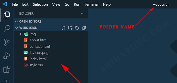
As you see I have an additional folder (img) for storing images & a favicon (favicon.png) for the site identity. It’s not mandatory to have but professionals have it. So I would suggest you have the favicon as well.
Open the files in a text editor
There are countless text editor programs you can choose from. For example, notepad++, sublime text, atom, etc. If you are already familiar with any text editor & using it, then you can definitely go for it. But if you need suggestions, I would recommend “Visual Studio Code” commonly known as “VS Code.” It’s totally free & available for all operating systems. You can download the “Visual Studio Code” editor from their official website.
It was created by Microsoft. But more importantly, it works very well, and it has a built-in terminal as well.
Anyways, after you open the project folder or the files in your text editor, together we can write some code now.
Write code in the index.html to create the home page
In the first step, we will work on the “index.html & style.css” and then copy & paste the global header & footer to the other files.
HTML is a markup language (HyperText Markup Language) and any HTML document consists of a basic skeleton as I explained in the following infographic & in plain English.
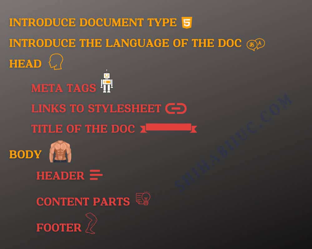
If you convert the above infographic into an HTML markup, this will be as follows:
<!DOCTYPE html>
<html lang="en">
<head>
  <meta charset="UTF-8">
  <meta http-equiv="X-UA-Compatible" content="IE=edge">
  <meta name="viewport" content="width=device-width, initial-scale=1.0">
  <link rel="stylesheet" href="style.css">
  <link rel="shortcut icon" href="favicon.png" type="image/x-icon">
  <title>Home</title>
</head>
<body>
  <nav>
    <!-- header navigation goes here -->
  </nav>

  <section>
    <!-- main content part goes here -->
  </section>

  <footer>
    <!-- footer goes here -->
  </footer>
</body>
</html>
You really don’t need to memorize the above HTML markup & your text editor can produce it for you. You can think of this as a boilerplate code.
At this point, you may think of reusing one navigation bar for multiple pages. But you can’t do it with plain HTML & without using JavaScript.
However, you can do it in all back-end programming such as PHP, Node, Ruby/Rails, etc. To keep things simple & easy to digest, we will copy-paste this same navigation bar to all the HTML pages.
Let’s create it first.
I am planning to create a header navigation that will have the following elements:
- A Logo on the left side
- The actual navigation menu links on the right side
To solve this purpose, I have the following HTML code for the entire header navigation:
<header>
  <nav>
    <div class="logo-container">
      <a href="index.html"><img src="img/logo.png" alt="logo"></a>
    </div>
    <div class="navigation-container">
      <ul>
        <li><a href="index.html">Home</a></li>
        <li><a href="about.html">About</a></li>
        <li><a href="contact.html">Contact</a></li>
      </ul>
    </div>
  </nav>
</header>As you see in the above code, I have the HTML file names in the “href” value. That means if someone clicks any of the links (home, about, contact), the corresponding HTML file will open. For example, if you click the “Home” link, the “index.html” file will open, and so on and so forth. This is how you create links in a static website.
I already have created a logo and it lives in the “img” folder. Only with the above HTML, my header navigation looks like the following screenshot.

As you see, it definitely needs some styling to properly align the different parts of the navigation.
With this mindset, I wrote CSS that made the entire header navigation like this screenshot below.


The CSS for the navigation bar:
/* header navigation menu */
header {
  background-color: #0C1733;
}
nav {
  max-width: 1200px;
  margin: 0 auto;
  display: flex;
  align-items: center;
}
nav .logo-container {
  max-width: 130px;
}
@media (min-width: 768px) {
  nav .logo-container {
    max-width: 250px;
  }
}
nav .logo-container a img {
  margin: 15px 5px;
}
nav .navigation-container {
  width: 100%;
}
nav .navigation-container ul {
  padding: 0;
  margin: 0;
  display: flex;
  justify-content: flex-end;
  align-items: center;
}
nav .navigation-container ul li {
  list-style: none;
  padding: 0;
  margin: 0;
}
nav .navigation-container ul li a {
  text-decoration: none;
  text-transform: uppercase;
  font-weight: 700;
  font-size: 1rem;
  font-style: italic;
  color: #FFFFFF;
  padding: 10px 5px;
  transition: all 0.9s ease-out;
}
@media (min-width: 768px) {
  nav .navigation-container ul li a {
    font-size: 1.125rem;
    padding: 30px 15px;
  }
}
nav .navigation-container ul li a:hover {
  background-color: #37415c;
  color: #E0413D;
}
In this example, we only have 3 navigation menu links and I made this responsive for mobile. But what if you have 10 of them?
If you want to learn how to create a responsive navigation bar that has lots of menu links, please see how to create a hamburger menu.
Anyways, since we completed the navigation, now it’s time to copy the code and paste it on the rest of the HTML files (about & contact). I know it’s redundant but this is how you work with plain HTML web pages.
And this same thing is true for the HTML footers. In the next section, I will create a footer very quickly & reuse it just like we did for the header.
To create a footer, I decided to make a three-column layout and then a row below it that contains the copyright text.
Just like the header, it’s also mobile responsive. However, I used flexbox CSS to create the layout & aligning elements. You can check my other post (including a video) that teaches flexbox CSS in detail.
Note: All these contact information are placeholders and you have to replace them with yours.
To meet this goal, I have the following HTML & CSS.
<footer>
  <div class="footer-container">
    <div class="footer-col">
      <img src="./img/logo.png" alt="logo">
      <p>Lorem ipsum dolor sit amet consectetur adipisicing elit. Itaque nostrum porro rem est ab ad accusantium eveniet exercitationem corporis voluptas, dolores amet maxime facilis maiores! Ea corrupti rerum sunt velit.</p>
    </div>
    <div class="footer-col">
      <h4>Contact options</h4>
      <p><a href="mailto:[email protected]?subject=Enquiry&body=Hello, I have a question">Email me</a></p>
      <p>Call me: <a href="tel:+1234567890">+1 (234) 567-8900</a></p>
      <p><a href="https://wa.me/1234567890?text=Hello,%20I%20have%20a%20question">Contact me on WhatsApp</a></p>
    </div>
    <div class="footer-col">
      <h4>Sitemap</h4>
      <nav>
        <ul>
          <li><a href="index.html">Home</a></li>
          <li><a href="about.html">About</a></li>
          <li><a href="contact.html">Contact</a></li>
        </ul>
      </nav>
    </div>
  </div>
  <div class="bottombar">Copyright © 2023 Your_Name. All rights reserved.</div>
</footer>
footer {
background-color: #193549;
padding: 90px 0 0;
}
footer .footer-container {
max-width: 1200px;
margin: 0 auto;
}
footer .footer-container p, a, h4 {
color: #FFFFFF;
}
footer .footer-container h4 {
margin: 0 0 10px;
}
footer .footer-container p, a {
font-size: .875rem;
}
footer .footer-container img {
max-width: 200px;
}
footer .footer-container .footer-col {
margin: 0 15px 60px;
padding: 30px;
border-radius: 4px;
background: #15232D;
box-shadow: 2px 2px 2px #15232D;
box-shadow: inset 2px 2px 2px hsla(0,0%,100%,.25), inset -2px -2px 2px rgba(0,0,0,.25);
}
footer .footer-container .footer-col ul li {
list-style: none;
}
@media (min-width: 768px) {
footer .footer-container {
display: flex;
justify-content: space-between;
}
footer .footer-container .footer-col {
flex-basis: 32%;
}
}
footer .bottombar {
padding: 20px 15px;
background-color: #070e14;
text-align: center;
font-style: italic;
color: #FFFFFF;
}As you see I completed writing HTML & CSS for the footer. So I will copy the HTML (only) and paste it on the rest of the files (about.html & contact.html).
At this point, we have the same global header & footer all across the website. That means if you go to any of the pages, you’ll see the same header navigation & footer.
Let’s complete the main content area.
Create the main content area of the HTML pages
Depending on your niche, skills & choice, the web pages will be different. You can include any type of layout, or design (colors, fonts, etc).
If you’re a web designer and want to create a static HTML website for you, or if you’re a graphic designer or content writer, or if you have a general business that needs a basic informational website, you can definitely take my concept and use it on your own project.
That means, you can download the multipage HTML website template that I created from scratch and customize it as you see fit.
So I will quickly create the main content area for all three pages (home, about & contact).
Create the home page (front page)
On the home page, I created 6 different sections as follows:
- Banner or hero section
- An intro
- Services
- Completed projects
- Testimonial
- Skills & expertise
You will find more detail on the demo page/website.
Create about page
On the about page, I created 3 sections for you. There are as follows:
- An introduction about you
- Why people should work with you
- Your past employment history. It also contains a link that will allow your visitors to download your resume/CV.
I also created a totally different about-us page template. If you want, feel free to download the template from another post.
Create contact page
The contact page only contains one section (two columns). It contains a generic message/text and contact methods.
See the live demo
I tried to explain how to create a multiple-page HTML website in the best way possible. Also, I explained the code where necessary.
However, it’s obvious to make mistakes and not see the expected outcome. So you can see the live demo and compare your web pages with mine.
As mentioned at the beginning of this post, I will give you the complete code. You can download it below.
Download the multipage HTML template
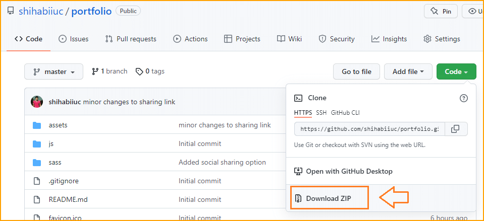
No subscription is required! The above picture shows a different repository name. The purpose of the picture is to show you the process of downloading files from GitHub.
Download this HTML template on GitHub »Alternatively, you can clone this repository using the command line (Git Bash, Terminal)
Build HTML CSS projects
Conclusion
To make this post easy to understand & easy to follow, I only used only HTML & CSS. And I did not even include JavaScript here. However, I have JavaScript-related posts on this blog.
Anyways, some of you may think that is why I have not used any CSS frameworks or libraries such as Bootstrap, Zurb Foundation, Tailwind, etc. This is just because I tried to make you understand the styling technics better.
HTML page linking technics is a bit different than any others. Here we include the file name itself in the “HREF.”
If you have any questions, confusion, or even suggestions regarding this post or templates, please let me know. I believe, this post will help you to create your own multi-page HTML template/website.

