If you’re trying to create a responsive navigation menu that works well on all screen sizes, this post will walk you in the right direction. Aside from the responsive header, you’ll also learn how to create a simple hamburger menu for smaller screen sizes.
End of this post, the source code is available for download.
Before you start building the navigation menu, see the demo in the link below.
In this example, I will use HTML, CSS & a few lines of JavaScript. As you saw on the live demo, the same header navigation works for all screen sizes. And this is what we are going to build.
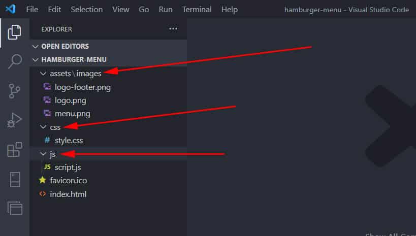
Files & folder structure
I have the following project setup as you see in the screenshot below.
HTML
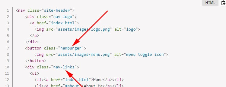
For the entire header navigation, I have the following HTML markup. This HTML contains a logo and the menu items (links).
<nav class="site-header">
	<div class="nav-logo">
	  <a href="index.html">
	    <img src="assets/images/logo.png" alt="logo">
	  </a>
	</div>
	<button class="hamburger">
		<img src="assets/images/menu.png" alt="menu toggle icon">
	</button>
	<div class="nav-links">
	  <ul>
	    <li><a href="index.html">Home</a></li>
	    <li><a href="#about">About Me</a></li>
	    <li><a href="#skill">Skills</a></li>
	    <li><a href="#service">Services</a></li>
	    <li><a href="#portfolio">Portfolio</a></li>
	    <li><a href="#testimonial">Testimonial</a></li>
	    <li><a href="#pricing">Pricing</a></li>
	    <li><a href="#contact">Contact</a></li>
	  </ul>
	</div>
</nav><!-- .site-header -->
As you see in the above HTML, the entire header is wrapped by a <nav> tag. It also helps search engines to better understand the navigation.
Then, I have a <div> that contains the logo (inside a link). If you click the logo, it will redirect you to the home page (index.html).
After the logo, I have a button that contains a hamburger icon/image instead of text.
Finally, I have another <div> that contains the actual menus (list item).
Only with the above HTML, it will look like the screenshot below.
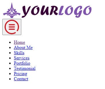
As you see on the above code, the logo & the hamburger menu icon live in the “assets/images” directory.
So if your project setup differs from mine, ensure you updated the above two image paths in your HTML.
CSS
I wrote the following CSS to hide the hamburger icon on large devices and to make the header navigation look nice.
.site-header {
  display: flex;
  align-items: center;
  flex-direction: column;
  background-color: #FFF;
  z-index: 10;
}
@media screen and (min-width: 1250px) {
  .site-header {
    justify-content: space-between;
    flex-direction: row;
  }
}
.site-header .nav-logo {
  align-self: flex-start;
  padding: 10px 5px 5px;
}
.site-header .nav-logo a img {
  max-width: 200px;
  height: auto;
}
@media screen and (min-width: 768px) {
  .site-header .nav-logo a img {
    max-width: 314px;
    height: auto;
  }
}
.site-header .nav-links {
  display: none;
  width: 100%;
}
@media screen and (min-width: 1250px) {
  .site-header .nav-links {
    display: block;
  }
}
.site-header .nav-links ul {
  display: flex;
  flex-direction: column;
  justify-content: flex-end;
  position: absolute; /* to prevent content pushing down */
  width: 100%;
  background-color: rgba(222, 240, 255, 0.95);
  margin: 0;
  padding: 0;
}
@media (min-width: 1250px) {
  .site-header .nav-links ul {
    position: static;
    background-color: transparent;
  }
}
@media screen and (min-width: 1250px) {
  .site-header .nav-links ul {
    flex-direction: row;
  }
}
.site-header .nav-links ul li {
  position: relative; /* to prevent content pushing down*/
  list-style: none;
  border-bottom: 1px solid #c7e5fc;
  border-top: 1px solid #f0f8ff;
}
@media (min-width: 1250px) {
  .site-header .nav-links ul li {
    position: static;
  }
}
@media (min-width: 1250px) {
  .site-header .nav-links ul li {
    border: none;
  }
}
.site-header .nav-links ul li a {
  font-size: 18px;
  text-transform: uppercase;
  font-weight: 400;
  color: #7f53ac;
  letter-spacing: 1.2px;
  padding: 10px 15px;
  text-decoration: none;
  display: block;
}
.site-header .nav-links ul li:hover {
  background-color: #efe0ff;
}
.site-header button {
  cursor: pointer;
  background: transparent;
  border: none;
  max-width: 50px;
  display: block;
  position: absolute;
  top: 10px;
  right: 10px;
}
@media screen and (min-width: 768px) {
  .site-header button {
    top: 20px;
  }
}
@media screen and (min-width: 1250px) {
  .site-header button {
    display: none;
  }
}
.nav-links.active {
  display: block;
}
Based on my CSS, the breakpoint is below 1250px. It means that if the screen size is smaller than 1250px, the hamburger menu will appear. And it will disappear on 1250px and above.
With the above HTML & CSS in place, the header navigation menu will look like the following screenshot.

JavaScript
Just like the above screenshot, you will see the hamburger menu icon on mobile devices but it won’t work until you write the following JavaScript. Don’t worry, you only need a few lines of JavaScript to complete the project.
To make the hamburger menu work (toggling), I wrote the following JavaScript:
const hamburger = document.getElementsByClassName("hamburger")[0]
const mobileNavs = document.getElementsByClassName("nav-links")[0]

hamburger.addEventListener("click", () => {
  mobileNavs.classList.toggle("active")
})
In my code, I have two constant/variables (hamburger & mobileNavs).
Since I don’t need to redeclare them, so I used const (constant) instead of let/var.
In my HTML, I have two classes such as .hamburger & .nav-links (as you also see in the screenshot below).
getElementsByClassName in JavaScript is the way to find all HTML elements by class name. My constants (const) contain the first element of each item using the zero index [0] (if don’t know, JavaScript arrays are zero-indexed). So the index or serial or order of the first item is 0, for the second item it’s 1, for the third item it’s 2, and so on and so forth.
In the next step, I have a method (addEventListener) that is listening for the click event. This method also contains an arrow function.
And this function toggles (adds and removes) .active class to the .nav-links.
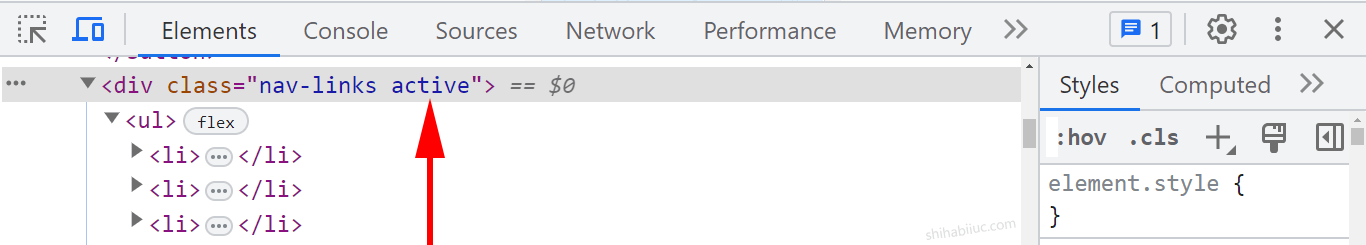
The .nav-links or the navigation menu is initially hidden on small screens. I made it hidden using CSS display: none.
But when you click the hamburger icon for the first time, it adds the .active class to the .nav-links. The .active has a CSS of display: block.
So if someone clicks the hamburger icon for the first time, the menu becomes visible. If someone clicks it for the second time, the .active class gets removed from the .nav-links and as well as the menu disappears. Because the display: block is specified to the .active class. Once the .active class is removed, the CSS changes to display: none. Because .nav-links is set to display: none initially.
This is how the hamburger icon & navigation menu works together both on small & large screens.
JavaScript references:
Troubleshoot
After following this guideline, if you see that your hamburger menu does not work, make sure you added the stylesheet & script to the HTML file. See the following basic HTML as a reference.
<!DOCTYPE html>
<html lang="en">
  <head>
    <link rel="stylesheet" type="text/css" href="css/style.css" >
    <!-- if your style.css lives inside css folder -->
  </head>

  <body>
    <script src="js/script.js"></script>
    <!-- if your script.js lives inside js folder -->
  </body>
</html>
Download the source code
I tried to make you understand how things are working behind the scenes. And I explained the code along the way. But if you need to download the entire source code, use the following button.
After you download the source code from my GitHub repository, you will find all the necessary files and folders. However, the CSS file lives in the “sass” folder. But you don’t have to use SASS if you don’t like it. The only file you need in this folder is “style.css” and ignore all other partials (_file.scss). I included these files (partials) because some of you may like to use SASS. But if you don’t like SASS, just ignore the other files in the “sass” folder and only look/work on “style.css.”
Build HTML CSS projects
Conclusion
I followed the mobile-first web design philosophy when writing code for the header navigation. There are various ways to make responsive navigation and hamburger menu. In this post, I showed you one of my preferred & simplest ways to do it.
You got all the code and even a link to my GitHub repository. I explained all the code bit by bit and provided all the necessary screenshots. Therefore if you still have any questions, please let me know.

