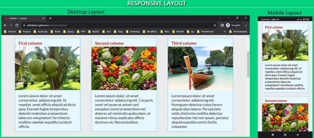
A responsive website is a layout that adapts all screen sizes such as mobile phones, tablets, desktops, etc. It does not require any extra effort for the end users to view the website on any device. A responsive website automatically fits the device viewport no matter what is the width & height.
For example, a three-column layout on a desktop automatically breaks into one column on mobile. And the visitors don’t have to scroll horizontally on a smaller screen.
Back in the 2000s, websites were made only for one screen size (such as large devices). So visitors had to scroll both horizontally & vertically which was difficult. In 2010, the responsive web design concept was first introduced by Ethan Marcotte.
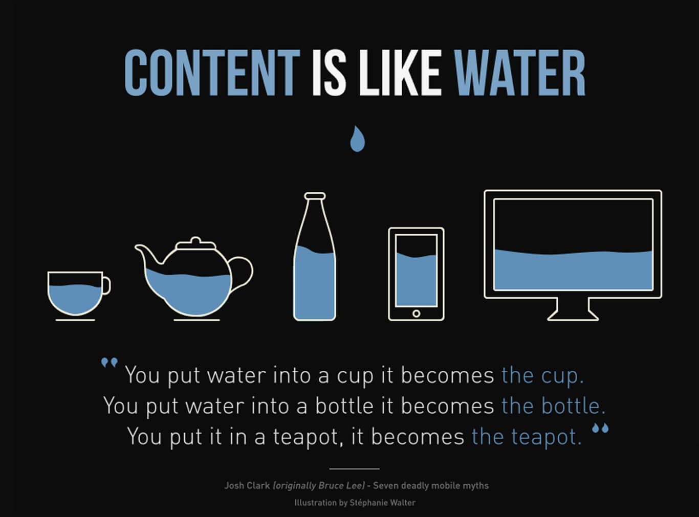
In this concept, websites were viewed as water. No matter what the utensil, water adapts to any shape or size. In the same vein, websites should be resized to adapt to any screen size no matter what the device is. You can think of this as a comparison for adapting. To learn more about the concept, you can read the history on Wikipedia.
How does responsive web design work?
CSS is the heart & soul of a responsive web design. To be more specific, it’s CSS media queries. A media query defines a screen size and respecifies the CSS rules for that screen.
There are two types of media queries:
- Mobile-first media query (from lowest to highest width/screen size)
- From large screens to smaller screens (opposite of mobile-first media query)
A media query resizes the web pages based on the screen sizes. Let’s see more details about the two different media queries.
1. Mobile-first media query
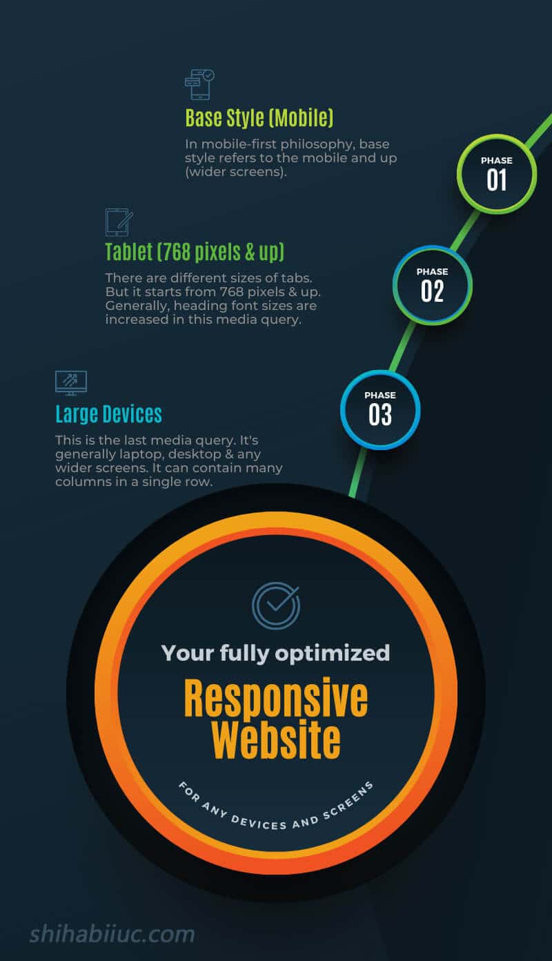
In this media query, the specification of screen size starts from the lowest size to the highest size. See the following CSS:
h2 {
  font-size: 26px;
}
@media (min-width: 768px) {
  h2 {
    font-size: 36px;
  }
}
@media (min-width: 1200px) {
  h2 {
    font-size: 50px;
  }
}
In the above CSS, I have 3 different font sizes for the heading (h2).
The first specification h2 {font-size: 26px} applies to any small screen size until the viewport hits 768 pixels width. It’s mainly for mobile screens. This is actually the base rule and the heading font size will be 26 pixels.
The second specification has a CSS media query of @media (min-width: 768px). It respecifies the heading font size for the 768 pixels & up. That means if the screen size is 768 pixels wide or more, the heading (h2) font size will be 36 pixels.
The third specification has another media query which is @media (min-width: 1200px). It also prespecified the CSS rules for the 1200 pixels width and up. And if the device or viewport is 1200 pixels wide or more, the font size will be 50 pixels.
You can have one or many media queries. But in general, you need 3 of them e.g. base style (mobile), tablet & up, and large devices. For the base style, you don’t need to specify the media query as you see in the above example CSS.
And it’s just not limited to respecify the font sizes. You can respecify any CSS rules under a certain screen size.
2. From large to smaller screens (opposite of mobile-first media query)
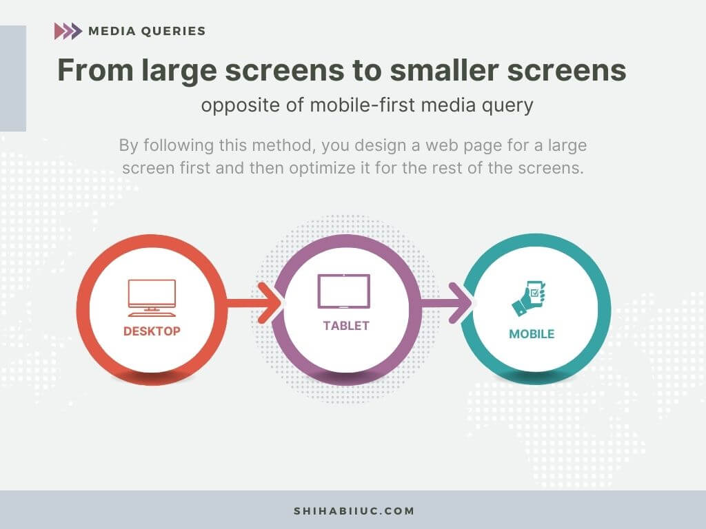
In this media query, it goes opposite direction than the first method. By following this method, you design a web page for a large screen first and then optimize it for tablet and then mobile. Let me give you an example of CSS for it.
h2 {
  font-size: 50px;
}
@media screen and (max-width: 1200px) {
  h2 {
    font-size: 36px;
  }
}
@media screen and (max-width: 768px) {
  h2 {
    font-size: 26px;
  }
}
In the above CSS, the heading (h2) font size will be 50 pixels for any large screens before it hits 1200 pixels.
From 1200 pixels to 767 (before 768) pixels, the font size will be 36 pixels.
Lastly, from 768 pixels to any smaller screens, the font size will be 26 pixels.
Winner (best approach to using media queries)

The mobile-first philosophy or media queries are the best approach to making a responsive website. Instead of offsetting CSS rules in the opposite directions (from large to small devices), in the mobile-first web design, you write all the CSS for the baseline and rewrite a couple of properties for larger devices.
In my practical experience in web designing since 2016, I use this mobile-first philosophy in 99% of cases and found it very easy, effective & maintainable.
So if you’re a web designer, I would suggest using this mobile-first philosophy. But if you should know both approaches.
And if you’re thinking of building your website and need to hire a web designer, make sure you tell your choices to your developer/designer.
Mostly used module layouts and CSS properties in responsive design
Aside from the different font sizes for different screens, you also need to break layouts (rows & columns) in different screen sizes.
For example, you have five columns in a row on large devices. But if you want to show the 5 columns in a single row on mobile, it would not only look odd but also very difficult for end users to browse your website. So you need to break or realign the layouts based on screen sizes.
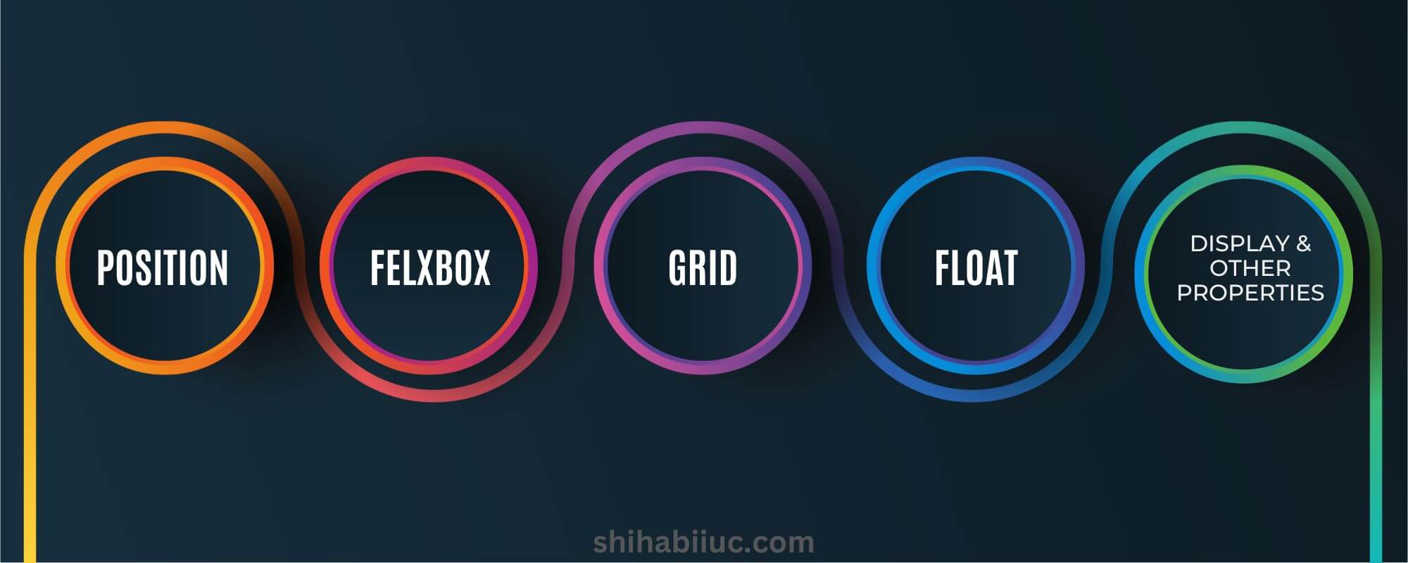
In old age, developers were mostly using CSS positioning and floats to align items in different media queries. But in today’s world, CSS Flexbox and Grid modules are introduced which are very popular and easy to use.
Impacts on SEO (search engine optimization)
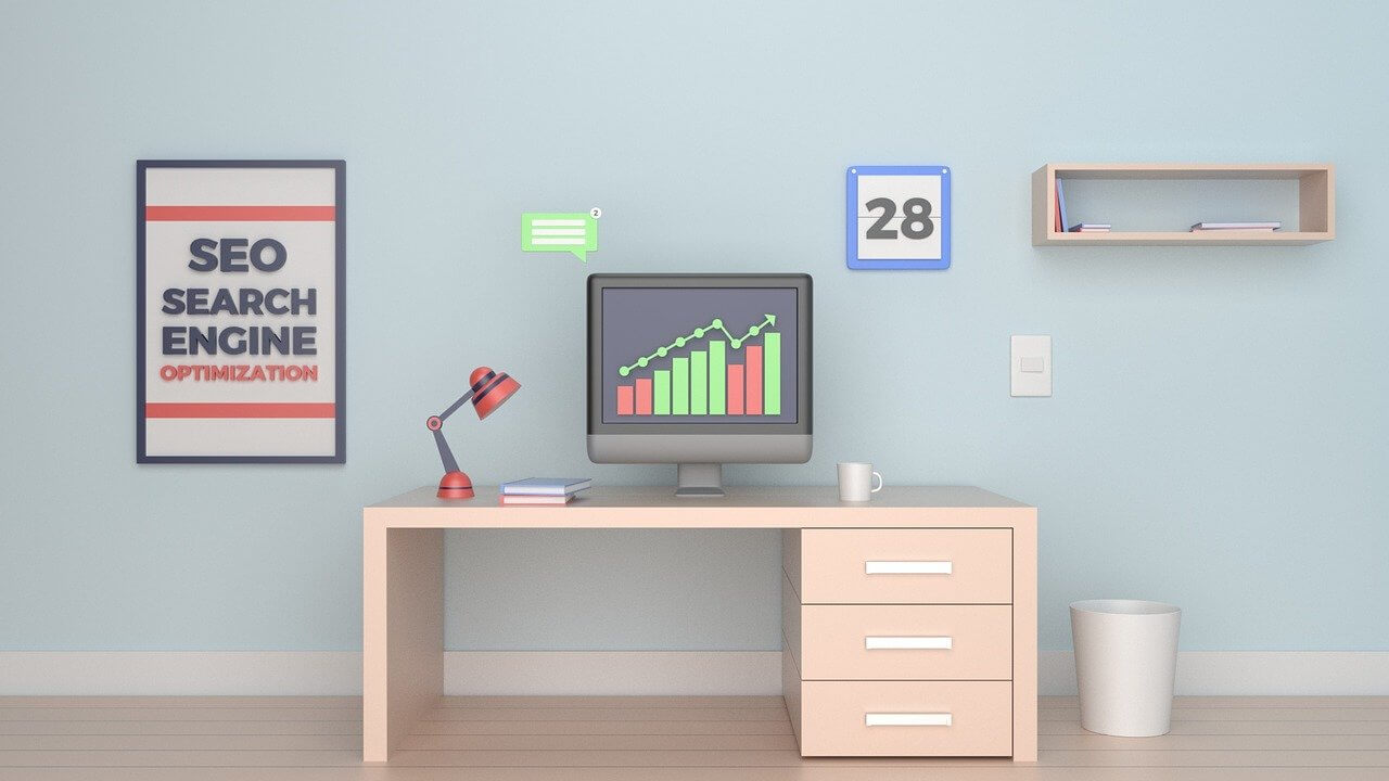
Mobile responsiveness is an important factor for SEO. In this digital world, the internet has a lot of information than most of us need. Every day a large amount of new content is coming out and that’s why we have so much competition.
So when it comes to ranking a website or its content, search engines have to take into consideration other factors like usability, performance (loading speed), etc.

If two websites have the same amount of valuable content and if one of them is not responsive, the other one will rank higher. In the same vein, people will prefer browsing information on a responsive web page.
So if your website is not mobile-responsive, you’re missing a lot of opportunities.
How do you know that if your website is not responsive?
If your website or pages show a horizontal scrollbar on mobiles or smaller screens, it means that your website is not responsive.
The horizontal scrollbar is not only one sign. You also have to take the usability into consideration. If your website shows many different columns on small screens that are difficult to read & navigate, you need to fix it.
The horizontal scrollbar can be removed by only one line of CSS body {overflow-x: hidden} but this is not the solution. You also have to fix & improve the usability issues in order to make your website fully responsive.
What problem does it solve?

A responsive website solves mainly one problem which is user experience or usability issues. But it ultimately boils down to SEO ranking, credibility, performance, monetization (earnings), etc. If you dig deeper, you will find many things depending on the user experience and these are correlated one with another.
For example, if a website is not responsive, search engines like Google may not rank it higher. If you do not rank high, you can’t earn or monetize your website very well. A non-responsive website will lose credibility and it may appear unreliable to the visitors.
Also, a responsive website can load faster because it breaks the layout into one column (mostly) on mobile. So users can see the FCP (First Contentful Paint) within a shorter amount of time.
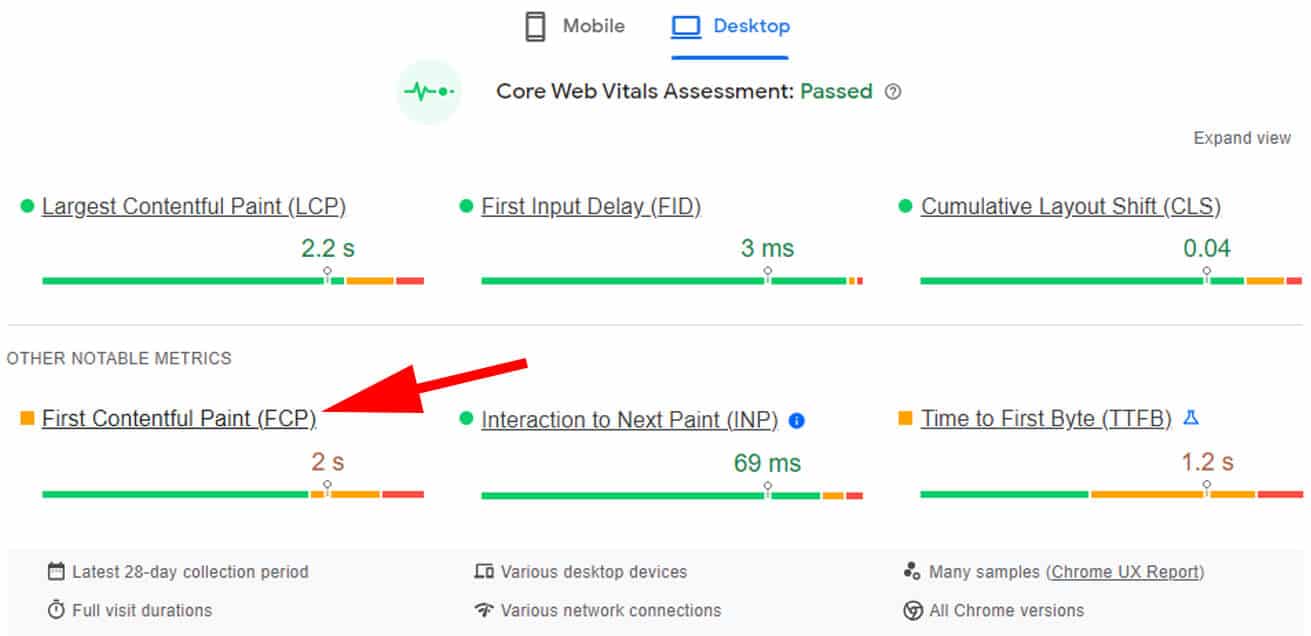
But if it is not responsive and shows 5 columns (with multiple images) in the same row, then it will take longer than expected.
So if you are serious about your website, want to grow your business through it, and want to make significant money from it in the long run, you have to keep maintaining the standard.
Conclusion
For the majority of websites, the most traffic comes from mobile devices. So responsive design is a must in this digital world if you want to make significant revenue from your website. Without responsiveness, it’s not usable on mobile phones which will impact your SEO ranking negatively & ultimately your income.
I tried to explain the responsiveness of a website and other aspects of it. Also, I tried to make you understand in the easiest ways possible along with examples. This could be helpful both for web designers and website owners.