In this post, I will show you how to create video backgrounds in HTML & CSS. Here I will include multiple examples. Such as:
- Create a banner section with a self-hosted video background
- Blur video background
- Full-screen video background
- Use YouTube video as the background
In all these examples, the videos will have an autoplay feature (including YouTube).
Before you start, let’s see the demo of the finished product (in the link below).
Let’s get started.
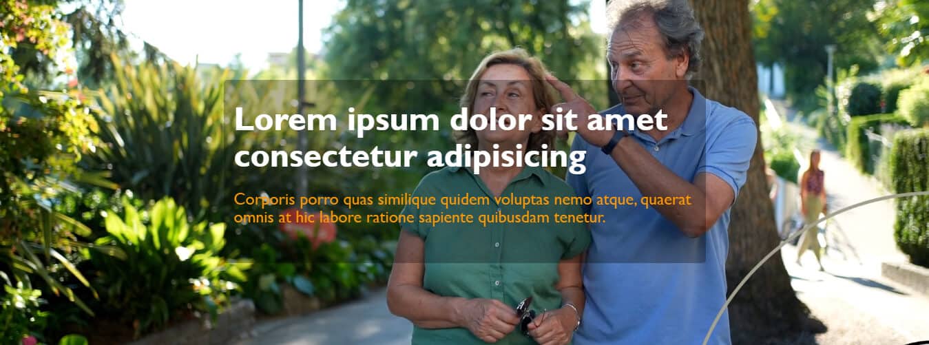
To create this banner section with an autoplay video background, I have the following HTML & CSS.
HTML
<section class="banner">
  <div class="banner-content">
    <h1>Lorem ipsum dolor sit amet consectetur adipisicing</h1>
    <p>Corporis porro quas similique quidem voluptas nemo atque, quaerat omnis at hic labore ratione sapiente quibusdam tenetur.</p>
  </div>
  <video src="assets/video.mp4" autoplay loop muted></video>
</section>
As you see above, I included the video in the HTML instead of CSS. Normally, we add background images and colors in CSS. But in this post, I will use the actual video directly in the HTML and you should too.
Note that you need to mute the video in order to make the autoplay option work. I also want the video to repeat once finished. So I have the 3 additional HTML attributes in the <video> tag: autoplay loop muted.
CSS
.banner {
  padding: 120px 15px;
  position: relative;
  overflow: hidden;
}
.banner .banner-content {
  max-width: 700px;
  margin: 0 auto;
  padding: 30px 15px;
  border-radius: 5px;
  background-color: rgba(0, 0, 0, 0.3);
}
.banner .banner-content h1 {
  margin: 0;
  color: #FFFFFF;
  font-weight: 700;
  line-height: 1.1;
  font-size: 2em;
}
@media (min-width: 768px) {
  .banner .banner-content h1 {
    font-size: 3em;
  }
}
.banner .banner-content p {
  color: #FF9800;
  font-size: 1.5em;
  line-height: 1.1;
}
.banner video {
  position: absolute;
  top: 0;
  left: 0;
  width: 100%;
  height: 100%;
  -o-object-fit: cover;
     object-fit: cover;
  pointer-events: none; /* Not mandatory but it ensure the video doesn't interfere with content */
  z-index: -1;
}
Now you see that I used CSS positioning to make the HTML video that looks like a background. The video has a negative z-index. It ensures that the text will go above and the video will go below the text.
Not to mention, I have an “assets” folder in the root directory and this “assets” folder contains the video. In the last section, I will show you can use a YouTube video instead.
That’s it! After you save your progress, you’ll have a banner with a video background like mine. If you want to download my demo video, please go to this link.
How to make a blurry video background?
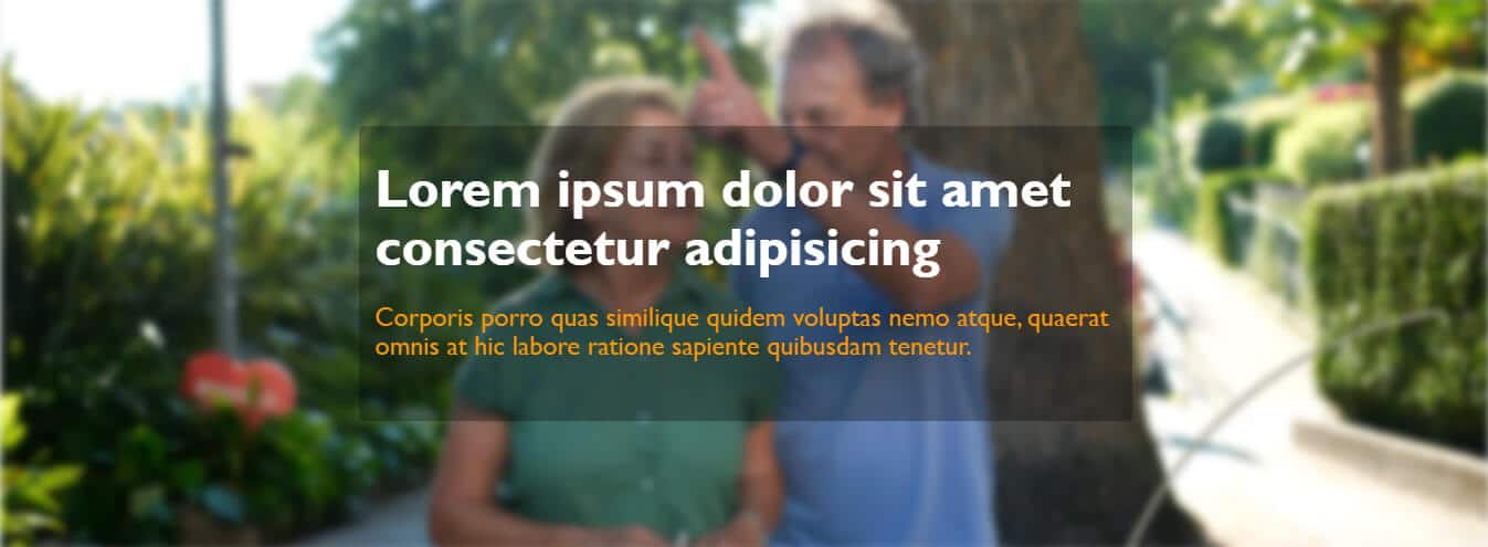
As you saw in “Example 2” in the live demo (live preview), this is what I am referring to. This is the exact same content as the first example.
The only exception is a single CSS property which is the filter. For the <video> tag, I added a 4px blur effect as you see below.
.banner video {
  -webkit-filter: blur(4px);
          filter: blur(4px); /* Add a blur effect to the video */
}
Other CSS remains the same. You can also adjust (increase or decrease) the 4px blur value as you see fit.
Full-screen video background
No matter the screen size, this section/background will be always full-scree. I used 100 viewport width and height to achieve that.
See my HTML CSS below.
HTML
<section class="banner-3">
  <div class="banner-content-3">
    <h1>Lorem ipsum dolor sit amet consectetur adipisicing</h1>
    <p>Corporis porro quas similique quidem voluptas nemo atque, quaerat omnis at hic labore ratione sapiente quibusdam tenetur.</p>
  </div>
  <video src="assets/video.mp4" autoplay loop muted></video>
</section>
CSS
.banner-3 {
  width: 100vw;
  height: 100vh;
  max-width: 100%;
  position: relative;
  overflow: hidden;
}
.banner-3 .banner-content-3 {
  max-width: 700px;
  padding: 30px 15px;
  border-radius: 5px;
  background-color: rgba(0, 0, 0, 0.3);
  position: absolute;
  top: 50%;
  left: 50%;
  -webkit-transform: translate(-50%, -50%);
          transform: translate(-50%, -50%);
}
.banner-3 .banner-content-3 h1 {
  margin: 0;
  color: #FFFFFF;
  font-weight: 700;
  line-height: 1.1;
  font-size: 2em;
}
@media (min-width: 768px) {
  .banner-3 .banner-content-3 h1 {
    font-size: 3em;
  }
}
.banner-3 .banner-content-3 p {
  color: #FF9800;
  font-size: 1.5em;
  line-height: 1.1;
}
.banner-3 video {
  position: absolute;
  top: 0;
  left: 0;
  width: 100%;
  height: 100%;
  -o-object-fit: cover;
     object-fit: cover;
  z-index: -1;
}
How to use YouTube videos as the autoplay background?
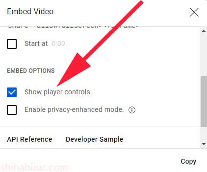
Go to any of the YouTube videos and get the embed code. If you don’t know, see this section of another post to get the embed code.
If you wish, you can also turn off the player control from the “Embed options” and this is what I want to like to do. But it’s not mandatory.
After you get the embed code, it will look something like this one as you see below.
<iframe width="560" height="315" src="https://www.youtube.com/embed/ng8Wivt52K0?controls=0" title="YouTube video player" frameborder="0" allow="accelerometer; autoplay; clipboard-write; encrypted-media; gyroscope; picture-in-picture; web-share" allowfullscreen></iframe>To make the video autoplay, we also need it to make mute. I want the video to repeat once finished and also I want to play this same video (instead of playing random videos based on the YouTube algorithm). To accomplish that, we need to add 4 more parameters to the video link (src) as follows:
| autoplay | 1 |
| mute | 1 |
| playsinline | 1 |
| loop | 1 |
| playlist | VIDEO_ID |
Keep in mind, you need to replace the VIDEO_ID with the actual ID.
You’ll find the video ID in the URL that comes after /watch?v=
In my example, the VIDEO_ID is ng8Wivt52K0 and it would be different in your case.
In the URL parameters (that you see in the above table), the number “1” means true. If you use “0” instead then it will refer to false. However, I will use 1 because I want those features (autoplay, muted, repeat the same video, consider the same video as the playlist).
Altogether the URL parameters will look like this: &autoplay=1&mute=1&playsinline=1&loop=1&playlist=VIDEO_ID
You need to put the above parameters end of your src (URL). In my example, the whole src will be as follows:
src="https://www.youtube.com/embed/ng8Wivt52K0?controls=0&autoplay=1&mute=1&playsinline=1&loop=1&playlist=ng8Wivt52K0"That’s enough for the sake of making you understand the process. Now see my HTML & CSS below.
HTML
<section class="banner-4">
  <div class="banner-content-4">
    <h1>Lorem ipsum dolor sit amet consectetur adipisicing</h1>
    <p>Corporis porro quas similique quidem voluptas nemo atque, quaerat omnis at hic</p>
  </div>
  <iframe width="560" height="315" src="https://www.youtube.com/embed/ng8Wivt52K0?controls=0&autoplay=1&mute=1&playsinline=1&loop=1&playlist=ng8Wivt52K0" title="YouTube video player" frameborder="0" allow="accelerometer; autoplay; clipboard-write; encrypted-media; gyroscope; picture-in-picture; web-share" allowfullscreen></iframe>
</section>
CSS
.banner-4 {
  padding: 120px 15px;
  position: relative;
  overflow: hidden;
}
.banner-4 .banner-content-4 {
  max-width: 700px;
  margin: 0 auto;
  padding: 30px 15px;
  border-radius: 5px;
  background-color: rgba(0, 0, 0, 0.3);
}
.banner-4 .banner-content-4 h1 {
  margin: 0;
  color: #FFFFFF;
  font-weight: 700;
  line-height: 1.1;
  font-size: 2em;
}
@media (min-width: 768px) {
  .banner-4 .banner-content-4 h1 {
    font-size: 3em;
  }
}
.banner-4 .banner-content-4 p {
  color: #FF9800;
  font-size: 1.5em;
  line-height: 1.1;
}
.banner-4 iframe {
  position: absolute;
  top: 0;
  left: 0;
  width: 100%;
  height: 100%;
  -o-object-fit: cover;
     object-fit: cover;
  z-index: -1;
  height: 177.77vh; /* reverse the aspect ration from 16:9 to 9:16*/
}
@media (min-width: 768px) {
  .banner-4 iframe {
    height: 56.25vw; /* keeps the video actual (16:9) proportion */
  }
}
Please note that some web browsers (especially Chrome) may not autoplay the video on mobile as videos are very data-consuming.
Anyways, on large screens, I am keeping the actual video aspect ratio (16:9) and reversing it on mobile. I used the height property to do that.
The CSS height: 56.25vw is a technique commonly used to maintain a 16:9 aspect ratio for responsive video embedding, including YouTube videos. vw is a unit in CSS that represents a percentage of the viewport width. It stands for “Viewport Width.” So, 1vw represents 1% of the viewport width.
And vh refers to the “Viewport Height.” 1vh represents 1% of the viewport height. From these calculations, 177.77vh refers to the 9:16 ratio. You can also use “%” instead of “vw & vh” and it will give you the same results.
Anyways, now if you save your HTML & CSS files, you’ll get the same output as mine.
And this brings me to the end of this post.
Learn more about CSS backgrounds
- Gradient background color
- Animated background examples
- Background image size (full-width, responsive, full-screen, etc)
- Video background
- How to add background color & background image to an HTML table?
- How to create a background slider
Conclusion
The process of making a video background is different from image background, color, gradient, etc. There are other ways to do it. However, this is one of the easiest ways.
I tried to make you understand all the possible ways and provide examples, live previews, code samples, etc. Therefore if you still have any questions, please let me know.

