CSS Flexbox refers to the “Flexible Box Module.” It is designed to align your HTML items & layouts in a more powerful way than CSS float. Flexbox is a one-dimensional layout model (either row or column when it comes to flex-direction).
This post will give you a clear concept and practical examples of the Flexbox. If you take the time to understand this post (line by line) and watch the video, you will be able to use CSS Flexbox properly in your real web development projects. And this will give you a rock-solid understanding that will help you to solve any complex layout issues.
Before you start, see the live preview of the examples that you’re going to build in this post.
Not to mention, I will also give you all the source code and the link to my GitHub Repository.
Let’s get started.
What is the prerequisite for understanding Flexbox?
If you understand the basics of HTML & CSS then you’re ready to move further. Other than that there are no prerequisites.
In this post, I tried to make you understand everything about CSS Flexbox by providing examples & real-world use cases. So you can see, understand, memorize & work with Flexbox in your everyday life without any confusion.
However, it is important to go through each example and understand them properly. Also, it’s more than important to practice every example yourself.
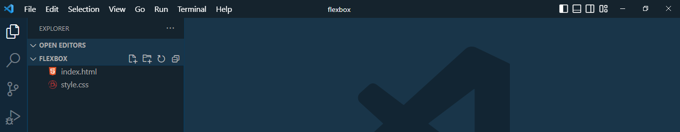
To practice Flexbox yourself, create an index.html & style.css file in your project folder.
In my setup, I named the project folder “flexbox” and created those two simple files as you see in the above screenshot.
Learn CSS Flexbox by examples
Instead of listing out all the Flexbox properties and imitating them, I want you to follow along with every example as I mentioned earlier.
As we go through the process, we will explore all the flexbox properties, combine them and see how & why things are working together.
This process will give you a clear picture of CSS Flexbox and you will be able to implement & tweak them on your own projects.
The practice examples start below:
First thing you need to know about Flexbox
In order to use Flexbox, you have to display: flex the container element. After that, you can apply other flexbox properties to the child elements. See the example below:
.container-element{
  display: flex;
}
If you do not write the “display: flex” to the container or wrapper element, other flexbox properties will not work. If this is not clear yet to you, don’t worry. It will be clearer as we go through other examples.
The container element may also have 6 other properties when needed. They are as follows:
.container-element {
  display: flex; /* this is mandatory */
  flex-direction: row;
  flex-wrap: nowrap ;
  flex-flow: row wrap;
  justify-content: center;
  align-items: center;
  align-content: space-between;
}
The flex-flow property combines flex-direction & flex-wrap together, and you can think of this flex-flow as a shorthand.
However, it will not require us to use all 6 properties together. Aside from the display: flex, most times, you may need to use 2 of them among the 6. And most commonly used 2 properties are justify-content & align-items.
How to make a full-width form using Flexbox?
To make a full-width form, write “display: flex” on each container element. By adding this property, the child elements will be ready to work with other flex properties.
Anyways, now write “flex: 1” for the fields. This will make your form full-width.
In this example, I have the following code:
<div class="form-container">

  <form class="" action="index.html" method="post">

    <div class="form-row">
      <label for="">Name</label>
      <input type="text" name="name" placeholder="John Doe">
    </div>

    <div class="form-row">
      <label for="">Enter Your Email</label>
      <input type="text" name="email" placeholder="[email protected]">
    </div>

    <div class="form-row">
      <label for="">Write your message</label>
      <textarea name="textarea" rows="4" cols="20" placeholder="Write your detail here"></textarea>
    </div>

  </form>

</div><!--form-container-->
.form-row{
display: flex;
}
.form-row input, textarea{
flex: 1;
}
.form-row label{
padding-right: 10px; /* optional */
}This will force the input & textarea fields to take all the available widths on all screen sizes.
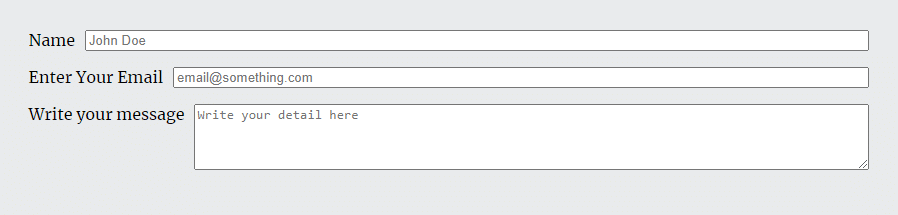
What did you learn in this example?
In this example, we learned that the “flex: 1” property makes a child element full width.
Here “1” is a base value. If you use “flex: 3” to a certain element then it will become three times larger than the element that has a “flex: 1” value.
How to align multiple divs/items side by side?
Only using the “display: flex” to the main container div/element, you can align multiple items in a single row.
To demonstrate, I have the following code:
<div class="main-container">
  <div>
    <h2>This is a heading</h2>
    <p>Content goes here. This is a paragraph. Accusamus odit necessitatibus, eius, placeat quibusdam hic voluptates esse sit architecto.</p>
  </div>
  <div>
      <img src="img/cat.jpg" alt="cat">
  </div>
  <div>
    <h2>Another element</h2>
    <p>This is an another paragraph. Lorem ipsum dolor sit amet consectetur adipisicing elit. Enim, beatae. Voluptatibus vel maxime dolores mollitia enim tempore veritatis.</p>
  </div>
</div><!-- .main-container -->
.main-container{
display: flex;
}Just by adding a single line of CSS (display: flex), the HTML document looks like the following screenshot:
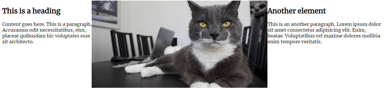
However, the contents are touching each other. So you may want to add some margin and padding.
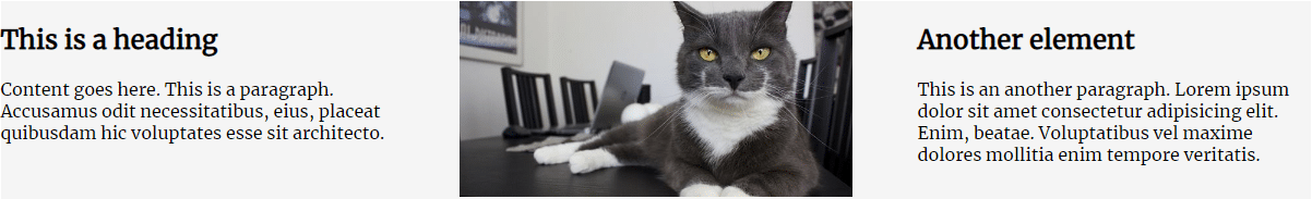
To do that, you can use the “flex-basis” property to the child elements. In the above example code (HTML), I added a CSS class name to each child element/div. Now my new code (HTML) looks like the following:
<div class="main-container">
<div class="child">
<h2>This is a heading</h2>
<p>Content goes here. This is a paragraph. Accusamus odit necessitatibus, eius, placeat quibusdam hic voluptates esse sit architecto.</p>
</div>
<div class="child">
<img src="img/cat.jpg" alt="cat">
</div>
<div class="child">
<h2>Another element</h2>
<p>This is an another paragraph. Lorem ipsum dolor sit amet consectetur adipisicing elit. Enim, beatae. Voluptatibus vel maxime dolores mollitia enim tempore veritatis.</p>
</div>
</div><!-- .main-container -->And the new CSS looks like the following:
.main-container{
display: flex;
justify-content: space-between;
}
.child{
flex-basis: 30%;
}The “flex-basis” works similarly to the “width.”
The “justify-content” distributes the horizontal space among elements and aligns the child elements (when they don’t use the full available width).
With this new code in place, my output looks like the following screenshot:
What did you learn in this example?
In this example, you learned “justify-content” applies to the main container element, it distributes space among elements (horizontal space) and aligns items when the child elements do not consume the full available width.
You also learned the “flex-basis” works like the CSS “width” property.
How to change the order of an element using Flexbox?
In this case, You have to assign/specify orders to the child elements.
For example, if you want the second (child) element to display first, you have to assign its value to “order: 1.” See the CSS below for more clarification:
.main-container{
  display: flex;
}
.first-child-item {
order: 2;
}
.second-child-item {
order: 1;
}
.third-child-item {
order: 3;
}The above CSS will display the “second-child-item” at first, then “first-child-item” in the second, and then “third-child-item”
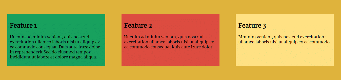
How to create equal-height columns/boxes using Flexbox?
After you add “display: flex” to the main container element, “align-items: stretch” will make all the child elements equal in height. However, “align-items: stretch” is the default value, so you don’t need to add it if you want equal-height columns.
In this example, I have the following HTML & CSS:
<div class="features">

  <div class="feature1 feature">
    <h2>Feature 1</h2>
    <p>Ut enim ad minim veniam, quis nostrud exercitation ullamco laboris nisi ut aliquip ex ea commodo consequat. Duis aute irure dolor in reprehenderit Sed do eiusmod tempor incididunt ut labore et dolore magna aliqua.</p>
  </div>
  <div class="feature2 feature">
    <h2>Feature 2</h2>
    <p>Ut enim ad minim veniam, quis nostrud exercitation ullamco laboris nisi ut aliquip ex ea commodo consequat kuis aute irure dolor.</p>
  </div>
  <div class="feature3 feature">
    <h2>Feature 3</h2>
    <p>Mminim veniam, quis nostrud exercitation ullamco laboris nisi ut aliquip ex ea commodo.</p>
  </div>

</div><!-- features -->
.features {
background: #DFB33C;
margin: 30px auto 30px auto;
padding: 30px;
display: flex;
justify-content: space-between;
align-items: stretch; /* default value that you don't need to include */
}
.feature{
padding: 10px; margin: 30px 0;
flex-basis: 30%;
}
.feature1{
background: #18A05E;
}
.feature2{
background: #DC4D41;
}
.feature3{
background: #FEE183;
}With the above code in place, the equal-height columns look like the screenshot below:
It has other properties such as center, flex-start, flex-end, etc.
To make your hands dirty, see how to create a 3 column layout in different ways.
What did you learn in this example?
“align-items: stretch” make all the child elements equal in height.
How to create a gallery layout using Flexbox?
To create a photo gallery layout using Flexbox, you need to specify “justify-content: space-between” to the main container so the child elements (or photos) get some space to breathe. And then you also need to specify “flex-wrap: wrap” so the child elements can break down to another line in the small screen sizes or whenever they need.
I have the following code to make a gallery layout:
<div class="gallery">
  <div class="photo">1</div>
  <div class="photo">2</div>
  <div class="photo">3</div>
  <div class="photo">4</div>
  <div class="photo">5</div>
  <div class="photo">6</div>
  <div class="photo">7</div>
</div><!-- .gallery -->
.gallery{
max-width: 1200px; margin: 30px auto 30px auto;
background: #FF9800; padding: 30px;
display: flex;
justify-content: space-between;
flex-wrap: wrap;
}
.photo{
width: 150px; height: 100px; font-size: 60px; background: #DD5044;
text-align: center; line-height: 100px; margin: 20px 0;
}With this code in place, my gallery layout looks like the following screenshot:
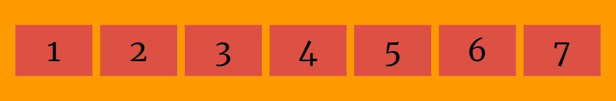
What did you learn in this example?
Adding “flex-wrap: wrap” to the main container element allows child elements to wrap when they need.
How to create nested rows & columns in Flex?
In Flexbox, a child element can also accept display: flex like a container element and it can align its own child differently.
To demonstrate the purpose, I have the following HTML & CSS:
<div class="rowcolumn">
  <div class="first">
    <p>Lorem ipsum dolor sit amet, consectetur adipisicing elit incididunt ... laborum.</p>
  </div>
  <div class="second">
    <div class="second-a">
      A Lorem ipsum dolor sit amet consectetur adipisicing elit.
    </div>
    <div class="second-b">
      B Dolor sit amet consectetur adipisicing elit.
    </div>
  </div>
</div><!-- .rowcolumn -->
.rowcolumn{
max-width: 900px; background: #36B27B;
margin: 60px auto 60px auto; padding: 30px;
display: flex;
}
.first {
background: #FF9800; padding: 10px;
flex: 1;
}
.second {
background: #FC334E; padding: 10px;
flex: 1;
display: flex;
flex-direction: column;
}
.second .second-a {
background: #424242;
flex: 1;
}
.second .second-b {
background: #0099D8;
flex: 1;
}And using the above code, my nested rows & columns look like the following screenshot:
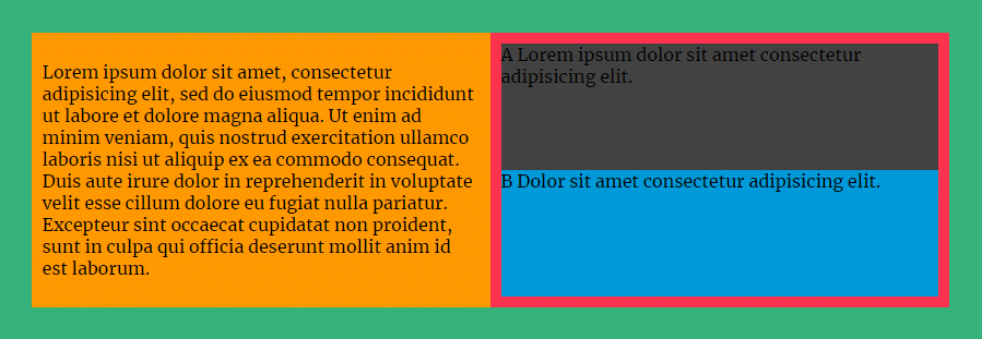
What did you learn in this example?
A child element can also act like a parent/container element and accept the “display: flex” property to align its own child differently.
To create a header navigation, I have the following HTML that contains a logo and some other navigation links:
<header class="flex-header">

  <div class="logo">
    <a href="#"><img src="favicon.png" alt="logo"></a>
  </div>

  <nav>
    <ul>
      <li><a href="#">Home</a></li>
      <li><a href="#">About</a></li>
      <li><a href="#">Portfolio</a></li>
      <li><a href="#">Service</a></li>
      <li><a href="#">Contact us</a></li>
    </ul>
  </nav>

</header>
To align the items properly, I have the following CSS:
.flex-header {
  background: #F3F4F6;
  padding: 15px;
  display:flex;
  align-items: center;
}

.flex-header nav ul{
  display: flex;
}
.flex-header nav ul li {
  list-style: none;
}
.flex-header nav ul li a {
  padding: 15px 30px;
  text-decoration: none;
}
.flex-header nav ul li a:hover {
  background: #424242;
  color: #FFFFFF;
}
With this code, my header navigation menu looks like the screenshot below:

However, this menu works very well on large devices but if you want to make a responsive navigation menu that also works on mobile devices, please see another post that shows it exactly.
What did you learn in this example?
“align-items: center” makes the child elements vertically centered.
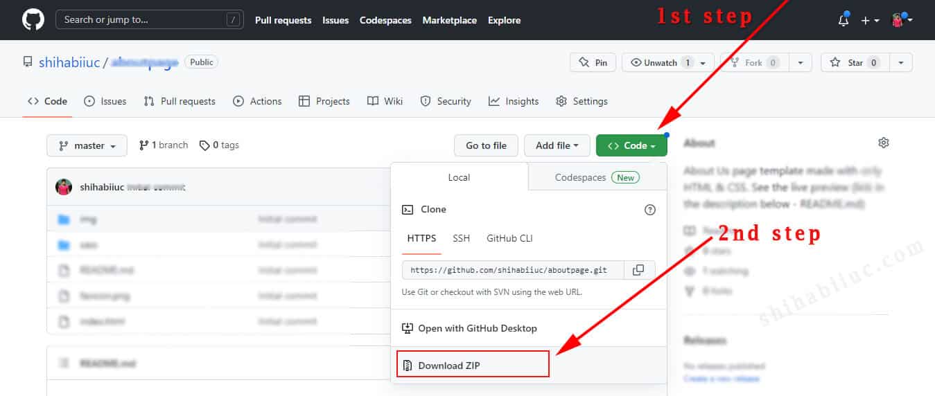
GitHub Repository of the examples
If you’re familiar with Git, you can clone the entire repo direct from your command line (using the following command): git clone https://github.com/shihabiiuc/flexbox.git
But if you’re not familiar with Git, you can download it as a Zip folder (as you see in the screenshot below).
| Learn & practice CSS with real-world examples |
|---|
| Learn basic CSS from the ground up. |
| Build real projects in HTML CSS. |
Build HTML CSS projects
Conclusion
I would recommend you watch the video, go through this post line by line, and practice them yourself. And try to create different types of projects than me.
Practicing yourself will give you the most output instead of just reading & watching. Therefore if you have any questions or confusion about Flexbox CSS, let me know. I will answer & cooperate with every valid query.

