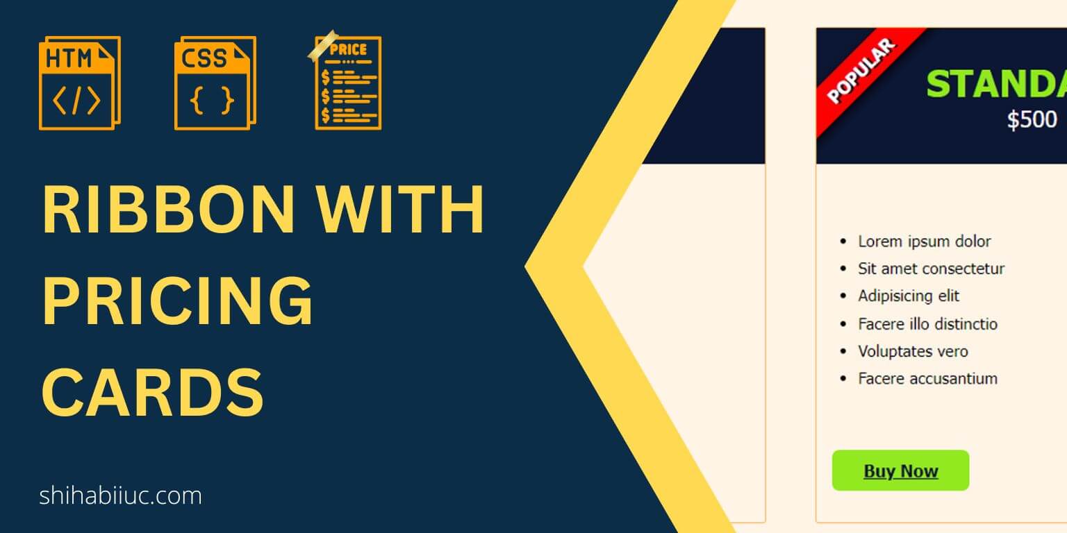
In this post, I will show how you can create a simple ribbon in pricing cards. Also, I will give you a downloadable template that contains 3 pricing cards and a ribbon.
In the real world, the ribbon is used only with one card/item that you want to highlight. And this is what I built in this post.
Around the web, you’ll get many ribbon samples. But the problem happens when you try to implement them on your own projects. This is just because most of the samples are created with a blank HTML div that has a specific width & height. But you need to implement the ribbon inside other content, especially on pricing cards.
And that’s why it’s very hard to implement those CSS into your project because its HTML skeleton is totally different than what you have.
Anyways, before you get started, see the demo that I built in this post.
Let’s get started.
Ribbon & pricing card template
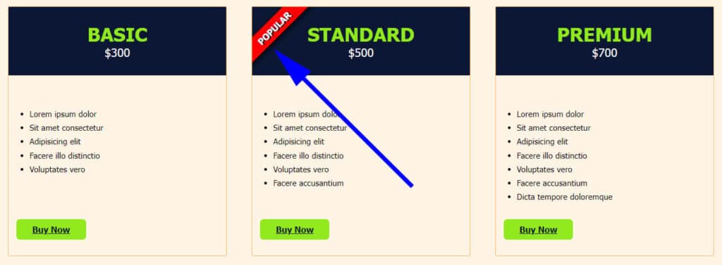
I always show you the demo first. So you can be sure what you’re going to build/get.
HTML
<section class="example-3">
  <div class="card-holder">
    <div class="item">
      <div class="item--header">
        <h3 class="package">Basic</h3>
        <p><data class="price" value="300">$300</data></p>
      </div> <!-- .item--header -->
      <ul>
        <li>Lorem ipsum dolor</li>
        <li>Sit amet consectetur</li>
        <li>Adipisicing elit</li>
        <li>Facere illo distinctio</li>
        <li>Voluptates vero</li>
      </ul>
      <div class="link">
        <a href="javascript:void(0)">Buy now</a>
      </div>
    </div>   <!-- .item -->
    <div class="item">

      <div class="item--header especial-item">
        <div class="ribbon">Popular</div>
        <h3 class="package">Standard</h3>
        <p><data class="price" value="500">$500</data></p>
      </div> <!-- .item--header -->
      <ul>
        <li>Lorem ipsum dolor</li>
        <li>Sit amet consectetur</li>
        <li>Adipisicing elit</li>
        <li>Facere illo distinctio</li>
        <li>Voluptates vero</li>
        <li>Facere accusantium</li>
      </ul>
      <div class="link">
        <a href="javascript:void(0)">Buy now</a>
      </div>
    </div>   <!-- .item -->
    <div class="item">
      <div class="item--header">
        <h3 class="package">Premium</h3>
        <p><data class="price" value="700">$700</data></p>
      </div> <!-- .item--header -->
      <ul>
        <li>Lorem ipsum dolor</li>
        <li>Sit amet consectetur</li>
        <li>Adipisicing elit</li>
        <li>Facere illo distinctio</li>
        <li>Voluptates vero</li>
        <li>Facere accusantium</li>
        <li>Dicta tempore doloremque</li>
      </ul>
      <div class="link">
        <a href="javascript:void(0)">Buy now</a>
      </div>
    </div>   <!-- .item -->
  </div>  <!-- .card-holder -->
</section> <!-- .example-3 -->
This HTML contains all 3 cards including the ribbon. And that is why it’s a bit longer than expected. However, you can edit this very easily.
CSS
.example-3 {
  background-color: #fff4e6;
  padding: 30px 15px;
}
@media (min-width: 768px) {
  .example-3 .card-holder {
    display: -webkit-box;
    display: -ms-flexbox;
    display: flex;
    -webkit-box-pack: justify;
        -ms-flex-pack: justify;
            justify-content: space-between;
  }
}
.example-3 .card-holder .item {
  margin: 0 0 30px;
  border: 1px solid #fcb65d;
  border-radius: 3px;
  -webkit-transition: -webkit-box-shadow 0.5s ease-in;
  transition: -webkit-box-shadow 0.5s ease-in;
  transition: box-shadow 0.5s ease-in;
  transition: box-shadow 0.5s ease-in, -webkit-box-shadow 0.5s ease-in;
}
@media (min-width: 768px) {
  .example-3 .card-holder .item {
    -ms-flex-preferred-size: 31%;
        flex-basis: 31%;
    display: -webkit-box;
    display: -ms-flexbox;
    display: flex;
    -webkit-box-orient: vertical;
    -webkit-box-direction: normal;
        -ms-flex-direction: column;
            flex-direction: column;
    -webkit-box-pack: justify;
        -ms-flex-pack: justify;
            justify-content: space-between;
  }
}
.example-3 .card-holder .item .item--header {
  text-align: center;
  background-color: #0C1733;
  padding: 30px 15px;
  margin-bottom: 60px;
}
.example-3 .card-holder .item .item--header h3 {
  margin: 0;
  text-transform: uppercase;
  color: #92E81C;
  font-size: 36px;
}
.example-3 .card-holder .item .item--header p {
  margin: 0;
}
.example-3 .card-holder .item .item--header p .price {
  color: white;
  font-size: 22px;
}
.example-3 .card-holder .item ul {
  margin: 0;
}
@media (min-width: 768px) {
  .example-3 .card-holder .item ul {
    -webkit-box-flex: 1;
        -ms-flex: 1;
            flex: 1;
  }
}
.example-3 .card-holder .item ul li {
  font-weight: 100;
  font-size: 1.1em;
  line-height: 1.7;
}
.example-3 .card-holder .item .link {
  padding: 30px 15px;
}
.example-3 .card-holder .item .link a {
  display: inline-block;
  background-color: #92E91F;
  padding: 10px 30px;
  color: #0C1733;
  font-size: 16px;
  font-weight: 700;
  border-radius: 7px;
  text-transform: capitalize;
}
.example-3 .card-holder .item:hover {
  -webkit-box-shadow: rgba(0, 0, 0, 0.16) 0px 10px 36px 0px, rgba(0, 0, 0, 0.06) 0px 0px 0px 1px;
          box-shadow: rgba(0, 0, 0, 0.16) 0px 10px 36px 0px, rgba(0, 0, 0, 0.06) 0px 0px 0px 1px;
}

/* Ribbon related */
.especial-item {
  position: relative;
  overflow: hidden;
}
.ribbon {
  max-width: 100%;
  width: 180px;
  background-color: red;
  color: white;
  position: absolute;
  text-align: center;
  text-transform: uppercase;
  font-size: 1.2em;
  text-shadow: 2px 2px #0C1733;
  -webkit-box-shadow: 2px 3px 10px #000000;
          box-shadow: 2px 3px 10px #000000;
  font-weight: bold;
  padding: 7px 5px;
  -webkit-transform: rotate(-45deg);
          transform: rotate(-45deg);
  -webkit-transform-origin: 50px 90px;
          transform-origin: 50px 90px;
}
This CSS contains vendor prefixes and also it contains all the styles for the entire template. That’s why it may seem longer than expected. However, the ribbon-related CSS is very small and I commented on this portion.
Download template
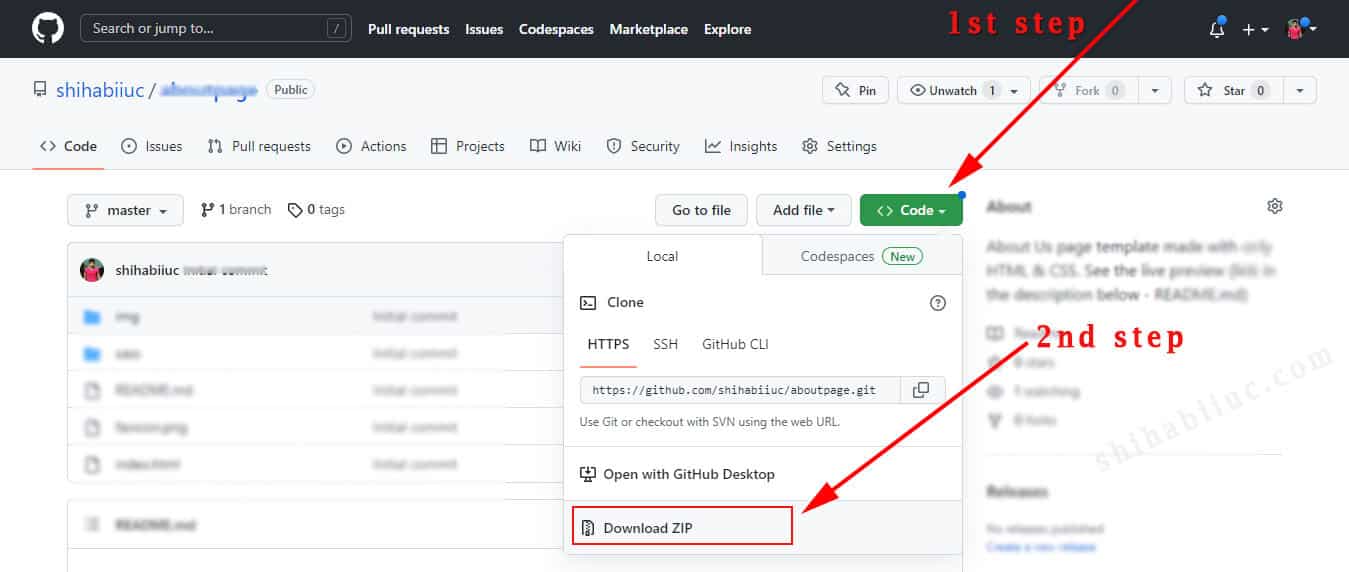
I gave you all the HTML & CSS for the pricing card & ribbon template. However, if you want to download the entire template that you saw in the live preview, you can do it in the link below.
The above link will take you to my GitHub Repository. If this is your first time, see the following picture that shows how to download a project from GitHub.
Build HTML CSS projects
Conclusion
I tried to give you a ready-to-use pricing card template that contains a ribbon. So you can get started quickly.
Ribbons can come in many styles. However, I tried to make it super simple and easy to use. Also, I tried to make it professional at the same time.
You can edit the color, font, background, etc. to match your requirements. If you have any questions, please let me know.

