
To center a form, you need to specify the width property and specify the left & right margin to auto. In this post, I will show you how to center an HTML form. Also, I will show you how to center it both in vertical & horizontal directions.
I have created some examples. You can check them in the link below.
Let’s get started.
How to center a form in the horizontal direction?
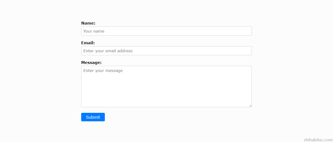
To demonstrate the purpose, you need some sort of HTML. I have the following markup for the form.
HTML
<div class="container">
  <form>
    <div class="row">
      <label for="name">Name:</label>
      <input
        type="text"
        id="name"
        name="name"
        placeholder="Your name"
        required
      />
    </div>

    <div class="row">
      <label for="email">Email:</label>
      <input
        type="email"
        id="email"
        name="email"
        placeholder="Enter your email address"
        required
      />
    </div>

    <div class="row">
      <label for="message">Message:</label>
      <textarea
        id="message"
        name="message"
        placeholder="Enter your message"
        required
        rows="8"
        cols="20"
      ></textarea>
    </div>

    <input type="submit" value="Submit" />
  </form>
</div>
You may have different markup but it’s totally fine and as long as you have a <form> tag.
To center a form (horizontally), you have to assign a width or max-width and auto margin to the left & right. See the CSS below to center the form.
CSS
form {
  max-width: 700px;
  margin: 0 auto;
}
In this example, I assigned a 700px max-width. So I don’t have to write other CSS or media queries to make the form mobile responsive. But you can change the max-width value depending on your needs.
If you write a fixed width for the form, make sure you also offset the value on other devices or make it responsive. Let me give you another example.
Mobile-first philosophy (working with media queries)
form {
  width: 100%; /* for mobile and smaller screens */
  margin: 0 auto;
}
@media (min-width: 768px) {
  form {
    /* for desktop and large devices (768 pixels & up) */
    width: 700px;
  }
}
When using media queries, it’s always the best approach to write them with a mobile-first philosophy as you see in the above CSS.
However, you can write them in the opposite way. Such as writing CSS for the large device first and then mobile. However, I would not recommend this approach as this is hard to maintain code and rewrite the CSS as the project grows. Let me give you an example of this bad practice.
Bad practice while working with media queries
form {
  /* for any screen sizes */
  width: 700px;
  margin: 0 auto;
}
@media (max-width: 768px) {
  form {
    /* for 768 pixels & below screens */
    width: 100%;
  }
}
You can also write the above media queries like this:
@media only screen and (max-width: 768px) {
 width: 100%
}
And this is the same as the last one.
Anyways, now you know how to make an HTML form center aligned & how to make it mobile responsive. Also, you learned mobile-first philosophy while working with media queries (as the byproduct of this post). Let’s move on.
Other styles of the form
Until this point, I showed you how to make the form center aligned. But my demo form has other styles such as colors, padding, font, border, box shadow, etc. If you want your form to look like my demo, you can grab it below.
*,
*::before,
*::after {
  -webkit-box-sizing: border-box;
          box-sizing: border-box;
  font-family: Verdana, Geneva, Tahoma, sans-serif;
  font-size: 16px;
}
body {
  background-color: #e9ebec;
  padding: 0;
  margin: 0;
  font-family: Verdana, Geneva, Tahoma, sans-serif;
  font-size: 1.2em;
}
.container {
  background-color: #fcfcfc;
  padding: 90px 15px;
}
.container form {
  max-width: 700px;
  margin: 0 auto;
}
.container form .row {
  margin-bottom: 20px;
}
.container form .row label {
  font-weight: bold;
  margin-bottom: 5px;
  display: inline-block;
}
.container form .row input[type=text],
.container form .row input[type=email],
.container form .row textarea {
  width: 100%;
  padding: 8px;
  border-radius: 4px;
  border: 1px solid #ccc;
  -webkit-transition: border-color 0.3s ease;
  transition: border-color 0.3s ease;
}
.container form .row input[type=text]:focus,
.container form .row input[type=email]:focus,
.container form .row textarea:focus {
  outline: none;
  border-color: #007bff;
  -webkit-box-shadow: 0 0 0 2px rgba(0, 123, 255, 0.25);
          box-shadow: 0 0 0 2px rgba(0, 123, 255, 0.25);
}
.container form input[type=submit] {
  padding: 8px 20px;
  background-color: #007bff;
  color: #fff;
  border: none;
  border-radius: 4px;
  cursor: pointer;
  -webkit-transition: background-color 0.3s ease-in-out;
  transition: background-color 0.3s ease-in-out;
}
.container form input[type=submit]:hover {
  background-color: #0069d9;
}
But the above CSS is optional in relation to the context of this post. However, this might help many of you to get started with forms.
How to center a form in the vertical direction
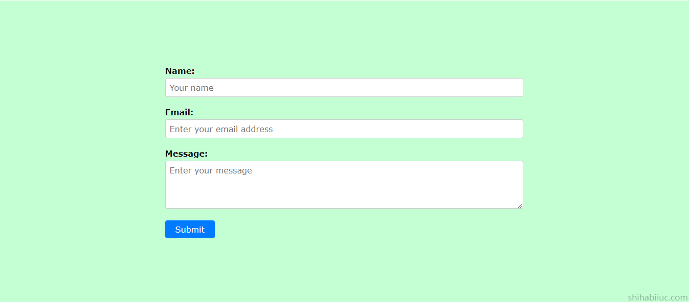
Think of a situation where you have a fixed height of the container div or one of the columns contains lots of text. How can you center the form in the vertical direction?
I am happy to ask because this is exactly what I will show you now.
In this example, I have the same HTML markup for the form, I just added a new class name to the container div.
HTML
<div class="container example-2">
/* other markup will go here just like the last example */
</div>
To make it vertically center aligned, I have the following CSS.
CSS
.example-2 {
  /* optional css */
  padding: 20px 15px;
  background-color: #c4ffd4;
  height: 95vh;
  /* optional css ended above */
  /* make the form center aligned */
  display: -webkit-box;
  display: -ms-flexbox;
  display: flex;
  -webkit-box-pack: center;
      -ms-flex-pack: center;
          justify-content: center; /* it makes the form horizontally center */
  -webkit-box-align: center;
      -ms-flex-align: center;
          align-items: center; /* it makes the form vertically center */
}
.example-2 form {
  width: 700px; /* it sets a width value to the form */
  max-width: 100%; /* it makes the form responsive */
}
In this example, I have a 95vh fixed height for the container div. It’s equivalent to 95% of your device height (viewport height).
To make this form vertically center align, I used align-items: center. Also, I wrote necessary comments to the CSS and explained which line does what specific things.
And this brings me to the end of this post.
Learn more about centering HTML elements
- Center a table
- Center an HTML list
- Center a video
- Center a button
- Center a div
- Center text (horizontally)
- Center text (vertically)
- Center an image
- Center a form
- Center a link
- Center alignment using absolute position
- Center alignment using Flexbox
Conclusion
In the same vein, you can also center-align any input fields.
I gave you multiple examples and showed you how to center-align an HTML form in different directions. If you want to download my project to your computer (HTML & CSS), please go to my GitHub repository.
In this post, if you did not understand certain things, or if you have any questions, please let me know.