In this post, I will show you how to make an HTML table vertically scrollable. You’ll also learn how to make the table header sticky when scrolling. End of this post, you’ll see how to make the table horizontally scrollable.
Last but not least, those tables will be mobile-responsive.
Before you get started, you can check the demo of the finished products in the link below.
Let’s get started.
How to make a table vertically scrollable? (Example 1)
You can use any HTML markup for the table. However, in my HTML, I have a table header (<th>) and table body (<tbody>) as you see below.
HTML
<div class="container example-1">
  <table>
    <tr>
      <th>Column 1</th>
      <th>Column 2</th>
      <th>Column 3</th>
      <th>Column 4</th>
    </tr>
    <tbody>
      <tr>
        <td>Apple</td>
        <td>Bicycle</td>
        <td>Carrot</td>
        <td>Dog</td>
      </tr>
      <!-- other rows will go here just like the above one -->
    </tbody>
  </table>
</div>
<!-- .example-1 -->
Not to mention, the table works well without the table body (<tbody>) tag. However, in this context, you need it because I wrote some CSS based on it.
Also, as you see in the above HTML, I wrapped the entire table within a container <div> (.container .example-1). It’s not mandatory to make the table scrollable but I have some basic CSS based on the wrapper such as padding, background color, etc.
CSS
/* general styles for the table */
table {
  border-spacing: 0;
  border-collapse: collapse;
  margin: 0 auto;
  width: 100%;
  max-width: 900px;
  text-align: left;
}
table tr {
  -webkit-transition: background-color 0.3s ease-in-out;
  transition: background-color 0.3s ease-in-out;
}
table tr th {
  background-color: #cce6ff;
}
table tr:nth-child(even) {
  background-color: #edf2fa;
}
table tr:hover {
  background-color: #d9dadb;
}
table tr td,
table tr th {
  border: 1px solid #ff0000;
  padding: 12px 8px;
}
/* general styles ended above */

/* adding padding & background color to the container div */
.example-1 {
  padding: 90px 15px;
  background-color: #fff1f0;
}
.example-1 table {
  width: 100%;
  max-height: 370px;
  overflow-y: scroll; /* makes the table vertically scrollable */
  overflow-x: auto; /* it adds a horizontal scrollbar on mobile and when needed */
  display: block;
}
.example-1 table tbody {
  display: block;
}
.example-1 table tr {
  display: grid;
  /* the line below makes equal width 4 columns where the minimum width is 150px and max width is 1 fraction */
  grid-template-columns: minmax(150px, 1fr) minmax(150px, 1fr) minmax(150px, 1fr) minmax(150px, 1fr);
  border-bottom: 1px solid transparent;
  width: max-content; /* it helps the background color go upto the end. otherwise, background color will stop after 100% viewport width */
  width: -webkit-max-content;
  width: -moz-max-content;
}
@media (min-width: 768px) {
  .example-1 table tr {
    /* offset the max-content on large device. otherwise, the table will shrink if you have less content */
    width: 100%;
  }
}
.example-1 table tr td,
.example-1 table tr th {
  border-right: 1px solid transparent;
}
.example-1 table tr td:last-child,
.example-1 table tr th:last-child {
  border-right: 1px solid red;
}
I wrote the necessary comments on the above CSS so you can understand which line does what specific thing. But if you still have any confusion, feel free to leave a comment.
Anyways, after you save your HTML & CSS, your table will look like the screenshot below.
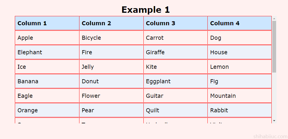
As I mentioned about the mobile responsiveness, the above screenshot does not show any horizontal scrollbar but it will when necessary (especially on mobile). If you need to check the responsiveness, please check this demo once again (from mobile).
In my demo, the table is four columns but in your case, it could be different. Note that you have to adjust the grid-template-columns according to your number of columns.
For example, if you have 3 columns, it will be like this:
grid-template-columns: minmax(150px, 1fr) minmax(150px, 1fr) minmax(150px, 1fr);So on and so forth.
How to make the table header sticky when scrolling? (Example 2)
In this example, I will slightly change the HTML markup. I will wrap the table header within the table head (<thead>). So I can easily target the table header and make it sticky. Otherwise, the table markup will remain the same.
HTML
<div class="container example-2">
  <table>
    <thead> <!-- table head. this is NEWLY ADDED in this markup -->
      <tr> <!-- tabe row -->
        <th>Column 1</th> <!-- table header -->
        <th>Column 2</th> <!-- table header -->
        <th>Column 3</th> <!-- table header -->
        <th>Column 4</th> <!-- table header -->
      </tr>
    </thead> <!-- closing table head -->
    <tbody> <!-- table body -->
      <tr>
        <td>Apple</td>
        <td>Bicycle</td>
        <td>Carrot</td>
        <td>Dog</td>
      </tr>
      <!-- rest of the rows go here -->
    </tbody>
  </table>
</div>
<!-- .example-2 -->
I wrote a comment in the HTML to indicate where exactly I made the changes. See my CSS below.
CSS
I used the exact same CSS as the first example. Just wrote a few new lines of CSS for the sticky behavior.
/* in addition to the above css (example 1) */
table thead {
  position: sticky;
  top: 0;
  left: 0;
  right: 0;
  display: -webkit-box;
  display: -ms-flexbox;
  display: flex; /* preventing the table head from shrinking */
  overflow-x: auto;
}
After you save the changes, your table will look like this demo.
How to make a table horizontally scrollable?
To create a horizontal scrollbar, wrap the entire table within a container and write CSS based on it. Let’s see what I am referring to.
HTML
      <div class="table-x-scrollbar">
        <table>
          <tr>
            <th>Column 1</th>
            <th>Column 2</th>
            <th>Column 3</th>
            <th>Column 4</th>
          </tr>
          <tr>
            <td>Apple</td>
            <td>Bicycle</td>
            <td>Carrot</td>
            <td>Dog</td>
          </tr>
          /* other table reows go here */
        </table>
      </div>
    </div>
CSS
.table-x-scrollbar {
  overflow-x: auto;
}
.table-x-scrollbar table {
  width: 100%;
}
With these HTML & CSS in place, your table will look like this demo.
In this example, I used overflow-x: auto for the horizontal scrollbar. So the scrollbar will appear when necessary. But if you want to show it always, try this line instead overflow-x: scroll
GitHub repository for this entire project/post
If you messed up your code or did not get the expected output from the source code that I provided, please refer to this project on GitHub. After downloading it, you’ll have the exact same template as the live preview. It also contains all the demo data, code, and everything in between that you saw in the live preview.
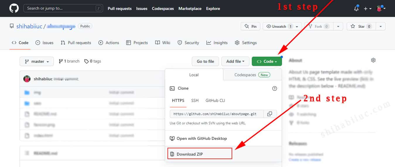
If you’re familiar with Git, you can clone it directly from your terminal using the following command: git clone https://github.com/shihabiiuc/table-scrollable.git
And this brings me to the end of this post.
Learn more about tables
- How to add borders in an HTML table?
- How to remove HTML table border?
- How to make a table rounded with CSS?
- How to fill a table cell with color in WordPress Gutenberg?
- How to center a table in HTML CSS?
- How to align table elements?
- How to add & align images inside an HTML table?
- TR, TH & TD workflow in an HTML table.
- HTML table background-color & background-image
- How to make a scrollable table in HTML CSS?
Learn more about the scrollbar
Conclusion
I did not only give you the source code but also showed you the live previews. I gave you multiple examples and explained the CSS. If you did not get the expected output, you can download the entire project from my GitHub repository.

