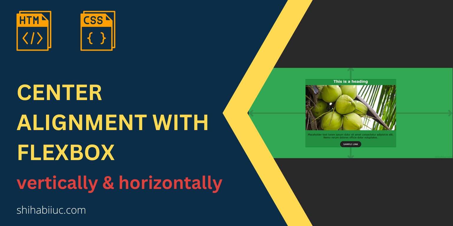
In this post, I will show you how to center elements both vertically & horizontally using CSS Flexbox. Also, I will give multiple examples to solve problems in different scenarios.
Before you start, please check the live demo of the examples that you’ll build.
Let’s get started.
Centering elements using Flexbox (both vertical & horizontal directions
As mentioned earlier, I will give you multiple examples so you can solve problems in any circumstance. Let’s check them one by one.
Example 1: Center alignment a collection of items that are stacked one after another
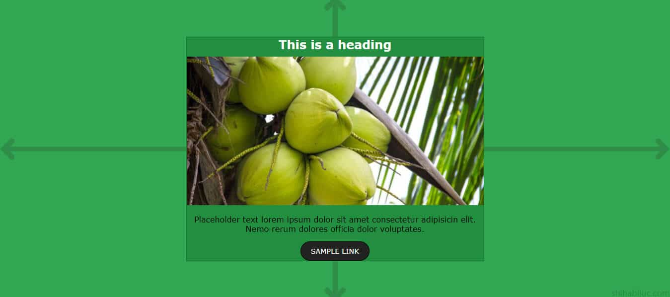
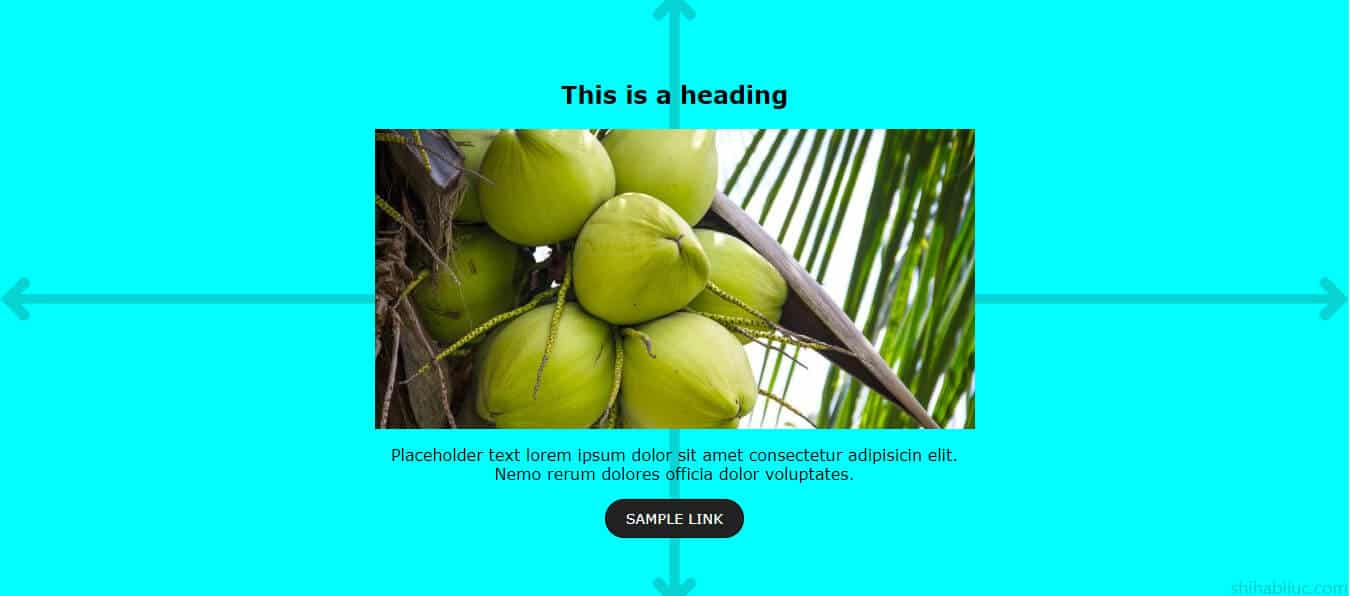
As you see in the screenshot above, it’s example 1 that you saw in the live demo.
It’s important to see the HTML markup before you write any CSS. I have the following HTML.
HTML
<!-- EXAMPLE 1 -->
<div class="container">
  <div class="elements">
    <h2>This is a heading</h2>
    <img src="./img/coconut.jpg" alt="coconut" />
    <p>
      Placeholder text lorem ipsum dolor sit amet consectetur adipisicin
      elit. Nemo rerum dolores officia dolor voluptates.
    </p>
    <a href="#">Sample link</a>
  </div> <!-- .elements -->
</div> <!-- .container -->
As you see in the above HTML, I have a heading, an image (in the ‘img’ folder), a paragraph & a link. In your case, these could be anything.
Here I have two wrapper div. The .container div contains everything. And the .elements div contains all elements.
In the 4th example, I will show you how you can do this exact thing using only 1 wrapper div.
Anyways, see my CSS below for this example.
CSS
.container {
  background-color: #32a852;
  padding: 30px 15px;
  min-height: 600px;
  /* required CSS below */
  display: flex;
  justify-content: center;
  align-items: center;
}
.container .elements {
  background-color: #218f3f;
  border: 1px solid #177a32;
  max-width: 600px;
  /* required CSS below */
  text-align: center;
}
I skipped the other silly CSS such as colors, font, etc.
The justify-content: center makes its child elements horizontally centered. And the align-items: center makes elements vertically center aligned. And this is how you can perfectly center-align flex items.
I also made this exact example using CSS positioning & transform. If you wish, you can check it on this post.
Example 2: Horizontally aligned items centered vertically
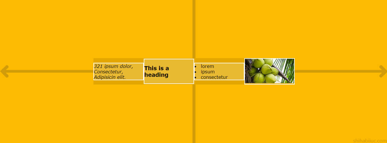
In this example, I have a couple of HTML elements that I aligned in a single row and also aligned them vertically. If this is not clear to you, please take a closer look at the above screenshot. This is also example 2 in the live demo.
I have the following HTML markup for it.
HTML
<!-- EXAMPLE 2 -->
<div class="example-2">
  <div class="holder">
    <div class="item">
      <address>321 ipsum dolor, Consectetur, Adipisicin elit.</address>
    </div>
    <div class="item">
      <h3>This is a heading</h3>
    </div>
    <div class="item">
      <nav>
        <li>lorem</li>
        <li>ipsum</li>
        <li>consectetur</li>
      </nav>
    </div>
    <div class="item">
      <img src="./img/coconut.jpg" alt="coconut" />
    </div>
  </div> <!-- .holder -->
</div> <!-- .example-2 -->
This markup is similar to the last one (example 1).
CSS
.example-2 {
  background-color: #fcba03;
  padding: 30px 15px;
  min-height: 500px;
  /* required CSS below */
  display: flex;
  justify-content: center;
  align-items: center;
}
.example-2 .holder {
  background-color: #e3a700;
  max-width: 700px;
  /* required CSS below */
  display: flex;
  justify-content: center;
  align-items: center;
}
.example-2 .holder .item {
  border: 2px solid #ffffff;
  background-color: rgba(255, 255, 255, 0.2);
  flex: 1; /* this makes the items equal in width */
}
As you see in the demo and in the above screenshot above, the flex items are equal in width.
But if you want them equal in width, remove the last line flex: 1. By removing this line, all the items will take space as they need. It means the div that has more content will take more space and the div that has less content will take less space. Flexbox will calculate it automatically and you don’t have to do anything.
For example, if I delete the flex: 1, the output looks like the following screenshot below.
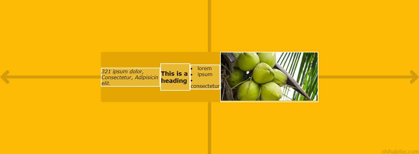
flex: 1 lineExample 3: Making items stacked one after another
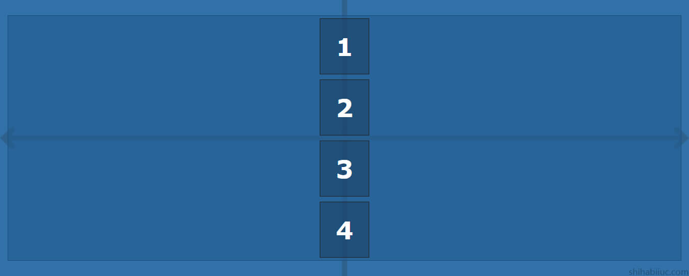
This example looks different but if you take a closer look, it’s the same as the first example.
The only exception is I used inline-level elements in this example. On the other hand, the first example contains block-level elements (except for the link – anchor tag).
I have the following markup for it.
HTML
<!-- EXAMPLE 3 -->
<div class="wrapper">
  <span>1</span>
  <span>2</span>
  <span>3</span>
  <span>4</span>
</div>
I also had another container div for the above HTML but I excluded it. Because its container div had nothing except for background color & padding. And this could be another exception compared to the first example.
But if you need the exact code for all the examples, you can go to my GitHub repository I will link at the very bottom of this post.
CSS
.wrapper {
  background-color: rgba(34, 92, 143, 0.6);
  border: 1px solid #194e7d;
  /* required CSS below */
  display: flex;
  justify-content: center;
  align-items: center;
  flex-direction: column;
}
.wrapper span {
  font-size: 3em;
  font-weight: bold;
  color: #ffffff;
  background-color: rgba(0, 0, 0, 0.2);
  border: 1px solid #222222;
  padding: 30px;
  margin: 5px;
  line-height: 1;
}
Only the four lines made this type of alignment. Also, you don’t even need to block the display for the <span> or any inline-level elements. Because after you reverse the flex-direction to the column (flex-direction: column), Flexbox will handle it for you.
Example 4: Achieving the same design as example 1 with different HTML markup
In this section, you’ll achieve the same layout/design as you saw in example 1. Here I have only one wrapper div that you see in the HTML below.
HTML
<!-- EXAMPLE 4 -->
<div class="example-4">
  <h2>This is a heading</h2>
  <img src="./img/coconut.jpg" alt="coconut" />
  <p>
    Placeholder text lorem ipsum dolor sit amet consectetur adipisicin elit.
    Nemo rerum dolores officia dolor voluptates.
  </p>
  <a href="#">Sample link</a>
</div> <!-- .example-4 -->
CSS
.example-4 {
  min-height: 600px;
  padding: 30px 15px;
  /* required CSS below */
  display: flex;
  flex-direction: column;
  justify-content: center;
  align-items: center;
}
.example-4 p {
  max-width: 600px; /* you can ignore it, or specify any width you like */
  text-align: center; /* if you specify any width or max-width, you also have to center align text */
}
/* if you do not specify width or max-width, then you also don't have to assign text align to center */
If you compare this CSS with example 1, you’ll see that here I have an extra line which is flex-direction: column. It means you have to write slightly different CSS based on the HTML markup even though the designs are the same.
How to make content only horizontally center align?
Throughout this post and all the examples, I aligned all the contents both vertically & horizontally. If you only need to center align horizontally, use the same CSS and only delete the align-items: center. By doing this, your content will be horizontally center aligned.
But there is a caveat! After removing align-items: center, your content will be full height (equal height for multiple items). To get around it, you have to specify align-items: flex-start. This will make the flex items start from the top. If you want the opposite, change it to flex-end and this will make the flex items start from the bottom.
You can learn more about CSS Flexbox in this post.
Learn more about centering elements
- Center a table
- Center a video
- Center an image
- Center alignment using absolute position
- Center alignment using Flexbox
Conclusion
I gave you multiple examples based on different scenarios. Provided you with all the code samples along with live demos. I tried hard to make this post very simple and easy to digest.
But if you still have any questions or confusion or if you have a hard time centering content using Flexbox, please let me know. If none of my examples & solutions work for you, I will happily extend this post.
If you want to see or download all the code for the live preview, please go to my GitHub repository.

