In this post, I will show you a couple of examples to create space between flex items. Also, I will show you how to offset the space on mobile devices.
Let’s get started.
How to create space between flexbox items?
To create space between flexbox items, you can use flex-basis which is very similar to the width property.
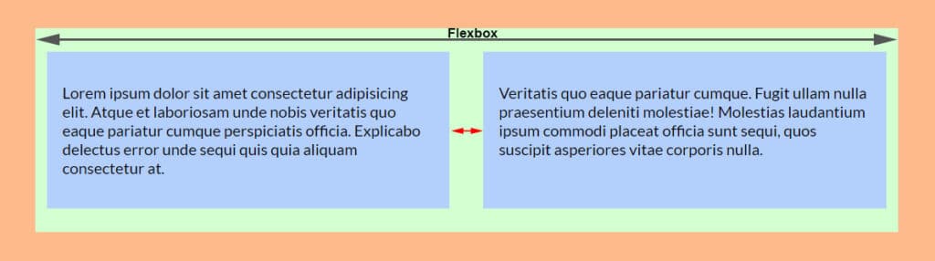
As you see in the above screenshot, I have two items in the flexbox container. Before I write or explain any CSS, let’s see the HTML markup for the above layout.
<div class="container">
  <div class="item">
    <p>Lorem ipsum dolor sit amet consectetur adipisicing.</p>
  </div>
  <div class="item">
    <p>Veritatis quo eaque pariatur cumque ullam nulla.</p>
  </div>
</div>
To create space between the items, I have flex-basis of 48% for each item and the container div has justify-content of space-between. See my CSS below.
.container {
  display: flex;
  justify-content: space-between;
}
.container .item {
  flex-basis: 48%;
}
In the above example, I have 2 items inside the flex container. And I chose 48% width which means I have 4% remaining space. Here is the math {100% – (48% x 2)} = 4%
Since I want to disburse the 4% space between the two elements, So I set the main container div justify-content to space-between. There are other values for the justify-content property such as space-around, center, flex-start, etc. To learn more about CSS flexbox, see another post written by me.
And of course, you can adjust the width or flex-basis value based on your need.
If I had three elements, I would choose 32% of flex-basis so I can distribute the remaining 4% of space.
How to offset this space on mobile?
You don’t want this space on mobile. And you also don’t want the columns to sit side by side on smaller screens. Right?
To get around this, the best approach is to use media queries. Implement the flexbox properties into larger screen sizes. For example 768 pixels or greater.
Let me rewrite the above CSS below so you will understand it clearly.
@media (min-width: 768px) {
  .container {
    display: flex;
    justify-content: space-between;
  }
}
.container .item {
  flex-basis: 48%;
  margin-bottom: 30px;
}
.container .item:last-child {
  margin-bottom: 0;
}
@media (min-width: 768px) {
  .container .item {
    margin-bottom: 0;
  }
}
With this new CSS, the mobile screen looks like the following screenshot you see below.
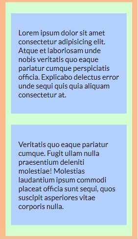
On small screens, we want the space vertically. So I have a margin-bottom of 30px and I offset this bottom margin on larger (768px+) screens.
How to create space where you have a lot of flex items?
There are some situations where you may have hundreds of items. Or you may don’t know the exact number of items you will have. Photo galleries, blog archives, etc are some examples.
In this type of case, you have to set a width (and even height) and margin for each flex item.
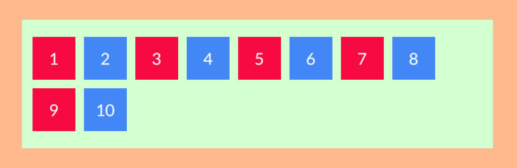
As you see in the above screenshot, I have 10 flex items for demonstration. You may have hundreds. Here is my HTML markup for the above layout.
<div class="container">
  <div class="item">1</div>
  <div class="item">2</div>
  <div class="item">3</div>
  <div class="item">4</div>
  <div class="item">5</div>
  <div class="item">6</div>
  <div class="item">7</div>
  <div class="item">8</div>
  <div class="item">9</div>
  <div class="item">10</div>
</div><!-- .container -->
And here is my CSS:
.container {
display: flex;
flex-wrap: wrap;
}
.container .item {
width: 100px;
height: 100px;
margin: 10px;
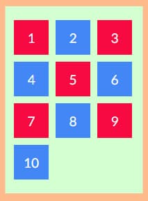
}As you see in the above CSS, I have a certain width, height, and margin. You need a margin if you want to keep the items separate.
Most importantly, I have “flex-wrap: wrap.” If you don’t have this property set to “wrap” the child elements will stay on the same line no matter how small is the screen size. To break certain elements to the next line, make sure you allowed them to wrap. If you don’t know, the default value is “nowrap.”
With the above CSS, the output looks like the below screenshot.
And this brings me to the end of this post.
| Learn & practice CSS with real-world examples |
|---|
| Learn basic CSS from the ground up. |
| Build real projects in HTML CSS. |
Build HTML CSS projects
Conclusion
I tried to explain and show everything you need to create space between flex items both on small & large devices. Also, I gave code & screenshots of each demonstration. Therefore if you still have any questions, please do let me know.

