There are two main ways you can position text over an image. Such as: (1) Placing the text over the image using the CSS position property, (2) Creating a background image for the text.
In this post, I will show you both ways to place the text over an image. Also, I will answer some of the related questions that you need to know.
Let’s get started.
How to place text with an image using the CSS position property?
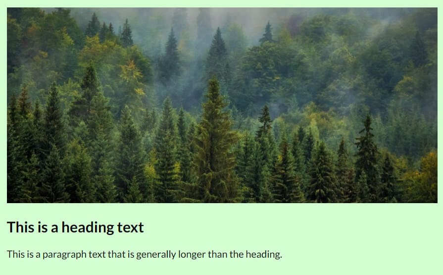
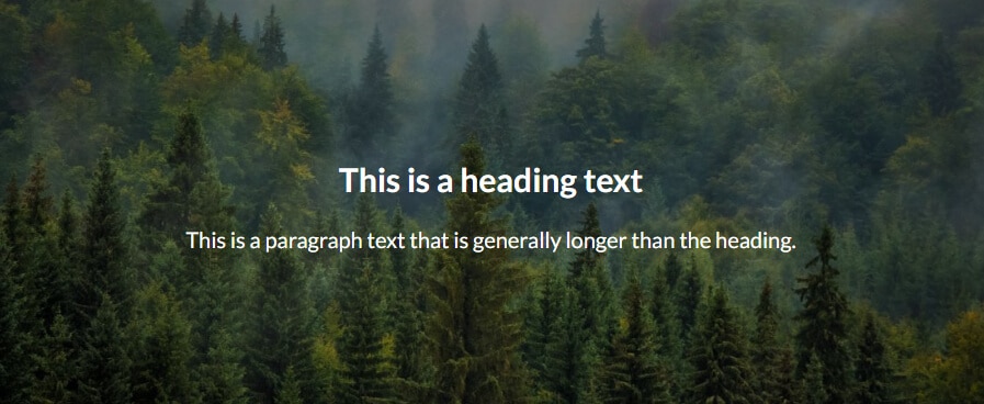
To demonstrate the purpose, I have the following HTML.
<div class="container">
  <img src="./img/forest.jpg" alt="forest">
  <div class="text-container">
    <h2>This is a heading text</h2>
    <p>This is a paragraph text that is generally longer than the heading.</p>
  </div>
</div>
Using the above HTML, my image and text look like the screenshot below.
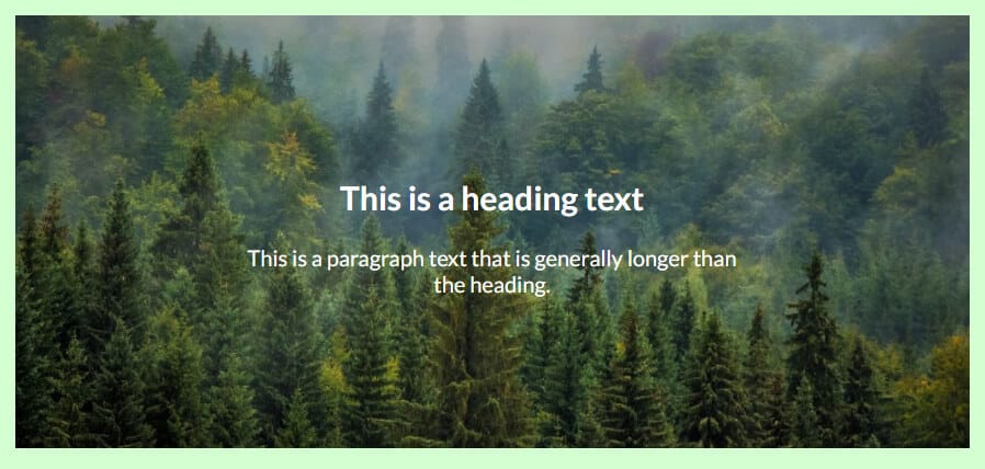
I do not only want to position the text over the image but also want it centered. Here is my CSS for it (I will explain after).
.container {
  position: relative;
}
.container .text-container {
  position: absolute;
  top: 50%;
  left: 50%;
  text-align: center;
  transform: translate(-50%, -50%);
  color: #FFFFFF;
}
After writing the above CSS, my text & image looks like the following screenshot.
CSS explanation:
As you see in my CSS, I have a container div that has a position of relative. And my text lives inside another div that has a class of “text-container.” It has a position of absolute.
Since I wanted to center align the text, so I pushed the text div by 50% from the top & left. But it goes way too much of the right-bottom corner (as you see below).
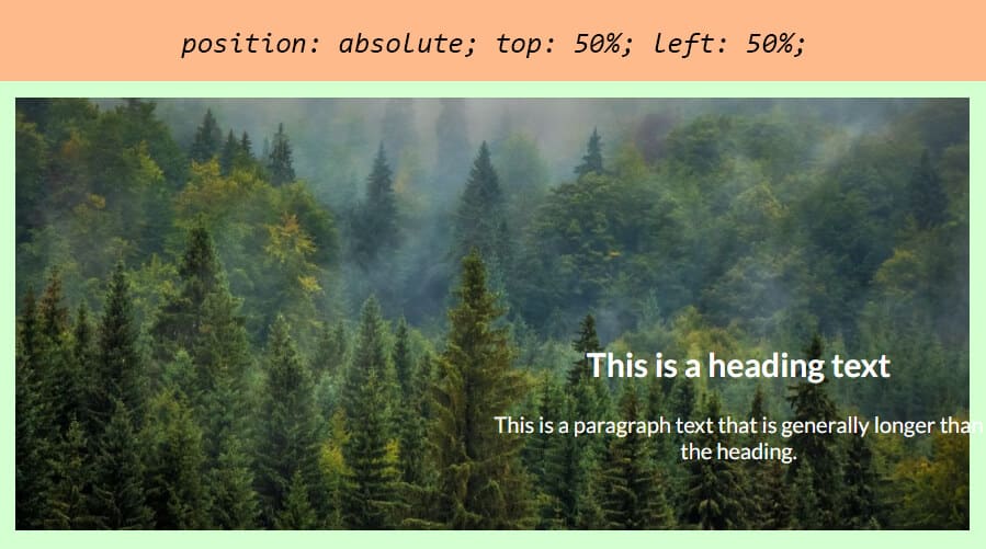
It happens because the text is pushed by 50% from the top & left. If we want to make it perfectly centered, we need to push it back of its own width & height.
And this is where the CSS transform property comes into play. I have a “translate(-50%, -50%)” that pushes back the text by 50% of its own width & height accordingly (because of the negative value).
Method 2: Text over a background image
This method would be the easiest way to position the text over an image. However, in some situations, the first method would be useful when you have to keep a similar HTML markup. It’s good to have another tool in your tool belt.
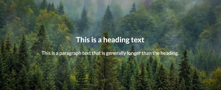
For this second method, I change my HTML a little bit.
<div class="container">
  <h2>This is a heading text</h2>
  <p>This is a paragraph text that is generally longer than the heading.</p>
</div>
And here is my CSS below.
.container {
  padding: 120px 15px;
  text-align: center;
  color: #FFFFFF;
  background-image: url(../img/forest.jpg);
  background-size: cover;
  background-position: center;
  background-repeat: no-repeat;
}
With this CSS in place, the output looks like the screenshot as you see below.
In your CSS, you can adjust the padding accordingly. Also, you can use a different background image size & position. To learn more about background image size, see another post written by me.
One last important thing that you may have not noticed yet
In my example, the text looks good. But if your image & text has slightly similar colors, the text would be not visible properly.
In real-world cases, you may need to use a semi-transparent background color between the image & text. Otherwise, the text may lose contrast.
To get around this, I added a semi-transparent background color. Here is my updated CSS.
.container {
  padding: 120px 15px;
  text-align: center;
  color: #FFFFFF;
  background: linear-gradient(rgba(0, 0, 0, 0.4) 100%), url(../img/forest.jpg);
  background-size: cover;
  background-position: center;
  background-repeat: no-repeat;
}
And the final output looks like the screenshot below.
That’s it!
Now let’s see answers to common questions.
Frequently asked questions
How do I put the pictures side by side with the text?
You can put the pictures and text side by side in many different ways in HTML & CSS. The easiest way is using flexbox.
In this example, I will show you two examples.
Example 1: one image & paragraph side by side
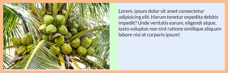
For this example, I have the following HTML.
<div class="container">
  <div class="image-container">
    <img src="./img/coconut.jpg" alt="coconut">
  </div>
  <div class="text-container">
    <p>Lorem, ipsum dolor sit amet consectetur adipisicing elit. Harum tenetur expedita debitis impedit? Unde veritatis earum, eligendi atque, iusto voluptas non sint ratione similique aliquam labore nisi at corporis ipsum!</p>
  </div>
</div>
And here is the CSS.
.container {
  display: flex;
  justify-content: space-between;
}
.container .image-container, .container .text-container {
      flex-basis: 48%;
}
Here I have 48% of flex-basis for each child div. So there is {100% – (48% x 2)} = 4% remaining space. The “justify-content: space-between” disburses the 4% available space between these two items.
The output looks like the screenshot below.
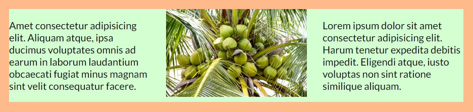
Example 2: one image & 2 paragraphs side by side
For this demonstration, I have the following HTML.
<div class="container">
  <div class="item">
    <p>Amet consectetur adipisicing elit. Aliquam atque, ipsa ducimus voluptates omnis ad earum in laborum laudantium obcaecati fugiat minus magnam sint velit consequatur facere.
    </p>
  </div>
  <div class="item">
    <img src="./img/coconut.jpg" alt="coconut">
  </div>
  <div class="item">
    <p>Lorem ipsum dolor sit amet consectetur adipisicing elit. Harum tenetur expedita debitis impedit. Eligendi atque, iusto voluptas non sint ratione similique aliquam.</p>
  </div>
</div>
And the following CSS.
.container {
  display: flex;
  justify-content: space-between;
}
.container .item {
   flex-basis: 31%;
}
Here I have a 31% flex-basis for each item. And I am distributing 7% remaining space just like the way I did in the past example.
The output looks like the screenshot below.
How do I align text and pictures on the same line?
If you want the text/paragraph to wrap around the image (generally as you see in the newspaper), use “float: left” to the image. See my code below for more clarification.
<div class="container">
  <img src="./img/flower.jpg" alt="flower">
  <p>Amet consectetur adipisicing elit liquam atque, ipsa ducimus voluptates omnis ad earum.</p>
</div>
.container {
padding: 10px;
}
.container img {
float: left;
margin-right: 10px;
}
.container::after {
content: "";
display: block;
clear: both;
}As you see I have a small padding to the container & margin-right to the image. It’s not mandatory but I did this to create a small gap.
With this CSS, the output looks like the screenshot below.
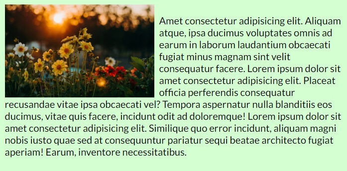
The last few lines of CSS are to clear the floats. Without clearing it, your next content may mess up with it. So it’s always best practice to clear floats after you use it.
Not to mention, there are no other easy ways to achieve this layout except for the float.
Learn more about images
- How to add images to an HTML table?
- How to create an image hover animation effect only with CSS?
- How to position text over an image with CSS?
- How to change an image on hover (CSS)
- Center an image in various directions & methods
- How to right-align an image in HTML CSS?
- How to create a hero banner image using HTML CSS?
- How to wrap text around an image in HTML?
- How to rotate text & images using CSS?
Conclusion
Now you know how to position text over an image in two different ways. Also, you learned a couple more related things. Therefore if you still have any questions, let me know.

