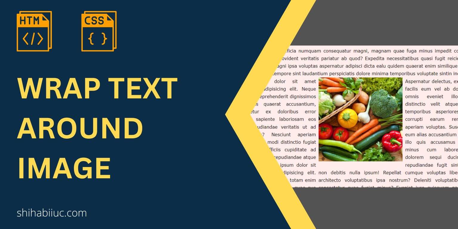
In this post, I will show you to wrap text around an image. You’ll also learn different versions of this wrapping. Such as wrapping the image from the top-right-bottom, top-left-bottom, top-right, bottom-left, etc. Last but not least, you’ll also learn how to fix/optimize the layout for mobile. Because you don’t want this wrapping or floating alignment on mobile, right?
I will use HTML & CSS to demonstrate all the examples but you can implement the same concept on other technologies such as WordPress, AMP, etc.
You can check the demo of all the examples that I will create in the link below.
Let’s get started.
Text wrapping around an image
You’ll see this kind of design or layout mostly in newspapers, books, and long-form online articles.
Anyways, to create such alignments and to wrap an image with texts, you need to write a few lines of CSS. Only using HTML, you won’t be able to create such a layout because images are inline-level elements, and texts such as paragraphs, headings, etc are block-level elements.
That means texts will always start from a new line until you prevent them. And that’s why you need CSS.
Anyways, in this section, I will give you a couple of examples to surround an image with texts.
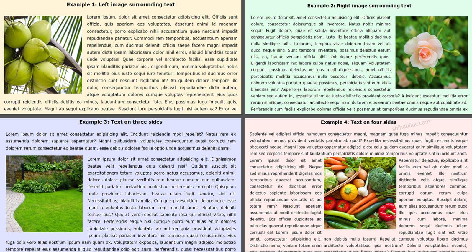
Example 1: Image on the left and surrounding text
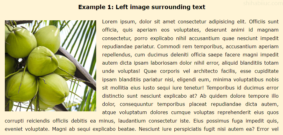
For the above example (screenshot), I have the following HTML.
HTML
<img src="./img/coconut.jpg" alt="coconut">
<p>Lorem ipsum, dolor sit amet consectetur adipisicing elit...</p>
Note that the serial of the HTML tags is important here. The image or <img> tag should come first and then the text or <p> tag will come next to it. Otherwise, the paragraph or text will consume full available space and the image will go to the next line, and the text wrapping will not work.
So keep this in mind. You can reorder the tags but you have to write additional CSS to accomplish your goal. But if you organize the tags like the example, you can achieve the layout in just one/two lines of CSS.
Also, you need sufficient text content in order to wrap the image. In the above HTML, you see a very small amount of text because I wanted to make it short. But you need enough of them.
CSS
img {
  float: left; /* mandatory */
  width: 300px; /* required but you can change */
  margin-right: 20px;
  margin-bottom: 10px;
}
To wrap the image with text, you have to change the float of the image to the left or right. For the above example, I used float: left.
Your image should not be quite large. If you use a big image, make sure you adjusted the width in CSS. It should be smaller than the containing <div>. For example, if the web page or the container <div> is 900 pixels wide, your image should be less than that.
Example 2: Image on the right and surrounding text
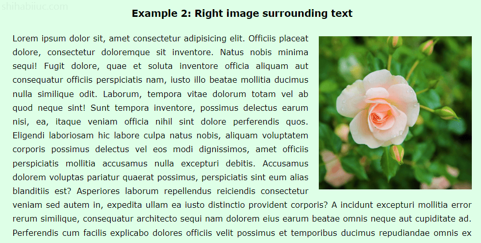
In this example, I used the same HTML markup & CSS except for one line of CSS. Let me show them again.
HTML
<img src="./img/flower.jpg" alt="flower">
<p>Lorem ipsum dolor sit, amet consectetur adipisicing elit...</p>
Just like the last example, I have the image at the top and then the paragraph. I will push the image to the right side in CSS.
CSS
img {
  float: right; /* mandatory */
  width: 300px; /* required but you can change and it should be less than the container */
  margin-left: 20px;
  margin-bottom: 10px;
}
Just by adding the float: right, the image went to the right side and was also wrapped by text.
Example 3: Text on three sides of the image
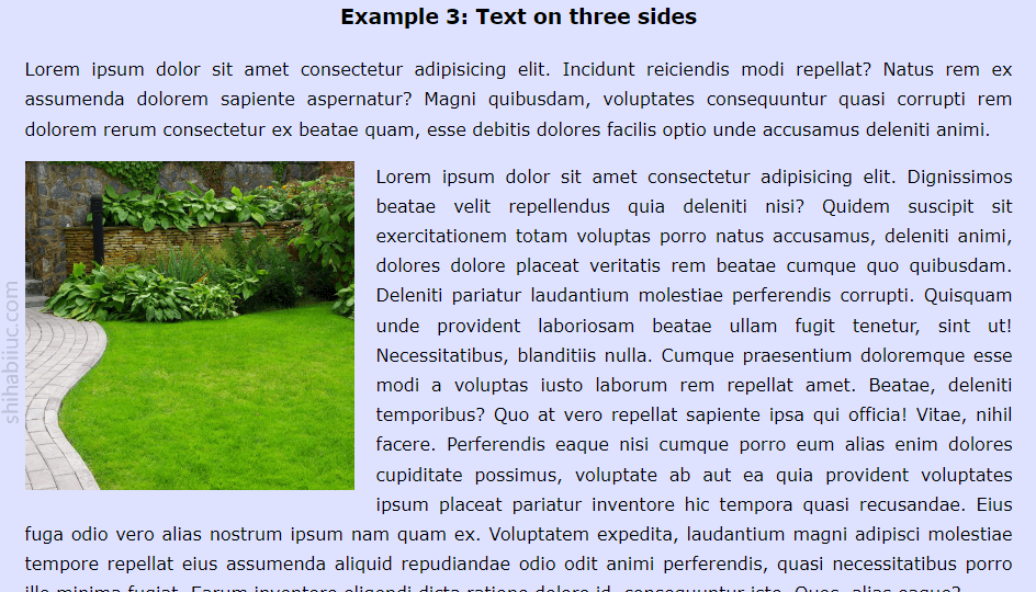
In the above example, the three sides of the image are wrapped by text. In this example, I changed the HTML markup a little. First, I have a paragraph. And then I have an image and another paragraph. See the markup below.
HTML
<p>Lorem ipsum dolor sit amet consectetur adipisicing elit...</p>
<img src="./img/lawn.jpg" alt="lawn">
<p>Lorem ipsum dolor sit amet consectetur adipisicing elit. Dignissimos beatae...</p>
CSS
img {
  float: left; /* mandatory */
  width: 300px; /* optional but it should be less than the main wrapper div */
  margin-right: 20px;
}
In the same vein, you can also align the image to the right side just by changing the float to the right (float: right). Also, don’t forget to replace the margin-right: 20px with margin-left: 20px (if you made it right-aligned).
Example 4: Text on four sides of the image
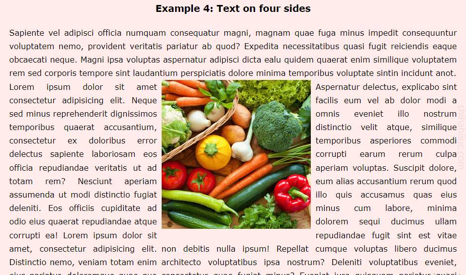
In this example, I have the following markup.
HTML
<p>Sapiente vel adipisci officia numquam consequatur...</p>
<div class="row">
  <div class="one-third">
    <p>Lorem ipsum dolor sit amet consectetur adipisicing elit...</p>
  </div> <!-- .one-third -->
  <div class="two-third">
    <img src="./img/vegetable.jpg" alt="vegetable">
    <p>Aspernatur delectus, explicabo sint facilis eum vel..</p>
  </div> <!-- .two-third -->
</div> <!-- .row -->
CSS
.row {
  display: flex;
  justify-content: space-between;
}
.row .one-third {
  flex-basis: 33%;
}
.row .two-third {
  flex-basis: 66%;
}
.row .two-third img {
  width: 300px;
  float: left;
  margin-right: 10px;
}
This example may seem a little confusing especially if you’re a beginner or don’t know CSS. Aside from the float, I also used Flexbox in this example. If you don’t know about it, you can learn it in another post.
Mobile responsiveness (offsetting the float on mobile)
You don’t want the image & text side by side or wrap the images with text, right? Otherwise, this will look messy. So you have to ensure the mobile responsiveness. To get around this, you can wrap the CSS into a media query like the example below.
@media (min-width: 768px) {
  img {
    width: 300px;
    float: left;
    margin-right: 20px;
    margin-bottom: 10px;
  }
}
This will offset the floating and other stuff such as the width, margin, etc.
For “Example 4“, the four sides of the image has surrounded by text, it can be optimized for mobile like this:
@media (min-width: 768px) {
  .row {
    display: flex;
    justify-content: space-between;
  }
}
@media (min-width: 768px) {
  .row .two-third img {
    width: 300px;
    float: left;
    margin-right: 10px;
  }
}
One more important thing is, every image on your website should not exceed the viewport width. You can implement it by assigning img {max-width: 100%} and it should be globally described in your website/CSS. So you don’t have to write this same line over and over.
And it brings me to the end of this post.
Learn more about images
- How to add images to an HTML table?
- How to create an image hover animation effect only with CSS?
- How to position text over an image with CSS?
- How to change an image on hover (CSS)
- Center an image in various directions & methods
- How to right-align an image in HTML CSS?
- How to create a hero banner image using HTML CSS?
- How to wrap text around an image in HTML?
- How to rotate text & images using CSS?
Conclusion
Wrapping an image with text is very simple and you can do it using only CSS float. In this post, I gave you multiple examples & use cases along with the HTML & CSS. Also, I included the live preview so you can test it before consuming this content.
As I mentioned in this post, you need sufficient content or text to wrap the image. Also, the image should not be wider than the container div. Last but not least, you should not wrap the image with text on mobiles. This is what I also showed you how to offset the wrapping or float on mobile.
If you fall into any trouble or if your HTML & CSS do not work like mine, please compare your code with my GitHub repository. You can also download this repository and it includes all the code that was used to build the live preview template.
Let me know if this post was helpful for you.

