The position: absolute can’t work alone. Because the absolutely positioned element also needs to position itself compared to a certain (another) element. And this is where the position: relative comes into play. But if you do not specify the relative position, then it (absolutely position element) will consider its nearest container (ancestor) element as the relative.
In this post, I will show how you can perfectly center-align HTML elements using absolute position. After reading this post, you’ll be able to center align any elements both horizontally & vertically.
Before you dive in, you can check the live demo of the two examples in the link below.
Let’s get started.
Horizontally center align using CSS position properties
CSS position property has 5 different values such as static, relative, absolute, fixed & sticky. The default value is static. That means, if you do not assign any position then it’s statically positioned.
Anyways, in this post, you’ll only need two of them: relative & absolute. If you want to learn more about the other values, check the other post that I linked at the very top.
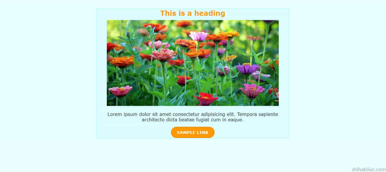
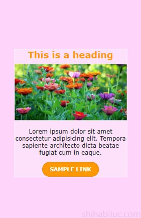
To demonstrate the purpose, we need some sort of HTML elements to make them center align. I took a heading tag, an image, a paragraph & a link. They are wrapped in a <div> that has a CSS class of .elements. Also, I have another <div> that contains everything and it has a class of .container.
See my HTML markup below.
HTML
<div class="container">
  <div class="elements">
    <h2>This is a heading</h2>
    <img src="./img/flower.jpg" alt="flower">
    <p>Placecholder text lorem ipsum dolor sit amet consectetur adipisicing elit. Tempora sapiente architecto dicta beatae fugiat cum in eaque.</p>
    <a href="#">Sample link</a>
  </div> <!-- .elements -->
</div> <!-- .container -->
The above HTML is pretty self-explanatory. But if you need, I will explain more. Please let me know.
CSS
.container {
  padding: 30px 15px;
  height: 600px;
  background-color: #e8feff;
  /* mandatory css below */
  position: relative;
}
.container .elements {
  background-color: #dbfdff;
  border: 1px solid #9af9fc;
  /* mandatory css below */
  position: absolute;
  left: 50%;
  transform: translateX(-50%);
  text-align: center;
}
.container .elements h2 {
  color: #ff9800;
  margin: 0 0 10px;
}
img {
  max-width: 100%;
}
.container .elements p {
  color: #222222;
}
.container .elements a {
  color: #ffffff;
  background-color: #ff9800;
  padding: 10px 20px;
  border: 1px solid #d98202;
  border-radius: 25px;
  text-decoration: none;
  text-transform: uppercase;
  font-size: 0.9em;
  font-weight: bold;
  display: inline-block;
}
Most of the CSS is optional. I wrote the necessary comments on the above CSS so you can identify the mandatory lines. Therefore I want to explain further about a few properties.
As I mentioned earlier, you need a relative position in order to make the absolute positioning work. In this example, the .container div has the relative position. So, the absolutely positioned div (.elements) will work compared to the .container div.
For the .elements div, I have left: 50%. So this div will have 50% space from the left side.
To make it perfectly centered (horizontally), we need to push it (.elements) back to the left side based on its own width. This width could be anything depending on your content. To calculate it dynamically, I used the transform property.
The transform: translateX(-50%) pushed the content back by 50% of its own width to the left side (because of the negative value). This is how you can make content horizontally center align using CSS position properties.
After you save your HTML & CSS, you’ll see have center-aligned content as mine.
Vertically (& horizontally) center align
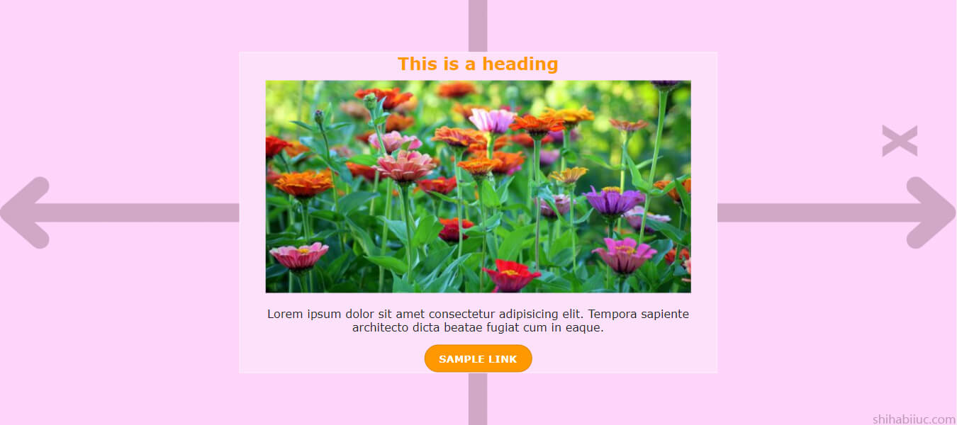
You can vertically center-align content using a very similar approach as you did in the last section.
In the last example, I used left: 50% and transform: translateX(-50%) to make it horizontally centered.
To make the same content vertically & horizontally centered, you can add two more lines such as top: 50% and transform: translateY(-50%). The top: 50% will create a 50% space from the top and the transform: translateY(-50%) will push it back to the top by 50% of its own height. This is how it will be perfectly centered vertically.
Not to mention, if you use both X & Y for the translate, you can combine them like this translate(-50%, -50%).
I used the previous HTML markup and all the CSS. Below is the newly added CSS.
CSS
.container {
  position: relative;
}
.container .elements {
  position: absolute;
  left: 50%;
  top: 50%; /* newly added css */
  transform: translate(-50%, -50%); /* newly added css */
}
This is how you can align content to the center (both in vertical & horizontal directions).
A little fix to the mobile responsiveness
After you use left or/and top values with positon: absolute, it will always try to keep the gap/space to the left or/and top side by 50% (or whatever you assigned). And this will shrink your content. Especially on mobile, it will look very tiny as you’ll have a huge gap (as you see in the screenshot below).
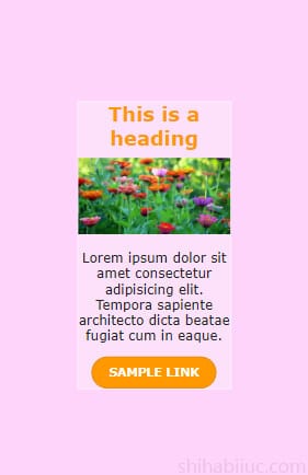
To get around this, you can assign a width value as you see below.
.container .elements {
  width: 80%; /* or whatever you like (for mobile) */
}
@media (min-width: 768px) {
  .container .elements {
    width: inherit; /* to offset the 80% width on large devices */
  }
}
With these two lines of CSS, the absolutely positioned elements will be optimized both on mobile & large devices. And then content will look like the screenshot below (on mobile).
And this brings me to the end of this post.
Learn more about centering elements
- Center a table
- Center a video
- Center an image
- Center alignment using absolute position
- Center alignment using Flexbox
Conclusion
In this post, I explained briefly how to center align content using CSS position and transform properties. I showed you centering content both vertically & horizontally.
If you need further help, you can also download the project (HTML, CSS) from my GitHub repo.
If you have any confusion or questions, please let me know in the comment.

