If you are looking for the best Google font pairs on your website, this post will help you to pick the right combinations. Also, I will show you the live preview of each pair. So you can imagine the look & feel of the font combination clearly.
Why does the font pair matter?
Every website has its own & unique way of elaborating on the subject matter. The exact same font does not convey the same level of comfort/weight on every type of website.
For example, the font for a jock website should be different than a technology blog. A gaming website needs a different font pair than a yoga site.
The font pair is not mandatory but it’s always a good practice to make a better font combination for your website to output the exact tone & message and show professionalism in your industry.
Why Google font instead of something else?
There are various sources of fonts including system fonts. Such as Adobe fonts, Creative market, DaFont, Font space, etc.
But why do most website owners & developers use Google fonts?
There are lots of reasons for choosing Google fonts but there are not limited to:
- Easy to use: The first & topmost reason for choosing Google fonts is usability. It’s very easy to use in any type of website from static HTML to dynamic websites and WordPress.
- Varieties of collections: Aside from the 5 main font categories, there are hundreds of fonts that you can choose from.
- High-speed server/CDN: Google fonts don’t need to host locally. You copy and paste the font link and the font loads from their high-speed server. It takes very low time to load Google fonts and that’s why it does not have a major impact on your website performance. However, if you use many different fonts with 4/5 variations, it will negatively impact loading speed.
- Free to use: Google font does not cost any money to use even if you use them commercially.
- Easy to make font pairings: No matter whatever your niche or type of site you’re creating, Google has a wide range of fonts for almost any type of website. So you easily make font pairs among Serif, Sans Serif, etc.
Best Google fonts combinations
You can make combinations in many different ways using Google fonts. However, to get the most out of font pairings we should not use more than 2 or 3 different fonts. Otherwise, your website will look unprofessional and messy.
The best approach to font pairings is using two different fonts for the headings and body text (paragraphs).
That means you should use a single font for the h1, h2, h3, h4, h5, and h6. And use another font for the rest of the texts such as paragraphs, list items, link texts (anchors), etc.
If you are fascinated about using different fonts, you can use a third font for the accent such as button text or any other call to action.
Whatever you do, don’t go above 3 different fonts.
In this Google font pairing, I will show a lot of combinations of two different fonts. One for headings and another for the rest of the texts. You can choose any one of the font combinations to implement on your project.
Lato & Merriweather pairing
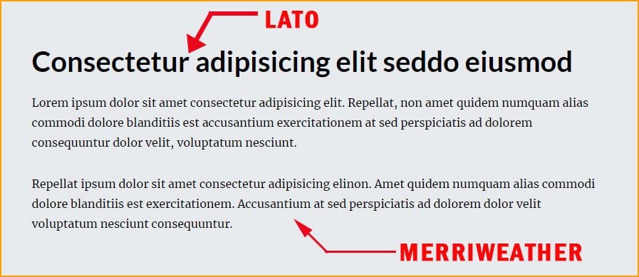
Lato is a Sans Serif font. Here I used it as the heading font. On the other hand, Merriweather is a Serif font.
Lato & Merriweather is a nice font pair for your website. I used 700 as the font weight for the heading (Lato) and 400 for the text (Merriweather).
These two are the best Google fonts for pairing on any website.
Font embed method
<link href="https://fonts.googleapis.com/css2?family=Lato:wght@700&display=swap" rel="stylesheet">
<link href="https://fonts.googleapis.com/css2?family=Merriweather&display=swap" rel="stylesheet">
h1, h2, h3, h4, h5, h6 {
font-family: 'Lato', sans-serif;
}
body {
font-family: 'Merriweather', serif;
}Roboto & PT Serif pairing
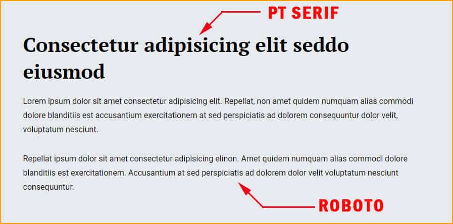
PT Serif is a Serif font. Here I used it as the heading font. On the other hand, Roboto is a Sans Serif font.
In this font pairing, PT Serif has 700 font weight & Roboto has 400.
Font embed method
<link href="https://fonts.googleapis.com/css2?family=PT+Serif:wght@700&display=swap" rel="stylesheet">
<link href="https://fonts.googleapis.com/css2?family=Roboto&display=swap" rel="stylesheet">
h1, h2, h3, h4, h5, h6 {
font-family: 'PT Serif', serif;
}
body {
font-family: 'Roboto', sans-serif;
}Montserrat & Roboto Slab pairing
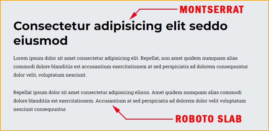
Montserrat is a Sans Serif font. Here I used it as the heading font. On the other hand, Roboto Slab is a Serif font.
In this font combination, Montserrat has 700 font weight and Roboto Slab has 400.
Font embed method
<link href="https://fonts.googleapis.com/css2?family=Montserrat:wght@700&display=swap" rel="stylesheet">
<link href="https://fonts.googleapis.com/css2?family=Roboto+Slab&display=swap" rel="stylesheet">
h1, h2, h3, h4, h5, h6 {
font-family: 'Montserrat', sans-serif;
}
body {
font-family: 'Roboto Slab', serif;
}Poppins & Lora pairing
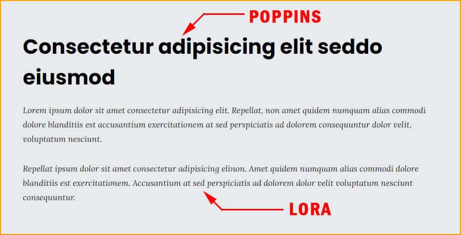
Poppins is a Sans Serif font. Here I used it as the heading font. On the other hand, Lora is a Serif font.
In this font combination, Poppins has 700 font weight & Lora has 400.
Font embed method
<link href="https://fonts.googleapis.com/css2?family=Poppins:wght@700&display=swap" rel="stylesheet">
<link href="https://fonts.googleapis.com/css2?family=Lora:ital@1&display=swap" rel="stylesheet">
h1, h2, h3, h4, h5, h6 {
font-family: 'Poppins', sans-serif;
}
body {
font-family: 'Lora', serif;
}Noto Sans & Vollkorn pairing
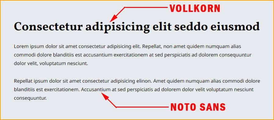
Vollkorn is a Serif font. Here I used it as the heading font. On the other hand, Noto Sans is a Serif font.
These two Google fonts go together very well. In this combination, I used 700 font weight for Vollkorn & 400 for Noto Sans.
Font embed method
<link href="https://fonts.googleapis.com/css2?family=Vollkorn:wght@700&display=swap" rel="stylesheet">
<link href="https://fonts.googleapis.com/css2?family=Noto+Sans&display=swap" rel="stylesheet">
h1, h2, h3, h4, h5, h6 {
font-family: 'Vollkorn', serif;
}
body {
font-family: 'Noto Sans', sans-serif;
}| Learn & practice CSS with real-world examples |
|---|
| Learn basic CSS from the ground up. |
| Build real projects in HTML CSS. |
Build HTML CSS projects
Conclusion
Google Fonts is a source of varieties of fonts that includes 5 different categories such as Serif, Sans Serif, Display, Handwriting, and Monospace. And each of these categories contains hundreds of different fonts.
So you can make thousands of font combinations. In this post, I gave you a couple of Google font pairs based on 6 years of my web design experience.
User experience is one of the topmost priorities when it comes to designing a website. And the fonts have vital roles in this context. The fonts on your website should be easy to read and match together. Also, the size, thickness, color, line height, everything mater.
If you find a better font that matches your website, feel free to make a new font pair even if you don’t see it here.