CSS gradient border is a great opportunity to make your content stand out. Throughout my website, I used gradient borders that helped me to focus on important parts of a web page. And you can do the same using them.
In this post, I will give you some examples of CSS gradient borders. Also, I will show how you can create your own border styles.
Let’s get started.
Examples of CSS gradient border
From the examples listed below, you can copy-paste my CSS and change the color values exactly the way you want. Let’s see some of the cool gradient borders.
Gradient border on all 4 sides
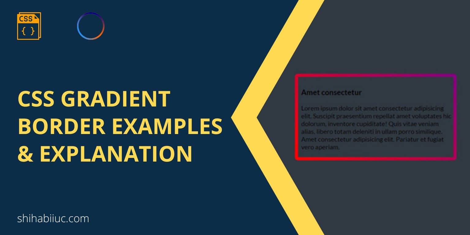
CSS gradient border example 1
Lorem ipsum dolor sit amet consectetur adipisicing elit. Suscipit praesentium repellat amet voluptates hic dolorum, inventore cupiditate! Quis vitae veniam alias, libero totam deleniti in ullam porro similique. Amet consectetur adipisicing elit. Pariatur et fugiat vero aperiam.
For the above example, I have the following CSS:
.gradient-border-example-1 {
  border-width: 10px 10px 10px 10px;
  border-image: linear-gradient(45deg, red 0%, purple 100%);
  border-image-slice: 9;
  border-style: solid;
}
Not to mention, to make the gradient border work on every web browser, you may need to add vendor prefixes for the border-image property. There are many ways to add vendor prefixes to your CSS. Such as using SASS auto prefixes, and online tools like Autoprefixer, etc. See my whole CSS that also contains vendor prefixes:
.gradient-border-example-1 {
  border-width: 10px 10px 10px 10px;
  -o-border-image: linear-gradient(45deg, red 0%, purple 100%);
     border-image: linear-gradient(45deg, red 0%, purple 100%);
  border-image-slice: 9;
  border-style: solid;
}
And I have the following HTML skeleton for the content:
<div class="gradient-border-example-1">
  <h3>Amet consectetur</h3>
  <p>Lorem ipsum dolor sit amet ...</p>
</div>
In this example, you saw that I have a mix of red & purple colors. But you can change or replace these two colors with your choice. Even, you can use hex colors like #FAC20A, #2014FC and RGBA colors such as rgba(250, 194, 10, 0.85), rgba(32, 20, 252, 0.67). We will see their use cases in the following couple of examples.
Gradient border on a few specific sides
Example 1: Lorem ipsum dolor sit amet consectetur adipisicing elit. Magni sit blanditiis hic asperiores sunt magnam culpa aperiam excepturi.
Example 2: Lorem ipsum dolor sit amet consectetur adipisicing elit. Magni sit blanditiis hic asperiores sunt magnam culpa aperiam excepturi.
Example 3: Lorem ipsum dolor sit amet consectetur adipisicing elit. Magni sit blanditiis hic asperiores sunt magnam culpa aperiam excepturi.
In these 3 examples, you see that we’re just not limited to using borders on all 4 sides. You can also add borders to any specific side(s). By following this strategy, you can also create a horizontal & vertical divider.
Anyways, for these three examples, I have the following CSS:
.example-one {
  border-width: 10px 0 10px 10px;
  border-image: linear-gradient(45deg, #FAC20A 0%, #2014FC 100%);
  border-image-slice: 9;
  border-style: solid;
}
.example-two {
  border-width: 10px 0 10px 0;
  border-image: linear-gradient(45deg, #04b004 5%, #b52905 90%);
  border-image-slice: 9;
  border-style: solid;
}
.example-three {
  border-width: 0 10px 0 0;
  border-image: linear-gradient(45deg, rgba($color: #c604d4, $alpha: 0.85) 0%, rgba($color: #4f4d4f, $alpha: 0.67) 100%);
  border-image-slice: 9;
  border-style: solid;
}
If you noticed in my CSS, you’ll see that I only changed the border-width property to add or remove border(s) from different sides. CSS border-width is a shorthand for border-top-width, border-right-width, border-bottom-width & border-left-width respectively.
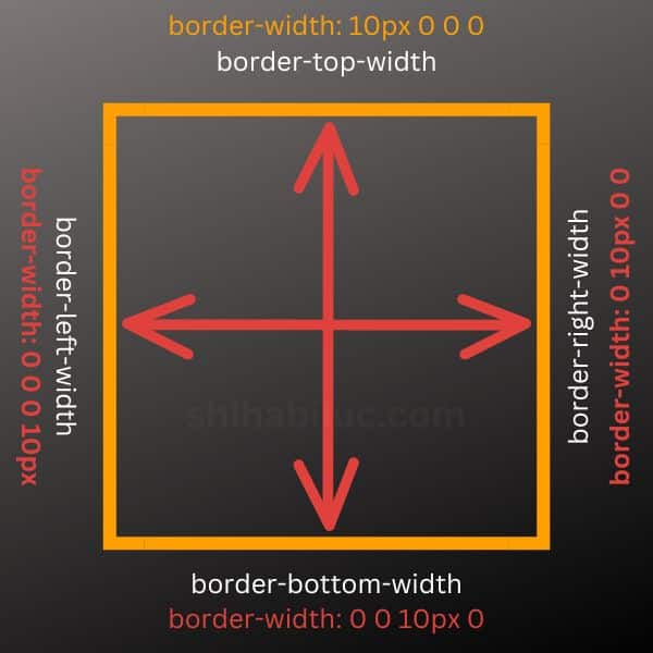
border-width shorthand properties explanationIn the same vein, you can add or remove borders from any side using the border-width shorthand property.
Lastly, you may also see two units border-width such as 5px 10px. The first unit is applicable for the top & bottom (5 pixels), and the second unit is applicable for the left & right (10 pixels). See the screenshot below for more clarification.
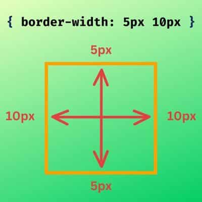
border-width property explanationIf you see one unit of border-width property, it applies to all 4 directions. For example border-width: 5px is same as border-width: 5px 5px 5px 5px.
CSS gradient border with radius
Gradient border radius example
Lorem ipsum dolor sit amet consectetur adipisicing elit. Suscipit praesentium repellat amet voluptates hic dolorum, inventore cupiditate! Quis vitae veniam alias, libero totam deleniti in ullam porro similique. Amet consectetur adipisicing elit. Pariatur et fugiat vero aperiam.
In this context, you can’t just create a radius using the border-radius property. Also, you’ll not find enough working solutions to work with border-image & border-radius together. However, I will show you the simplest way to get around this situation.
To work with CSS gradient border with border-radius, we need to tweak the HTML markup a little bit. Don’t worry, this will be super simple!
Just create a new container <div> and wrap the previous HTML markup within it. Let me show you:
<div class="gradient-border-wrapper">
  <div class="gradient-border-example-3">
    <h3>Amet consectetur</h3>
    <p>Lorem ipsum dolor sit amet ....</p>
  </div>
</div>
The main purpose is to add the wrapper <div> is to use overflow: hidden so we can make the border-radius work in a different way.
See my CSS first. This will help you to better understand my explanation after.
.gradient-border-wrapper {
  display: inline-block; /* not mandatory to use inline-block */
  border-radius: 10px;
  overflow: hidden; /* this is required */
}

.gradient-border-example-3 {
  border-width: 10px;
  -o-border-image: linear-gradient(45deg, red 0%, purple 100%); /* prefix */
     border-image: linear-gradient(45deg, red 0%, purple 100%);
  border-image-slice: 9;
  border-style: solid;
}
In the above CSS, the container element has an overflow: hidden. That means anything outside of the 10px radius (based on my border-radius) will be invisible. And this is how I made the gradient border rounded. I briefly explained this overflow working process in another post. If you’re curious, feel free to check this after.
| Learn & practice CSS with real-world examples |
|---|
| Learn basic CSS from the ground up. |
| Build real projects in HTML CSS. |
Now you know how to create a gradient border using CSS. Also, you learned how to add a gradient border to a specific side or multiple sides. Lastly, you saw how easy it is to make a rounded gradient border.
I tried my best to explain everything and gave you a couple of examples. And created infographics to make you understand everything clearly. Therefore if you still have any questions about the CSS gradient border, let me know.

