You can write CSS to style buttons to make it look exactly how you want. There is no right or wrong way to style buttons. You can also come up with many creative buttons in CSS.
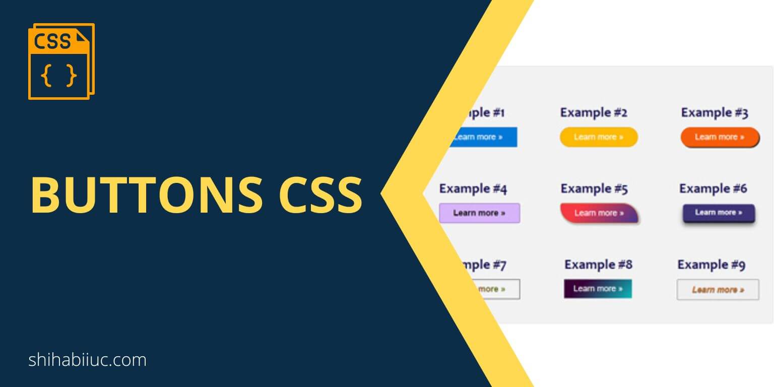
Here, I have included a couple of live examples that you can use as inspiration. Some of these buttons have animations. Hover your mouse over each of these buttons to see the animation in action.
Example #1
Example #2
Example #3
Example #4
Example #5
Example #6
Example #7
Example #8
Example #9
As you can see above, I have created a couple of examples. The corresponding buttons in CSS and HTML are below.
HTML markup for all the buttons
<section class="btn-container">
  <div class="btn-example">
    <h3>Example #1</h3>
    <button class="example-1">Learn more »</button>
  </div>
  <div class="btn-example">
    <h3>Example #2</h3>
    <button class="example-2">Learn more »</button>
  </div>
  <div class="btn-example">
    <h3>Example #3</h3>
    <button class="example-3">Learn more »</button>
  </div>
  <div class="btn-example">
    <h3>Example #4</h3>
    <button class="example-4">Learn more »</button>
  </div>
  <div class="btn-example">
    <h3>Example #5</h3>
    <button class="example-5">Learn more »</button>
  </div>
  <div class="btn-example">
    <h3>Example #6</h3>
    <button class="example-6">Learn more »</button>
  </div>
  <div class="btn-example">
    <h3>Example #7</h3>
    <button class="example-7">Learn more »</button>
  </div>
  <div class="btn-example">
    <h3>Example #8</h3>
    <button class="example-8">Learn more »</button>
  </div>
  <div class="btn-example">
    <h3>Example #9</h3>
    <button class="example-9">Learn more »</button>
  </div>
</section>
CSS for all the buttons
.btn-container {
  max-width: 900px;
  margin: 90px auto;
  background-color: #F2F2F2;
  padding: 30px 20px;
  border: 1px solid #dedede;
  border-radius: 5px;
  display: flex;
  flex-wrap: wrap;
  justify-content: space-between;
}
.btn-container .btn-example {
  margin: 20px 10px;
}
.btn-container button {
  cursor: pointer;
  padding: 10px 30px;
  font-family: 'Lato', sans-serif;
  font-size: 18px;
}
.btn-container button.example-1 {
  color: #FFFFFF;
  background-color: #0078D7;
  border: 1px solid #0264b3;
  transition: all 0.8s ease;
}
.btn-container button.example-1:hover {
  background-color: #015191;
  text-shadow: 1px 2px 2px #222222;
}
.btn-container button.example-2 {
  color: #FFFFFF;
  background-color: #fcba03;
  border: 1px solid #dba100;
  border-radius: 25px;
  transition: all 0.8s ease;
}
.btn-container button.example-2:hover {
  background-color: #dba100;
}
.btn-container button.example-3 {
  color: #FFFFFF;
  background-color: #f55c0a;
  border: 1px solid #d64e04;
  box-shadow: 2px 2px #222222;
  border-radius: 25px;
  transition: all 0.8s ease;
}
.btn-container button.example-3:hover {
  background-color: #d64e04;
  box-shadow: 2px 2px 2px 3px rgba(0, 0, 0, 0.2);
}
.btn-container button.example-4 {
  color: #000000;
  font-weight: 700;
  border: 1px solid #7f53ac;
  border-radius: 4px;
  display: inline-block;
  background-color: #d7b4fa;
  background-image: linear-gradient(315deg, #7f53ac 0%, #647dee 74%);
  background-position: 0 100%;
  background-size: 0% 2px;
  background-repeat: no-repeat;
  transition:
    background-size 0.3s,
    background-position 0s 0.3s;
}
.btn-container button.example-4:hover {
  background-position: 100% 100%;
  background-size: 100% 3px;
}
.btn-container button.example-5 {
  color: #FFFFFF;
  background-color: #42378f;
  background-image: linear-gradient(315deg, #42378f 0%, #f53844 74%);
  border: 1px solid #d64e04;
  border-radius: 5px 35px 5px 35px;
  transition: all 0.8s ease;
  box-shadow: 2px 2px 2px 3px rgba(0, 0, 0, 0.2);
}
.btn-container button.example-5:hover {
  border-radius: 35px 5px 35px 5px;
  color: #FF9800;
  text-shadow: 2px 2px 2px #222222;
  font-size: 18.3px;
}
.btn-container button.example-6 {
  color: #FFFFFF;
  background-color: #3d3377;
  font-weight: 700;
  box-shadow: 0px 10px 11px rgba(0, 0, 0, 0.6), 1px 4px 0px rgba(31, 36, 78, 0.95);
  border: none;
  border-radius: 7px;
  transition: all 0.5s ease;
  transform: scale(0.9);
}
.btn-container button.example-6:hover {
  box-shadow: 0px 2px 0px rgba(29, 36, 78, 0.98), 0px 2px 3px rgba(0, 0, 0, .9);
  top: 6px;
  transform: scale(0.8) translateY(2px);
}
.btn-container button.example-7 {
  border: 1px solid #222222;
  font-weight: 700;
  background: linear-gradient(90deg, red, green);
  -webkit-background-clip: text;
  -webkit-text-fill-color: transparent;
  -webkit-box-decoration-break: clone;
  transition: all 0.9s ease;
}
.btn-container button.example-7:hover {
  background: linear-gradient(to left, #4A378B 34%, #F53844 65%) right;
  background-size: 300% 100%;
  color: blue;
  text-shadow: 2px 2px #FFFFFF;
}
.btn-container button.example-8 {
  background-color: #0cbaba;
  background-image: linear-gradient(315deg,#0cbaba 0,#380036 74%);
  padding: 10px 20px;
  max-width: 200px;
  display: block;
  text-align: center;
  color: #fff;
  border: none;
}
.btn-container button.example-9 {
  animation: change_color 2s infinite;
  font-weight: 700;
  font-style: italic;
  text-shadow: 0 1px 1px #222222;
  transition: all 0.8s ease-out;
}
.btn-container button.example-9:hover {
  border: 1px solid #FF9800;
  -webkit-animation: 0;
}
@keyframes change_color {
  0%   {color: red;}
  25%  {color: blue;}
  50%  {color: #FF9800;}
  75%  {color: green;}
  100% {color: red;}
}
Buttons are generally used with forms. And once you click the button, the form is going to submit. However, it does not mean that you are bound to use buttons only with forms. You can use them whenever you see fit.
Anyway, you now have many buttons with different styles. You can easily change the colors, background, etc., to match your brand.
Learn more about buttons
| Learn & practice CSS with real-world examples |
|---|
| Learn basic CSS from the ground up. |
| Build real projects in HTML CSS. |
If you look at the HTML, each button has a number, such as #1, #2, #3, and so on. You will also find these numbers in the CSS classes. For example, “.example-2, .example-3”, etc.
I did this so you can find the corresponding CSS for specific buttons that you liked. If you still have any issues or questions, please let me know.

