You can make a two-column list using the following CSS:
ul,
ol {
  display: grid;
  grid-template-columns: repeat(2, auto);
  column-gap: 90px;
}
If you prefer a video explanation, look at the bottom.
In this post, I will show you how to create a two-column list in HTML and CSS. This list could be ordered or unordered.
Some of you may have tried to create a two-column at first and then put your list items separately on those divs. But this is not what I am going to do.
Instead, I will write some CSS to automatically arrange the list items in two columns. Also, this will be mobile responsive. That means, on mobile and smaller screens, this will be a one-column list, and on larger screens, it will be two columns.
Create a two-column list (unordered)
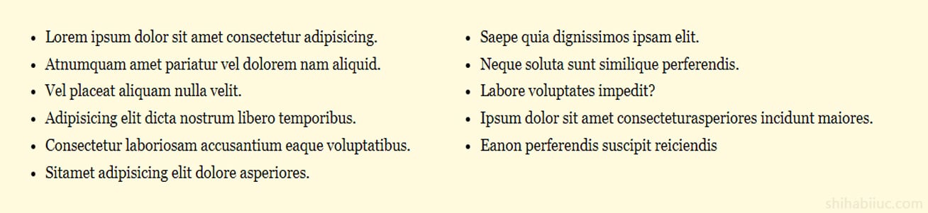
To demonstrate this purpose, I have the following HTML & CSS.
HTML
<ul>
  <li>Lorem ipsum dolor sit amet consectetur adipisicing.</li>
  <li>Saepe quia dignissimos ipsam elit.</li>
  <li>Atnumquam amet pariatur vel dolorem nam aliquid.</li>
  <li>Neque soluta sunt similique perferendis.</li>
  <li>Vel placeat aliquam nulla velit.</li>
  <li>Labore voluptates impedit?</li>
  <li>Adipisicing elit dicta nostrum libero temporibus.</li>
  <li>Ipsum dolor sit amet consecteturasperiores incidunt maiores.</li>
  <li>Consectetur laboriosam accusantium eaque voluptatibus.</li>
  <li>Eanon perferendis suscipit reiciendis</li>
  <li>Sitamet adipisicing elit dolore asperiores.</li>
</ul>
CSS
ul {
  display: grid;
  grid-template-columns: 1fr;
}
@media (min-width: 768px) {
  ul {
    grid-template-columns: repeat(2, auto);
    -webkit-column-gap: 30px;
       -moz-column-gap: 30px;
            column-gap: 30px;
  }
}
This is how you can make a two-column list. However, if you need more than two columns, you need to change just one line of CSS.
For example, if you need a three-column list, your CSS will be as follows:
grid-template-columns: repeat(3, auto);So on and so forth.
Two-column list (ordered)
If you are working with an ordered (numbered) list, you can use the same approach as the last example. However, there is a caveat that you may have not noticed yet. Please see the screenshot below to understand the types better.
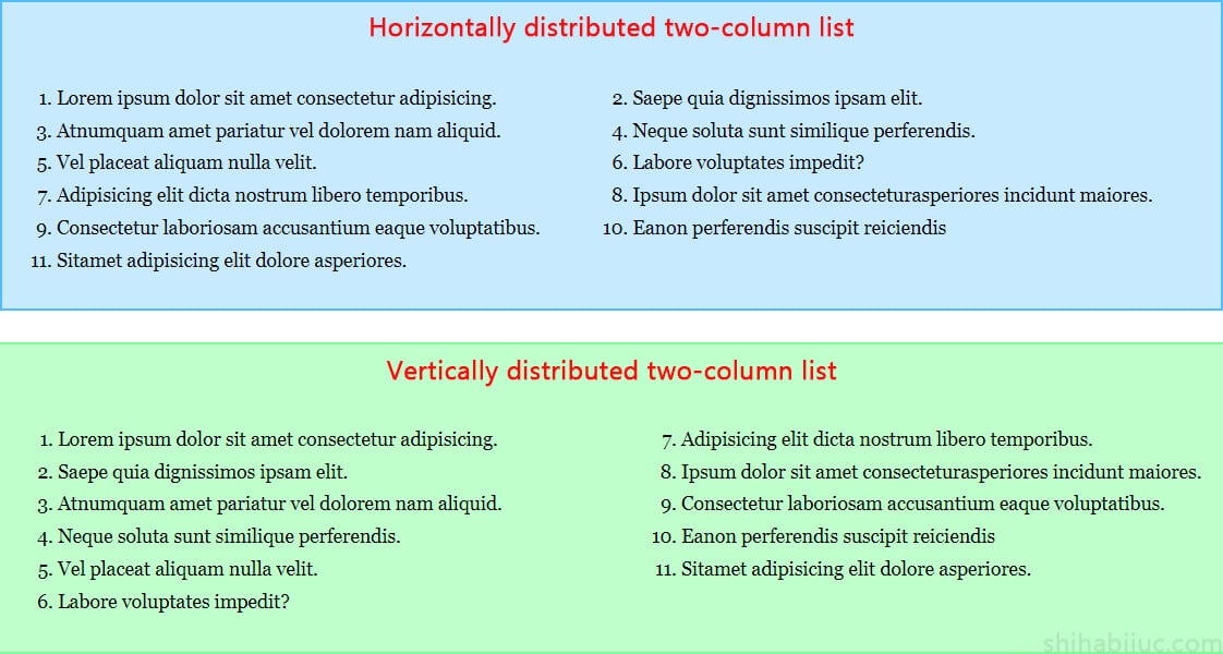
In the screenshot above, the first example (Horizontally distributed two-column list) distributes the list items horizontally. All the odd numbers live on the left side, and even numbers live on the right side.
In the second example (vertically distributed two-column list), the numbers/items started at 1 and continued serially until the end.
None of the approaches is wrong. In some cases, the first example is the correct format, and in some cases, the second example is perfect. However, most of you may want/like the second example.
In this section, I will show you both.
Ordered list (horizontally distributed)
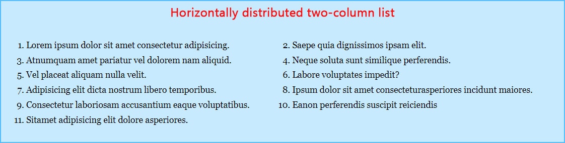
For this example, I have the following HTML.
HTML
  <ol>
    <li>Lorem ipsum dolor sit amet consectetur adipisicing.</li>
    <li>Saepe quia dignissimos ipsam elit.</li>
    <li>Atnumquam amet pariatur vel dolorem nam aliquid.</li>
    <li>Neque soluta sunt similique perferendis.</li>
    <li>Vel placeat aliquam nulla velit.</li>
    <li>Labore voluptates impedit?</li>
    <li>Adipisicing elit dicta nostrum libero temporibus.</li>
    <li>Ipsum dolor sit amet consecteturasperiores incidunt maiores.</li>
    <li>Consectetur laboriosam accusantium eaque voluptatibus.</li>
    <li>Eanon perferendis suscipit reiciendis</li>
    <li>Sitamet adipisicing elit dolore asperiores.</li>
  </ol>
And I have the following CSS.
CSS
ol {
  display: grid;
  /* for mobile (one-column) */
  grid-template-columns: 1fr;
}
@media (min-width: 768px) {
  ol {
    /* for large devices (two-column) */
    grid-template-columns: repeat(2, auto);
    -webkit-column-gap: 30px;
       -moz-column-gap: 30px;
            column-gap: 30px;
  }
}
This is where you can create a horizontally distributed two-column ordered list.
Ordered list (vertically distributed)
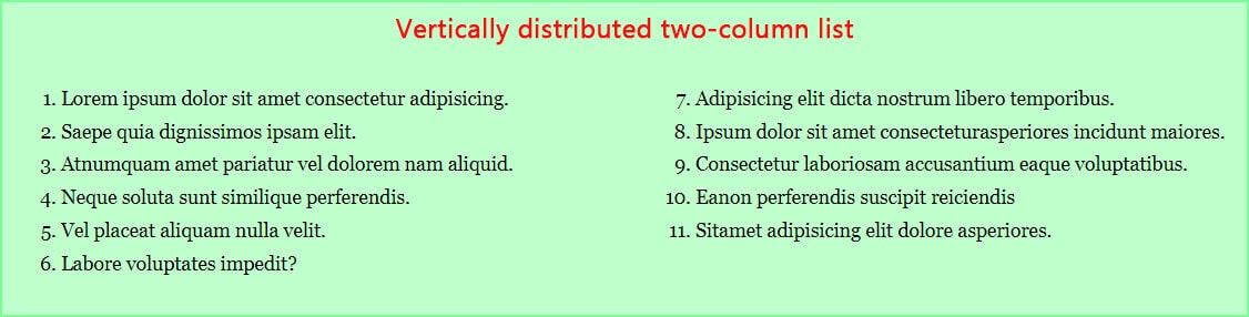
To organize the list items like this example, you need to reorganize the HTML markup slightly. However, it’s very simple.
HTML
<div class="container">
  <ol>
    <li>Lorem ipsum dolor sit amet consectetur adipisicing.</li>
    <li>Saepe quia dignissimos ipsam elit.</li>
    <li>Atnumquam amet pariatur vel dolorem nam aliquid.</li>
    <li>Neque soluta sunt similique perferendis.</li>
    <li>Vel placeat aliquam nulla velit.</li>
    <li>Labore voluptates impedit?</li>
  </ol>
  <ol start="7">
    <li>Adipisicing elit dicta nostrum libero temporibus.</li>
    <li>Ipsum dolor sit amet consecteturasperiores incidunt maiores.</li>
    <li>Consectetur laboriosam accusantium eaque voluptatibus.</li>
    <li>Eanon perferendis suscipit reiciendis</li>
    <li>Sitamet adipisicing elit dolore asperiores.</li>
  </ol>
</div> <!-- .container -->
As you see in the above HTML, I created two <ol> and listed the items separately. Here, you see an extra HTML attribute, which is start.
By default, the ordered list starts from 1 and increases by 1. If you mention/assign a start attribute with a number, it will change the default starting value. In my example, the start="7" will make the second list start to count from 7.
CSS
.container {
  display: grid;
  /* for mobile & smaller screens */
  grid-template-columns: 1fr;

  /* optional */
  background-color: #BFFFCC;
  padding: 60px 15px;
  max-width: 1100px;
  margin: 0 auto;
}
@media (min-width: 768px) {
  .container {
    /* for large screens (two-column) */
    grid-template-columns: 1fr 1fr;
  }
}
.container ol {
  /* optional */
  margin: 0;
}
And this brings me to the end of this post.
Video explanation
List related posts:
| Learn & practice CSS with real-world examples |
|---|
| Learn basic CSS from the ground up. |
| Build real projects in HTML CSS. |
To create the layout, I used CSS Grid, but everything can be done by Flexbox. If you want to learn about Flexbox in detail and get your hands dirty, see this post.

