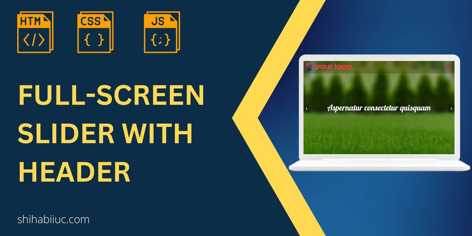
This post will show you how to create a full-screen slider using HTML, CSS & JavaScript. Also, I will include header navigation that stays on top of the slider.
It’s fully mobile responsive and works well on all web browsers. No dependencies, frameworks, or libraries are required.
Before you start, you can see the finished project in the link below.
If you liked the live demo, let’s get started.
How to create a full-screen slider (Source code)
No matter the screen size, the slider will always be full-screen. This kind of slider is generally used in the home page section. But it can be used anywhere you like.
I have a semi-transparent header navigation which is also mobile responsive. Also, I have some generic/placeholder content on the HTML document and a footer.
To keep this post short and easy to digest, I will ignore the generic content and footer part. And I will show you only the slider along with the header navigation. But if you need the exact template as the demo, I will link it to my GitHub repository later in this post.
HTML
<section class="fullscreen-slider-with-header">
  <nav class="site-header">
    <div class="nav-logo">
      <a href="index.html">
        <img src="img/logo.png" alt="logo" width="314" height="60" />
      </a>
    </div>
    <button class="hamburger">
      <img src="img/menu.png" alt="menu toggle icon" />
    </button>
    <div class="nav-links">
      <ul>
        <li><a href="index.html">Home</a></li>
        <li><a href="#about">About Me</a></li>
        <li><a href="#skill">Skills</a></li>
        <li><a href="#service">Services</a></li>
        <li><a href="#portfolio">Portfolio</a></li>
        <li><a href="#testimonial">Testimonial</a></li>
        <li><a href="#pricing">Pricing</a></li>
        <li><a href="#contact">Contact</a></li>
      </ul>
    </div>
  </nav>
  <!-- .site-header -->

  <div class="slideshow-container">
    <div class="mySlides fade bg1">
      <h3 class="text">Aspernatur consectetur quisquam</h3>
    </div>
    <!-- .mySlides -->

    <div class="mySlides fade bg2">
      <h3 class="text">Debipisicing laboriosam deserunt</h3>
    </div>
    <!-- .mySlides -->

    <div class="mySlides fade bg3">
      <h3 class="text">Consectetur voluptates suscipit</h3>
    </div>
    <!-- .mySlides -->

    <a class="prev" onclick="plusSlides(-1)">❮</a>
    <a class="next" onclick="plusSlides(1)">❯</a>
  </div>
  <!-- .slideshow-container -->
</section>
<!-- .fullscreen-slider-with-header -->
As you see in this HTML, I have an “img” folder where all the images are stored. If you want to download the image or the folder, please refer to this link. This “img” folder also contains the social icons for the footer (as you see in the demo).
CSS
.fullscreen-slider-with-header {
  position: relative;
  /* Fading animation */
  /* On smaller screens, decrease text size */
}
.fullscreen-slider-with-header .site-header {
  height: 83px;
  position: relative;
  z-index: 10;
  display: -webkit-box;
  display: -ms-flexbox;
  display: flex;
  -webkit-box-align: center;
      -ms-flex-align: center;
          align-items: center;
  -webkit-box-orient: vertical;
  -webkit-box-direction: normal;
      -ms-flex-direction: column;
          flex-direction: column;
  background-color: rgba(0, 0, 0, 0.2);
  border-bottom: 1px solid rgba(255, 255, 255, 0.3);
}
@media screen and (min-width: 1250px) {
  .fullscreen-slider-with-header .site-header {
    -webkit-box-pack: justify;
        -ms-flex-pack: justify;
            justify-content: space-between;
    -webkit-box-orient: horizontal;
    -webkit-box-direction: normal;
        -ms-flex-direction: row;
            flex-direction: row;
  }
}
.fullscreen-slider-with-header .site-header .nav-logo {
  -ms-flex-item-align: start;
      align-self: flex-start;
  padding: 10px 5px 5px;
}
.fullscreen-slider-with-header .site-header .nav-logo a img {
  max-width: 200px;
  height: auto;
}
@media screen and (min-width: 768px) {
  .fullscreen-slider-with-header .site-header .nav-logo a img {
    max-width: 314px;
    height: auto;
  }
}
.fullscreen-slider-with-header .site-header .nav-links {
  display: none;
  width: 100%;
}
@media screen and (min-width: 1250px) {
  .fullscreen-slider-with-header .site-header .nav-links {
    display: block;
  }
}
.fullscreen-slider-with-header .site-header .nav-links ul {
  position: absolute;
  width: 100%;
  background-color: rgba(0, 0, 0, 0.6);
  margin: 0;
  padding: 20px 10px;
  display: -webkit-box;
  display: -ms-flexbox;
  display: flex;
  -webkit-box-orient: vertical;
  -webkit-box-direction: normal;
      -ms-flex-direction: column;
          flex-direction: column;
  -webkit-box-pack: end;
      -ms-flex-pack: end;
          justify-content: flex-end;
}
@media screen and (min-width: 1250px) {
  .fullscreen-slider-with-header .site-header .nav-links ul {
    -webkit-box-orient: horizontal;
    -webkit-box-direction: normal;
        -ms-flex-direction: row;
            flex-direction: row;
    background-color: transparent;
    padding: 0;
    position: static;
  }
}
.fullscreen-slider-with-header .site-header .nav-links ul li {
  list-style: none;
  position: relative;
}
.fullscreen-slider-with-header .site-header .nav-links ul li a {
  font-family: "Open Sans", sans-serif;
  font-size: 18px;
  font-weight: 400;
  font-style: italic;
  color: #ff9800;
  text-transform: uppercase;
  text-decoration: none;
  letter-spacing: 1.2px;
  padding: 10px 15px;
  display: block;
  -webkit-transition: all 0.4s ease-in-out;
  transition: all 0.4s ease-in-out;
}
.fullscreen-slider-with-header .site-header .nav-links ul li a:hover {
  background-color: rgba(255, 152, 0, 0.5);
  color: #ffffff;
  border-radius: 20px 5px 35px 7px;
}
.fullscreen-slider-with-header .site-header button {
  cursor: pointer;
  background: transparent;
  border: none;
  max-width: 50px;
  display: block;
  position: absolute;
  top: 10px;
  right: 10px;
}
@media screen and (min-width: 768px) {
  .fullscreen-slider-with-header .site-header button {
    top: 20px;
  }
}
@media screen and (min-width: 1250px) {
  .fullscreen-slider-with-header .site-header button {
    display: none;
  }
}
.fullscreen-slider-with-header .nav-links.active {
  display: block;
}
.fullscreen-slider-with-header .slideshow-container {
  margin-top: -83px;
  z-index: 0;
  font-family: "Lobster", cursive;
  padding: 0;
  width: 100vw;
  max-width: 100%;
  height: 100vh;
  /* Next & previous buttons */
}
.fullscreen-slider-with-header .slideshow-container .mySlides {
  -webkit-box-pack: center;
      -ms-flex-pack: center;
          justify-content: center;
  -webkit-box-align: center;
      -ms-flex-align: center;
          align-items: center;
  height: 100%;
  padding: 30px 10px;
}
@media (min-width: 768px) {
  .fullscreen-slider-with-header .slideshow-container .mySlides {
    padding: 45px 35px;
  }
}
.fullscreen-slider-with-header .slideshow-container .mySlides .text {
  font-weight: 400;
  text-align: center;
  color: rgba(255, 255, 255, 0.95);
  font-size: 30px;
  padding: 0 20px;
  line-height: 1.2;
}
@media (min-width: 768px) {
  .fullscreen-slider-with-header .slideshow-container .mySlides .text {
    font-size: 3.225rem;
  }
}
.fullscreen-slider-with-header .slideshow-container .bg1 {
  background-image: -webkit-gradient(linear, left top, left bottom, from(rgba(0, 0, 0, 0.25))), url("./img/slide-1.jpg");
  background-image: linear-gradient(rgba(0, 0, 0, 0.25)), url("./img/slide-1.jpg");
  background-repeat: no-repeat;
  background-size: cover;
}
.fullscreen-slider-with-header .slideshow-container .bg2 {
  background-image: -webkit-gradient(linear, left top, left bottom, from(rgba(0, 0, 0, 0.45))), url("./img/slide-2.jpg");
  background-image: linear-gradient(rgba(0, 0, 0, 0.45)), url("./img/slide-2.jpg");
  background-repeat: no-repeat;
  background-size: cover;
}
.fullscreen-slider-with-header .slideshow-container .bg3 {
  background-image: -webkit-gradient(linear, left top, left bottom, from(rgba(0, 0, 0, 0.25))), url("./img/slide-3.jpg");
  background-image: linear-gradient(rgba(0, 0, 0, 0.25)), url("./img/slide-3.jpg");
  background-repeat: no-repeat;
  background-size: cover;
}
.fullscreen-slider-with-header .slideshow-container .prev,
.fullscreen-slider-with-header .slideshow-container .next {
  cursor: pointer;
  position: absolute;
  top: 50%;
  width: auto;
  padding: 16px;
  margin-top: -22px;
  color: white;
  font-weight: 700;
  font-size: 18px;
  -webkit-transition: 0.6s ease;
  transition: 0.6s ease;
  border-radius: 0 3px 3px 0;
  -webkit-user-select: none;
     -moz-user-select: none;
      -ms-user-select: none;
          user-select: none;
  background-color: rgba(0, 0, 0, 0.25);
}
.fullscreen-slider-with-header .slideshow-container .next {
  right: 0;
  border-radius: 3px 0 0 3px;
}
.fullscreen-slider-with-header .slideshow-container .prev:hover,
.fullscreen-slider-with-header .slideshow-container .next:hover {
  background-color: rgba(0, 0, 0, 0.8);
}
.fullscreen-slider-with-header .fade {
  -webkit-animation-name: fade;
          animation-name: fade;
  -webkit-animation-duration: 1.5s;
          animation-duration: 1.5s;
}
@-webkit-keyframes fade {
  from {
    opacity: 0.4;
  }
  to {
    opacity: 1;
  }
}
@keyframes fade {
  from {
    opacity: 0.4;
  }
  to {
    opacity: 1;
  }
}
@media only screen and (max-width: 300px) {
  .fullscreen-slider-with-header .prev,
  .fullscreen-slider-with-header .next {
    font-size: 11px;
  }
}
As I mentioned, the placeholder content and the footer part are missing from the above CSS. If you want them all, please find my GitHub repo at the bottom of this post.
JavaScript
// HEADER NAVIGATION
const hamburger = document.getElementsByClassName("hamburger")[0]
const mobileNavs = document.getElementsByClassName("nav-links")[0]

hamburger.addEventListener("click", () => {
  mobileNavs.classList.toggle("active")
})

// SLIDER
let slideIndex = 1;
showSlides(slideIndex);

function plusSlides(n) {
  showSlides(slideIndex += n);
}

function currentSlide(n) {
  showSlides(slideIndex = n);
}

function showSlides(n) {
  let i;
  let slides = document.getElementsByClassName("mySlides");

  if (n > slides.length) {slideIndex = 1}
  if (n < 1) {slideIndex = slides.length}
  for (i = 0; i < slides.length; i++) {
    slides[i].style.display = "none";
  }
  slides[slideIndex-1].style.display = "flex";
}
This is plain/vanilla JavaScript that does not require any dependencies. The first two const and the Event Listener I created for mobile navigation. And rest of the code is applicable to the slider.
That’s all after you save your file and if you have the “img” folder in the root (along with images), you will see that you have a full-screen slider as mine (including the header navigation).
If you find any issue, please look for any error in the console (inspect element) and see if any file paths are missing. Or if you properly added the styles & scripts to the HTML. Otherwise, let me know.
Slider-related posts:
- How to create a background slider [download template]
- How to create a testimonial slider using HTML, CSS, JS (download)
- Full-screen slider using HTML, CSS & JS (template included)
Build HTML CSS projects
Conclusion
This is a pretty straightforward slider. I used 100vw (viewport width) and 100vh (viewport height) to make it full width. So no matter the screen size, the slider will always be full-screen.
If you want to add this slider in an existing project where you already have a header navigation, you have to remove my CSS that is associated with the header (.site-header).
You can download the entire project (as you see in the demo/live preview) from my GitHub Repository.


2 comments on "Full-screen slider using HTML, CSS & JS (template included)"
hi Shihab, nice job, could u please add some code to autoplay the slider ? Thx
Thanks for the idea, maybe in the future.