A close button refers to the icon that sends away another HTML document. By clicking the close button, the HTML document disappears.
This type of close button can be found in a modal, popup window, warning, alert, etc.
In this post, I will show you how to create a close button in different ways. Also, I will give you a couple of examples that may help you to implement the whole concept in your project.
Some examples may contain JavaScript and some of them are not. Let’s get started.
To create a close button, you can use any of the two approaches/lines from the HTML below:
<button>×</button>
<button>⨯</button>
The above two lines will give you output as you see in the screenshot below.
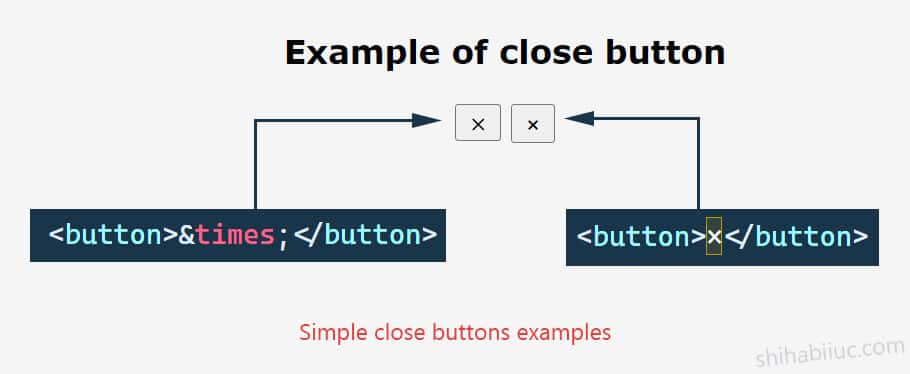
However, you need only one of them.
You can also use icon/image (PNG/SVG) as you see in the following HTML.
<button><img src="./img/close.png"></button>You got the close button HTML. But these buttons are not very helpful and don’t do anything if you click them. So the question is how you can make them interactive.
The above is an example of an alert or warning. If you click the close icon, the whole panel will disappear.
I used onclick HTML event attribute to write the one line of JavaScript. See the whole HTML below:
<div class="alert">Click the close button to make it disappear. <span class="close" onclick="this.parentElement.style.display='none'">×</span></div>I also wrote a few lines of CSS for styling the above alert/warning. It’s optional but if you want, take a look at the CSS below.
.alert{
  position:relative;
  padding:.75rem 1.25rem;
  margin-bottom:1rem;
  border:1px solid transparent;
  border-radius:.25rem;
  color:#004085;
  background-color:#cce5ff;
  border-color:#b8daff;
}
.alert .close{
  position:absolute;
  right:20px;top:50%;
  -webkit-transform:translateY(-50%);
  transform:translateY(-50%);
  color:#f70000;
  cursor:pointer;
  font-weight:700;
  font-size:1.5rem;
  line-height: 1.7;
}Before I explain the process and code, let me know you the example below.
I created the above example for my other post/project where I made a team member page/section. Anyways, for this example, I have the following HTML markup.
<div class="one-third">
  <img class="profile-photo" src="img/Charles-Shimer-min.jpg">
  <p class="name">Charles Shimer</p>
  <div class="popup-outer">
    <div class="popup-inner">
      <div class="ui-close-holder">
        <span class="ui-close">×</span>
      </div>
        <p>Your other content goes here</p>
    </div>
  </div>
</div>
And I have the following jQuery to open & close the popup modal.
jQuery(document).ready(function() {
	jQuery('.profile-photo, .name').click(function() {
		jQuery(this).closest('div').find('.popup-outer').fadeIn();
	});

	jQuery('.ui-close').click(function() {
		jQuery(this).parents('div').find('.popup-outer').fadeOut();
	});
});
And of course, you need to insert the jQuery library in the head (as you see below).
<head>
  <script src="https://code.jquery.com/jquery-1.12.4.min.js" integrity="sha256-ZosEbRLbNQzLpnKIkEdrPv7lOy9C27hHQ+Xp8a4MxAQ=" crossorigin="anonymous"></script>
</head>
That’s it!
If you want to download this whole project, go to my GitHub Repository. And if you need further explanation, please see this post.
- What is the difference between a link & button?
- How to create an HTML button that works like a link?
- How to style buttons with CSS
- How to center a button in CSS?
- How to create an image button?
- Button border examples
- Rounded buttons
- How to create back to top button in HTML, CSS & JavaScript
- How to create a close button?
- How to remove the button border?
Conclusion
I gave you a couple of examples, demos (live preview), and sample code. Now you have multiple options to choose from.
I tried to give you all sorts of close buttons that can be found in the real world. If you wish to see something different, please let me know.