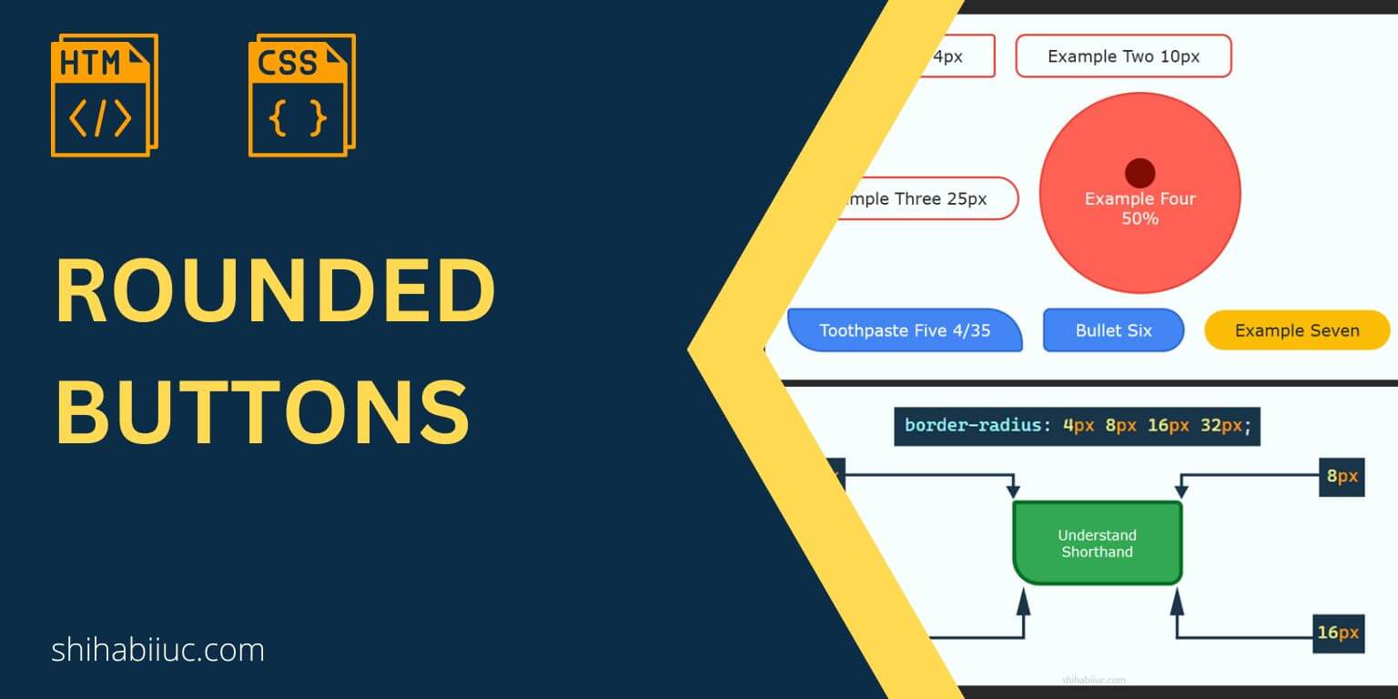
You can create numerous button styles using CSS. This post will show you how to make a rounded button with minimum CSS. Also, you’ll see how to implement different sizes of corners (border-radius) for the same button.
You can check the live demos in the link below.
Let’s get started.
Examples of rounded buttons
Here I will give you the HTML & CSS for the buttons that you saw in the live preview.
HTML
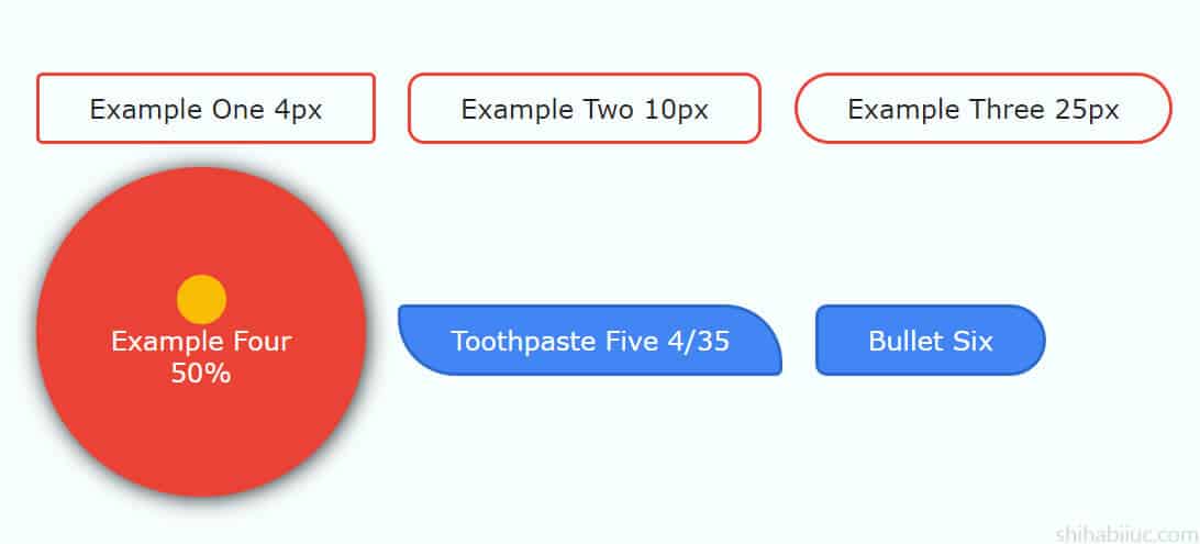
<button class="example-1">Example one 4px</button>
<button class="example-2">Example two 10px</button>
<button class="example-3">Example three 25px</button>
<button class="example-4">Example four 50%</button>
<button class="example-5">Toothpaste five 4/35</button>
<button class="example-6">Bullet six</button>
<button class="example-7">Example seven</button>
CSS
button {
  /* default styles for all buttons */
  padding: 10px 30px;
  cursor: pointer;
  font-size: 16px;
  color: #222222;
  border: 2px solid #ea4335;
  background-color: transparent;
  text-transform: capitalize;
  transition: background-color 0.4s ease-in-out;
}

.example-1 {
  border-radius: 4px;
}

.example-2 {
  border-radius: 10px;
}

.example-3 {
  border-radius: 25px;
}

.example-4 {
  border-radius: 50%;
  width: 200px;
  height: 200px;
  background-color: #ff6154;
  color: #ffffff;
  transition: all 0.4s ease-in-out;
}
.example-4:hover {
  background-color: #ea4335;
  box-shadow: 1px 1px 13px #222222;
}
.example-4::before {
  content: "";
  width: 30px;
  height: 30px;
  display: block;
  margin: 0 auto;
  background-color: #800b01;
  border-radius: 50%;
}
.example-4:hover::before {
  background-color: #fbbc05;
}

.example-5 {
  background-color: #4285f4;
  color: #ffffff;
  border: 2px solid #2d69cc;
  border-radius: 4px 35px;
}
.example-5:hover {
  background-color: #2d69cc;
}

.example-6 {
  background-color: #4285f4;
  color: #ffffff;
  border: 2px solid #2d69cc;
  border-radius: 8px 25px 25px 8px;
  -webkit-transition: all 0.7s ease-in-out;
  transition: all 0.7s ease-in-out;
}
.example-6:hover {
  background-color: #2d69cc;
  border-radius: 25px 8px 8px 25px;
}

.example-7 {
  border-radius: 25px;
  border-width: 0;
  background-color: #fbbc05;
}
.example-7:hover {
  background-color: #bd8d02;
  color: #ffffff;
}
How to make rounded corners?
In the above CSS, you saw that I used border-radius on every button. This is the CSS property that can make rounded corners for most HTML elements. For example, you can’t use this property directly on the HTML tables to make them rounded. See how to make the table rounded after.
Anyways, now take a deeper look at the border radius.
Please note that it’s not mandatory to have a border in order to implement a border-radius.
You can specify the border-radius property in all four directions and also you can use different values for each corner.
Understanding the border-radius units and shorthand
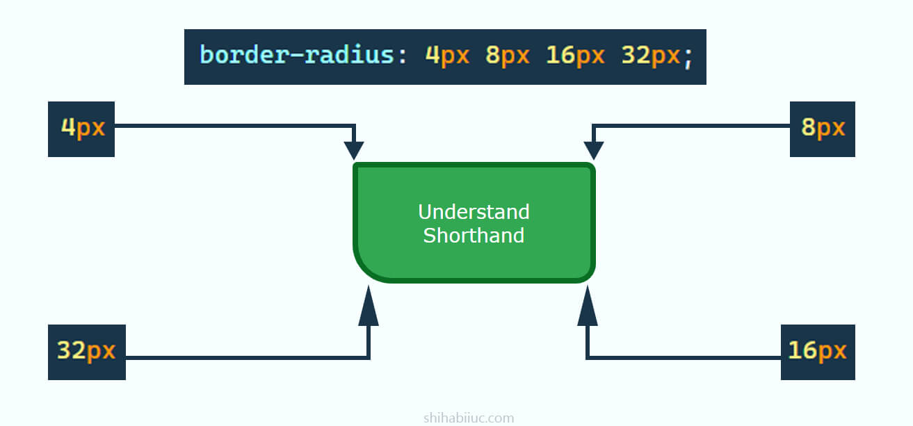
A border radius property can have 1, 2, 3 & 4 units. Such as 4px, 4px 8px, 4px 8px 16px, 4px 8px 16px 32px. It’s not only limited to the pixel value and you can also use rem, em, % (percentage), etc.
The border-radius property moves clockwise from the top-left to bottom-left corners. To be more specific, the full direction is top-left, top-right, bottom-right & bottom-left accordingly.
If you specify only one unit such as border-radius: 4px, this 4 pixels radius will be applied to all four directions.
If you specify two units such as border-radius: 4px 30px, then 4 pixels radius will be applied to the top-left & bottom-right, and 30 pixels will be applied to the top-right & bottom-left.
If you specify three units such as border-radius: 4px 30px 60px, then 4 pixels will be applied to the top-left, 30 pixels to the top-right & bottom-left, and 60 pixels to the bottom-right.
If you specify 4 units such as border-radius: 4px 30px 60px 80px, then the radius will go through the top-left, top-right, bottom-right & bottom-left as I mentioned earlier.
And this brings me to the end of this post.
Learn more about buttons
- What is the difference between a link & button?
- How to create an HTML button that works like a link?
- How to style buttons with CSS
- How to center a button in CSS?
- How to create an image button?
- Button border examples
- Rounded buttons
- How to create back to top button in HTML, CSS & JavaScript
- How to create a close button?
- How to remove the button border?
Build HTML CSS projects
Conclusion
I did not only give you rounding examples but also explained the necessary properties so you can create the rounding corners exactly the way you want. Also, I explained the required CSS from the ground up so everyone can easily understand the concept.
You can download the live preview template from my GitHub repository (HTML, CSS/SCSS).
You can copy-paste my CSS but it’s not an efficient way to create something meaningful. The examples are for your inspiration so you can get started quickly. So it’s important to understand the tiny topics and why & how they work together.
If you want to brush up on your web design skills, here is a checklist of learning CSS you can read. After that, you can build some small & real-world projects. Here is the list of projects that you can build.