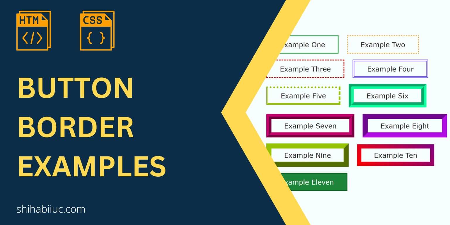
In this post, I will give you a couple of button border examples including gradient border. I will also include the HTML & CSS for those buttons so you can easily implement them on your projects.
You can also check the finished buttons in the link below.
Let’s get started.
Button border examples
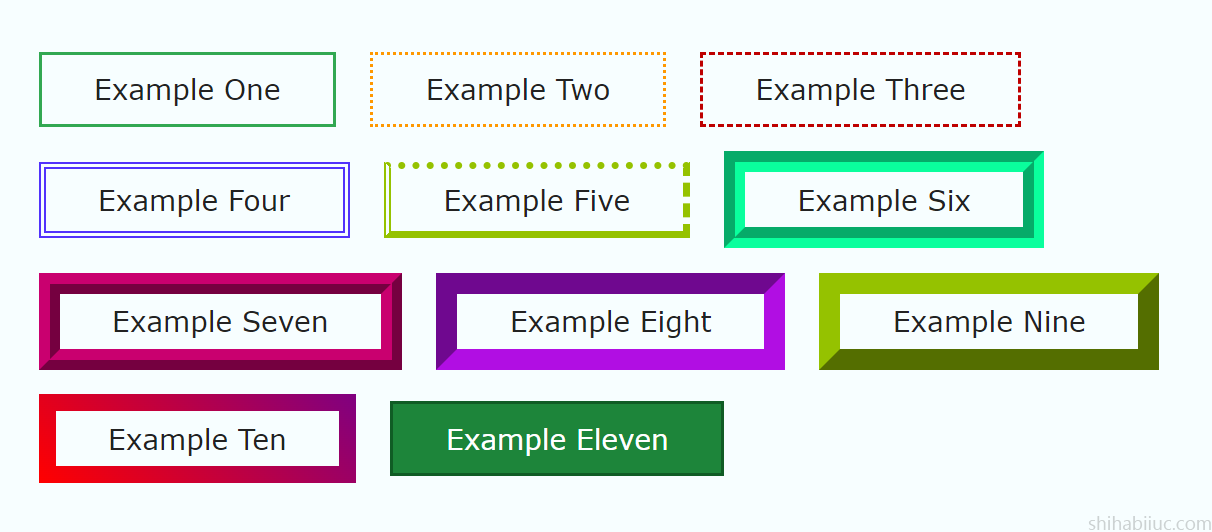
For all the buttons, I have simple button tags and different CSS class names as you see below.
HTML
<button class="example-1">Example one</button>
<button class="example-2">Example two</button>
<button class="example-3">Example three</button>
<button class="example-4">Example four</button>
<button class="example-5">Example five</button>
<button class="example-6">Example six</button>
<button class="example-7">Example seven</button>
<button class="example-8">Example eight</button>
<button class="example-9">Example nine</button>
<button class="example-10">Example ten</button>
<button class="example-11">Example eleven</button>
CSS
/* default style for all buttons */
button {
  padding: 10px 30px;
  cursor: pointer;
  font-size: 16px;
  color: #222222;
  background-color: transparent;
  text-transform: capitalize;
  transition: background-color 0.4s ease-in-out;
}

/* individual styles */

/* EXAMPLE 1 */
button.example-1 {
  border: 2px solid #32a852;
}
button.example-1:hover {
  background-color: #1d853a;
  color: #ffffff;
}

/* EXAMPLE 2 */
button.example-2 {
  border: 2px dotted #ff9800;
}
button.example-2:hover {
  background-color: #ffb64a;
  color: #ffffff;
}

/* EXAMPLE 3 */
button.example-3 {
  border: 2px dashed #be0000;
}
button.example-3:hover {
  background-color: #fc3838;
  color: #ffffff;
}

/* EXAMPLE 4 */
button.example-4 {
  border: 4px double #5132fc;
  padding: 8px 30px;
}
button.example-4:hover {
  background-color: #8b75ff;
  color: #ffffff;
}

/* EXAMPLE 5 */
button.example-5 {
  border-width: 4px;
  border-color: #95c200;
  border-style: dotted dashed solid double;
  padding: 8px 30px;
}
button.example-5:hover {
  background-color: #95c200;
  color: #ffffff;
}

/* EXAMPLE 6 */
button.example-6 {
  border: 12px groove #0aff9d;
  padding: 6px 30px;
}
button.example-6:hover {
  background-color: #0aff9d;
}

/* EXAMPLE 7 */
button.example-7 {
  border: 12px ridge #c9006f;
  padding: 6px 30px;
}
button.example-7:hover {
  background-color: #c9006f;
  color: #ffffff;
}

/* EXAMPLE 8 */
button.example-8 {
  border: 12px inset #b10ee3;
  padding: 6px 30px;
}
button.example-8:hover {
  background-color: #b10ee3;
  color: #ffffff;
}

/* EXAMPLE 9 */
button.example-9 {
  border: 12px outset #95c200;
  padding: 6px 30px;
}
button.example-9:hover {
  background-color: #95c200;
  color: #ffffff;
}

/* EXAMPLE 10 */
button.example-10 {
  padding: 6px 30px;
  border-width: 10px 10px 10px 10px;
  border-image: linear-gradient(45deg, #ff0000 0%, #800080 100%);
  border-image-slice: 9;
  border-style: solid;
}
button.example-10:hover {
  background-image: linear-gradient(315deg, #fb0004 10%, #980068 74%);
  color: #ffffff;
}

/* EXAMPLE 11 */
button.example-11 {
  background-color: #1d853a;
  color: #ffffff;
  border: 2px solid #105c25;
}
button.example-11:hover {
  background-color: #105c25;
}
Learn more about buttons
- What is the difference between a link & button?
- How to create an HTML button that works like a link?
- How to style buttons with CSS
- How to center a button in CSS?
- How to create an image button?
- Button border examples
- Rounded buttons
- How to create back to top button in HTML, CSS & JavaScript
- How to create a close button?
- How to remove the button border?
Build HTML CSS projects
Conclusion
I gave you many examples of the button borders along with their HTML & CSS. You can also download the whole button template (as you saw in the live preview) from my GitHub repository.
Each of the examples also contains hover effects that you can ignore if you don’t want them.
If you have any questions, please let me know.