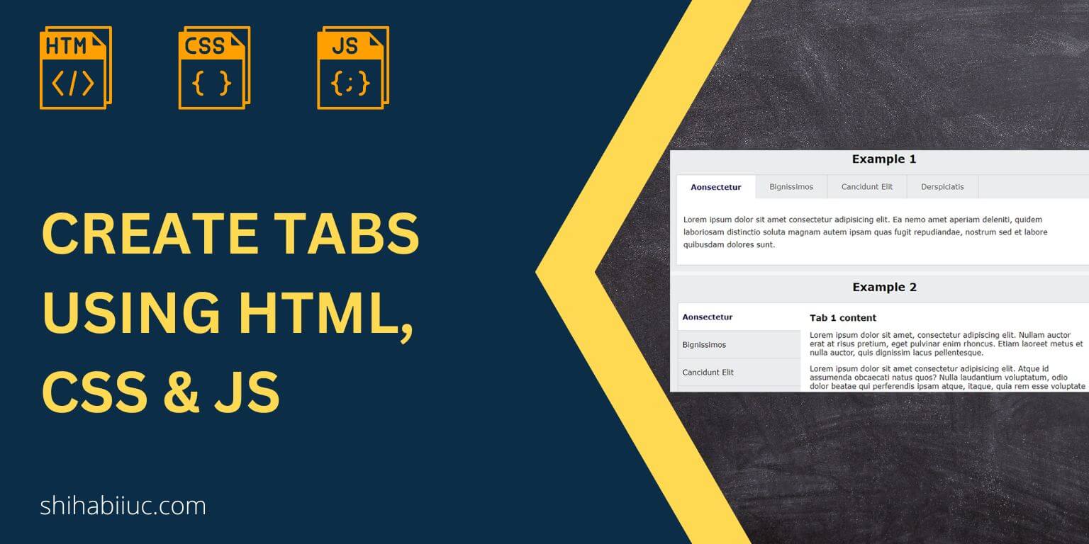
In this post, I will show you how to create mobile responsive tabs using HTML, CSS & JavaScript. I will give you two different layouts (designs). Also, you’ll get the source code for these tabs. See the screenshot of the 2 tabs that you’re going to build: Do you want to see the live preview? Click the button below. It contains both examples. Let’s get started. Project structure Before we dive in, let me show you the project structure. I have 3 files such as index.html, style.css & script.js (as you see in the infographic below). However, you may create […]
Read More →I will show you some exceptional animated backgrounds. I only used CSS to create those animations. There is no JavaScript involved. You’ll see all the demos and get the code (HTML & CSS). I used CSS keyframes & animation property to create the background animations. Some of the examples contain images that I created or I own them. If you like, you can use them on your projects. Example 1 Example 1: The cow eats grass 🌲 This is a very simple but eye-catching background example. Aside from the fallback white background, I used three different colors to make the […]
Read More →Throughout the years, I wrote a lot on CSS. This post contains all the resources that you should know to learn CSS from the ground up. It will take you from the very basic to a little further. At least, these will give you a rock-solid concept of CSS. All these posts contain source code, examples, and other necessary resources. Think of this post as a beginner guide to learning CSS. SL Button 1 How to style buttons? Border 1 How to add borders in an HTML table 2 CSS gradient border examples & explanation Background 1 Background images size […]
Read More →In this post, I will provide you with a list of HTML and CSS projects so you can practice and brush up on your skills. I built each of these projects from scratch. In these projects, you’ll build small websites, pages, templates, and single components like cards, navbar/header, footer, slider, etc. These are also real-world projects that will help you create living, breathing websites. Table of contents SL Detail project link 1 About us page 2 Portfolio website design 3 Computer science portfolio 4 Testimonial page 5 Team page 6 Contact us page 7 Multiple-page website 8 Thank You page […]
Read More →When people buy something on our website or subscribe to the newsletter, we generally redirect them to a “Thank You” page. It’s a great opportunity to engage with our audience more closely & build business relationships. In this post, I will give you a thank you page template. And I will show you how I created this only using HTML & CSS. This template is fully mobile responsive, fast loading & well-structured. When I say well-structured, it means that I used semantic HTML where/when necessary and I did not even include a wrapper <div> just for the sake of limiting […]
Read More →
In this post, you’ll see how to create a mobile responsive “Contact Us” page design using HTML & CSS. I will give you all the source code for the template. Before you dive in, let’s see the demo of the finished page you will build. In this template (live preview), I also have two optional parts such as the header navigation & footer. But you can ignore that if you already have them in your existing template. I commented out both in HTML & CSS files so you can easily understand which code does what specific things. Let’s start building […]
Read More →By the word “Interactive” here I meant the two-way flow of information. I am referring to a team page where the visitors will get the full information in two steps. In the first step, the visitors will see the list of all team members in your company (their photo & name). If they (visitors) choose to get more details about a specific team member, they will click on the photo or name of the person in the second step. And it will show the full detail about a team member. If this is not clear yet, please see a live […]
Read More →
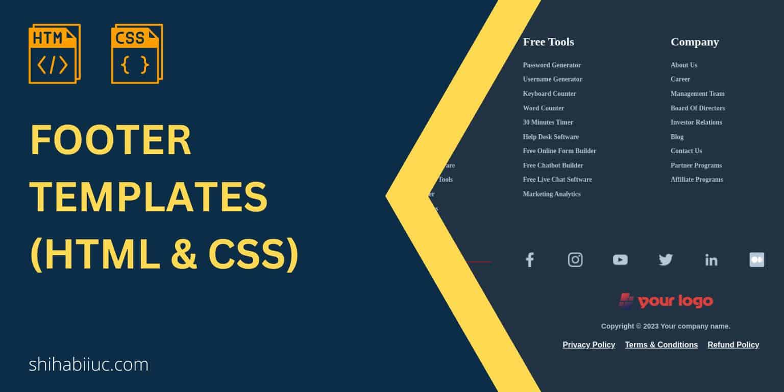
The footer is a global element of any website (just like the header navigation bar). This same element is visible on all pages. Just like the <section>, <div>, <main>, <article>, the <footer> is also an HTML tag containing a website’s entire bottom element. When you include a <footer> tag on a file, search engines also understand it’s the bottom or last part of the document/page. In this post, I will give you a couple of footer templates. Each of these templates also contains the required CSS. All these footers are mobile responsive. Footer templates using HTML & CSS You can […]
Read More →
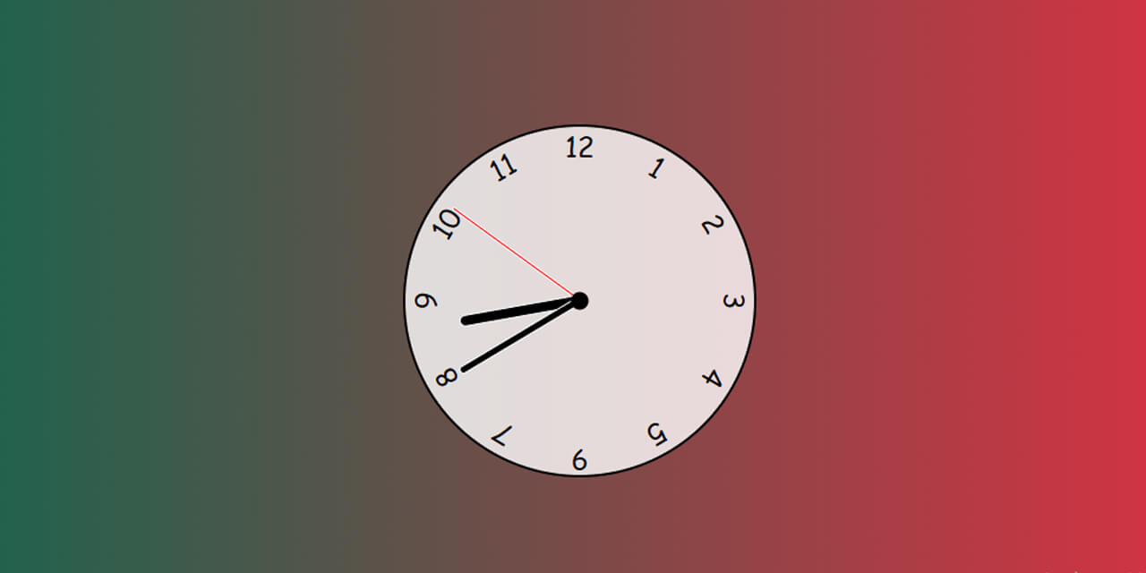
In this post, you’ll see how to create an analog clock using only HTML, CSS & JavaScript. This clock will display the current time in your location no matter where you live. Before we start, let’s see the live demo of the finished product that we are going to build in this post. If this is what you want, let’s follow the guideline. Template for the analog clock In the project root folder, create the following three files: Not to mention, you need to link the style.css & script.js in your index.html. To connect the stylesheet or style.css file, write […]
Read More →In this post, you’ll see how to create a two-column layout in HTML CSS. Also, you’ll learn how to make this layout mobile responsive. That means the layout will automatically break into one column on small screens. I will give you all the source code for this column layout & the link to my GitHub repository. Before you start, let’s see the live template that we’re going to build in this post. In this post, I will show you three different ways to create a two-column layout. Use any of the approaches that you like the most. Using CSS Flexbox […]
Read More →