In this post, I will show you how to create mobile responsive tabs using HTML, CSS & JavaScript. I will give you two different layouts (designs). Also, you’ll get the source code for these tabs.
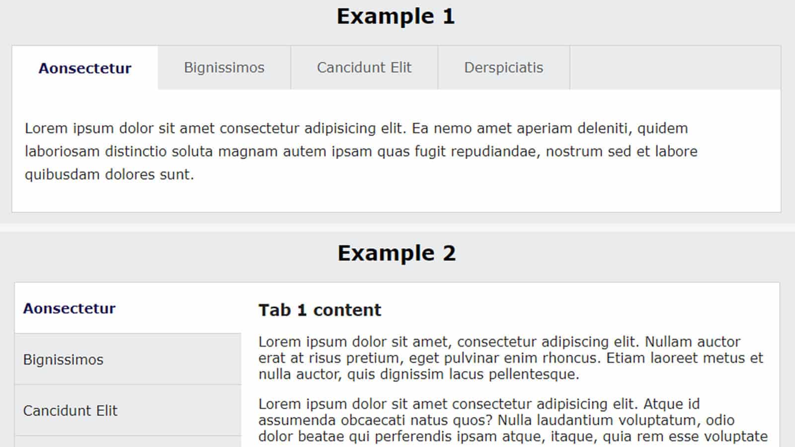
See the screenshot of the 2 tabs that you’re going to build:
Do you want to see the live preview? Click the button below. It contains both examples.
Let’s get started.
Project structure
Before we dive in, let me show you the project structure.
I have 3 files such as index.html, style.css & script.js (as you see in the infographic below).
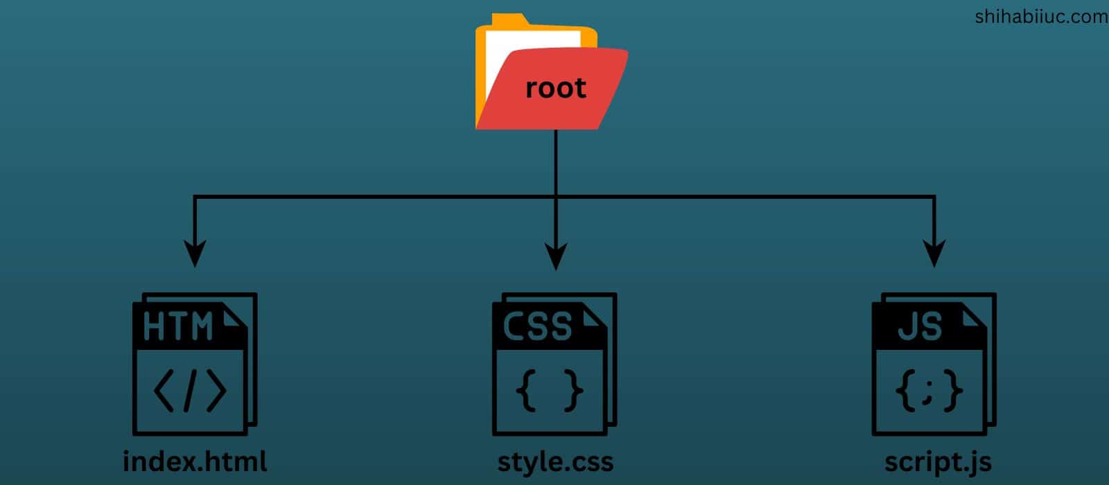
However, you may create a different project structure and you can name the files differently than mine. But make sure you have the right file paths in the HTML.
Adding stylesheet to the HTML
In the HTML file, I wrote the following line to add the stylesheet with my HTML.
<link rel="stylesheet" href="style.css">This line will go anywhere in between the <head> tag.
Adding script file to the HTML
To add the script file to the HTML, I have the following line:
<script src="script.js"></script>The above line will go just before the closing </body> tag.
I know, most of you already know this stuff. However, I wanted to make everyone understand the process (even complete beginners).
Now you’re done with the project setup. Let’s build the actual tabs.
Create a horizontal tab (Example 1)
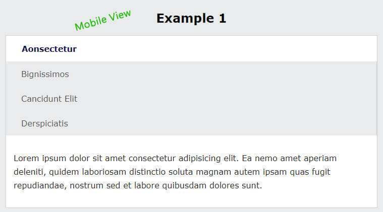
This is the tab that you see in “Example 1.” In desktop and large devices, this tab is laid out horizontally (as you see in the screenshot above). But on mobile, it’s aligned vertically (as you see in the screenshot below).
Now let’s create this tab.
HTML
<div class="tabs-container">
  <ul class="tab-nav">
    <li><a href="#tab1" class="active" data-tab="tab1">Aonsectetur</a></li>
    <li><a href="#tab2" data-tab="tab2">Bignissimos</a></li>
    <li><a href="#tab3" data-tab="tab3">Cancidunt Elit</a></li>
    <li><a href="#tab4" data-tab="tab4">Derspiciatis</a></li>
  </ul>

  <div class="tab-content">
    <div class="tab-pane active" id="tab1">
      <p>Lorem ipsum dolor sit amet consectetur adipisicing elit. Ea nemo amet ...</p>
    </div>

    <div class="tab-pane" id="tab2">
      <p>Naborum pariatur est voluptatum excepturi commodi labore nihil repudiandae...</p>
    </div>

    <div class="tab-pane" id="tab3">
      <p>Itaque laborum quisquam magni et, consequuntur deserunt nesciunt ullam iste ...</p>
    </div>

    <div class="tab-pane" id="tab4">
      <p>Blanditiis illum assumenda placeat tempora, in expedita sit dignissimos commodi ...</p>
    </div>

  </div> <!-- .tab-content -->
</div>  <!-- .tabs-container -->
You’ll also find this type of tab on the WooCommerce product page.
CSS
.tabs-container {
  max-width: 900px;
  margin: 0 auto;
  background-color: #FFFFFF;
  border: 1px solid #d2d2d2;
  color: #222222;
  font-size: 1em;
  font-weight: 400;
}
.tabs-container .tab-nav {
  padding: 0;
  margin: 0;
  list-style: none;
  background-color: #E9EBEC;
  display: -webkit-box;
  display: -ms-flexbox;
  display: flex;
  -webkit-box-orient: vertical;
  -webkit-box-direction: normal;
      -ms-flex-direction: column;
          flex-direction: column;
}
@media (min-width: 768px) {
  .tabs-container .tab-nav {
    -webkit-box-orient: horizontal;
    -webkit-box-direction: normal;
        -ms-flex-direction: row;
            flex-direction: row;
  }
}
.tabs-container .tab-nav li {
  display: -webkit-box;
  display: -ms-flexbox;
  display: flex;
}
@media (min-width: 768px) {
  .tabs-container .tab-nav li {
    -webkit-box-orient: horizontal;
    -webkit-box-direction: normal;
        -ms-flex-direction: row;
            flex-direction: row;
  }
}
.tabs-container .tab-nav li a {
  color: #555;
  font-size: 16px;
  font-weight: 500;
  text-decoration: none;
  padding: 15px 30px;
  border-right: 1px solid #d2d2d2;
  display: block;
  width: 100%;
}
@media (min-width: 768px) {
  .tabs-container .tab-nav li a {
    display: inline-block;
  }
}
.tabs-container .tab-nav li a.active {
  color: #0D054C;
  font-weight: 700;
  background-color: #FFFFFF;
  border: 1px solid transparent;
}
.tabs-container .tab-content {
  padding: 15px;
}
.tabs-container .tab-content .tab-pane {
  display: none;
  line-height: 1.7;
}
.tabs-container .tab-content .tab-pane.active {
  display: block;
}
I added necessary vendor prefixes so it works well on all web browsers. Also, I have a media query (768px). The mobile style will be applied until 768px (including tablet devices). The horizontal layout will be applied once the browser hits 768px or goes above.
JavaScript
var tabNavLinks = document.querySelectorAll('.tab-nav a');
var tabPanes = document.querySelectorAll('.tab-pane');

for (var i = 0; i < tabNavLinks.length; i++) {
  tabNavLinks[i].addEventListener('click', function(e) {
    e.preventDefault();
    var tabId = this.getAttribute('data-tab');

    for (var j = 0; j < tabNavLinks.length; j++) {
      tabNavLinks[j].classList.remove('active');
    }

    for (var k = 0; k < tabPanes.length; k++) {
      tabPanes[k].classList.remove('active');
    }

    this.classList.add('active');
    document.getElementById(tabId).classList.add('active');
  });
}
After you save all these three files (HTML, CSS & JS), you’ll see that you have the same tabs as mine.
You can also include images, heading, and any other HTML tags in the content area (.tab-content .tab-pane)
How to add or remove tab content?
You can add new tab content and also remove an existing one.
If you need to add a new tab content, do the following.
1. Copy-paste the following HTML block inside the .tab-content.
<div class="tab-pane" id="give-it-a-unique-id">
  <p>Naborum pariatur est voluptatum excepturi nihil repudianda...</p>
</div>
Don’t forget to replace the “give-it-a-unique-id” with the actual CSS ID name. You can name it anything but make sure it’s unique.
2. Add the navigation/anchor inside the .tab-nav. You can copy & paste the following line.
<li><a href="#give-it-a-unique-id" data-tab="give-it-a-unique-id">Derspiciatis</a></li>Don’t forget to replace the “give-it-a-unique-id” with the actual ID. This ID is the same as you did in the 1st step.
For example, if you name it “tab5” altogether your code will be as follows:
<ul class="tab-nav">
  <li><a href="#tab1" class="active" data-tab="tab1">Aonsectetur</a></li>
  <li><a href="#tab2" data-tab="tab2">Bignissimos</a></li>
  <li><a href="#tab3" data-tab="tab3">Cancidunt Elit</a></li>
  <li><a href="#tab4" data-tab="tab4">Derspiciatis</a></li>
  <li><a href="#tab5" data-tab="tab5">New Tab</a></li>
</ul>
<div class="tab-content">
  <!-- existing tabs remain the same as they are  -->
  <div class="tab-pane" id="tab5">
    <p>New tab content goes here...</p>
  </div>
</div> <!-- .tab-content -->
Not to mention, if you do not fill out the href value, the tab will still work. But I recommend you to do this as this is SEO/Search engine friendly.
Similarly, you can also remove tab content by removing the .tab-pane block and the navigation associated with it.
How to create a vertical tab (Example 2)
This is the tab that you saw in “Example 2.” It’s vertically aligned large devices.
I have two columns in this tab (as you saw in the screenshot at the very top). On the left side, it has the navigations. And on the right side, it has the tab content. The left column is 30% wide and the right column is 70% wide.
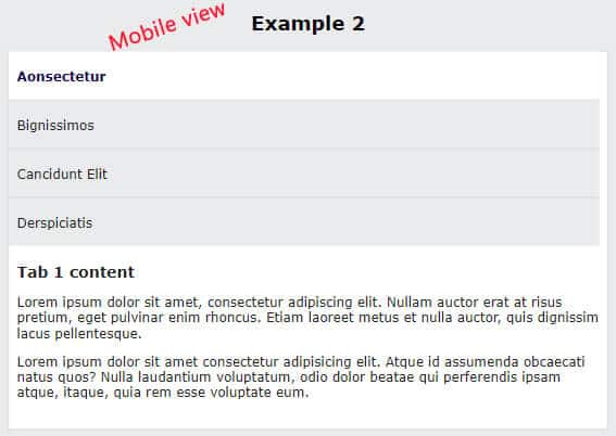
On smaller screens such as mobile, tablet, etc, it’s also vertically aligned but has one column instead of two (as you see in the screenshot below).
Let’s build this one.
HTML
<div class="vertical-tabs-container">
  <div class="v-tab-nav">
    <ul>
      <li><a href="#v-tab1" class="active" data-tab="v-tab1">Aonsectetur</a></li>
      <li><a href="#v-tab2" data-tab="v-tab2">Bignissimos</a></li>
      <li><a href="#v-tab3" data-tab="v-tab3">Cancidunt Elit</a></li>
      <li><a href="#v-tab4" data-tab="v-tab4">Derspiciatis</a></li>
    </ul>
  </div> <!-- .v-tab-nav -->
  <div class="v-tab-content">
    <div class="v-tab-pane active" id="v-tab1">
      <h3>Tab 1 content</h3>
      <p>Lorem ipsum dolor sit amet, consectetur adipiscing elit. ...</p>
      <p>Lorem ipsum dolor sit amet consectetur adipisicing elit. Atq..</p>
    </div>
    <div class="v-tab-pane" id="v-tab2">
      <h3>Tab 2 content</h3>
      <p>Phasellus in tellus consequat, hendrerit nisi eu, molestie...</p>
    </div>
    <div class="v-tab-pane" id="v-tab3">
      <h3>Tab 3 content</h3>
      <p>Sed vel mi vel eros semper bibendum. Curabitur eget...</p>
    </div>
    <div class="v-tab-pane" id="v-tab4">
      <h3>Tab 4 content</h3>
      <p>Esemper bibendum. Curabitur eget libero non...</p>
    </div>
  </div> <!-- .v-tab-content -->
</div>  <!-- .vertical-tabs-container -->
This HTML is very similar to the first example. Here, I mostly changed the CSS class & ID names. Otherwise, the skeleton is nearly the same.
CSS
.vertical-tabs-container {
  max-width: 900px;
  margin: 0 auto;
  background-color: #FFFFFF;
  border: 1px solid #d2d2d2;
  color: #222222;
  font-size: 1em;
  font-weight: 400;
  display: -webkit-box;
  display: -ms-flexbox;
  display: flex;
  -webkit-box-orient: vertical;
  -webkit-box-direction: normal;
      -ms-flex-direction: column;
          flex-direction: column;
}
@media (min-width: 768px) {
  .vertical-tabs-container {
    -webkit-box-orient: horizontal;
    -webkit-box-direction: normal;
        -ms-flex-direction: row;
            flex-direction: row;
  }
}
.vertical-tabs-container .v-tab-nav {
  -ms-flex-preferred-size: 100%;
      flex-basis: 100%;
  margin-right: 10px;
  background-color: #E9EBEC;
}
@media (min-width: 768px) {
  .vertical-tabs-container .v-tab-nav {
    -ms-flex-preferred-size: 30%;
        flex-basis: 30%;
  }
}
.vertical-tabs-container .v-tab-nav ul {
  list-style: none;
  margin: 0;
  padding: 0;
}
.vertical-tabs-container .v-tab-nav ul li a {
  color: #222222;
  display: block;
  font-size: 16px;
  font-weight: 500;
  padding: 20px 10px;
  border-bottom: 1px solid #d2d2d2;
  text-decoration: none;
  -webkit-transition: all 0.3s ease;
  transition: all 0.3s ease;
}
.vertical-tabs-container .v-tab-nav ul li a:hover {
  background-color: #d2d3d4;
}
.vertical-tabs-container .v-tab-nav ul li a.active {
  background-color: #FFFFFF;
  color: #0D054C;
  font-weight: 700;
}
.vertical-tabs-container .v-tab-nav ul li:last-child a {
  border-bottom: none;
}
.vertical-tabs-container .v-tab-content {
  -ms-flex-preferred-size: 100%;
      flex-basis: 100%;
}
@media (min-width: 768px) {
  .vertical-tabs-container .v-tab-content {
    -ms-flex-preferred-size: 70%;
        flex-basis: 70%;
  }
}
.vertical-tabs-container .v-tab-content .v-tab-pane {
  display: none;
  padding: 20px 10px;
}
.vertical-tabs-container .v-tab-content .v-tab-pane h3 {
  margin: 0;
}
.vertical-tabs-container .v-tab-content .v-tab-pane.active {
  display: block;
}
In this CSS, I aligned the layout in two columns for large devices. I used Flexbox to create this layout (also the first example). If you want to learn more about Flexbox, see this post after.
JavaScript
var VtabNavLinks = document.querySelectorAll('.v-tab-nav a');
var VtabPanes = document.querySelectorAll('.v-tab-pane');

for (var i = 0; i < VtabNavLinks.length; i++) {
  VtabNavLinks[i].addEventListener('click', function(e) {
    e.preventDefault();
    var tabId = this.getAttribute('data-tab');

    for (var j = 0; j < VtabNavLinks.length; j++) {
      VtabNavLinks[j].classList.remove('active');
    }

    for (var k = 0; k < VtabPanes.length; k++) {
      VtabPanes[k].classList.remove('active');
    }

    this.classList.add('active');
    document.getElementById(tabId).classList.add('active');
  });
}
After you save all these three files, you’ll have a vertically aligned tab as the demo.
How to add or remove tab content
Like the method I mentioned in the first example, you have to copy & paste the following HTML to add a new tab content.
<div class="v-tab-pane" id="unique-id">
  <!-- your tab content goes here -->
</div>
And you also have to add the new navigation inside the .v-tab-nav ul
<li><a href="#unique-id" data-tab="unique-id">Anchor text</a></li>If this is not clear yet, please see the last explanation with an example.
To remove a tab content, you can delete a specific tab content (.v-tab-pane) & its associate navigation menu.
Build HTML CSS projects
Conclusion
This is how you can create tabs using HTML, CSS, and pure JavaScript.
Tabs are handy for putting lots of information in a single place. It’s also useful when you need to write different types of information for a single project, product, service, topic, etc.
If you need the entire project, visit my GitHub repository.
I tried to explain every step of the development process. Also, I showed you the demo of the finished products (live preview) and gave you all the code. So everyone can understand and follow the instructions. Therefore, if you still have issues, please let me know.

