In this post, you’ll see how to create an analog clock using only HTML, CSS & JavaScript. This clock will display the current time in your location no matter where you live.
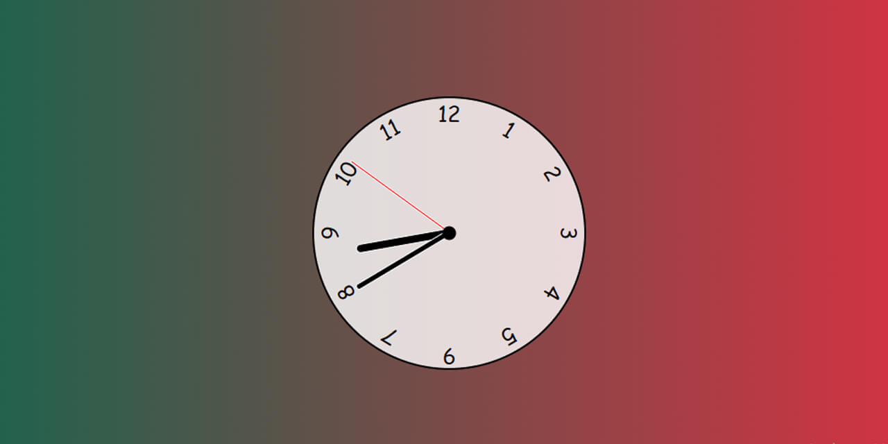
Before we start, let’s see the live demo of the finished product that we are going to build in this post.
If this is what you want, let’s follow the guideline.
Template for the analog clock
In the project root folder, create the following three files:
- index.html
- style.css
- script.js
Not to mention, you need to link the style.css & script.js in your index.html.
To connect the stylesheet or style.css file, write the following code in the <head> tag.
<head>
	<link rel="stylesheet" type="text/css" href="style.css">
</head>
To connect the script.js file, write the following code before the closing </body> tag.
	<script src="script.js"></script>
</body>
Alright! Now your stylesheet & javascript files are linked with the index.html. Let’s move forward.
HTML
In your index.html file (after the opening <body> tag), write the following markup for the clock.
<div class="clock">
	<div class="hand hour" data-hour-hand></div>
	<div class="hand minute" data-minute-hand></div>
	<div class="hand second" data-second-hand></div>
	<div class="number number1">1</div>
	<div class="number number2">2</div>
	<div class="number number3">3</div>
	<div class="number number4">4</div>
	<div class="number number5">5</div>
	<div class="number number6">6</div>
	<div class="number number7">7</div>
	<div class="number number8">8</div>
	<div class="number number9">9</div>
	<div class="number number10">10</div>
	<div class="number number11">11</div>
	<div class="number number12">12</div>
</div>
As you see that I have a bunch of class names for the hour, minute & second sticks. And also for the numbers (1 -12).
This will be more clear in the next (CSS) section.
CSS
*, *::after, *::before {
	box-sizing: border-box;
	font-family: "Comic Sans MS", cursive, sans-serif;
}
body {
	background: linear-gradient(to right, hsl(164, 100%, 21%), hsl(353, 90%, 56%));
	display: flex;
	justify-content: center;
	align-items: center;
	min-height: 100vh;
	overflow: hidden;
}
.clock{
	width: 300px;
	height: 300px;
	background: rgba(255, 255, 255, 0.8);
	border-radius: 50%;
	border: 2px solid black;
	position: relative;
}
.clock::after{
	content: '';
	position: absolute;
	top: 50%;
	left: 50%;
	transform: translate(-50%, -50%);
	width: 15px;
	height: 15px;
	background-color: black;
	z-index: 11;
	border-radius: 50%;
}
.clock .number{
	--rotation: 0;
	position: absolute;
	width: 100%;
	height: 100%;
	text-align: center;
	transform: rotate(var(--rotation));
	font-size: 1.5rem;
}
.clock .number1{--rotation: 30deg}
.clock .number2{--rotation: 60deg}
.clock .number3{--rotation: 90deg}
.clock .number4{--rotation: 120deg}
.clock .number5{--rotation: 150deg}
.clock .number6{--rotation: 0deg; transform: translateY(90%); }
.clock .number7{--rotation: 210deg}
.clock .number8{--rotation: 240deg}
.clock .number9{--rotation: 270deg}
.clock .number10{--rotation: 300deg}
.clock .number11{--rotation: 330deg}
.clock .hand{
	--rotation: 0;
	position: absolute;
	bottom: 50%;
	left: 50%;
	border: 1px solid white;
	border-top-left-radius: 10px;
	border-top-right-radius: 10px;
	transform-origin: bottom;
	z-index: 10;
	transform: translateX(-50%) rotate(calc(var(--rotation) * 1deg))
}
.clock .hand.second{
	width: 3px;
	height: 45%;
	background-color: red;
}
.clock .hand.minute{
	width: 7px;
	height: 40%;
	background-color: black;
}
.clock .hand.hour{
	width: 10px;
	height: 35%;
	background-color: black;
}
In the above, I also have additional CSS which is optional. Such as the <body> background gradient color. You can change any style based on your choice.
JavaScript
This is the fun part that will make it a usable clock. Until this point, you have the basic structure & style for the clock. To make the actual & working clock, you must need JavaScript.
setInterval(setClock, 1000)
const hourHand = document.querySelector('[data-hour-hand]')
const minuteHand = document.querySelector('[data-minute-hand]')
const secondHand = document.querySelector('[data-second-hand]')
function setClock() {
  const currentDate = new Date()
  const secondsRatio = currentDate.getSeconds() / 60
  const minutesRatio = (secondsRatio + currentDate.getMinutes()) / 60
  const hoursRatio = (minutesRatio + currentDate.getHours()) / 12

  setRotation(secondHand, secondsRatio)
  setRotation(minuteHand, minutesRatio)
  setRotation(hourHand, hoursRatio)
}
function setRotation(element, rotationRatio) {
  element.style.setProperty('--rotation', rotationRatio * 360)
}
setClock()
That’s all!
After you save all the files, drag & drop the index.html file into a web browser. And you’ll see the analog clock is working just like you saw in the demo.
Build HTML CSS projects
Conclusion
This is a basic analog clock that shows the current time every second. All three clock sticks are moving as you normally see in the wall clocks.
I tried to keep this post short as possible and easy to digest. You also got all the code to make it. If you have any questions, let me know. And if you’ve been confused or your project does not work like the demo, please see my GitHub repository for more clarification.

