To create a circle using CSS, you need to apply 50% border-radius to all four corners, and the element should be equal in width & height (square).
Not to mention, there are some exceptions that I will explain as we go through the examples.
In this post, I will show how to create different types of circles with CSS.
How do you can create a circle border in CSS?
Video explanation
To create a circle border (hollow) as you see in the above example (blue), you need to specify the exact/same width & height and add a 50% border-radius. It’s not the exact width & height as mine, I am referring to the equal width & height.
See the HTML & CSS below.
<div class="circle1"></div>div.circle1 {
width: 200px;
height: 200px;
border-radius: 50%;
border: 5px solid #4285F4;
}As you see in the CSS above, the element has a 200 pixels width & height. And also it has a 50% border-radius in all four directions.
This is how you can create a circle border in CSS.
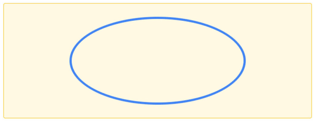
You can change the width & height to anything but these two need to be the same. For example, if you change the above width to 400px, the circle will look like an egg shape as you see in the screenshot below.
How to create a circle background in CSS?
You’ll see this kind of circle as a slider/carousel navigation and other UI components.
The process of making this circle is the same as the last one. It only needs an additional background-color property. CSS border is optional for these background circles or dotted circles. But a border-radius is mandatory as I mentioned at the very top of this post.
For the above example, I have the following HTML & CSS:
<span></span>
<span></span>
<span></span>
It’s not mandatory to have them <span> tag. It could be any other tags you like such as <div>, <p>, etc. However, span is more appropriate in this context as I wanted to have them inline elements. You can also add CSS classes to those spans.
Anyways, here is my CSS to convert those spans into dotted circles.
span {
  width: 30px;
  height: 30px;
  background-color: #e0413d;
  border-radius: 50%;
  display: inline-block;
}
You can change the width and height to increase or decrease the size of the background circle.
Last one thing about this CSS. You saw that I have a display: inline-block. This property/value is important because spans are inline-level elements by default. And inline properties prevent the width to take effect. Moreover, we have empty spans. So you need to change the “Inline” block-level to something else. Also, you can change the display value to flex, block, grid, etc if you need.
If you’re not sure about the HTML block & inline-level elements, see another post in w3schools.
Now that you know how to properly create a circle with CSS. In the next few sections, together we will see & create more stylish circles very quickly. Of course, I will give you the HTML & CSS for each of them.
Create multicolor/gradient circle with CSS
For the above example, I used the border-image property instead of the solid border so that I can use gradient colors for the border. Also, I have an additional container <div> so I can use the overflow property.
See my HTML CSS below:
<div class="circle3-wrapper">
  <div class="circle3"></div>
</div>
.circle3-wrapper {
max-width: 100%;
display: inline-block;
border-radius: 50%;
overflow: hidden;
}
.circle3-wrapper .circle3 {
border-width: 125px; /* change as per your need */
-o-border-image: linear-gradient(45deg, red 0%, purple 100%);
border-image: linear-gradient(45deg, red 0%, purple 100%);
border-image-slice: 9;
border-style: solid;
}How to create a half or semi-circle in CSS?
A semi or half-border can be 8 different types. Such as outline border from top to bottom direction, bottom to top, left to right, right to left, and their filled colors. If this is not clear yet, see the examples below.
See its HTML CSS below.
<div class="circle9"></div>.circle9 {
width: 200px;
height: 100px;
border-radius: 160px 160px 0 0;
border: 10px solid #07ad48;
border-bottom: 0;
}Only in this example, the height is half of the width and the border-radius is 160px or 10rem instead of 50%.
In the next examples, I will go back to the previous formula (square size & 50% radius). And you’ll see sharp edges in the next 4 examples. But if you don’t like them, you can use this tactic instead.
Outline half border from top to bottom direction
See its HTML CSS below.
HTML
<div class="circle5"></div>CSS
.circle5 {
  width: 200px;
  height: 200px;
  border-top: 10px solid #07ad48;
  border-top-left-radius: 50%;
  border-top-right-radius: 50%;
}
Outline half border from bottom to top direction
See its HTML CSS below.
HTML
<div class="circle6"></div>CSS
.circle6 {
  width: 200px;
  height: 200px;
  border-bottom: 10px solid #fc3419;
  border-bottom-left-radius: 50%;
  border-bottom-right-radius: 50%;
}
Outline half border from left to the right direction
See its HTML CSS below.
HTML
<div class="circle7"></div>CSS
.circle7 {
  width: 200px;
  height: 200px;
  border-left: 10px solid #2d75fc;
  border-top-left-radius: 50%;
  border-bottom-left-radius: 50%;
}
Outline half border from left to the right direction
See its HTML CSS below.
HTML
<div class="circle8"></div>CSS
.circle8 {
  width: 200px;
  height: 200px;
  border-right: 10px solid #696a6b;
  border-top-right-radius: 50%;
  border-bottom-right-radius: 50%;
}
Again, if you don’t like the sharp edges in the above 4 examples, use the first example in this section.
In the last couple of examples, most circles are hollowed out. So in the following examples, I will show you the opposite. That means half circles with a filled or solid color.
Also, I will use the half height of the width and 16rem/160px radius in the next 4 examples.
Half or semi-circles with filled color
In the above examples, you see that I created 4 half circles in different directions. These four examples have the following classes respectively:
circle10circle11circle12circle13
Find their corresponding HTML & CSS below.
<div class="circle10"></div>
<div class="circle11"></div>
<div class="circle12"></div>
<div class="circle13"></div>
.circle10 {
width: 200px;
height: 100px;
background-color: red;
border-radius: 10rem 10rem 0 0;
}
.circle11 {
width: 200px;
height: 100px;
background-color: green;
border-radius: 0 0 10rem 10rem;
}
.circle12 {
width: 100px;
height: 200px;
background-color: blue;
border-radius: 10rem 0 0 10rem;
}
.circle13 {
width: 100px;
height: 200px;
background-color: black;
border-radius: 0 10rem 10rem 0;
}How to create a responsive circle in CSS?
There are various ways you can make the circles responsive. Here I will show you the easiest way to create a responsive circle in CSS. Also, I will show how you can place a text in the center of the circle.
To create this responsive circle, you can define a fixed or relative width such as 400px, 12vw, 15rem, 100%, etc. And most importantly, you have to use the aspect-ratio property in order to make this circle change proportionally (1:1).
But if you use a fixed width for example 400px, then you need to decrease this value in mobile devices using media queries. However, to avoid using CSS media queries and to make this post simple, I am going to use max-width instead of width.
See my HTML & CSS below:
<div class="circle14"></div>.circle14 {
max-width: 500px;
aspect-ratio: 1 / 1;
border-radius: 50%;
border: 1px solid green;
background-color: #f5b907;
}See the output below:
You can shrink your browser to check its responsiveness.
How to place a text in the center of the circle?
Just the like responsive circle, there are a couple of ways to center align the text both vertically & horizontally. Let me show one of many ways to do it.
<div class="circle15">
  <p>Hi mom! This is perfectly centered text.</p>
</div>
.circle15 {
max-width: 500px;
aspect-ratio: 1 / 1;
border-radius: 50%;
border: 1px solid green;
background-color: #f5b907;
position: relative;
}
.circle15 p {
position: absolute;
top: 50%;
left: 50%;
-webkit-transform: translate(-50%, -50%);
transform: translate(-50%, -50%);
text-align: center;
}The transform property is pushing back the text to the left & top of its own width & height. Thus why it’s perfectly centered.
See the output below.
Hi mom! This is perfectly centered text.
Learn more about centering a <div> vertically, and centering anything vertically. These four posts will make everything clear when it comes to centering anything & everything and in any direction (horizontal & vertical).
How to create a circular image in CSS?
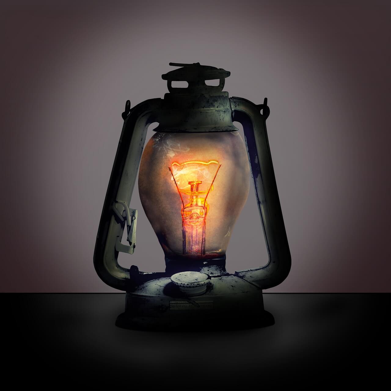
The process of making an image circle is very similar to the last examples you saw in this post. But there is a catch that I will describe & show in the next example after this one.
To create the above circular image, I have the following HTML and CSS.
<img class="circle17" src="bulb.jpg" alt="bulb">img.circle17 {
border-radius: 50%;
width: 100%; /* to make it responsive */
/* optional */
max-width: 400px;
display: block;
}This is how you can make a circular image. However, the above image is square in size (equal width & height). But what if the image is not square?
If the image is not equal in width & height, you have to make it circular in a slightly different way.
How to make a rectangular image circle?
To demonstrate the purpose, I have the following rectangular size image:

To make the above image circle, I used CSS object-fit property and to crop/show the image from the center position, I used object-position. See the output below first.

To make it circular, I have the following HTML and CSS.
<div class="example-15">
  <img class="circle18" src="bulb-rectangular.jpg" alt="rectangular size bulb photo">
</div>
img.circle18 {
border-radius: 50%;
width: 100%;
max-width: 500px;
aspect-ratio: 1 / 1;
display: block;
-o-object-fit: cover;
object-fit: cover;
-o-object-position: 50% 50%;
object-position: 50% 50%;
}As you see in the above CSS, I have a max-width of 100% but I limited it to 500px. This is just a matter of choice. A width: 100% will make the image responsive and max-width: 500px will prevent it from expanding more than that. But you can change this pixel value as you like.
The object-fit property pushed/resized the image to fill the specified area. And object-position specifies the area of the image that you need to select. In our case, it’s object-position: 50% 50% which selects the image from the center. If you need to select/crop the image from different edges, you can test and learn more about it on the MDN website.
Now, you know how to create a circle image from any size.
And it brings me to the end of this post.
| Learn & practice CSS with real-world examples |
|---|
| Learn basic CSS from the ground up. |
| Build real projects in HTML CSS. |
Build HTML CSS projects
Two things are important when making a circle in HTML CSS. First, you need to specify the same width & height for the HTML element. Second, you have to assign a 50% border radius. I have you a couple of examples and showed how you can create a perfect circle using CSS.

