To create a simple HTML alert box, you really don’t need a large CSS framework like Bootstrap. You only need a few lines of HTML, CSS, and one line of JavaScript.
In this post, I will show how you can create an alert box similar to Bootstrap but without using any framework. You’ll also get a close icon on the right side of each alert and the alert box will disappear once you click the icon.
Let’s get started.
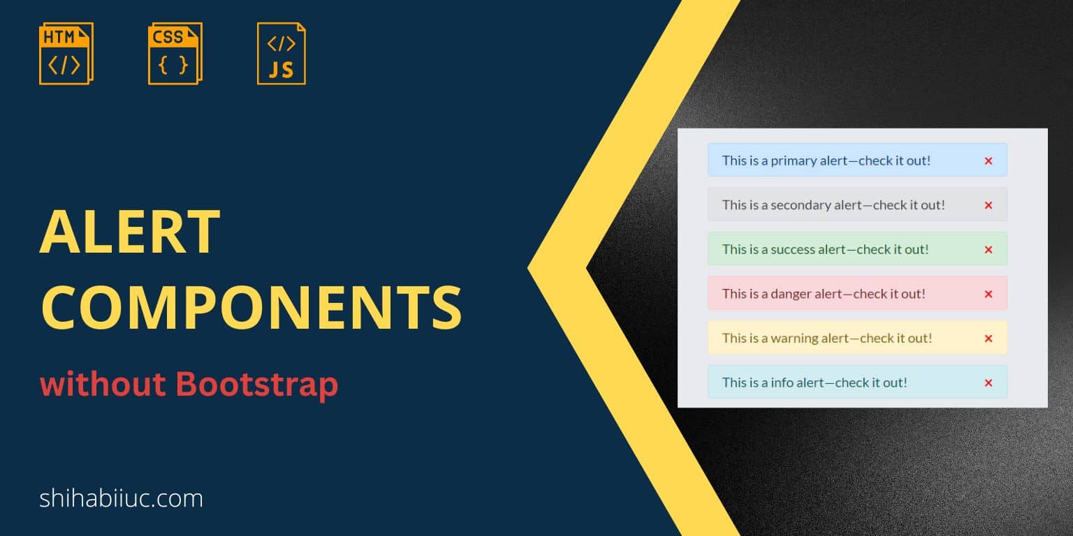
Alert components using only HTML, CSS & JavaScript
Before I give you the same code, see all the alert components below.
Examples
As you see, the above alert boxes are very similar to the Bootstrap component. But they have been created using only HTML, CSS & one line of JavaScript. Additionally, you got an option to close the alert.
Find their code below.
HTML
<div class="alert primary">
  This is a primary alert—check it out!
  <span class="close" onclick="this.parentElement.style.display='none'">×</span>
</div>
<div class="alert secondary">
  This is a secondary alert—check it out!
  <span class="close" onclick="this.parentElement.style.display='none'">×</span>
</div>
<div class="alert success">
  This is a success alert—check it out!
  <span class="close" onclick="this.parentElement.style.display='none'">×</span>
</div>
<div class="alert danger">
  This is a danger alert—check it out!
  <span class="close" onclick="this.parentElement.style.display='none'">×</span>
</div>
<div class="alert warning">
  This is a warning alert—check it out!
  <span class="close" onclick="this.parentElement.style.display='none'">×</span>
</div>
<div class="alert info">
  This is a info alert—check it out!
  <span class="close" onclick="this.parentElement.style.display='none'">×</span>
</div>
<div class="alert light">
  This is a light alert—check it out!
  <span class="close" onclick="this.parentElement.style.display='none'">×</span>
</div>
<div class="alert dark">
  This is a dark alert—check it out!
  <span class="close" onclick="this.parentElement.style.display='none'">×</span>
</div>
CSS
.alert {
  position: relative;
  padding: 0.75rem 1.25rem;
  margin-bottom: 1rem;
  border: 1px solid transparent;
  border-radius: 0.25rem;
}
.alert .close {
  position: absolute;
  right: 20px;
  top: 50%;
  -webkit-transform: translateY(-50%);
          transform: translateY(-50%);
  color: #F70000;
  cursor: pointer;
  font-weight: bold;
  font-size: 1.5rem;
}

.alert.primary {
  color: #004085;
  background-color: #cce5ff;
  border-color: #b8daff;
}
.alert.secondary {
  color: #383d41;
  background-color: #e2e3e5;
  border-color: #d6d8db;
}
.alert.success {
  color: #155724;
  background-color: #d4edda;
  border-color: #c3e6cb;
}
.alert.danger {
  color: #721c24;
  background-color: #f8d7da;
  border-color: #f5c6cb;
}
.alert.warning {
  color: #856404;
  background-color: #fff3cd;
  border-color: #ffeeba;
}
.alert.info {
  color: #0c5460;
  background-color: #d1ecf1;
  border-color: #bee5eb;
}
.alert.light {
  color: #818182;
  background-color: #FCFCFD;
  border-color: #DEE1E6;
}
.alert.dark {
  color: #1b1e21;
  background-color: #d6d8d9;
  border-color: #c6c8ca;
}
For each variation, we are only changing the color, background-color and border-color.
JavaScript is added directly to the HTML. “onclick” is an event that occurs when someone clicks the HTML element. In our case, we’re hiding the parent element <div> (using display: none).
Additional content in the alert box
Aside from the one-line message, you can also include multiple HTML elements in your alert components.
Example
Natus officiis fugit!
Lorem ipsum dolor sit amet consectetur adipisicing elit. Quibusdam dignissimos corrupti delectus, quis asperiores alias sit porro saepe beatae minus, maxime recusandae magnam. Natus officiis fugit soluta obcaecati.
Consectetur adipisicing elitorporis necessitatibus pariatur neque ipsum voluptatibus.
×You’ll find a similar alert box on the Bootstrap website. Here only exception is the horizontal line gradient color (<hr>).
The above is an example to show you how to add additional content like a heading, paragraph, etc to your alert box. See its HTML & CSS below.
HTML
<div class="alert-additional">
  <h4>Natus officiis fugit!</h4>
  <p>Lorem ipsum dolor sit amet consectetur adipisicing elit. Quibusdam dignissimos corrupti delectus, quis asperiores alias sit porro saepe beatae minus, maxime recusandae magnam. Natus officiis fugit soluta obcaecati.</p>
  <hr>
  <p>Consectetur adipisicing elitorporis necessitatibus pariatur neque ipsum voluptatibus.</p>
  <span class="close" onclick="this.parentElement.style.display='none'">×</span>
</div>
CSS
.alert-additional {
  position: relative;
  padding: 0.75rem 1.25rem;
  margin-bottom: 1rem;
  border: 1px solid transparent;
  border-radius: 0.25rem;
  color: #155724;
  background-color: #d4edda;
  border-color: #c3e6cb;
  margin: 20px;
}
.alert-additional hr {
  border: 0;
  height: 3px;
  background-image: -webkit-gradient(linear, left top, right top, from(#32a852), to(#fc2b23));
  background-image: linear-gradient(90deg, #32a852, #fc2b23);
  border-radius: 5px;
}
.alert-additional .close {
  position: absolute;
  top: 20px;
  right: 20px;
  color: #F70000;
  cursor: pointer;
  font-weight: bold;
  font-size: 1.5rem;
}
Build HTML CSS projects
Conclusion
Now you know how to create an alert box on your own and without any framework like Bootstrap. Additionally, you learned how to add a working close icon to your alert component.
Therefore if you have any questions, feel free to ask.