To reverse columns on mobile or any other screens, you can use flexbox & its order property. If this does not make sense, I will show you now.
But when actually do you need to reverse columns?
I am happy to ask because this is exactly what I will show you now.
Let’s imagine you have the following layout on a large device.
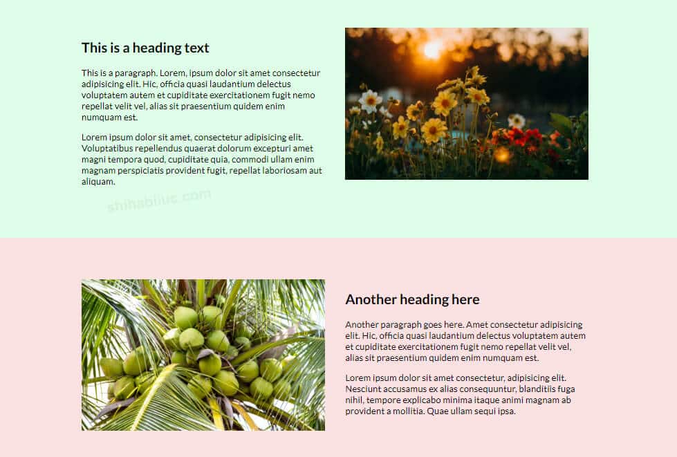
As you see in the above screenshot, I have two rows. Each row contains two columns. Each of the right columns contains images.
You will see this kind of layout a lot. Even you may have built such a layout many times.
Anyways, there is a problem with this layout. If you check the web page on a mobile, you will see that the two images stack one after another. To better visualize the problem, see the screenshot below.
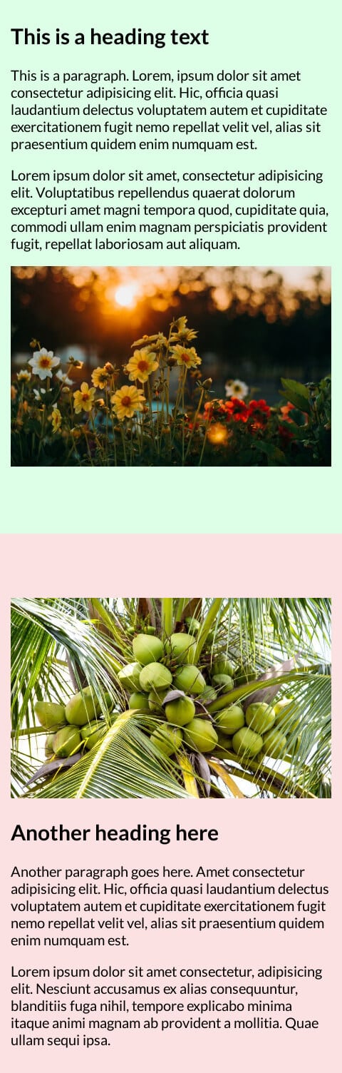
In this type of case, you may want to show the second image (coconut tree) at the bottom of the paragraph.
To achieve this goal, select the column that contains the coconut image, and set its flex order to “2” on mobile.
.mobile-order-2 {
 order: 2;
}
However, just setting the order will not work. Make sure you made the container div’s display flex. See my entire HTML & CSS below.
HTML
<section class="row-1">
  <div class="container">
    <div class="col-1">
      <h2>This is a heading text</h2>
      <p>This is a paragraph. Lorem, ipsum dolor sit amet consectetur adipisicin.</p>
    <div class="col-2">
      <img src="./img/flower.jpg" alt="flowers">
    </div>
  </div>  <!-- .container -->
</section><!-- .row-1 -->
<section class="row-2">
  <div class="container">
    <div class="col-1 mobile-order-2">
      <img src="./img/coconut.jpg" alt="coconuts">
    </div>
    <div class="col-2">
      <h2>Another heading here</h2>
      <p>Another paragraph goes here. Amet consectetur adipisicing elit.</p>
    </div>
  </div>  <!-- .container -->
</section><!-- .row-1 -->
CSS
.row-1 {background-color: #deffe7;}
.row-2 {background-color: #fce1e2;}
.container {
  display: -webkit-box;
  display: -ms-flexbox;
  display: flex;
  -ms-flex-wrap: wrap;
      flex-wrap: wrap;
}
@media (min-width: 768px) {
  .container {
    -webkit-box-pack: justify;
        -ms-flex-pack: justify;
            justify-content: space-between;
  }
}
.container .col-1, .container .col-2 {
  -ms-flex-preferred-size: 100%;
      flex-basis: 100%;
}
@media (min-width: 768px) {
  .container .col-1, .container .col-2 {
    -ms-flex-preferred-size: 48%;
        flex-basis: 48%;
  }
}
.container .mobile-order-2 {
  -webkit-box-ordinal-group: 3;
      -ms-flex-order: 2;
          order: 2;
}
This is how you can reverse the column on mobile or other screen sizes.
Final output
After changing the second image order, it sits at the bottom of the paragraph (as you see below).
As you see in my CSS, I have a class name “mobile-order-2.” I used this class only on the div that I want to reverse on mobile. In this example, I have only one image that requires reverse (coconut image). So I used this class only one div.
But if you have multiple items to reverse, use the same class on those divs.
If you want to see the live web page, check this URL.
And if you want to find the git repo (code), check this URL.
| Learn & practice CSS with real-world examples |
|---|
| Learn basic CSS from the ground up. |
| Build real projects in HTML CSS. |
Build HTML CSS projects
Conclusion
This is a small code snippet. But it took me an hour to prepare things for you. Such as the Git repo, live page/preview, screenshot, and writing this actual post. I tried to make it very easy to understand by the beginners. But if you still have any issues reversing columns using CSS, let me know. I will try to help everyone as much as I can (for free).

